

> Key Takeaway:
Why do some articles pull clicks and still fail to earn trust, attention, or action?
The answer isn’t traffic—it’s what readers do next.
Why do some articles pull clicks and still fail to earn trust, attention, or action?
The answer isn’t traffic—it’s what readers do next.
This article looks at content quality as something we can measure.
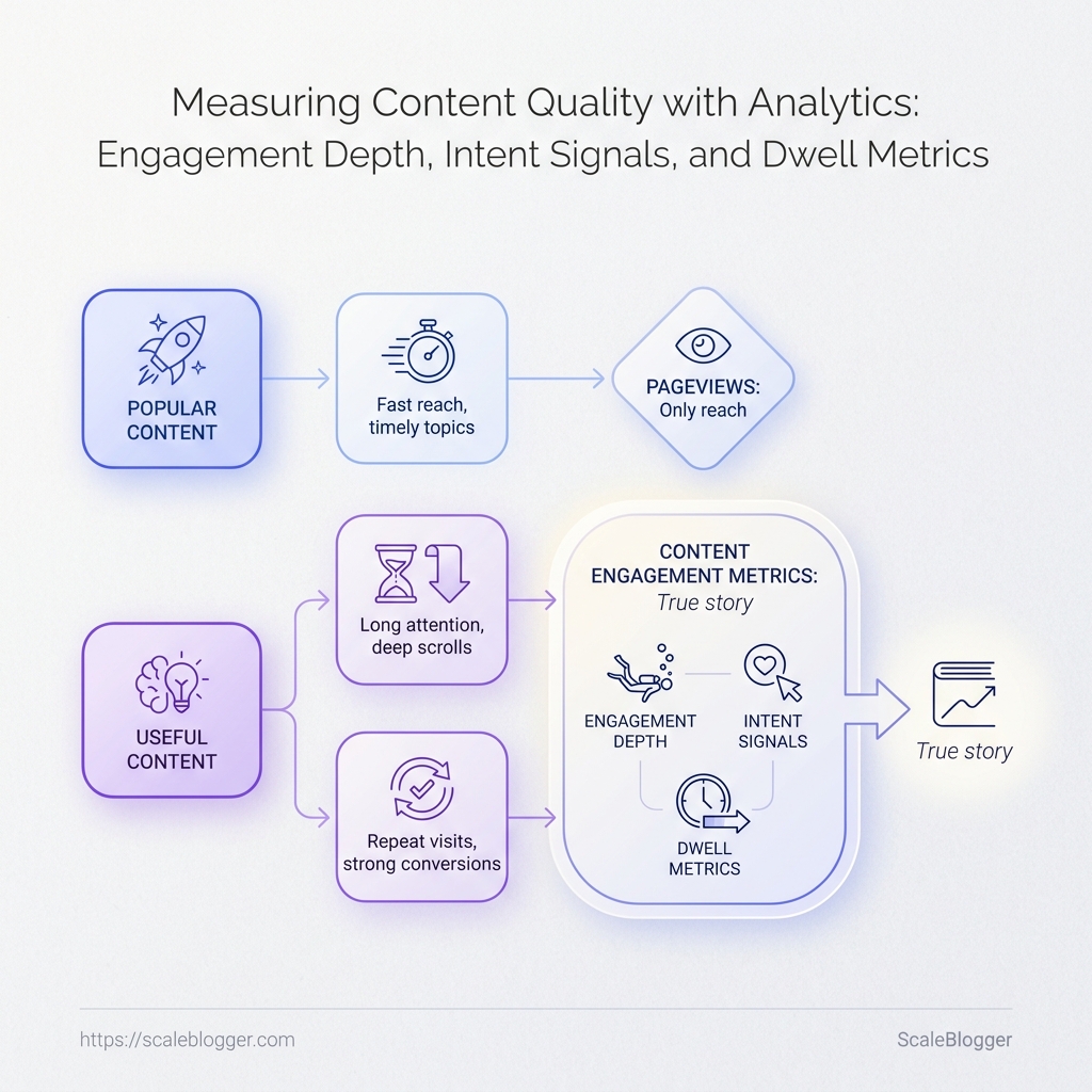
Did people notice the page, move through it, and take the intended next step? Pageviews can bring visitors in.
However, what they do next determines if the content truly provides value.
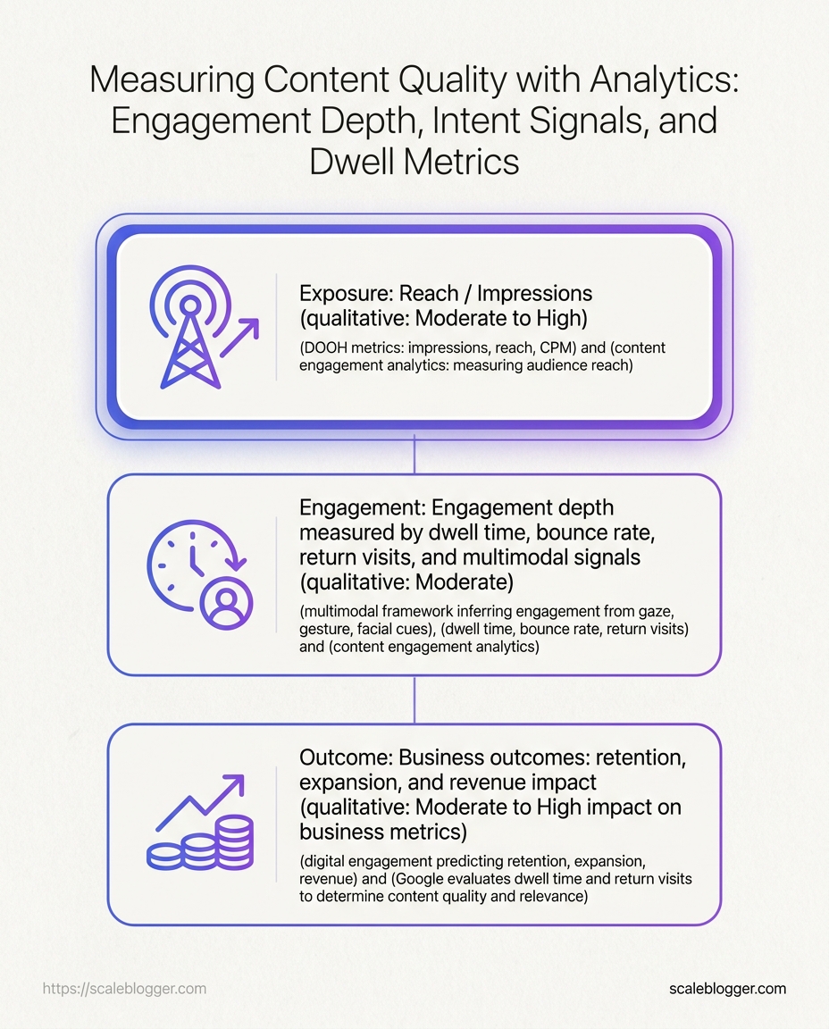
We’ll use three analytics layers—exposure, engagement, and outcome—to diagnose where performance breaks:
- Exposure: visibility and entry behavior
- Engagement: attention and progression signals (dwell/scroll/engaged sessions)
- Outcome: downstream intent actions (internal clicks, returns, and conversions)
GA4’s “engaged” sessions are a useful baseline, but they aren’t the full picture.
The practical goal is to combine engagement depth with intent/outcome evidence so you can tell the difference between:
- visitors who skim and leave,
- visitors who evaluate and move deeper,
- and visitors whose behavior aligns with what the page is supposed to accomplish.
Start here, then use the frameworks and checklists later in the post to turn analytics into a repeatable editorial decision process—one that doesn’t confuse loud volume with real reading.
(For a deeper look at content performance metrics and how teams structure dashboards, see: https://scaleblogger.com/blog/content-performance-benchmarking-techniques/.)
## Quick Guide to Diagnostic Symptom Analysis Take 60 seconds to diagnose the symptoms on your dashboard by matching them to key measurement issues, then make a targeted change. ### Diagnostic Snapshot (symptom → likely measurement issue → action) 1) Symptom: Engagement appears adequate, yet progression is lacking – Likely issue: Captures awareness, but fails to guide toward critical decision points. – Suggested action: Reposition key proofs/steps earlier in the structure, enhancing coherence in how initial claims lead to evidence. 2) Symptom: High dwell/engaged time, but weak intent signals – Likely issue: While content is informative, it’s not effectively guiding readers toward subsequent actions at their point of need. – Suggested action: Enhance intent-driving sections with contextual links/CTAs positioned where engagement peaks. 3) Symptom: Intent signals present with flat outcomes – Likely issue: Mismatched goal wiring or ineffective paths from intent expressions to actual conversions. – Suggested action: Review the setup for goals/events, ensuring alignment with how users navigate post-intent.
This guide enables teams to quickly identify issues based on key diagnostic signals and implement straightforward, actionable changes to content strategies.
What does content quality look like in analytics, beyond pageviews?
A post with weak measurement can look “fine” even when readers don’t get meaningful value.
So instead of treating engagement as one number, define measurable progress for the page you published.
Start with a baseline (so metrics mean something)
Don’t judge performance against a universal benchmark.
Divide into similar groups (same intent/source type and similar content format/length).
Then ask two questions: 1) Does the page help readers progress? 2) Does it guide readers to the next step?
Make “reading” measurable (calibrate to your proof moment)
A common reason dashboards mislead teams is that “reading” isn’t measured in relation to the page’s decision-critical proof.
Align your scroll/progression signals to where the core claim, comparison, or steps actually live (your “proof/decision moment”).
If you need a practical checklist for making sure events and thresholds are wired consistently, use the workflow’s instrumentation sanity check in Section 11.
Then interpret those markers with engagement behavior and internal navigation so the dashboard reflects progress rather than just “someone stayed on the tab.”
Benchmark the relationship, not just the values
Once you know what “normal” looks like for the cohort, focus on where signals diverge:
- attention present but progression weak, or
- progression present but next-step fit missing.
That’s the quickest path from “metrics look okay” to a diagnostic answer you can act on.
That’s how analytics turns into decision clarity instead of vanity reassurance.
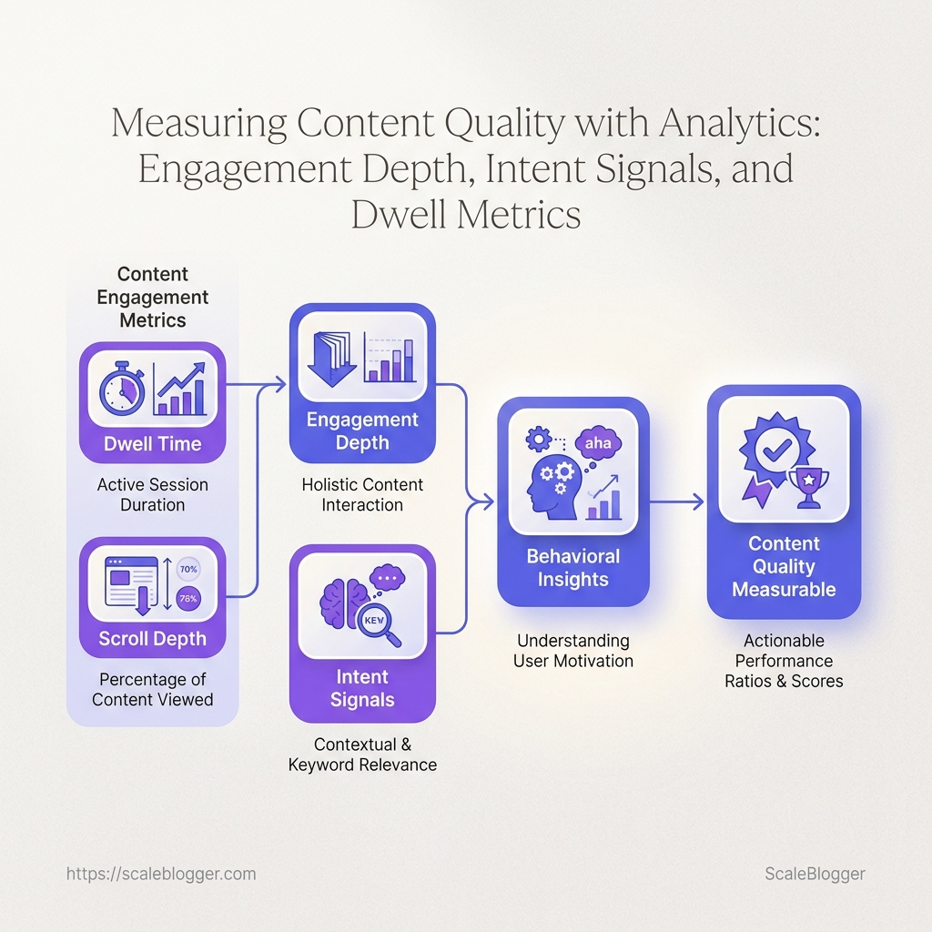
> Key Takeaway:
One metric usually doesn’t reveal the type of content work that happened.
Therefore, use the metric-to-decision mapping to check for consistency.
One metric usually doesn’t reveal the type of content work that happened.
Therefore, use the metric-to-decision mapping to check for consistency.
One metric usually does not show what type of content work occurred.
Therefore, use the metric-to-decision mapping to check for consistency.
Which metric answers which question?
Table: Why pageviews alone can hide the real story — Metric, Reveals, Misses & more
| Metric | Reveals | Misses | Best for |
|---|---|---|---|
| Pageviews | Reach and visibility | Satisfaction and usefulness | Top-of-funnel awareness |
| Search impressions | How often a query surfaced your page | Whether the user found value on-page | SEO demand tracking |
| Average engagement time | Attention held on page | Whether users reached the right proof | Content quality spot-checking |
| GA4 engagement rate | Whether sessions contain “active” behavior | Activity that doesn’t match intent | Early-stage engagement context |
| Scroll depth | How far users go | Whether they found the decision-critical sections | Long-form and proof placement |
| Content consumption score | Dwell + completion-style signals | Intent strength and outcome alignment | Reading-to-commitment inference |
| Return visits in a short window | Repeat interest | First-pass comprehension vs. unresolved questions | Intent strength and evaluation |
| Key events | Micro-actions that matter | Passive reading with no follow-through | Lead-gen / conversion logic |
| Conversion rate | Outcome efficiency | Weak top-of-funnel signals | Revenue and commercial effectiveness |
Interpret as linked hypotheses (not competing facts)
Use the table to ask one question at a time: “What decision am I trying to support right now?” Then look for agreement—or specific disagreement—between neighboring signals:
- Visibility (entry) looks fine, but outcomes don’t: the entry promise or proof/CTA alignment is likely off.
- Attention looks fine, but progression is weak: readers may be consuming without finding decision support.
- Outcomes happen with surprisingly low depth: treat it as likely intent-match or instrumentation blind spots—confirm with cohort + event coverage.
If multiple related signals point to the same failure stage, translate that into edits.
If they don’t, widen the lens (cohort segmentation and instrumentation coverage) before you conclude the content quality story.
> Key Takeaway:
> Key Takeaway: ## How do intent signals reveal whether readers found the content useful? Which readers were curious, and which were actually ready to act?
> Key Takeaway: ## How do intent signals reveal whether readers found the content useful? Which readers were curious, and which were actually ready to act?
How do intent signals reveal whether readers found the content useful?
Which readers were curious, and which were actually ready to act? That difference shows up in the behavior after the first click—not in the page load itself.
A reader who opens one article, clicks a related guide, and returns later is sending a different signal from someone who lands, skims, and vanishes.
When we look at content engagement metrics this way, the page becomes a map of intent—not just a traffic record.
A single article can attract both kinds of visits at once.
A broad informational post may pull in low-intent readers from search, while the same post may also pull in high-intent readers who click deeper into product pages, save the piece, or come back within a day or two.
That split matters in analyzing content performance.
GA4 can flag “activity,” but intent requires reading what people do next—especially internal clicks, returns, and downstream actions.
- Read clicks: A click from one article to another shows the reader wants more depth, not just a quick answer.
- Returns: Repeat visits over a short window often point to comparison shopping, research, or unresolved questions.
- Downstream actions: Visits to pricing, demo, contact, or signup pages usually indicate stronger intent than a casual browse.
- Saves and shares: Bookmarks, emailed links, and private saves are quiet signals that the content felt worth keeping.
A useful mini-case makes the pattern obvious.
Imagine a how-to article about choosing a content calendar workflow.
Low-intent readers arrive from a general search, skim one section, and leave after a single page.
High-intent readers click into a benchmarking guide, return the next day, and then move to a scheduling or planning page.
That is where behavioral insights become useful for planning, not just reporting.
For teams building a measurement process, the signals are straightforward:
- Track internal link clicks: Watch which links pull readers deeper into the site.
- Separate return visits from first visits: Repeats often signal stronger purchase research.
- Log key downstream pages: Pricing, demo, contact, and case-study visits matter.
- Use depth calibration separately: When you need to interpret “how consumed,” pair these intent markers with the depth framework (see Sections 8–9).
That is the difference between a post that merely attracts attention and one that moves a reader forward.
When the signals line up, the content has done real work.
Which engagement depth signals matter most for measuring content success?
Engagement and dwell metrics are useful, but only after you calibrate them to the page’s decision moment.
Engagement depth calibration checklist (make depth comparable)
Table: Which engagement depth signals matter most for measuring content success? — Signal, Calibrate by…, Healthy pattern (within cohort) & more
| Signal | Calibrate by… | Healthy pattern (within cohort) | Decision move |
|---|---|---|---|
| Scroll depth (key thresholds) | Content length + where the “decision proof” lives (not a generic 50%) | Users reach the sections that contain the core claim/comparison/steps | If users stop early: improve intro clarity, re-order the argument, or move proof earlier |
| Average engagement time / time active | Your topic baseline + typical reading density | Time active increases with progression (not just “tab stays open”) | If time is high but progression is low: check readability, layout, and whether your events fire where meaning happens |
| GA4 engaged sessions / engagement rate | GA4’s definition + the minimum “useful” actions for your goals | Engaged sessions rise when the content actually holds attention for that cohort | If engaged rate stays flat: verify instrumentation and segment by intent source |
The calibration output you should generate
For each content group, produce a single cohort-level readout:
- “What counts as meaningful progress for this content type?” (your calibrated thresholds)
- “Where do readers typically drop before proof?” (your failure point)
Then use intent/outcome signals (see Section 6) to decide which edit fits the calibrated failure point—without letting depth metrics drive the conclusion on their own.
Why a long dwell time is not always a win
Long dwell times can be misleading; they may indicate either genuine engagement or confusion, distraction, or friction on the page.
It’s essential to use a two-step diagnostic to discern the underlying reasons for high dwell times.
First, assess whether users reach decision-support sections of the content.
If many don’t reach this point, look for possible problems: unclear navigation, lack of guidance, or layout issues.
Second, evaluate intent markers to determine if users signal a next action.
If not, it may mean that although the content is informative, it is not directing readers toward the next step effectively.
The goal is to turn these observations into actionable editorial changes.
How can we build an analytics workflow that supports faster content decisions?
Why does a dashboard look healthy when leads are flat? This is because it can show three layers at once: visibility, behavior, and conversion.
Why does a dashboard look healthy when leads are flat?
This happens because it can display three layers at once: visibility, consumption behavior, and conversion.
This does not require the team to connect them to a single decision.
The result is charts that ‘agree’ visually, while the editorial and growth systems don’t.
Rather than repeating the same diagnostics each week, create a workflow that labels where page clusters are struggling, turns these findings into an experiment backlog, and validates outcomes with specific evidence.
Run the loop: Audit → Label → Queue → Validate
1) Audit (start-of-week, 45–60 minutes): evidence first, not conclusions
- Pick your priority page clusters (same set you’ll evaluate all cycle).
- Check instrumentation sanity for the week’s newest content: scroll/proof events firing, internal link click events present, and the relevant goal events captured.
- Confirm the entry mix for each cluster isn’t being distorted (new sources, landing-page drift, or attribution changes).
2) Label (same day, 20–30 minutes): assign each cluster to one primary failure label Create a one-line label per cluster:
- Entry mismatch (exposure looks fine, but the cohort arriving isn’t the one that finds the proof)
- Progress gap (attention exists, but readers don’t reach the decision moment)
- Route gap (readers reach proof, but the content doesn’t move them into the next-step path)
- Outcome wiring gap (intent appears, but outcomes are flat due to goals/events or post-intent routing)
This label becomes your decision key for the rest of the week.
3) Queue experiments (midweek, 30–45 minutes): propose changes with measurable acceptance criteria For each labeled cluster, pull one experiment from a small menu of stage-appropriate moves (keep the menu consistent so experiments stay comparable):
- If Progress gap: re-order proof, tighten intro-to-claim mapping, or add intermediate guidance before the decision moment. – If Route gap: revise “why this next” context and move internal links/CTAs to the moments where the reader is most ready to act. – If Entry mismatch: adjust expectations at the landing layer (headline/intro alignment) or improve audience fit via targeting/briefing.
- If Outcome wiring gap: validate goals/events and ensure the post-intent path actually leads to the monitored conversion surfaces.
Each queued item should include:
- the stage label,
- the specific asset you’ll change (CTA placement, proof order, event mapping, etc.), and
- the acceptance metric you expect to move (proof-threshold attainment, internal click rate, or goal event rate—based on the label).
4) Validate (end-of-week, 30 minutes): measure the acceptance criteria, not vanity charts
- Re-check that the stage evidence agrees with the change (e.g., progress metrics improved where you moved proof).
- Verify the outcome layer only after you confirm the intent/route evidence improved.
- Document what didn’t move and update the label logic for next cycle (this is how the workflow gets sharper).
Use ‘one panel’ per content type—so you don’t re-litigate interpretation
Maintain a compact panel for each page cluster:
- This week’s label (entry/progress/route/outcome wiring)
- Top evidence (2–3 signals max: the exact scroll/proof indicator, the relevant internal routing indicator, and the outcome/goal indicator)
- Experiment queued (what changed)
- Acceptance criterion (what will confirm it worked)
That’s the difference between tracking charts and running a decision system.
Optional: AI-assisted archive scan, but keep humans responsible for labels
AI can help you shortlist where the chain likely breaks (pattern outliers across many URLs), but your workflow should still label each cluster and set acceptance criteria based on the stage definitions above.
Goal: every weekly view should either (a) produce a label with stage evidence, or (b) move an experiment from the queue to validation—so “activity” becomes “progress toward the next decision.”
Where should AI writing tools fit in a measurement-first content process?
If an AI draft is completed faster than the dashboard can update, where does the tool fit?
Not at the end.
AI writing tools fit best in the drafting, classification, and comparison stages, while analytics decides whether the work deserved to ship at all.
That split matters because content performance is not just about production speed; it is about whether a topic deserves attention, whether the writing matches intent, and whether the post-publish signals justify another round.
At Scaleblogger, we treat AI as a working layer inside the content system, not as the system itself.
Our com/blog/data-driven-content-calendar/”>data-driven content calendar approach starts with measurable signals, then uses those signals to guide what AI should draft next.
AI writes faster. Measurement decides smarter.
AI is strongest when the brief is already grounded in evidence.
A good workflow starts with historical engagement and conversion data, then uses AI to generate drafts, angles, or comparison points for review.
That keeps the process honest.
A strong draft that targets the wrong topic is still the wrong topic.
- Use AI for speed: Generate first drafts, variants, and rewrites quickly.
- Use AI for sorting: Classify topics by intent, funnel stage, or likely reader action.
- Use AI for comparison: Test two headlines, two openings, or two content angles before publishing.
- Use analytics for proof: Check results against a baseline, not against feelings.
The loop should run in both directions
A measurement-first process does not stop after publication.
Post-launch signals should feed back into the next brief, the next outline, and the next update.
That is where content engagement metrics become useful.
They tell you which pieces deserve expansion, which need a sharper angle, and which should be retired.
In practice, that means the same workflow connects topic selection, writing quality, and behavioral insights instead of treating them as separate jobs.
- Pick topics from evidence.
Use past performance, seasonality, and priority scoring.
- Draft with AI.
Build several versions instead of one generic post.
- Validate against the baseline.
Compare the post to prior content in the same category.
- Feed results back into planning.
Use the numbers to shape the next round of topics.
A clean setup also depends on measurement hygiene.
Our Google Analytics benchmarking process starts with a defined baseline, consistent tagging, and a current content inventory before any judgment calls.
AI belongs in the production lane.
Analytics owns the verdict.
When both are connected, analyzing content performance becomes a repeatable process instead of a monthly guess.
What are the marketing metrics for 2026?
Marketing metrics for 2026 need to show if content leads to business progress—not just if it gained attention.
Use the article’s measurement stages (exposure → engagement depth/progression → intent signals → outcomes) to choose metrics that match the stage you’re trying to improve:
- Exposure (fit + visibility): impressions/search reach and landing-page mix by source (Search vs. social vs. email).
- Engagement depth (progress to proof): GA4 engagement/engaged sessions paired with scroll/proof progression thresholds appropriate to the page type.
- Intent (did it route readers toward the next step?): internal link clicks + short-window returns + relevant goal-adjacent events (demo/contact/pricing views where applicable).
- Outcomes (did it pay off?): conversions tied to the content’s funnel goal (signup/qualified lead), benchmarked within comparable cohorts.
For the practical “what to fix first” decision logic (symptom → likely break → one instrumented change), use the 60-second diagnostic in Section 2 and the workflow approach in Section 11.
Conclusion
Great content analytics should end in decisions—not reassurance.
Use the frameworks above to treat each pattern as evidence for a specific stage of the journey (visibility → progress → routing → outcomes).
When signals agree, you know what to scale.
When they conflict, you can pinpoint the most likely failure stage and run a tightly scoped editorial test targeted to that stage—then confirm it with the matching success metric.
If your measurement chain is consistent and your experiments are stage-specific, dashboards stop feeling noisy because the patterns align to actions you can defend.
