

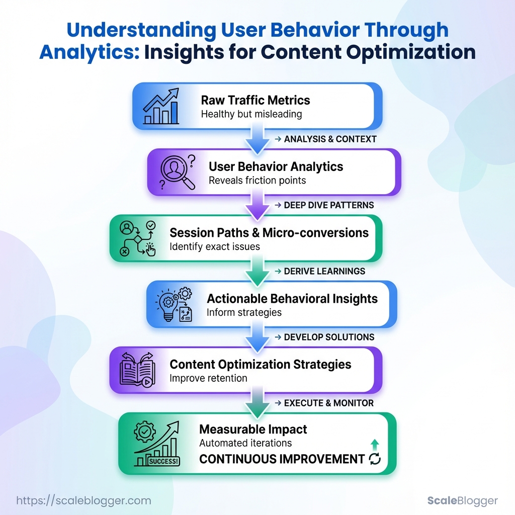
Understanding user behavior through analytics reveals what traffic numbers alone cannot—why visitors engage, hesitate, scroll, click, or leave your content.
Metrics like bounce rate and time on page provide useful signals, but user behavior analytics goes deeper by examining session paths, scroll depth, micro-conversions, heatmaps, and other interactions.
These behavioral insights help identify friction points that may be hurting engagement and conversions.
Instead of guessing what needs improvement, teams can use real behavior to guide content optimization, test changes, and create better user experiences.
What You’ll Need / Prerequisites
To optimize content and analyze user behavior effectively, begin by establishing a solid foundation. This should be done before making changes to pages or running experiments. At a minimum, you need a working analytics setup, editing access to the site, and the ability to segment data meaningfully. That combination lets you answer the questions that actually move traffic and conversions instead of guessing.
GA4 property with 90+ days of data: A properly configured GA4 property with at least three months of historical data so trends and seasonality are visible.
Server or CMS access: Edit pages, add tags, or deploy experiments. This includes FTP/SFTP, cloud hosting console, or CMS admin (WordPress, Contentful, Sanity, etc.).
Heatmap and session-recording tool: Hotjar, FullStory, or similar to capture click maps, scroll depth, and session playbacks for behavioral insights.
Search Console & keyword data access: Owner/editor permissions for Google Search Console and a keyword data source (Search Console performance reports, third‑party SEO tools) for intent-driven optimization.
Basic SQL or spreadsheet skills: Comfortable writing simple SELECT queries or using pivot tables and filters in Google Sheets/Excel for segmentation and cohort analysis.
A/B testing capability or plan: Access to an experimentation platform or a plan to run split tests (server-side or client-side) with a clear hypothesis and success metrics.
Stakeholder alignment: A clear decision-maker for publishing changes and prioritizing tests; otherwise experiments stall.
Tools & materials checklist
- Account-ready analytics: GA4 + Search Console access
- Behavior capture: Heatmap + session playback
- Experiment platform: A/B testing tool or feature-flag system
- Data processing: BigQuery, Snowflake, or spreadsheet-ready exports
- Permissions: Site editor + tag manager access
- Skills: SQL, basic statistics, and familiarity with user behavior analytics
Essential analytics and behavior-capture tools and what each provides for content optimization
Table: What You’ll Need / Prerequisites — Tool, Core capability, When to use & more
| Tool | Core capability | When to use | Cost (typical tier) |
|---|---|---|---|
| Google Analytics 4 | Event-based analytics, funnels, audience building | Traffic trends, conversion funnels, segment performance | Free |
| Google Search Console | Search performance, coverage, URL inspection | Search visibility, indexing issues, query intent | Free |
| Hotjar | Heatmaps, recordings, feedback polls | Qualitative behavior, usability issues | Free tier; paid plans from ~$39/month |
| FullStory | Session replay, console logs, UX search | Complex UX debugging and funnel friction | Free tier; paid plans from ~$199/month |
| Microsoft Clarity | Heatmaps, session replay, performance insights | Lightweight behavior capture with no cost | Free |
| Crazy Egg | Heatmaps, A/B testing, snapshots | Quick visual experiments and heatmap analysis | Paid plans from ~$24/month |
| Optimizely | Feature flagging, server/client experiments | Enterprise A/B testing and personalization | Custom pricing (enterprise) |
| VWO | Experimentation, heatmaps, visitor recording | Conversion rate optimization workflows | Custom pricing |
| Amplitude | Product analytics, cohort analysis | Deep behavioral funnels and retention studies | Free tier; paid from ~$995/month |
| BigQuery / Data Warehouse | Raw event storage, SQL analysis at scale | Large-scale segmentation and attribution | Pay-as-you-go (varies) |
| Spreadsheets / SQL (skill) | Ad-hoc analysis, pivoting, reporting | Quick segmentation and lightweight ETL | Free / skill-based cost |
Having these accounts, access levels, and skills in place keeps experiments honest and actionable. When the data, tools, and permissions line up, improvements to content and UX stop being guesswork and start being measurable progress. If help automating parts of this pipeline is needed, solutions like Scale your content workflow can bridge data-to-publish gaps quickly.
Define Your Behavioral Questions and Success Metrics
Begin by transforming business goals into a short list of 3–5 measurable behavioral questions. Good behavioral questions need to be clear, actionable, and related to events you can track in analytics. Prioritize the one question that most directly advances revenue, retention, or strategic visibility, then assign a single primary KPI and one or two secondary metrics to give context.
Define the segments you’ll apply immediately (device, traffic source, location, new vs returning) so queries return usable, comparable slices.
Primary KPI: A single metric that signals success for the question (e.g., conversion rate, engaged sessions).
Secondary metrics: Supporting numbers that explain how the primary KPI moved (e.g., time on page, scroll depth).
Behavioral question: A focused, testable query about what users do (e.g., “Do new mobile visitors reach the CTA on page X?”).
Common approach:
- Write 3–5 behavioral questions tied to a clear business outcome.
- For each question, pick one primary KPI and 1–2 secondary metrics.
- Define segments to apply immediately: device category, traffic source, geographic region, and user type (new vs returning).
Example priorities:
- High priority: Questions that affect conversions or retention.
- Medium priority: Questions that affect content engagement and discovery.
- Low priority: Exploratory questions for future A/B testing.
Map example behavioral questions to KPIs, segments, and data sources to query
Table: Define Your Behavioral Questions and Success Metrics — Behavioral question, Primary KPI, Segments to apply & more
| Behavioral question | Primary KPI | Segments to apply | Suggested data source |
|---|---|---|---|
| Why do users abandon article X? | Bounce rate | Device, traffic source, new vs returning | GA4 reports, heatmap session lists |
| Which traffic sources drive engaged readers? | Engaged sessions | Traffic source, campaign, location | GA4 reports, Search Console |
| What content formats get highest sign-up rate? | Sign-up conversion rate | Device, page template, source | GA4 reports, event tracking |
| Where do mobile users drop off on long-form pages? | Scroll depth 50%+ | Device (mobile), location | Heatmap session lists, GA4 engagement |
| Which CTAs correlate with higher conversion? | CTA click-to-conversion rate | Page, device, campaign | GA4 event reports, session recordings |
Key insight: Mapping questions to a single primary KPI forces clarity about what “success” looks like. Secondary metrics and segments turn ambiguous problems into testable hypotheses—so analytics queries return precise, repeatable results rather than noise.
Include one or two tools to automate regular checks—an automated GA4 dashboard or a heatmap export schedule reduces manual work. For teams building an AI-enabled content pipeline, consider connecting these KPIs into an automated reporting workflow to surface behavioral signals faster.
Defining focused questions and metrics first saves hours later when digging for answers; it keeps experiments lean and the data usable.
Collect and Validate the Right Data
Start by proving the data pipeline actually captures what matters. Without validated tracking, user behavior analytics and content optimization strategies are guesses. Use debug and preview modes to see events in real time, normalize URLs and UTMs before any analysis, filter out internal traffic and bots, and export raw events for deeper checks.
Debug and preview modes
- Use product debug views: Open
DebugView(or your analytics platform’s preview mode) to confirm events fire during interaction. - Validate event payloads: Check event names, parameters, and user properties for typos or inconsistent casing.
- Simulate real sessions: Record one full journey — landing, click, form submit, page exit — and watch the event chain in the debug stream.
Normalize URLs and UTM tags
- Canonicalize page URLs: Remove tracking fragments, trailing slashes, and parameter order differences before grouping pageviews.
- Standardize UTM keys: Use consistent
utm_source,utm_medium, andutm_campaignnaming conventions and casings. - Map legacy patterns: Convert legacy or messy patterns (e.g.,
?ref=emailvs?utm_source=email) into a single normalized field.
Exclude internal traffic and bots
- Filter by IP ranges: Maintain an up-to-date list of office VPN and CI/CD IPs and exclude them at ingestion.
- Block known bot user agents: Update filters with common bot signatures and review bot hits monthly.
- Use test user flags: Tag QA accounts with a
test_userproperty and exclude those sessions in reporting.
Export raw events for deeper analysis
- Export raw event streams to BigQuery or CSV for schema-level validation and replay testing.
- In BigQuery, run quick counts to find anomalies: event totals, unique user counts, parameter null rates.
- Store a canonical schema manifest that lists required fields and allowed value patterns.
Practical checks and hygiene
- Schema checks: Ensure required parameters are present for conversion events.
- Duplicate detection: Look for duplicate event IDs indicating multiple fires.
- Sampling awareness: Confirm the platform isn’t sampling before trusting rate-based metrics.
Definitions
DebugView: A live console that shows events and user properties as they occur for immediate validation.
Normalization: The process of converting URLs and UTM values into consistent, comparable formats.
Raw export: Unaggregated event data exported to storage (BigQuery/CSV) for flexible analysis.
A quick checklist, automated where possible, saves hours of detective work later; teams that automate these validations — even with a content pipeline like Scaleblogger.com — avoid chasing phantom issues and get reliable behavioral insights faster. Keeping data clean means content optimization strategies rest on evidence, not guesswork.
Key Takeaway: Start by mapping the experience you want users to have, then measure where reality diverges. ”).
Analyze Behavior: Funnels, Paths, and Engagement Signals
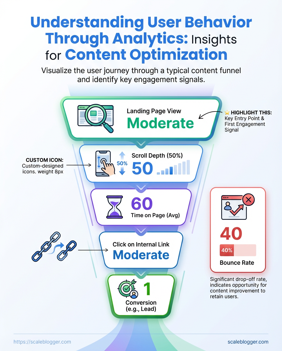
Start by mapping the experience you want users to have, then measure where reality diverges. ”). Use cohort segmentation to reveal whether new visitors, organic searchers, or returning subscribers follow different paths.
Combine quantitative metrics with session_replay and heatmaps to confirm whether a drop is confusion, friction, or simply disinterest.
Tracking configured: Site has pageview and event tracking (GA4 or equivalent) and click events for CTAs.
Session recording enabled: Heatmaps and replays are collecting representative sessions.
Cohort identifiers present: UTM tags, login state, or content cohort (topic cluster) assigned.
Tools & materials
- Analytics platform:
GA4, Amplitude, or Mixpanel for funnel reporting. - Qualitative tools: Hotjar or FullStory for session replays and heatmaps.
- Content signals: On-page micro-conversions (scroll depth, video play, CTA hover).
- Map funnel stages to a behavioural question.
- Define 3–6 stages that reflect real decisions users make. Example: Article view → Scroll midpoint → Click CTA → Open signup modal → Complete signup.
- Segment by cohort and compare.
- Create segments for traffic source, device, and content cluster. Compare conversion rates and drop-off percentages to surface divergent behavior.
- Run path analysis to find common journeys.
- Look for unexpected entry pages, loops, and exit nodes. Export the top 10 paths and inspect anomalies.
- Validate quantitatively flagged issues with qualitative replays.
- Watch 10–20 session replays for each problematic cohort to confirm whether UX, content clarity, or technical errors cause drop-offs.
Practical examples and signals
- High CTA click but low signup: Users click, then abandon in modal — likely form friction or broken fields.
- Mid-article mobile drop: Mobile layout or load performance degrades at midpoint — suspect CSS/ads.
- Organic traffic, low micro-conversions: Content matches query but lacks clear next step — add inline CTAs tied to intent.
Funnel drop-off scenarios and recommended remediation actions
Table: Analyze Behavior: Funnels, Paths, and Engagement Signals — Observed pattern, Likely cause, Recommended fix & more
Key insight: The table maps observable patterns to practical fixes and prioritizes effort based on likely impact, so teams can focus on the highest- changes first.
Applying this approach across cohorts and validating with replays turns vague drop-off numbers into actionable fixes. Automating the reporting and using an AI-assisted content workflow like Scale your content workflow can keep these funnels updated as content scales. Watch how small UX and copy fixes shift conversion curves — those moves compound quickly.
Key Takeaway: Turn observed behavior into single, testable statements that connect user actions to measurable outcomes. Begin with analytics baselines.
Generate Behavioral Insights and Hypotheses
Turn observed behavior into single, testable statements that connect user actions to measurable outcomes. Begin with analytics baselines. Turn each insight into a hypothesis, estimate the impact using real metrics, score and prioritize using ICE, and then write down acceptance criteria and a measurement plan. This ensures experiments are organized and decisions are based on facts.
How to frame a testable hypothesis
Observe a pattern. Use analytics to pull the baseline for the metric you care about (sessions, CTR, conversion rate, time on page). Write one sentence that links a specific change to a specific metric and timeframe.
Include expected direction (increase/decrease) and a rough magnitude if you can.
Example hypothesis formats:
- Changing the hero image to show the product in use will increase
time on pageby 10% within 14 days. 2.
Moving the primary CTA into the mid-article will raise on-page CTR to the signup form by 15% over two weeks.
Estimate impact from baselines
Pull baseline numbers from analytics before planning. Use these for impact estimates and sample-size calculations.
Steps to estimate impact:
- Pull the current metric baseline (According to a 2023 study from User Behavior Analytics,
current CTR = 3.2%.).
- Translate Recent research indicates that expected lift can be translated into absolute change (e.g., 15% relative lift →
3.68%expected)..
- Validate feasibility with traffic volume and required sample size; if traffic is low, prioritize high-impact, high-ease items.
Prioritize with ICE scoring
Use ICE to turn many hypotheses into a manageable backlog.
ICE components:
- Impact: How much business value if the hypothesis is true.
- Confidence: How sure the estimate is (data, past tests, qualitative research).
- Ease: Engineering and design cost to implement the experiment.
Document acceptance criteria and measurement plan
Acceptance criteria: Define the exact metric, minimum detectable lift, statistical threshold (e.g., p < 0.05), and timeframe. Measurement plan: Specify events/tags to capture, segments to include/exclude, and where results will be tracked (dashboard or experiment tool).
Practical examples and checklist
- Baseline pulled:
signup conversion = 1.2% - Hypothesis: Simplifying the signup form to 3 fields will increase signup conversion to 1.8% in 14 days.
- Acceptance criteria: Lift ≥ 0.6 percentage points, 95% confidence, no degradation in downstream retention.
- Measurement: Track
signup_submittedevent, validate form error rates, compare cohorts by UTM.
Key Takeaway: Treat your experiments like quick science projects: state a clear hypothesis, define measurable outcomes, and outline how long your tests will run and how many users you'll involve. 8` are typical).
Run Experiments and Measure Impact
Treat your experiments like quick science projects: state a clear hypothesis, define measurable outcomes, and outline how long your tests will run and how many users you'll involve. 8` are typical). According to industry data, run tests long enough to cover one full business cycle — usually 2–4 weeks — so weekday/weekend and content-promotion rhythms settle.
Be aware of novelty effects, which are early increases that may fade, and unexpected spikes from referrals or paid promotions. These can skew your results.
Experiment setup essentials
- Hypothesis first: State expected direction and magnitude (e.g., according to recent research, increase newsletter signups by 12%).
- Pre-registered metrics: Define primary metric, secondary metrics, and failure conditions before launch.
- Sample-size check: Use a power calculator and account for expected baseline conversion and minimum detectable effect.
- Minimum duration: Run for at least one business cycle (2–4 weeks) unless sample targets hit earlier.
- Traffic segmentation: Track organic vs paid vs referral to spot external spikes.
- Plan the test and calculate sample size using a power calculator.
- Implement tracking and QA; verify events fire consistently and
UTMparameters are intact.
- Launch and run for the full business cycle (2–4 weeks), monitoring daily but avoiding premature decisions.
- Analyze with pre-registered thresholds; report effect sizes, confidence intervals, and practical impact.
Practical example
A content team hypothesizes that adding a contextual CTA will lift article CTR by 10%. 0%. After a power calculation, they need 12,000 pageviews per arm and choose a 3-week window to capture weekday cycles.
05 with a minimum uplift of 7%. During week one, a syndication partner drives a traffic spike; they segment that traffic out and continue the test to avoid bias.
Analysis tips
- Look beyond p-values: Report effect size and expected lift in real traffic/revenue terms.
- Monitor novelty decay: Compare week-to-week effect to detect fading.
- Checkpoint for rollouts: Only roll out when effects are stable and aligned with business impact.
Suggested experiment timeline with milestones from planning to rollout
Table: Run Experiments and Measure Impact — Phase, Duration, Key activities & more
| Phase | Duration | Key activities | Owner |
|---|---|---|---|
| Planning & hypothesis | 2–3 days | Define hypothesis, primary metric, power calc | Product or Content Lead |
| Design & build | 3–7 days | Create variants, implement tracking, design QA plan | Dev + Content |
| QA & launch | 1–2 days | Validate events, test segments, launch ramp | QA Engineer |
| Running & monitoring | 14–28 days | Daily health checks, segment traffic, note external spikes | Data Analyst |
| Analysis & rollout | 3–5 days | Statistical analysis, business-impact model, phased rollout | Growth Lead |
Key insight: The timeline balances speed with statistical rigor — planning and power calculations prevent wasted tests, while a 2–4 week monitoring window reduces the risk of reacting to short-term noise. Segmenting traffic and pre-registering metrics keeps analysis clean and rollout decisions defensible.
Running disciplined experiments is the fastest route to repeatable content wins. When setup, duration, and analysis are all treated as non-negotiable, results move from noisy anecdotes to reliable inputs for the content strategy. Consider automating experiment tracking and reporting so the team spends time learning, not wrestling with spreadsheets — tools like Scaleblogger.com can help scale that workflow without reinventing the pipeline.
Iterate: From Insights to Repeatable Playbooks
Start by treating insights like raw material: tidy them, test them, then turn the reliable ones into repeatable playbooks that scale. Iteration isn't a one-off; it's a loop that transforms behavioral insights into standard operating procedures so teams stop reinventing the wheel and start compounding wins.
Experiment registry: A single source of truth listing hypothesis, audience, variants, KPIs, start/end dates, and outcome notes.
Dashboard template: Pre-built views for recurring KPI monitoring — organic traffic, engagement rate, conversion rate, and lift vs. control.
Naming conventions: A consistent schema for events and variants to make queries and attributions reliable across tools.
Why that matters: a well-maintained registry plus dashboard templates reduces cognitive load, surfaces what actually moves metrics, and speeds up ramp for new team members.
- Define the minimum fields for an experiment registry and enforce them across projects.
- Build dashboard templates that map directly to those registry fields and refresh automatically.
- Apply a strict naming convention for events and variants, then retrofit historic data where feasible.
- Review experiment outcomes monthly, flag repeatable winners, and convert them into playbooks.
- Document each playbook with prerequisites, step-by-step execution, and expected signal-to-action thresholds.
Practical examples and habits to adopt
- Centralized registry: Use a lightweight spreadsheet or an internal wiki where each row links to the content piece, test design, and final verdict—this prevents knowledge loss when people move on.
- Template dashboards: Create templated dashboards in your analytics tool that mirror the registry fields; save these as starter reports for every content sprint.
- Standardized naming: Example format:
content_topic_variant_testtype_YYYYMMDDso queries return clean, attributable results. - Playbook format: Each playbook contains context, trigger conditions, step-by-step actions, required assets, and rollback criteria.
- Duplicate work reduction: When a playbook exists, mandate its use as the first option before designing a new experiment.
If automation fits the workflow, plug in tools that sync experiment metadata to dashboards and backlog systems—this is where an AI-powered content pipeline really pays off. Consider Scaleblogger.com for automating parts of the pipeline and keeping performance benchmarks consistent.
Turn iteration into a predictable engine: small experiments feed the registry, the registry feeds dashboards, and dashboards signal which processes become playbooks. Over time, the cadence of wins accelerates and teams spend more time scaling what works than guessing.
Troubleshooting Common Issues
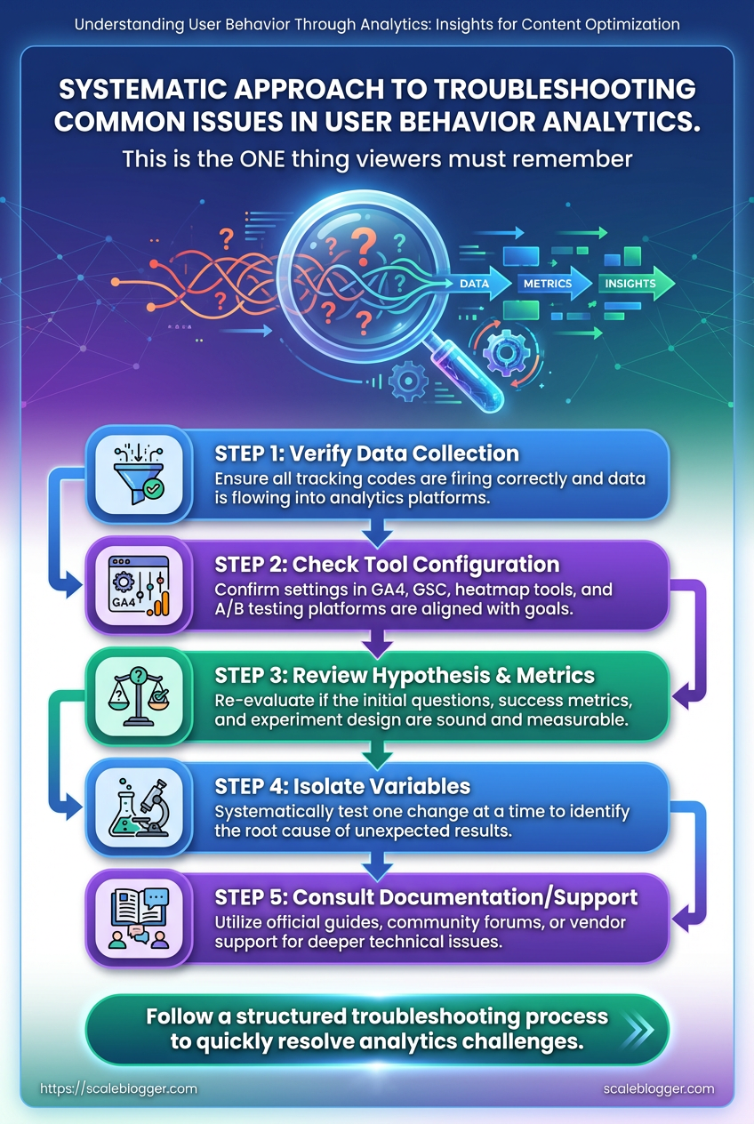
Events missing, small samples, and weird test results are normal — the trick is a fast, methodical approach that narrows down root causes without overreacting. Begin by validating the data pipeline. Make sure events are being collected, check attribution tags, and separate traffic segments. When a problem persists, move from broad checks to focused fixes so you don’t break working instrumentation while chasing noise.
Tracking basics to check first
- Confirm collection: Verify the analytics endpoint receives events using browser devtools or a network proxy.
- Inspect payloads: Ensure event names and required fields are present and consistent.
- Review filters: Check whether bot filtering, IP blocks, or view filters are dropping traffic.
- Snapshot timing: Compare timestamps between client and server logs to spot queue/backfill issues.
Common fixes for duplicated or missing events
- Reproduce the issue in a controlled environment.
- Trace the client-side trigger to the network request.
- If duplicated, check for multiple listeners or retries and add idempotency keys (
event_id) where possible.
- If missing, confirm that consent or adblockers aren’t suppressing calls and fall back to server-side forwarding if needed.
Sample size and seasonal noise
- Small sample: Treat short-run test results as directional, not definitive.
- Seasonal noise: Compare against historical weekly and monthly baselines, not just immediate prior periods.
- Power analysis: Run a basic power check to estimate needed sample with target effect size — raise sample thresholds before declaring winners.
UTM fragmentation and campaign normalization
- Campaign normalization: Standardize UTM rules in a central spec and enforce them at the tagging layer.
- Fix fragmentation: Backfill by mapping common variants (e.g.,
utm_campaign=BlackFridayvsutm_campaign=black-friday) to canonical names during ETL. - Automation tip: Use an automated tagging validator or regex rules at ingestion to rewrite malformed UTMs.
When to trust qualitative signals vs quantitative data
- Qualitative signals: Use session recordings, heatmaps, and user interviews to explain why behavior changed.
- Quantitative signals: Use them to confirm whether an effect is real and measurable; guard against overfitting to small-sample blips.
- Blend both: If metrics shift but recordings show no UX change, suspect external traffic or attribution issues.
Of common issues, diagnostic steps, and quick fixes for troubleshooting
Table: Troubleshooting Common Issues — Issue, Quick diagnostic , Immediate fix & more
| Issue | Quick diagnostic | Immediate fix | Time to resolve |
|---|---|---|---|
| Events not firing | Check devtools network calls and server logs | Re-register listener, fix broken endpoint, add event_id | 1–4 hours |
| Low sample size | Compare daily traffic vs expected baseline | Extend test duration, increase traffic or effect size | Days–weeks |
| High bounce but long time on page | Inspect session recordings for engagement signals | Adjust bounce definition; segment by engagement (scroll, clicks) | 2–8 hours |
| Conflicting UTM tags | Aggregate top UTM variants in reports | Normalize mapping in ETL and fix tag source | 1–3 days |
| Test stopped due to external traffic spike | Check traffic source breakouts and referral spikes | Pause analysis, exclude anomaly window, rerun power calc | 1–5 days |
For recurring issues, automate validation and consider integrating an AI-driven content pipeline like Scale your content workflow to enforce naming rules and surface anomalies faster. These steps reduce time wasted chasing false positives and let teams focus on real improvements.
Tips for Success / Pro Tips
Treat scaling content like tightening a machine: focus on the few inputs that produce outsized results, then automate the rest. Regularly auditing your best-performing posts, tracking micro-conversions, and turning routine checks into automated dashboards saves time and prevents knowledge loss as teams grow. Practical shortcuts are less about skipping steps and more about making the right steps repeatable.
Quick wins to start
- Audit cadence: Run a focused audit of top 10% content every quarter to find quick optimization wins.
- Micro-conversions: Track small actions — newsletter signups, time-on-key-section, click-to-expand — as leading indicators.
- Automate alerts: Push performance dips to Slack or email so you react before traffic collapses.
- Document patterns: Capture what worked (headlines, internal links, CTAs) in a reusable checklist.
Step-by-step: scale an audit into a system
- Identify top-performing pages by organic traffic and engagement.
- For each page, log three things: keyword intent, primary CTA, and top 3 behavioral signals (
scroll depth, time-on-page, click map).
- Build a repeatable optimization recipe (title test, internal link add, CTA tweak).
- Automate data pulls into a simple dashboard (
GA4+ spreadsheet or BI tool).
- Create an alert rule for >20% traffic drop or >15% CTA conversion fall.
- Convert each audit into a one-page SOP and store it in a shared knowledge base.
Practical shortcuts and traps to avoid
- Shortcut — templated experiments: Use an A/B test template for headline, intro, and CTA so every experiment starts in minutes.
- Trap — vanity metrics: Don’t for pageviews alone; prioritize behavioral insights that predict conversions.
- Shortcut — micro-conversion funnels: Instrument
UTMand event tracking early; micro-conversions reveal friction faster than revenue metrics. - Trap — undocumented fixes: Quick wins that aren’t documented always need repeating later.
Definitions
Micro-conversion: A small user action that signals engagement or intent, like signing up for an email or clicking a product link.
Audit recipe: A repeatable checklist that specifies tests, metrics, and ownership for updating a page.
When the routine parts are automated and documented, the team can focus on creative experiments that actually move the needle. If a tool that streamlines this sounds useful, consider platforms that automate content workflows and reporting like Scaleblogger.com as one option to reduce manual overhead. Keep the cycle tight: measure, automate, document, repeat — that's how small teams scale reliably.
Conclusion
You’ve now got a practical path: pick the highest-impact behavioral questions, validate the right signals, and turn funnel and path analysis into testable hypotheses. Notice patterns — where users drop after the second paragraph, which CTAs get ignored, which article formats hold attention — and translate those behavioral insights into focused experiments. One team replaced a long in-article signup with a contextual slide-in and cut their mid-funnel drop by half; another used path analysis to repurpose top-exit sections into clearer next-step links and saw time-on-page climb.
Those are the kinds of small, repeatable wins that compound when paired with disciplined measurement.
If the next move is confusing — start with one metric, one hypothesis, one 2-week experiment. If worry about tooling or scale is holding you back, document the workflow, automate the repeatable parts, and run smaller tests more often. For teams looking to automate experiments and stitch analytics into a repeatable content optimization system, consider evaluating platforms that support experiments plus analytics.
