

A page can look healthy and still leak visitors at every step.
Traffic arrives, scroll depth seems decent, and then the trail goes cold before conversion.
That gap is where content funnel analytics earns its value.
It shows which pages attract attention, where readers hesitate, and which moments quietly break the path from first visit to action.
Most teams start with conversion rate. The problem is that conversion is the outcome, not the diagnosis.
In practice, friction often starts earlier: weak intent match, slow-loading pages, unclear offers, or content that answers the wrong question too soon. User behavior analytics helps separate those issues so the true drop-off point is visible.
Once you know where the chain breaks, content optimization strategies stop being guesswork.
A headline can pull in the right audience, but the page still has to keep them moving, remove doubt, and make the next step obvious.
That is where the funnel either holds or fails.
Quick Answer: Content funnel analytics pinpoints where readers stop progressing—from first visit to conversion—by tracking funnel events (e.g., click-to-engagement signals like low scroll depth or short dwell time, and engagement-to-intent signals like stopping before the action point). Use user behavior analytics to distinguish the likely cause (promise/CTA mismatch, unclear offers, or missing trust-building) and then target the exact stage that’s losing momentum—since even a strong article can stall when the offer is introduced too early or the CTA feels vague.
Why visitors disappear between first click and conversion
A visitor can look “interested” for a few seconds and still vanish before taking action.
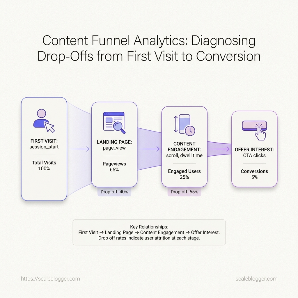
In content funnel analytics, that usually shows up as a clean landing-page visit, a modest scroll, and then a quiet exit with no meaningful event attached.
The gap is rarely random.
User behavior analytics usually reveals a small set of friction points: the page promised one thing, the CTA asked for another, or the next step felt too expensive for the level of trust built so far.
For content-driven traffic, the most important stages are simple to name and easy to miss.
Search or social brings the click, the content earns attention, the page guides intent, and the conversion step asks for commitment.
One weak link can break the chain.
A high-performing article can still underperform if the offer sits too early, the CTA feels vague, or the page never confirms that the reader is in the right place.
The pattern usually shows up in three places.
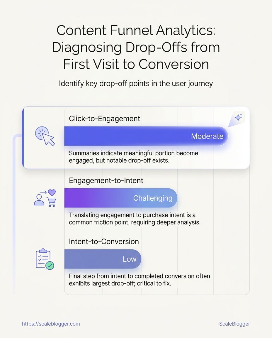
- Click-to-engagement drop-off: People arrive, but they do not interact. In analytics, that often looks like low scroll depth, short dwell time, and almost no internal clicks.
- Engagement-to-intent drop-off: Readers consume part of the page, then stop before the action point. A common sign is strong content consumption with weak CTA clicks or form starts.
- Intent-to-conversion drop-off: Visitors click the CTA, then abandon the form, pricing page, or signup flow. That signals friction in the offer, the copy, or the process itself.
A practical example makes this easier to see.
Imagine an article that earns 5,000 visits a month, but only 80 visitors click the main CTA and 12 complete the form.
The content is doing its job at the top, but the funnel is leaking in the middle and at the handoff.
Common friction signals are usually obvious once you know where to look:
- High exits on one section: Readers leave after a specific block, often where the page shifts from education to persuasion.
- Low CTA interaction: The offer is visible, but the wording does not match the reader’s intent.
- Repeated pogo-sticking: Visitors bounce back to search results, which usually means the page missed the query.
- Strong traffic, weak assisted conversions: The page attracts visits but contributes little downstream.
Those signals point directly to content optimization strategies worth testing: clearer intent matching, tighter CTA placement, cleaner page structure, and better event tracking.
When the behavior data lines up with the content, the fix is usually much easier to see.
Map the funnel events that reveal where users hesitate
Which click actually matters?
In content funnel analytics, the answer is rarely the final form submit.
The useful signal usually sits one step earlier, where a reader pauses, scrolls, clicks an internal link, or opens a lead form and then stops.
A clean event map turns that behavior into something readable.
It gives user behavior analytics enough structure to show whether the problem is weak acquisition, shallow reading, low offer interest, or a broken handoff between content and conversion.
That only works when the events are specific.
Pageviews alone tell you people arrived; they do not show whether the content earned a second action.
Event map from landing page to conversion
| Funnel stage | Event to track | What it reveals | Common mistake |
|---|---|---|---|
| First visit | session_start or first page_view with landing page parameters |
Acquisition quality and whether the source matched the promise | Tracking only traffic volume |
| Landing page view | page_view with page path, referrer, and campaign tags |
Which entry pages bring qualified readers | Treating all visits as equal |
| Content engagement | scroll, engagement_time_msec, or custom reading-depth event |
Intent and reading depth | Treating pageviews as engagement |
| Mid-funnel action | click on CTA, internal link, or anchor link |
Content-to-offer movement | Ignoring micro-conversions |
| Offer exploration | view_item, view_form, pricing click, or resource download |
Whether the reader wants more detail before converting | Assuming interest without proof |
| Form start | form_start or first field interaction |
Friction before commitment | Waiting only for the final submit |
| Conversion | generate_lead, submit_form, or purchase |
Outcome performance | Missing confirmation events |
| Confirmation | Thank-you page page_view or CRM success log |
Which conversions actually completed | Counting failed submits as wins |
A CTA tap that happens before any scroll or time on page often signals misfires, especially on mobile.
A better signal is a click after visible reading depth, or after a sequence such as scroll plus click plus form start.
The same logic helps with internal links.
If readers click a pricing link and immediately bounce, the issue may be expectation mismatch, not weak copy.
If they click a related article first, the content may need a stronger bridge to the offer.
The table below is simple on purpose.
It forces GA4 event setup, tag manager configuration, and CRM conversion logs to tell one story instead of three disconnected ones.
For content optimization strategies, this is the point where measurement becomes editorial judgment.
We are not just counting activity; we are mapping hesitation, one event at a time.
Read behavior data without mistaking noise for intent
A long session does not always mean real interest.
In content funnel analytics, the stronger signal comes from how a reader moves across pages, how far they scroll, and where they leave without friction.
A useful pattern is rarely a single metric.
A reader who reaches 75% scroll, clicks one internal link, then exits from a comparison page is sending a different signal than someone who bounces after ten seconds on an unrelated post.
Session patterns tell us whether someone is exploring, comparing, or stalling.
That matters more than raw page time, because user behavior analytics often mixes curiosity with distraction.
A real-world example makes this easier to read.
Suppose a visitor lands on a guide, scrolls to the middle, opens a second article, then exits on a pricing page.
That usually points to evaluation, not confusion.
Look at the sequence, not the spike. A single high scroll depth can mean the reader found the page useful, or it can mean they skimmed to the end.
Pair scroll depth with clicks. Deep scroll plus no clicks often signals passive reading.
Deep scroll plus internal navigation usually shows active comparison.
Treat exit pages as context, not failure. An exit on a contact page can be a positive end.
An exit on a dense explainer may mean the article did not answer the question fast enough.
Use time on page with care. It helps on long tutorials, technical explainers, and pricing pages with multiple checks.
It misleads on tabs left open, embedded video pages, and slow readers on mobile.
A practical read pattern looks like this:
- Short time, shallow scroll, no clicks: weak match or weak opening.
- Medium time, deep scroll, one internal click: healthy exploration.
- Long time, repeated back-and-forth clicks: comparison or hesitation.
- Deep scroll, exit on CTA page: likely decision point, not abandonment.
When these signals conflict, trust the pattern that repeats across sessions.
That is where content optimization strategies become sharper, because the page stops being a guess and starts behaving like evidence.
The clearest reading comes from combining all three signals before you change a page.
One metric can lie; a session pattern usually tells the truth.
Diagnose drop-offs with a repeatable content audit
A page rarely fails all at once.
More often, one section raises doubt, the next section adds friction, and the reader leaves before the action appears.
That pattern shows up fast in content funnel analytics and user behavior analytics.
The cleanest audit starts with the worst landing pages in GA4, then compares them against pages that keep visitors moving and converting.
A strong review follows the same order every time.
Check the headline first, then the promise, then the action path, then the links that keep the session alive.
- Match the headline to the query. A vague title creates early doubt, even when the body copy is solid.
- Check the promise against intent. If the page tries to serve everyone, it usually serves no one well.
- Trace the action path. The next step should be visible before the reader has to hunt for it.
- Inspect the internal link trail. Pages that convert well often point to one clear next move, not five unrelated options.
How to compare high-exit pages against high-converting pages
| Signal | High-converting pages | High-drop-off pages | Likely diagnosis |
|---|---|---|---|
| Headline clarity | Specific, plain, and closely tied to the query | Generic, broad, or packed with jargon | The opening fails to set a clear expectation |
| Promise and intent match | One page solves one reader job | The page tries to cover too much ground | Message mismatch |
| CTA placement | The next step appears early and again later | The action sits far down the page | Weak path to action |
| CTA visibility timing | Readers see the action before scrolling much | The action appears after several screens | Hidden below the fold |
| Internal links | Links point to the next logical page | Links are scarce or off-topic | Broken content path |
| Next-step relevance | Each link answers the reader’s likely next question | Links send readers to unrelated topics | The session loses momentum |
| Engagement depth | Readers click, scroll, or move to another page | The session ends on one page | Single-page exits |
| Content momentum | Each section builds naturally on the last one | Sections feel disconnected or repetitive | Low content momentum |
They make the promise clear, keep the action visible, and give the reader a sensible next step.
The fastest wins often come from small edits, not rewrites.
Tightening the headline, moving the CTA higher, and replacing weak links with relevant next-step links can cut abandonment without changing the whole page.
Turn findings into stronger content decisions
A page that gets traffic but stalls on action usually has one weak link, not five.
In content funnel analytics, the fastest gains come from fixing the first thing readers trip over, not from rewriting the whole page.
That usually means starting where the drop-off is clearest.
If visitors arrive and leave fast, the opening likely misses intent.
If they read but ignore the next step, the offer or CTA is misaligned.
If they start a form and quit, the problem is usually friction, not interest.
AI writing tools help here because revision cycles get shorter without turning the page into guesswork.
Our team uses that speed in Scaleblogger when content needs a fast rewrite path, but the method matters more than the tool: isolate one change, draft one version, and keep the rest stable.
What to change first when the funnel breaks
| Problem | Likely cause | Recommended fix | Expected impact |
|---|---|---|---|
| High entry, low CTA clicks | Weak offer match | Rewrite CTA and supporting copy | More mid-funnel action |
| Good engagement, poor conversion | Friction in form or offer | Shorten the conversion path | Higher completion rate |
| Fast exits from blog pages | Intent mismatch or thin content | Expand answer depth and add next-step links | Lower bounce and better flow |
| Slow scroll but no action | Value is delayed too long | Move the main payoff higher | Faster recognition of relevance |
| Form starts, few submits | Too many fields or unclear benefit | Remove fields and clarify the reward | Fewer abandonments |
| Internal clicks are low | Links are buried or generic | Add contextual links near proof points | Better movement to the next page |
| Repeat visits without conversion | Reader needs stronger trust signals | Add evidence, examples, and specificity | Higher confidence before action |
| Search traffic looks healthy, but exits rise | Content matches the query only partly | Tighten the page around the original intent | Better alignment and retention |
Fix the break closest to the reader’s current step, not the most visible one.
How AI speeds revision without muddying the test
A useful workflow starts with one note per issue, then one draft per change.
That keeps user behavior analytics readable, because the result ties back to a single content shift.
- Identify one failing page element. Pick the headline, CTA, opener, or form, not all four.
- Draft one revised version. Ask the AI to rewrite only that section, keeping the rest unchanged.
- Publish or test once. Compare the new version against the old with the same traffic source and time window.
- Record the outcome. Keep a short log of what changed, so later edits do not blur the result.
This approach works because content optimization strategies fail when too many variables move at once.
One clean change tells a clear story.
Two or three changes usually create noise, and noise hides the real fix.
The right sequence saves time and protects the signal.
Fix the highest-friction step first, then test the next one with discipline.
Build a reporting rhythm that keeps drop-offs visible
If the report lands once a month, the leak has already moved.
By then, the page that stalled readers last week may already be edited, republished, or forgotten.
A tighter rhythm catches drift while it is still small.
In content funnel analytics, that matters because reader behavior changes before the final conversion number does.
Weekly and monthly reporting should do different jobs.
Weekly tells you whether a page is slipping right now.
Monthly tells you whether the pattern holds across a topic, a channel, or a sequence of posts.
Review weekly for movement
Weekly checks should stay narrow and fast.
They are there to spot fresh friction, not to explain the whole funnel.
- Entry volume by page: Watch which articles are bringing readers in and which ones are fading.
- Next-step clicks: Track the action immediately after the article, not just the final form submit.
- Exit points on priority pages: Flag pages where readers leave before reaching the intended CTA.
- Fresh experiment results: Check whether a headline, intro, or CTA change is moving the expected metric.
- Source mix shifts: Notice when search, email, or social traffic changes the quality of visits.
A weekly report works best when it fits on one page.
If a metric moves sharply, it should trigger a note, not a rewrite.
Review monthly for patterns
Monthly reviews need a wider lens.
That is where repeated stalls, aging pages, and topic gaps become obvious.
- Topic-cluster performance: Compare how related posts move readers toward action.
- Content decay: Find pages that used to perform and now need revision.
- Path consistency: Check whether readers follow the same route before converting.
- Channel quality over time: Compare how search, social, and newsletter traffic behave across several weeks.
- Segment differences: Separate new readers from returning ones, since they rarely act the same way.
Document experiments so the next review is easier
A good experiment log saves time later.
It should capture the page, the date, the change, the reason for the change, and the metric used to judge it.
- Record the page URL and publish date.
- Write one clear hypothesis.
- Log the exact change made.
- Name the primary metric and one guardrail metric.
- Note the result and the next action.
Keep the log boring and exact.
A year from now, that discipline makes comparisons possible instead of fuzzy.
This rhythm sits inside the broader content analytics cluster, where reporting supports auditing, testing, and revision.
In our own workflow, that same cadence keeps publishing decisions tied to evidence, not memory.
The goal is simple: see drift early, document changes cleanly, and make the next round of content decisions faster to trust.
What is a drop-off funnel analysis?
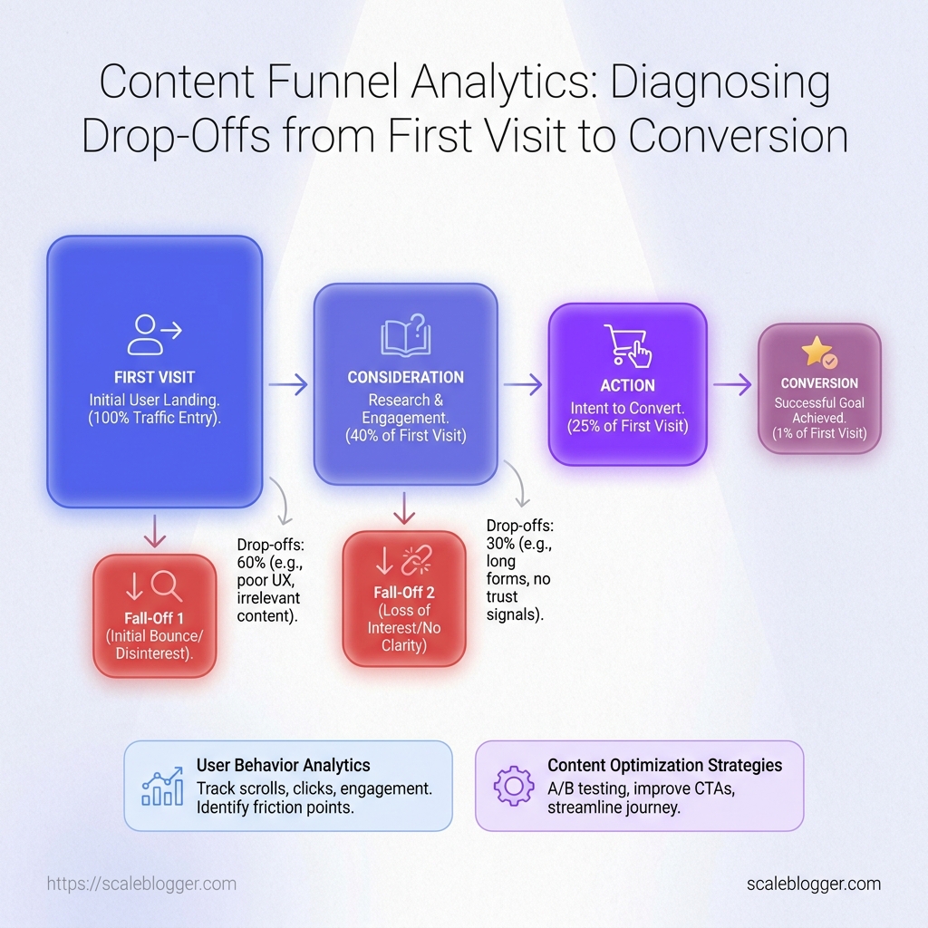
A drop-off funnel analysis identifies exactly where visitors stop progressing through a defined journey from first visit to conversion. It tracks funnel events such as click-to-engagement signals (for example, low scroll depth or short dwell time) and engagement-to-intent signals (stopping before the action). The goal is to expose the specific friction point instead of treating a low conversion rate as one single problem.
What are the four stages of the content marketing funnel?
The four stages of a content marketing funnel are First Visit (attraction/landing), Engagement (read/scroll/dwell), Intent (moving toward the action, such as internal link clicks or lead-form opens), and Conversion (the final outcome like form submission). This structure matches common behavior patterns where readers either exit after shallow engagement or pause before the action point. Using these stages makes it clear where the “trail goes cold.”
What is conversion funnel analysis?
Conversion funnel analysis measures how users move through each step of a conversion journey and calculates where they drop out. It focuses on the moments that matter for action readiness, such as whether visitors engage meaningfully and whether they stop before the CTA or form submit. By separating friction causes (like promise/CTA mismatch or unclear offers), it pinpoints what needs fixing at the right stage.
How to calculate conversion rate in a funnel?
To calculate conversion rate in a funnel, divide the number of conversions by the number of users who entered the relevant funnel stage, then multiply by 100. For example: conversion rate (%) = (conversions ÷ funnel entries) × 100. Comparing this rate across stages (first visit to engagement, engagement to intent, and intent to conversion) reveals where the largest drop-off occurs.
Where in GA4 would you go to manage events, conversions, and audiences?
In GA4, you manage events under Configure, then Events. You mark and manage which events count as conversions under Configure, then Conversions. You manage audience definitions under Configure, then Audiences, so you can analyze different user groups and see where they drop off.
The most valuable insight here is simple: a page can look busy and still fail quietly before conversion.
Content funnel analytics works when it connects engagement signals (pageviews used correctly, scroll depth, key clicks, form starts) to the exact moment people hesitate—not just to the final outcome.
Once those signals sit beside user behavior analytics, the problem stops feeling random and starts pointing to a specific friction point.
A strong example: the page that draws traffic, then loses people right after a section or call to action. In that case, content optimization strategies should begin with the handoff itself—tightening the promise, clarifying the offer, and removing any trust or clarity gaps introduced too early.
In our own content performance benchmarking, we often see that the biggest gains come from pairing the largest step-down in the funnel with the most plausible on-page cause, then validating it with a controlled test using the same measurement window.
Action for today: pull your last 30 days of funnel events, identify the biggest drop between mid-funnel engagement and conversion/confirmation, and use the audit checklist to choose the first element to adjust. When your next change is tied to that specific step-down, the follow-up result becomes a decision—not a guess.
