

What if the content that drives your best customers is not the content that gets credit?
That mismatch is common—and it’s exactly why content attribution modeling matters.
A single white paper, product page, or comparison post rarely closes the deal alone. More often, content shapes the first visit, builds trust over time, and influences the moment someone decides to convert.
But if you judge performance with the wrong attribution lens, you’ll reward the wrong pieces and underinvest in the work that actually moves people forward.
That’s the real problem for teams practicing data-driven decision making: it’s not about collecting more data—it’s about choosing an attribution method that matches how content influences outcomes.
In this article, you’ll get a model-by-model comparison (and when each one helps), a decision guide for choosing the right approach based on your goal and data maturity, and a practical checklist to avoid misleading setups.
Quick Answer: Choose an attribution model based on the decision you’re making: discovery (brand awareness), influence (journey shaping), or conversion (revenue). Then validate the story by comparing last-click reporting to a multi-touch/assisted-path view—if the narrative changes, your attribution setup is revealing real editorial priorities. The tracking requirements and event/UTM specifics for making any model work are covered next.
What if your best content is not the content getting the credit?
What if the article that shaped the sale never appeared in the last click report? That happens all the time, and it warps how teams judge measuring content success.
A comparison guide may look weak on paper, while the early educational post that brought the right visitor into the funnel does the real work.
That is why content attribution modeling changes the conversation.
It moves the question from “Which page converted?” to “Which page moved the buyer forward?” Once teams see that difference, data-driven decision making gets sharper fast, because content can be evaluated by influence, not just by closure.
The decision problem is simple but painful: publish more of what looks good in dashboards, or invest in the pieces that actually create demand.
If the tracking is thin, teams end up rewarding late-stage assets and starving the top of the funnel.
Over time, that creates a content library that looks busy but performs unevenly.
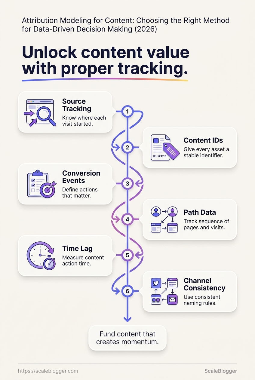
Before any model can work, the tracking plan has to be clean.
Every meaningful piece of content needs a trackable URL, consistent UTM rules, and a clear map of the conversion path.
Without that structure, attribution turns into guesswork with prettier charts.
- Source tracking: Know where each visit started, including organic search, email, social, and referrals. Without source data, influence gets blurred fast.
- Content IDs: Give every asset a stable identifier. That makes it easier to connect one article to assisted conversions, repeat visits, and later revenue.
- Conversion events: Define the actions that matter, such as demo requests, newsletter signups, or quote forms. Vague goals lead to vague models.
- Path data: Track the sequence of pages and visits, not just the final touch. The middle of the journey often reveals the real value.
- Time lag: Measure how long content takes to produce action. A post that converts in 30 days can be more valuable than one that converts in 3.
- Channel consistency: Use the same naming rules across platforms. One messy campaign tag can break an otherwise solid model.
When attribution is set up well, the best content stops hiding in plain sight.
Teams can finally fund the pages that create momentum, not just the ones that get the last click.
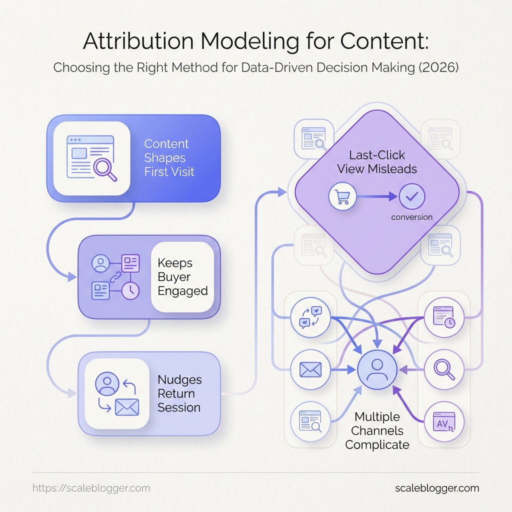
The most common content attribution models and what each one really tells us
Last-click reports make tidy dashboards, not honest ones.
They reward the final touch before conversion, which is useful when you want a simple answer and misleading when you want to understand content success.
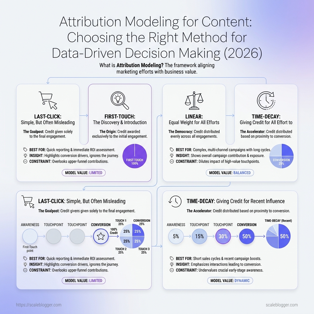
In content attribution modeling, each model is really a different theory about which touchpoints deserve credit.
First-touch attribution gives discovery the spotlight.
It is strongest when the real question is, “Which articles, newsletters, or social posts introduce people to us in the first place?” A top-of-funnel SEO piece may rarely close a deal, yet it can still be the reason the journey started.
Last-touch attribution still dominates because it is easy to explain and easy to report.
Teams like it because the data is clean, the logic is obvious, and most analytics tools default to it in some form.
The problem is that it turns assistive content into invisible work.
Linear and time-decay models sit closer to the middle.
Linear spreads credit across the journey, which works well when every touchpoint plays a similar role; time-decay gives more weight to recent interactions, which fits shorter buying cycles or campaigns with strong late-stage intent.
A webinar invite, a comparison page, and a follow-up email may each matter, just not equally.
Data-driven attribution changes the picture again.
It uses observed patterns to estimate which interactions tend to move users forward.
That makes it attractive for data-driven decision making, but it also depends on enough conversion volume and clean event tracking to avoid noise.
Small teams often get more value from a simple model they trust than from a complex model they cannot interpret.
Model comparison at a glance
| Model | Best for | What it measures well | Main limitation | Ideal content team use case |
|---|---|---|---|---|
| First-touch | Demand generation and discovery analysis | Which content starts the journey | Ignores everything after the first interaction | Measuring which topics bring new audiences into the funnel |
| Last-touch | Simple reporting and conversion summaries | The final step before conversion | Overcredits closing assets | Tracking which pages or emails finish the job |
| Linear | Balanced journey review | Broad participation across touchpoints | Treats every touch equally | Teams with long sales cycles and many useful assists |
| Time-decay | Shorter cycles and recency-heavy funnels | Recent interactions near conversion | Underweights early discovery content | Campaigns where late-stage content drives action |
| Position-based | Journeys where first and last matter most | Entry and exit points with some middle credit | Uses a fixed rule, not observed behavior | Content teams that care about both acquisition and conversion |
| Data-driven | Mature analytics setups | Real patterns in conversion paths | Needs volume, clean data, and modeling support | Teams with enough traffic to compare channels and content types reliably |
First-touch shows how people arrived, last-touch shows what finally tipped them over, and the middle models reveal whether content helped all along the way.
Data-driven attribution is the strongest option when the tracking is solid and the sample size is big enough to trust.
For measuring content success, the smartest move is rarely to pick one model forever.
Use the model that matches the decision in front of you, then compare results against a second view when the stakes are high.
How to choose the right attribution method for content decisions
Are we trying to prove that content was discovered, that it shaped the buyer’s thinking, or that it closed the deal?
Those are three different jobs, and each one calls for a different lens.
Strong content attribution modeling starts with the question behind the report, not the report itself.
When the goal is brand awareness, pick a method that rewards early touchpoints and repeated exposure.
First-touch or position-based models work well here because they show which articles introduce people to the brand and keep them coming back.
When the goal is lead generation or revenue, the picture changes fast.
You want a model that credits middle- and late-stage assets, especially comparison pages, case studies, and pricing content, because those pages often carry the final lift before a form fill or purchase.
The fastest way to make the wrong choice is to skip data maturity.
A small content team with messy UTM tags and partial CRM data should not use a complex multi-touch setup on day one.
- Discovery goals: Use first-touch or assisted-conversion views when the real question is which topics bring new audiences into the pipeline.
- Influence goals: Use position-based or time-decay models when you care about the path, not just the entrance or exit.
- Revenue goals: Use multi-touch attribution only when your tracking is clean enough to connect content to known opportunities.
- Low data maturity: Start simple. If you cannot trust source data, a sophisticated model only produces confident noise.
- Higher data maturity: Add CRM stages, content scoring, and channel splits so you can separate curiosity from buying intent.
A practical example helps.
A SaaS company may find a top-of-funnel guide brings most first visits, while a product comparison page appears in most won deals.
Those pages deserve different attribution rules, because they play different roles in measuring content success.
For teams building data-driven decision making, the best model is the one you can explain in one meeting and defend in one dashboard.
If that is not possible yet, the model is too advanced for the data behind it.
That discipline keeps the numbers useful.
It also keeps content decisions tied to reality, which is where the value starts.
A short story from the reporting room: when one dashboard changed the editorial plan
The content team thought they had a clean read on performance.
Their how-to guides looked strong, the product pages got the credit, and everything else seemed expendable.
Then one dashboard changed the conversation.
It grouped sessions by assisted paths, not just final clicks, and a very different picture appeared: a handful of “quiet” articles kept showing up before high-value visits, even when they rarely closed the deal themselves.
The team had been measuring content success too narrowly.
Their comparison posts, glossary pages, and early-stage explainers were not dead weight; they were often the first useful stop in a buying journey.
That shift matters because content attribution modeling is not only about assigning credit.
It is about seeing which pieces reduce friction, build confidence, and move people closer to action without demanding the final click.
A simple example made the pattern obvious.
One article that looked average in the main report kept appearing before demo-page visits and newsletter signups, while a flashy “best of” post barely showed up outside last-touch reports.
This is where single-touch reporting falls short.
It rewards the last page in the path and hides the pages that made the last page possible.
For teams building a better dashboard, the fix is usually practical, not dramatic:
- Track assisted paths: Show which URLs appear before conversions, not just which ones close them.
- Separate discovery from closure: Treat early research content and decision content as different jobs.
- Watch repeat exposure: Pages that appear multiple times in a journey often carry more influence than they first seem.
- Review by content cluster: Topic groups reveal patterns that single URLs hide.
- Compare against action quality: A page with fewer conversions can still produce better leads or longer sessions.
Once that reporting changed, the editorial plan changed with it.
The team stopped trimming “low-converting” support content and started strengthening the clusters that made the funnel work.
That is the practical side of data-driven decision making.
Better dashboards do not just report outcomes; they reveal which stories are carrying the rest of the library.
The mistakes that distort attribution and lead to weak content decisions
More data does not rescue bad measurement logic.
A dashboard can look precise and still reward the wrong pages, the wrong channels, or the wrong time window.
That is where content attribution modeling goes sideways.
Teams start measuring content success, but they end up measuring whatever their setup makes easiest to see.
The most common failure is simple: the report answers a question nobody asked.
If branded search, direct traffic, and final-click wins dominate the view, the content team may cut the very pieces that create demand in the first place.
Mistake checklist for tracking setup
| Check item | Why it matters | What goes wrong if missed | Who should confirm it |
|---|---|---|---|
| Define conversion events clearly | Attribution only works when the goal is explicit and consistent. | Pageviews or shallow micro-events get treated like revenue signals. | Analytics lead and marketing owner |
| Standardize UTM rules | Clean campaign tags keep channel data comparable across teams. | Paid, email, and social traffic collapse into messy or mislabeled buckets. | Marketing operations |
| Set lookback windows | Time windows should match the buying cycle, not default settings. | Short windows undercount content that assists later conversions. | Growth analyst and lifecycle marketer |
| Separate branded and non-branded traffic | These behave differently and should not be judged the same way. | High-intent demand gets mixed with demand creation, hiding content’s role. | SEO lead and reporting owner |
| Validate cross-device behavior | Readers often move from mobile discovery to desktop conversion. | Conversions disappear or get assigned to the wrong path. | Analytics engineer |
A team may think a blog lost traffic value when the real problem is that the conversion window was too tight or UTMs were inconsistent.
The deeper issue is decision bias.
Attribution should guide choices, not defend a favorite channel or justify a budget line already decided in advance.
- Do: Use attribution to compare patterns across content types, journeys, and devices.
- Don’t: Use one model to crown a single winner and ignore the rest.
- Do: Review event logic whenever the funnel changes.
- Don’t: Keep old conversion definitions after the business goal has shifted.
- Do: Check whether content assists show up later in the path.
- Don’t: Assume the last touch tells the full story.
A cleaner setup produces better editorial calls.
It keeps the team focused on evidence, not convenience, and that is where stronger decisions begin.
How to put attribution into an AI-assisted content workflow
A team can publish three times faster and still keep measurement honest.
The trick is not more dashboards; it is a cleaner loop between planning, drafting, publishing, and review.
In practice, content attribution modeling only works when it sits inside the production process, not beside it.
Our workflow places planning signals, draft inputs, and performance data in the same chain, so each new brief reflects what earlier pieces actually did.
Start with the brief, not the article.
If the topic cluster, target page, and conversion path are defined before drafting, attribution later becomes far easier to read.
That is where Scaleblogger fits in our content production and planning loop: it uses site analysis and topic clustering to shape the brief, then carries that structure through drafting, scheduling, and publishing.
The value is simple.
The output stays fast, but the measurement trail stays intact.
Once an article is live, feed the results back into three places.
Update the brief if the wrong intent won, revise the article if readers drop off early, and repurpose the strongest section for social distribution.
That keeps measuring content success tied to behavior, not vanity metrics.
A repeatable monthly review should stay tight and practical.
- Match content to outcomes: Compare each article’s role in discovery, engagement, and conversion rather than judging every page the same way.
- Check cluster performance: Look for topic groups that attract traffic but fail to move readers forward. Those gaps usually point to missing internal links or weak next-step copy.
- Mark update candidates: Flag pages with strong impressions but soft engagement, since they often need sharper angles, fresher examples, or a better call to action.
- Reassign repurposing priority: Promote the pieces that create momentum across channels, then trim or merge the ones that add noise.
The best teams treat the review as data-driven decision making, not reporting theater.
One clean monthly pass is usually enough to redirect briefs, refresh old assets, and improve future attribution signals without slowing production.
Fast content is useful.
Fast content with a reliable feedback loop is better.
What are the different types of attribution models?
The main attribution model types discussed are first-touch, last-touch, and position-based (including position/“position-based” approaches) models, plus data-driven attribution. Each model is a different theory for which touchpoints deserve credit across the buyer journey. First-touch spotlights discovery, last-touch credits the final interaction before conversion, and position-based methods distribute credit based on where touches occur.
What is the difference between first attribution and last attribution?
First-touch attribution gives credit to the very first interaction that introduced someone to your brand, such as a top-of-funnel article, newsletter, or social post. Last-touch attribution (last interaction before conversion) gives credit to the final page or touch that directly precedes the sale. The practical difference is whether you’re measuring discovery and trust building or the final closing step.
What is the drawback to using the last touch attribution model on HubSpot?
The drawback of last-touch attribution on HubSpot-style reporting is that it rewards only the final touch before conversion, which can produce tidy dashboards but an incomplete view of content success. Content that influenced the buyer earlier—like educational explainers or comparison guides that rarely “close” by themselves—can be undercredited or invisible in the last-click report. This misleads teams into underinvesting in top- and middle-funnel work.
What is the difference between data driven attribution and last click?
Data-driven attribution is designed to measure the influence of content across the full journey by assigning credit based on how touchpoints actually relate to outcomes, not just what happened immediately before conversion. Last-click (last click attribution) assigns nearly all credit to the single final interaction that preceded the conversion. In practice, data-driven attribution better reflects assisted paths, while last click can overvalue the “closing” moment and undervalue earlier momentum builders.
What are examples of good KPI dashboards?
Good KPI dashboards tie metrics to the job each stage of the funnel performs, not just final conversions. Examples include a brand awareness dashboard that tracks early-touch performance (e.g., first-touch leads or repeat exposure signals using first-touch or position-based logic) and a revenue dashboard that uses assisted paths to show which middle- and late-stage content influences conversion. Another strong dashboard groups sessions by assisted paths so “quiet” articles that appear before high-value visits are visible even if they rarely close on their own.
The real value of content attribution modeling is not perfect credit—it’s better judgment.
When your dashboard is built around the decision you’re actually trying to make, attribution stops being reporting theater and starts changing what you publish, update, and repurpose.
A last-click view can be useful for one kind of question, but it isn’t sufficient for every editorial decision. The right approach depends on whether you’re evaluating discovery, influence, or conversion—and on whether your tracking is clean enough to support the model you choose.
That’s why data-driven decision making should start with a question, then select an attribution method that answers it honestly.
If you also need cleaner production and publishing support in an AI-assisted workflow, Scaleblogger can help handle that layer while your team focuses on the signals that matter.
Action for today: pick one recent campaign and compare its last-click outcome to a multi-touch view. If the story changes, use it to decide what to brief next, what to update, and what to stop investing in.
