

Content teams rarely suffer from a shortage of ideas.
They struggle with content ROI because traffic, leads, and revenue rarely move in a straight line from one article or campaign.
The real problem is not volume.
It is choosing which topics deserve attention, which formats deserve production time, and where promotion budget will actually compound results.
Without that discipline, even strong teams end up funding content that looks busy but underperforms.
Most content marketing metrics describe what happened after the work is already live.
That leaves leaders making budget calls from rear-view data, with little confidence about whether a topic will attract the right audience or whether a video, article, or social push will pay back faster.
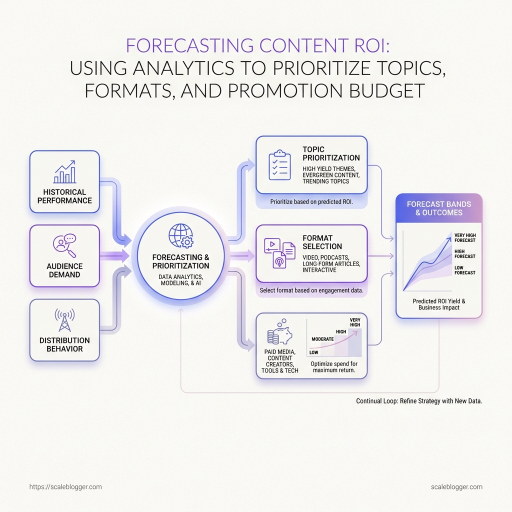
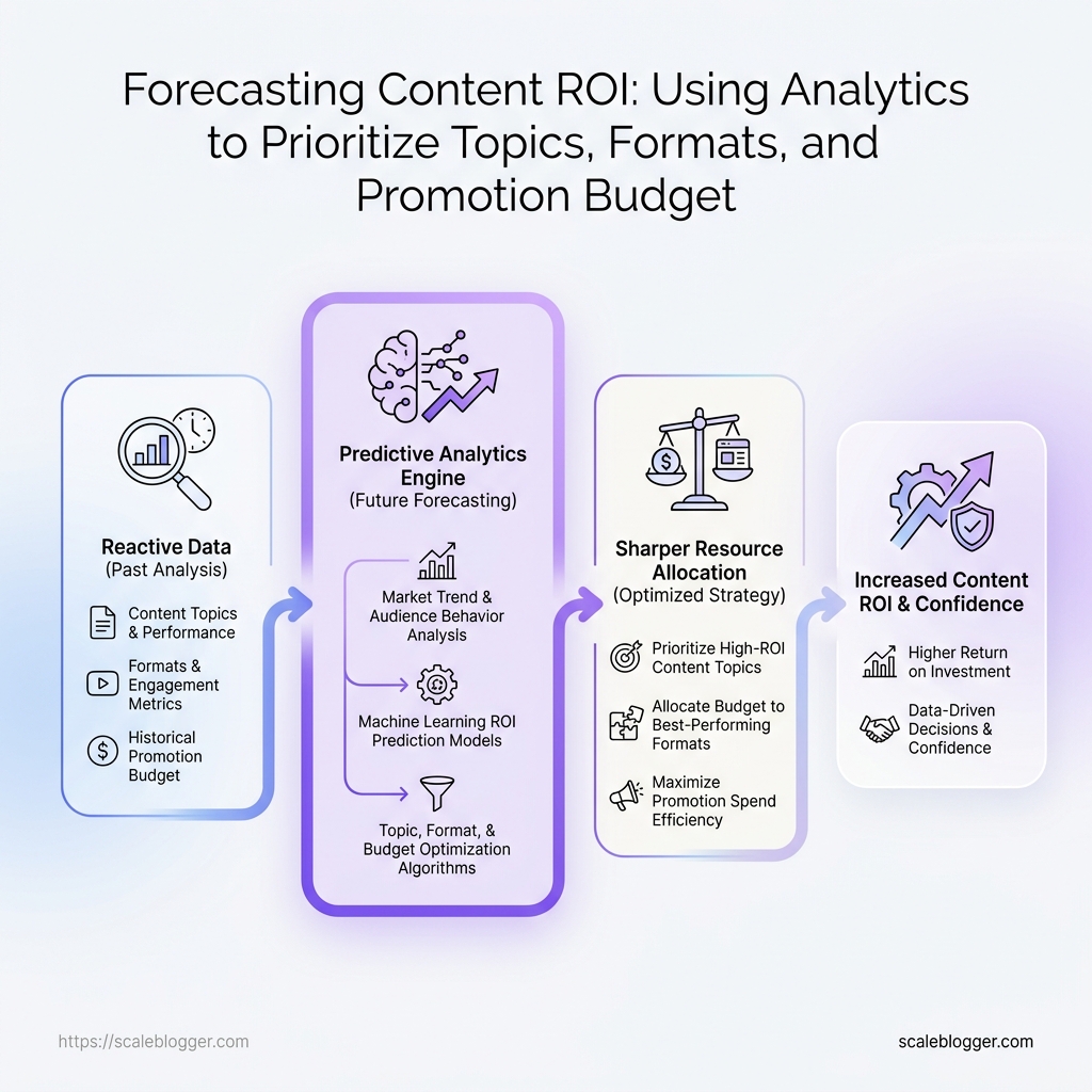
Predictive analytics for content changes that decision model.
By reading patterns across historical performance, audience demand, and distribution behavior, teams can forecast content success with far more precision than intuition allows.
The result is a sharper allocation of time and spend.
Instead of treating every idea as equal, leaders can rank opportunities by likely return, reduce waste in promotion, and build a content program that earns its budget rather than merely consuming it.
Quick Answer: Use forecasting content ROI to rank topics, formats, and promotion budgets by predicted return—asking “what is likely to happen if we invest again?” rather than relying only on past traffic and conversions. The key shift is from rear-view reporting to predictive analytics that models patterns in audience demand, historical performance, and distribution behavior so leaders can cut promotion waste and fund the highest-likelihood opportunities with confidence.
A surprising number: why most content teams still guess at ROI
Most content teams don’t lack ideas.
They lack a decision system for choosing what gets funded next.
They can report what happened—clicks, leads, assisted paths—yet struggle to answer the budgeting question: which topics and formats are most likely to produce downstream value if the team invests again?
That’s why “good performance” is often a misleading proxy for “good next bet.” A Q2 winner can be an outlier driven by timing, brand demand, or a temporary SERP shift. Before a forecast exists, the data points to patterns—not certainty.
Forecasting content success reframes the problem as forward-looking allocation. It turns content ROI into a set of assumptions leaders can inspect (and challenge) before production starts.
Where this white paper fits:
Most content metrics clusters have three layers:
1) Historical reporting (what happened) 2) Diagnostic analysis (why it happened) 3) Forward-looking forecasting (what is likely to happen next)
The white paper sits in the third layer.
It treats content like an investment portfolio—topics, formats, and channels combined—so budgeting conversations focus on expected returns and risk, not just last quarter’s winners.
Teams that stay in retrospective mode tend to overfund proven formats and underfund emerging ones. Teams that forecast can compare topics, channels, and publishing cadences before committing resources.
That difference is the practical ROI story: content becomes easier to defend when the numbers describe where value is likely to go next—not only where it already went.
What we should measure before choosing topics and formats
Which signals actually predict whether a topic will earn real business value later?
That question matters because a page can attract traffic and still fail to change pipeline, retention, or revenue.
For forecasting content success, the useful metrics are the ones that travel with the user journey, not the ones that simply flatter a dashboard.
The strongest content marketing metrics are usually the ones that show intent, depth, and momentum.
Think assisted conversions, engaged time, topic velocity, and format completion rate from GA4, Search Console, CRM data, and platform analytics.
Do-versus-don’t checklist for forecasting inputs
| Metric type | Predictive value | Use in forecasting | Common mistake |
|---|---|---|---|
| Organic impressions | Medium for discovery-stage topics | Use to estimate how large the search audience could become, especially for new clusters | Treating impressions as demand proof before ranking quality is established |
| Engaged time | High for fit and depth | Use to judge whether readers stay long enough to absorb the argument | Reading every long session as positive, even when the page is confusing |
| Assisted conversions | Very high for revenue-linked content | Use to connect content with later pipeline movement in CRM and GA4 |
Ignoring assisted paths because the final click happened elsewhere |
| Topic velocity | High for emerging clusters | Use to measure how fast a topic gains traction across articles, formats, and channels | Measuring single-post growth instead of cluster momentum |
| Format completion rate | High for video, webinar, and long-form assets | Use to compare how well a format holds attention from start to finish | Comparing completion rates across formats without normalizing length |
| Promotion CTR | Medium for distribution planning | Use to test which headlines, hooks, and channels send qualified traffic | Treating click-through as success when downstream engagement is weak |
Engagement and CRM data tell you whether that signal was worth following.
Watch out: top-of-funnel topics often deserve a lower weight on conversion metrics, because they are built for discovery first.
Bottom-funnel pieces should carry more weight on assisted conversions, demo starts, and form progress, since those behaviors map closer to revenue.
A practical weighting rule keeps the model honest.
For awareness topics, favor organic impressions, topic velocity, and promotion CTR; for consideration topics, raise the weight on engaged time and repeat visits; for decision-stage content, give the most weight to assisted conversions, demo requests, and CRM progression.
- Awareness: weight reach and early engagement more heavily.
- Consideration: weight depth, return visits, and cluster growth more heavily.
- Decision: weight conversion paths and sales handoff signals more heavily.
That mix is what makes predictive analytics for content useful in practice.
It turns topic selection into a measured bet instead of a guess, and it makes the next round of content easier to justify.
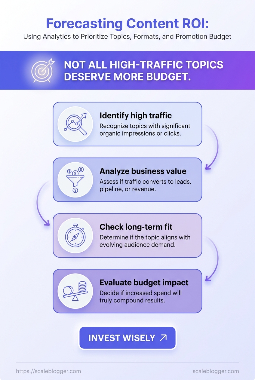
A contrarian view: not every high-traffic topic deserves a bigger budget
A page with 20,000 searches can still be a weak bet.
That sounds backward until reach, intent, and conversion potential pull in different directions.
Content marketing metrics often reward the biggest visible audience, while forecasting content success depends on where the audience is in the buying journey.
Imagine a B2B payroll team choosing between two topics.
A trend piece may attract more visits, but a comparison page can surface buyers who are already weighing vendors, pricing, or implementation risk.
That is where predictive analytics for content starts to matter.
We are not asking which topic is popular; we are asking which topic deserves more budget because it is more likely to become pipeline, leads, or assisted revenue.
A simple decision matrix for topic budgeting
Score each topic on a 1-to-5 scale, where 1 is weak and 5 is strong.
For production cost and promotion intensity, 1 means low effort and 5 means high effort, so the model stays honest about resource drag.
| Topic | Search demand | Intent strength | Production cost | Expected conversion value | Promotion intensity | Forecast score |
|---|---|---|---|---|---|---|
| How-to topic | 4 | 4 | 2 | 3 | 2 | 72 |
| Comparison topic | 3 | 5 | 2 | 5 | 2 | 86 |
| Thought leadership topic | 2 | 2 | 4 | 2 | 4 | 28 |
| Product-led topic | 3 | 5 | 3 | 5 | 2 | 84 |
| Trend-driven topic | 5 | 1 | 3 | 1 | 5 | 26 |
A trend-driven topic may bring more traffic, but it usually needs heavier promotion and still converts poorly.
Consider a mid-market software team evaluating pricing and vs pages.
The lower-volume comparison page may forecast better ROI because the reader has already narrowed the field, which shortens the path to conversion.
That same logic shapes how we score work at Scaleblogger before it enters our content pipeline.
Bigger traffic is useful, but only when the topic also clears the bar on intent and business value.
##
Scenario planning for formats: which content type is most likely to return value
A 1,200-word article and an interactive calculator can answer the same buyer question, yet they do not carry the same financial risk.
One is usually faster to ship and easier to forecast; the other can create stronger engagement, but only after more moving parts are coordinated.
That difference matters because format choice changes both production cost and performance probability.
In predictive analytics for content, the format is not a packaging decision.
It is part of the forecast.
A practical model starts with the business outcome, then works backward into the format that can reach it with the least uncertainty.
That is where forecasting content success becomes useful: not by guessing which idea is “good,” but by estimating which format has the highest return curve before the work begins.
- Estimate build cost by format: Include research, writing, design, editing, approvals, and distribution.
- Score outcome probability: Rate discovery, engagement, and conversion separately on a simple scale.
- Assign business value: Tie each likely action to pipeline value, assisted revenue, or retention impact.
- Check time horizon: Some formats pay back in weeks. Others need months of compounding distribution.
Format comparison table
| Format | Production effort | Typical engagement depth | SEO value | Distribution fit | Forecast confidence |
|---|---|---|---|---|---|
| Blog article | Low to moderate | Moderate; easy to skim and revisit | Strong for search discovery and long-tail intent | Organic search, email, social excerpts | High |
| White paper | Moderate to high | Deep; best for consideration-stage readers | Indirect SEO value, stronger as a support asset | Sales enablement, email, partner distribution | Medium |
| Short video | Moderate | High initial attention, usually shallow depth | Limited direct SEO, strong platform discovery | Social feeds, paid promotion, landing pages | Medium |
| Interactive tool | High | Very high; hands-on and personal | Strong link potential and branded search lift | PR, demand generation, product-led funnels | Lower |
A white paper can return more value per engaged reader, but only if the audience is already close to evaluation.
Interactive assets are the hardest to forecast.
They can outperform everything else on engagement, yet the build cost and scope risk are higher, so the model needs wider error bars.
The strongest planning habit is simple: match format certainty to business urgency.
When the goal is predictable reach, articles win.
When the goal is deeper buying intent, white papers or tools deserve the budget.
A short story from the dashboard: turning performance history into prediction
A content manager once noticed a strange pattern.
The weekly report looked healthy, yet the pipeline kept missing quota.
The problem was not traffic.
It was timing.
High-traffic posts were arriving too late in the buyer journey, while the topics with the best conversion signals were getting too little production time.
That is where forecasting content success starts to feel different from ordinary reporting.
Weekly dashboards describe what already happened; predictive analytics for content asks what the next three publishing cycles are likely to do.
The shift is practical, not mystical.
First, separate lagging metrics like visits and clicks from leading signals like topic momentum, assisted conversions, and refresh decay.
Then compare each new idea against past performance patterns, not against guesswork.
- Map the baseline: Pull six to twelve months of content marketing metrics and tag them by topic, format, and funnel stage.
- Score the leading signals: Look for topics that convert after fewer visits, formats that hold attention longer, and clusters that keep producing assisted paths.
- Test scenarios: Compare a new article, a repurpose, and a refresh side by side before anything is scheduled.
Predictive analytics can reveal things a standard dashboard usually misses.
It can show that one topic family wins in search but fades fast after the launch window.
It can also expose format sensitivity.
A practical guide may outperform a thought piece on one channel, while the same subject needs a shorter summary for another audience.
> In many teams, the useful signal is not “what got the most views,” but “what kept converting after the first week.”
AI-assisted planning tools fit best after the pattern is clear.
They help combine topic, format, and promotion inputs in one planning view, so the team can compare options before committing budget and time.
- Topic input: Rank ideas by historical fit, not just search demand.
- Format input: Match the topic to the format that has already shown the strongest return.
- Promotion input: Assign distribution effort where past performance justifies it.
At Scaleblogger, that planning layer matters because it ties forecasting to execution instead of leaving it as a quarterly exercise.
The dashboard becomes a working model, not a report archive.
The result is a calmer planning cycle.
Fewer bets are made blind, and the next publish plan starts with evidence already in hand.
How to assign promotion budget with forecast bands, not gut feel
A post expected to reach 50,000 people at a 0.4% conversion rate deserves a very different budget than one expected to reach 8,000 people at 3%.
Once reach and conversion probability sit in the same model, promotion stops feeling like a fixed tax on publishing.
The clean model is simple: expected value = expected reach × conversion probability × conversion value.
From there, forecast bands decide how much of that value should go back into promotion.
Owned channels usually come first when confidence is low.
Email, internal links, and partner newsletters tend to produce the fastest return because they are cheaper and easier to measure.
Paid social and retargeting move higher when the forecast becomes steadier, while paid search earns a bigger slice only when conversion odds are already proven.
Budget allocation by forecast band
| Forecast band | Expected ROI | Recommended promotion share | Primary channels | Risk level |
|---|---|---|---|---|
| Low confidence | 0.8x–1.5x |
5%–10% of content cost |
Email, organic social, community posts, internal site links | Low if spend is capped tightly |
| Moderate confidence | 1.5x–3.0x |
10%–25% of content cost |
Email, paid social, retargeting, partner newsletters | Medium |
| High confidence | 3.0x+ |
25%–40% of content cost |
Paid search, LinkedIn ads, retargeting, conversion landing pages | Low-to-medium |
Low-confidence content should earn cheap, controllable distribution first, while high-confidence assets can justify paid reach because the downside is smaller and the signal is clearer.
That is where predictive analytics for content pays off.
When the model uses content marketing metrics like assisted conversions, cost per engaged visit, and downstream pipeline value, the promotion budget starts to behave like an investment decision instead of a reflex.
If the forecast band changes, the spend should change with it.
That discipline keeps content marketing from buying exposure that the numbers never supported.
The question leaders ask last: how do we keep the forecast accurate over time?
Forecasts drift fast when the market moves, and content teams feel that drift first. A topic that looked strong in January can flatten by March if search intent changes, a rival publishes a better resource, or distribution shifts to a new channel.
That is why forecasting content success cannot end at launch.
It needs a monthly feedback loop that compares expected results with actual outcomes, then adjusts the assumptions behind the model.
The useful habit is simple, but disciplined: review the inputs before launch, then review the outcomes after launch.
Before launch, look at expected reach, intent quality, format fit, and production cost; after launch, inspect the content marketing metrics that reveal real behavior, such as qualified traffic, conversion rate, assisted pipeline, and retention over time.
> Predictive analytics for content gets sharper when every miss is treated as evidence, not failure.
A repeatable workflow usually works best when it follows the same four moves each month:
- Compare forecast to actuals: Measure the gap between predicted traffic, engagement, or conversions and what the content delivered.
- Classify the variance: Separate misses caused by weak demand, poor distribution, wrong format, or slow sales follow-up.
- Update the assumptions: Adjust click-through rates, conversion rates, and content velocity based on the new evidence.
- Re-score the backlog: Re-rank upcoming topics using the updated model, not last month’s instincts.
- Keep a change log: Record what changed and why, so the model improves instead of drifting quietly.
The best teams also split metrics into two windows. Before launch, they judge whether a topic deserves investment at all. After launch, they ask whether the forecast held up under real conditions, and whether the page created downstream value.
That separation matters.
A forecast can look wrong on traffic and still be right on pipeline, especially when the topic attracts fewer but better-fit readers.
A clean monthly review keeps the model honest.
It also turns forecasting from a one-time planning exercise into a living system that improves with every publish cycle.
What is attribution and incrementality testing?
Attribution testing answers “which channels or campaigns drove the conversions we can already observe,” usually by assigning credit after the fact. Incrementality testing answers “would those conversions have happened without the investment,” by comparing outcomes between groups that did and did not receive the marketing. Forecasting content ROI relies on incrementality to avoid rear-view reporting that can fund topics or promotions that only look effective.
How do you calculate lift in marketing?
Marketing lift is the difference in outcomes between the test and control groups divided by the baseline control outcome. A common formula is Lift % = (Conversion rate(test) − Conversion rate(control)) / Conversion rate(control). If you’re using forecast bands to prioritize topics and formats, lift is the measurable input that tells you how much incremental value the added budget is likely to produce.
What is the incrementality test for Google ads?
An incrementality test for Google Ads uses a holdout design where a comparable subset of users is intentionally prevented from seeing your ads, while the rest continues to receive them. You then measure conversions or business outcomes in both groups over the same period and compute incremental lift. This approach isolates what your spend changes, rather than relying solely on attribution reports that reflect what happened after campaigns were live.
What is the method of incrementality measurement?
The standard method is a controlled experiment that compares a treated group (exposed to the campaign) with a control/holdout group (not exposed), then estimates incremental outcomes. Teams typically implement this via randomized audience holdouts, geo experiments, or time-based holdouts and analyze results using difference-in-differences or lift calculations. This measurement directly supports forecasting content ROI by turning “expected spend” into “expected incremental return.”
Forecasting Beats Guesswork
Content wins rarely come from a single bright idea.
They follow repeatable patterns you can model—topic fit, format probability, and distribution efficiency—so ROI planning becomes a forecast you can manage, not a scoreboard you react to.
This article’s core shift is operational:
- Topic decisions get grounded in predictive signals (intent, depth, momentum), not just traffic.
- Format decisions get matched to risk and payback time, using a scenario model rather than intuition.
- Promotion budgets get tied to forecast bands so spend changes with confidence.
Because of that, a “high-traffic” topic can still earn less budget when the forecast expects weaker downstream conversion—and an asset that looks average on views can outperform in assisted conversions.
Next step: test the model against your own archive today. Pick three recent topics, compare their promotion spend, conversion paths, and downstream revenue, and assign a forecast band to each before the next publish date. Use the comparison to decide what deserves more budget, what needs a rewrite, and what should be deprioritized.
If you need a more systematic way to do this at scale, our content pipeline can help turn these signals into a repeatable forecasting workflow.
