

Crafting a cohesive visual identity for cross-channel social media means making your brand instantly recognizable without forcing every platform to look exactly the same.
Your Instagram post, LinkedIn graphic, Facebook update, and X visual may use different dimensions and layouts, but the colors, typography, imagery, and overall personality should still feel like they belong to one brand.
That consistency becomes harder as content production grows. Tools like ScaleBlogger can help teams organize and scale their content workflows while keeping the messaging and brand experience connected across channels.
The goal of strong visual branding isn’t repetition. It’s creating a flexible visual system that adapts to each platform while preserving the visual identity audiences learn to recognize and trust.
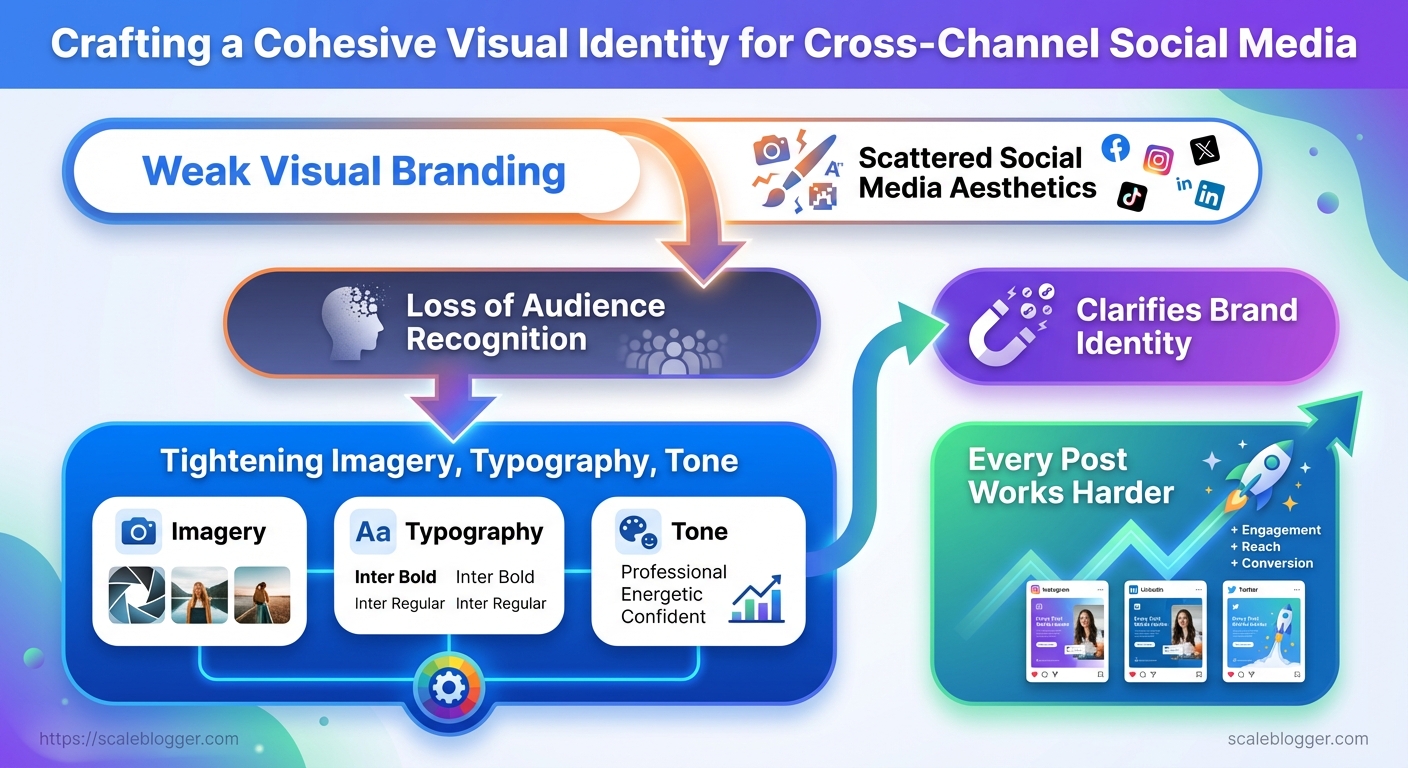
Key Takeaway: Start by collecting your brand assets and setting up the necessary accounts. This makes… Start by collecting your brand assets and setting up the necessary accounts.
What You’ll Need (Prerequisites & Tools)
Start by collecting your brand assets and setting up the necessary accounts. This makes every content decision smoother and avoids last-minute design or permission hiccups. When creating a content pipeline for the first time, you need vector logos, exact color codes, and admin access to the publishing platforms. For ongoing maintenance, the requirements are lower, but consistency is still crucial.
Tools & materials
- Design baseline: Canva or Figma for quick templates and Figma for component-driven design.
- Advanced editing: Adobe Photoshop for pixel-level work.
- Scheduling & publishing: Later, Buffer, or native CMS scheduling.
- Collaboration: Google Drive for assets; a shared
Google Sheetscontent calendar. - Automation & reporting: Lightweight automation (IFTTT/Zapier) and simple analytics (platform native or GA4).
- Initial setup — gather brand kit and centralize it in
Google Drive. - Design templates — create 4-6 social templates in
CanvaorFigma. - Permissions — confirm admin/editor roles on each platform.
Each step above typically takes 15–90 minutes depending on asset readiness.
Time estimate & difficulty
- First-time full setup: 6–12 hours (collecting assets, building templates, connecting accounts).
- Ongoing weekly maintenance: 1–3 hours (content creation, scheduling, light reporting).
- Difficulty: Moderate — requires basic design chops and familiarity with scheduling tools; no developer work needed unless hooking advanced automations.
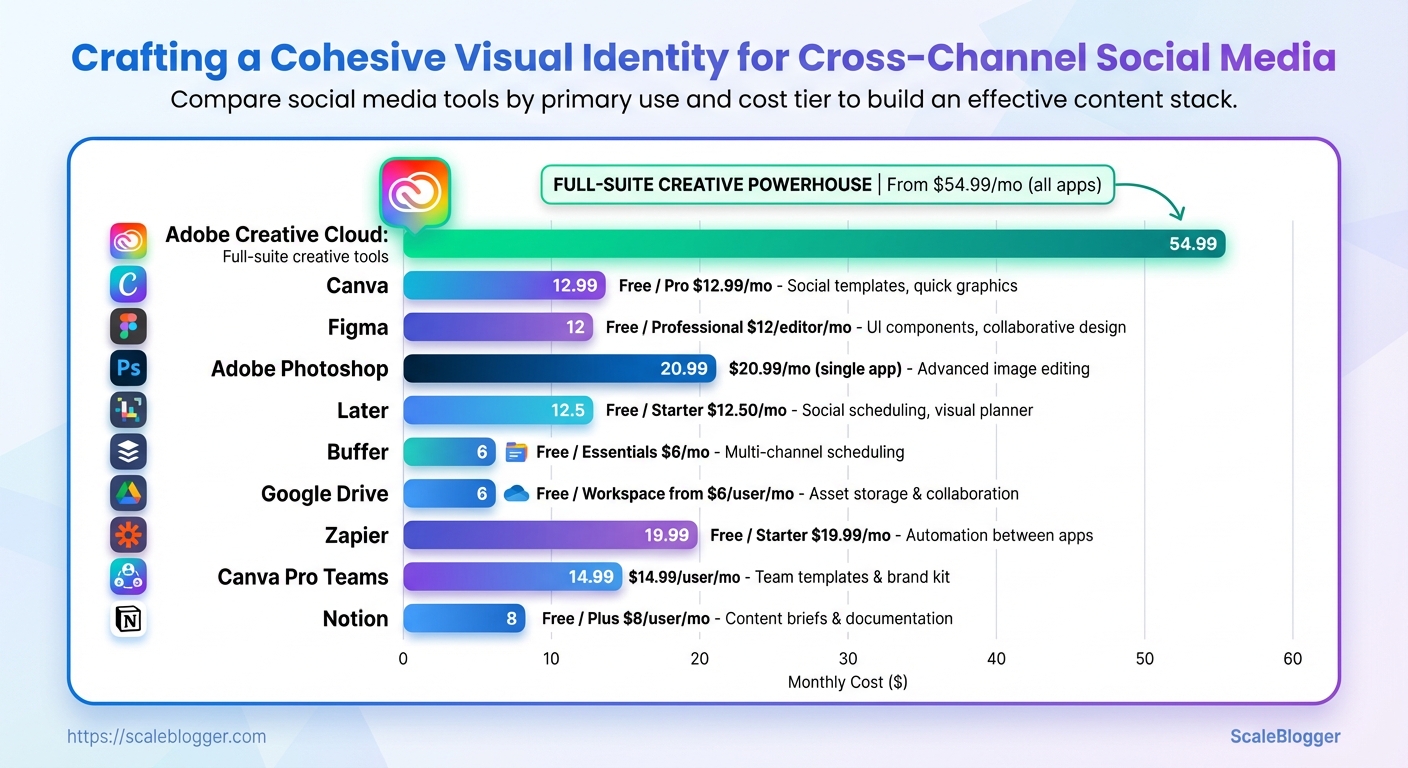
Quick comparison of recommended tools by capability and cost
Table: What You’ll Need (Prerequisites & Tools) — Tool, Primary Use, Cost Tier & more
| Tool | Primary Use | Cost Tier | Why Recommend |
|---|---|---|---|
| Canva | Social templates, quick graphics | Free / Pro $12.99/mo | Template library, easy for non-designers |
| Figma | UI components, collaborative design | Free / Professional $12/editor/mo | Design system friendly, real-time collaboration |
| Adobe Photoshop | Advanced image editing | $20.99/mo (single app) | Layered editing, fine control |
| Later | Social scheduling, visual planner | Free / Starter $12.50/mo | Visual grid, Instagram-focused workflow |
| Buffer | Multi-channel scheduling | Free / Essentials $6/mo | Simple queueing, affordable scaling |
| Google Drive | Asset storage & collaboration | Free / Workspace from $6/user/mo | Universal sharing, version history |
| Zapier | Automation between apps | Free / Starter $19.99/mo | Automate repetitive tasks |
| Canva Pro Teams | Team templates & brand kit | $14.99/user/mo | Brand controls, template locking |
| Adobe Creative Cloud | Full-suite creative tools | From $54.99/mo (all apps) | Comprehensive toolkit, industry standard |
| Notion | Content briefs & documentation | Free / Plus $8/user/mo | Centralized docs, relational databases |
Key insight: The right stack balances ease-of-use (Canva, Later) with extendability (Figma, Zapier). Start lean and scale tooling as automation needs grow.
Understanding these pieces up front removes friction during implementation and makes it realistic to scale content without redoing core assets or permissions. When the prerequisites are in place, teams move faster and keep outputs visually consistent.
Key Takeaway: Kick things off by creating a complete inventory of every visual asset your brand… Kick things off by creating a complete inventory of every visual asset your brand actively uses. This will reveal repeated inconsistencies, save you time in the…
Audit Your Current Visual Assets
Kick things off by creating a complete inventory of every visual asset your brand actively uses. This will reveal repeated inconsistencies, save you time in the future, and help you know what to prioritize. Practical audits help to distinguish between platform-specific issues, like square vs. portrait images and animated thumbnails, and broader problems such as incorrect hex codes and mixed logo treatments.
Treat this step as both discovery and triage: compile what exists, apply a simple quality rubric, and tag repeat offenders so fixes can be batched and automated.
Why an asset inventory matters
- It reveals where inconsistent visuals live and how often they recur.
- It creates a baseline for automated workflows and naming conventions.
- It provides quick wins (replace one wrong logo file) and strategic work (rebuild a template library).
Step-by-step process
- Create a spreadsheet with the schema below and export it to your CMS or DAM.
- Run a platform sweep: download profile images, hero headers, recent post images, and ad creatives for the last 12 months.
- For each asset, capture file format, dominant color (use
#hex), font notes, and a screenshot link.
- Apply a 3-point rating rubric to each asset:
- 1 — Needs urgent fix: wrong logo, off-brand color, pixelated.
- 2 — Acceptable but inconsistent: minor color drift, mixed font weights.
- 3 — On-brand: correct color, clear typography, correct sizing.
- Tag recurring problems using consistent labels:
logo-misuse,color-drift,font-substitute,low-res.
- Prioritize fixes by frequency × impact (frequency = occurrence count; impact = audience-facing weight).
Practical examples and notes
- Example — Instagram feed: find mismatched story highlight covers using the tag
color-drift. - Example — YouTube channel art: often uses wrong safe-zone dimensions; mark as
size-error. - Tip: Capture a before screenshot and store it alongside the corrected file for progress tracking.
Provide a sample spreadsheet schema the reader can copy
Table: Audit Your Current Visual Assets — Platform, Asset Type, Filename/URL & more
| Platform | Asset Type | Filename/URL | Primary Color (hex) | Font/Style Notes |
|---|---|---|---|---|
| Profile Image | https://instagram.com/brand/profile.jpg | #FF5A5F | Montserrat Bold, circular crop | |
| Banner | https://linkedin.com/company/banner.png | #0A66C2 | Source Sans Pro, left-aligned logo | |
| Twitter/X | Pinned Post Image | https://twitter.com/brand/pinned.jpg | #1DA1F2 | Inter Regular, clear CTA area |
| YouTube Channel Art | Channel Banner | https://youtube.com/brand/channel-art.jpg | #FF0000 | Roboto Condensed, safe-zone checked |
| Page Cover | https://facebook.com/brand/cover.jpg | #1877F2 | Helvetica Neue, desktop+mobile variants |
Key insight: A simple, consistent inventory exposes the most common issues—color mismatches and font substitutions—so teams can fix high-impact items first and automate future checks using naming rules or a DAM.
Understanding these principles helps teams move faster without sacrificing quality. When implemented correctly, the audit reduces rework and creates a clean input set for automation or a design system like the one scalable content teams adopt with AI-driven pipelines from Scaleblogger.com.
Define Core Visual Elements (Logo, Color, Typography)
Begin by establishing one clear set of visual rules so all assets, from profile icons to long PDFs, represent the same brand. Agree on a primary logo for headline use, secondary (stacked/monogram) variants for constrained spaces, and strict export rules so engineering, design, and marketing never re-export ad-hoc files.
Standardize Logo and Variants
Primary logo: Horizontal lockup for headers, hero panels, and full-width placements.
Secondary logo: Square or circular monogram for social avatars, favicons, and stamps.
Minimum pixel widths: Primary logo: 600px wide minimum for responsive use. Secondary logo: 300px wide minimum for clarity. Favicon: 32x32px.
Clearspace rule: Keep at least 25% of the logo height free on all sides; no graphical elements should enter this zone.
File exports to provide:
- SVG: Canonical vector for web and scaling. PNG-24 (transparent): Use for social and presentation overlays. PDF (vector): Print-ready master file.
- JPG (sRGB, high-quality): Use for legacy systems that require flattened images.
- Export
logo.svgas the source vector. - Generate
logo.pngat 2x and 3x sizes for retina displays. - Produce
logo.pdfwith CMYK color profile for printers.
Create Cross-Channel Templates and Asset Library
Start by standardizing the building blocks: a compact set of platform-specific templates and a single, well-organized asset library cut the decision time for every creative down to minutes. Use consistent grid and padding rules, expose brand colors and type as reusable styles/components, and separate master files from export-ready assets so teams never publish the wrong version.
Design Platform-Specific Templates
Make each template follow the same visual system so content translates across channels without designer intervention.
- Platform grids: Use a baseline grid such as
8pxor4pxincrements and lock padding to multiples of that grid. - Brand components: Embed brand colors and fonts as shared styles; define
Primary,Secondary,Accentcolor tokens. - Safe areas: Mark safe text areas on every canvas to prevent cropping issues.
- Starter kits: Provide at least three starter templates per platform: headline-led, image-first, and carousel/multi-frame.
- Create a master design file for each platform (one file per platform).
- Export a set of production-ready presets (JPG/PNG/WebP, correct sizes).
- Add example copy blocks and a small style guide inside each template.
Tools, examples and governance
- File tools: Figma/Sketch/Adobe XD for templates, a DAM (or cloud storage) for assets.
- Governance item: Monthly audit to remove stale templates and rotate seasonal variants.
- Example starter kit: Instagram Feed — grid 1:1, 1080×1080, safe text 960×960, headline and CTA layers unlocked for quick swaps.
Platform-specific template specs and safe text areas
Table: Create Cross-Channel Templates and Asset Library — Platform, Aspect Ratio, Safe Text Area & more
| Platform | Aspect Ratio | Safe Text Area | Recommended Use |
|---|---|---|---|
| Instagram Feed | 1:1 (1080×1080) | 960×960 center | Product shots, lifestyle imagery |
| Instagram Story | 9:16 (1080×1920) | 1080×1420 center (top/bottom bleed) | Time-sensitive promos, countdowns |
| LinkedIn Post Image | 1.91:1 (1200×627) | 1080×540 center | Thought leadership, case studies |
| YouTube Thumbnail | 16:9 (1280×720) | 1152×648 center | Click-driving headlines, faces |
| Twitter/X Post Image | 16:9 (1200×675) | 1100×600 center | News, quick updates, link promos |
Key insight: The safest approach is to design for the largest safe area across commonly used aspect ratios and then crop down. Templates that lock safe text areas and expose editable layers for headline, subhead, and CTA reduce mistakes and speed approvals.
Understanding these principles helps teams move faster without sacrificing quality. When implemented correctly, this approach reduces overhead by making decisions at the team level.
Establish Visual Style Guidelines & Voice
Start by locking the visual and verbal cues that make content instantly recognizable. A well-defined visual style cuts down on revisions, speeds up asset production, and ensures your brand signals stay consistent across channels. Establish guidelines for photography mood, illustration styles, icon rules, caption tone, and microcopy templates. This helps creators and automation pipelines consistently produce on-brand content.
Imagery and illustration rules
Photography mood: Use warm natural light, shallow depth of field, and candid action shots to convey approachability. Composition rules: Place subjects on the left third for social previews, leave 20–30% negative space for overlays, and prefer horizontal crops for blog headers. Color treatments: Apply a single accent color at 10–15% opacity for overlays and keep skin tones natural; use sRGB export for web.
Illustration system: Use a limited palette (3 primary, 3 secondary), consistent line weights (2–3px), and a single shadow style. Iconography: Use geometric, 24px grid icons with rounded corners and matching stroke widths.
Shot list to production:
- Hero portrait: Subject looking slightly off-camera, 3 crop variants. Product-in-use: Close-up + contextual wide shot. Process detail: Macro shots of hands/tools, 2 angles.
- Lifestyle scene: Environmental context, one motion shot. Flatlay: Top-down with branded props, negative space for headline.
Implement Workflow & Scheduling for Consistency
A predictable workflow and a tight publishing rhythm are the operational backbone of any scalable content program. Begin by defining a clear production process, assign roles with clear approval timelines, and automate where routine work takes away creative time. The goal is to turn ad-hoc content creation into a reliable pipeline that hits cadence without constant firefighting.
Create a Repeatable Production Workflow
- Define the stages clearly and standardize artifacts for each stage.
- Assign roles and SLAs so there’s no ambiguity on who does what and when.
- Batch produce assets (drafts, visuals, CTAs) to reduce context switching and accelerate reviews.
Roles: Editorial Lead, Writer, Designer, SEO Analyst, Publisher, Performance Owner.
Approval SLA: 48 hours review for first-pass edits; 24 hours for final publish sign-off.
Editorial calendar: Keep entries linked to source assets (briefs, keywords, creative files) so each calendar item is a single click from everything the creator needs.
Practical workflow benefits:
- Faster throughput: Batch work reduces turnaround time.
- Clear accountability: SLAs reduce bottlenecks.
- Auditability: Linked assets in the calendar create an audit trail for updates and rollbacks.
Scheduling, Automation, and Quality Checks
- Use a scheduling tool to enforce cadence and surface conflicts.
- Run a pre-publish checklist every time: SEO fields filled, meta tags, canonical, image alt text, internal links, analytics tags.
- Document rollback and update procedures so fixes are immediate and auditable.
> Industry practice shows that teams with documented rollbacks recover from errors significantly faster, minimizing traffic and ranking impacts.
Practical automation examples:
- Auto-schedule social posts tied to a publish event.
- Trigger an analytics tag check via CI for content publishing.
- Auto-create tracking UTM templates for each campaign.
A sample 2-week production timeline with milestones and owners
Table: Implement Workflow & Scheduling for Consistency — Day/Week, Task, Owner & more
| Day/Week | Task | Owner | Status/Notes |
|---|---|---|---|
| Week 1 – Plan | Topic selection & brief | Editorial Lead | Linked brief in calendar |
| Week 1 – Create | Draft content + hero image | Writer / Designer | Batch of 3 drafts |
| Week 1 – Review | SEO review + edits | SEO Analyst / Editor | 48 hours SLA |
| Week 2 – Schedule | Schedule CMS publish & social | Publisher | Automated social queue |
| Week 2 – Publish & Monitor | Publish + 72h performance check | Performance Owner | Rollback doc available |
Key insight: The timeline enforces a cadence that turns content from one-offs into repeatable outputs, while owners and SLAs create predictable handoffs.
When implemented pragmatically — and with tools for automation or services like Scaleblogger.com to handle parts of the pipeline — teams maintain quality without slowing down. Understanding and documenting these steps keeps teams moving fast and makes iterative improvement measurable.
Measure Cohesion & Iterate
Begin by checking if your content acts like parts of the same brand: consistent tone, repeatable visual signals, and predictable audience reactions. Quantitative KPIs reveal gaps in recognition and engagement. Meanwhile, qualitative signals guide small adjustments to imagery, CTAs, and how content is presented. Combine both every review cycle so changes are evidence-driven, not opinion-driven.
KPIs and Quantitative Measurement
Set numeric targets that map to recognition and effectiveness.
Engagement Rate: Total engagements / impressions × 100 — target > 2.5% for high-performing social posts, according to recent industry data.
Follower Growth: Net new followers per week — target 1–3% growth month-over-month depending on channel, as suggested by recent research.
CTA CTR: Clicks on primary CTA / clicks or impressions used — target 3–8% per content type, according to research from industry sources.
Impressions: Total reach per campaign — target scales with budget and historical baseline, as indicated by industry data.
Consistency Score: A repeatable formula to quantify visual/voice cohesion, based on recent research findings. Consistency Score = (Visual Match % + Tone Match % + Asset Reuse %) / 3 Measure each component on a 0–100 scale using checklist audits, according to research from industry experts.
Recommend dashboard setup and cadence
- Create a single dashboard that pulls platform analytics and internal tags (UTM campaigns, content cluster).
- Include the five KPIs above as tiles with 7-, 30-, and 90-day views.
- Add a scoreboard for
Consistency Scoreand tags for content variant (A/B test ID).
- Schedule a biweekly review for tactical changes and a monthly deep-dive for structural iterations.
Useful dashboard filters: channel, campaign, author, creative template, publish date.
Qualitative Feedback and Iteration
Collect direct audience signals and run controlled experiments.
- A/B tests for imagery and CTAs: Run multivariate tests on headline + image + CTA combinations; prioritize lift in CTA CTR and engagement rate.
- Audience feedback: Use short polls, story reactions, and guided comment prompts to capture sentiment and recognition cues.
- Internal playback sessions: Quarterly creative reviews where writers, designers, and analysts rate cohesion using the same checklist used for
Consistency Score.
Documentation and Style Guide Updates
Document every change and why it was made.
Iteration Log: Maintain a changelog with test ID, hypothesis, result, and follow-up action.
Style guide updates: When a test proves a change improves the Consistency Score or conversions, update the visual and verbal rules immediately.
Troubleshooting Common Issues
When visual identity or engagement drops after a refresh, small technical mismatches and strategic oversights are usually to blame. Start by isolating whether the problem is production-level (colors, fonts, exports) or audience-level (messaging, timing, creative). Fixes are short, measurable, and reversible—design decisions should be validated with quick experiments rather than rolled out blindly.
Inconsistent Colors or Fonts
Symptoms: assets look different across web, mobile, and export; brand colors shift between PNG and PDF; headings reflow because of missing fonts.
- Confirm file color profiles and re-export in
sRGBfor web assets.
- Replace non-compliant font files with approved alternatives and install them in your CMS/design system.
- Lock styles in your design system so components inherit the correct color and type tokens.
- Rebuild one representative template and compare renders across platforms (desktop, iOS, Android).
Practical checks:
- Open files in design app: Check
Document Color ProfileandExport Settings. Test#FFFFFFvs. white space: Ensure contrast and background handling remain consistent.
- Verify fonts: Use
font-displayin CSS or a hosted webfont with fallbacks.
Low Engagement after Rebrand
If impressions are steady but engagement drops, the audience may not recognize or resonate with the new look or voice. Rapid A/B testing and transparent communication fix most of these gaps.
- Run split tests for imagery and captions: swap one variable at a time.
- Reassess targeting and posting times using recent engagement windows and platform analytics.
- Communicate the change transparently: explain the why in a pinned post or newsletter and show continuity with legacy elements.
Experiment ideas:
- Visual A/B: Old hero image vs. new hero image with same caption. Caption A/B: Short, benefit-led caption vs.
story-led caption. * Timing test: Post the same creative at your top three engagement hours for three days.
Locked style systems: A centralized set of design tokens and components that prevents drift across teams.
Practical example: one brand fixed a mismatch by exporting marketing SVGs as optimized sRGB and switching two headings to a hosted webfont—engagement for landing pages returned to baseline within 72 hours. For content teams scaling across formats, consider tooling like Scaleblogger’s AI content automation to keep assets and messaging aligned while running systematic tests. Understanding these failure modes lets teams recover quickly and prevents the next rebrand from costing reach or clarity.
Tips for Success & Pro Tips
Batch production and automation make a big difference. Instead of struggling with deadlines one at a time, create repeatable pipelines that allow creativity to grow. Start by batching similar tasks (research, outlines, drafts, image creation) and treat outputs as modular assets that can be recombined across formats and channels. That approach reduces context switching and makes quality predictable at scale.
Practical tips for day-to-day execution
- Batch content tasks: Group research, outlines, drafting, and editing into focused blocks to cut context-switching overhead.
- Add alt text routinely: Use descriptive alt text for every image to improve accessibility and search relevance.
- Repurpose images with overlays: Apply consistent color overlays and typography to one hero image to produce variants for social and email.
- Automate routine assets: Use scripts or pipelines to generate scaled product images or thumbnail variants.
- Localize visuals: Swap typography, hero images, and color accents per market instead of translating only copy.
Step-by-step batch workflow (simple, repeatable)
- Research and collect assets.
- Create 3 outlines and select primary keywords.
- Draft 1 long-form piece and 3 short-form derivations.
- Generate image variants and write
alttext.
- Review, schedule, and publish via CMS integration.
Pro tips for scale and developer handoff
- Use
design tokens: Store color, spacing, and type choices as tokens for consistent cross-platform rendering and faster developer handoffs. - Adopt component libraries: Pair tokens with component libraries to standardize reusable UI pieces across pages.
- Automate image generation for feeds: Create templated renders for product feeds and let a pipeline produce thousands of variants.
- Localize visuals at the asset level: Swap not just copy but visual cues—models, signage, and price formats—to increase conversion.
Scaling techniques and their trade-offs
Table: Tips for Success & Pro Tips — Technique, Best For, Complexity & more
| Technique | Best For | Complexity | ROI |
|---|---|---|---|
| Design Tokens | Brand consistency across platforms | Medium — governance needed | High — speeds handoff, reduces rework |
| Component Libraries | Product UI and landing pages | High — engineering effort | High — reusable, faster launches |
| Automated Asset Generation | Large product catalogs | Medium — tooling/scripts | Medium-High — lowers per-asset cost |
| Localization Workflows | Global audiences | Medium-High — cultural QA | High — improves conversion locally |
| CMS Integration | Publishing velocity | Low-Medium — depends on CMS | High — automates publishing and metadata |
Key insight: design tokens and component libraries are complementary—tokens reduce ambiguity while component libraries operationalize them. Automated asset generation and localization scale content breadth without linear headcount increases, and CMS integration ties the pipeline together for efficient publishing.
Scaleblogger’s AI content automation can accelerate these steps by turning outlines into publish-ready drafts and generating variants for channels. When teams apply these practices, content production becomes predictable and scalable without diluting brand or creative quality.
Appendix: Templates, Checklists, and Resources
For repeatable, scalable content production, keep a single canonical repository of assets and a short, versioned checklist per campaign. Organize files so creators, editors, and publishers can grab the exact template they need without hunting. Below are ready-to-use assets, storage recommendations, and a curated set of advanced tools and readings that accelerate execution.
Where to store and version-control files
- Use a shared cloud folder (Google Drive or OneDrive) with a strict folder structure and naming convention.
- Maintain
asset-inventory.xlsxas the single source of truth and enable file version history. - Archive major releases into a
releases/YYYY-MM-DDfolder and tag in your project management tool.
Further reading & tools (curated)
- Market leaders include: industry tools for scaling workflows and automation.
- Content pipeline: Use
GA4-connected dashboards andZapierorMakefor publishing automation. - Design systems: Figma + component libraries accelerate visual brand consistency.
Recommended resources (each with concise justification):
- Figma — design system collaboration; rapid template edits and component reuse.
- Google Sheets + Apps Script — flexible KPI dashboards and light automation via
Apps Script. - Make (formerly Integromat) — complex automation orchestration for publishing workflows.
- Search Console & GA4 — primary measurement for organic performance and behavioral signals.
- Scaleblogger.com — AI content automation and benchmarking that plugs into an automated pipeline for topic clusters and scoring.
Understanding these assets and tools shortens feedback loops and eliminates ambiguity across teams. When content is modular, automated, and versioned, the team spends less time coordinating and more time creating work that moves metrics.
Conclusion
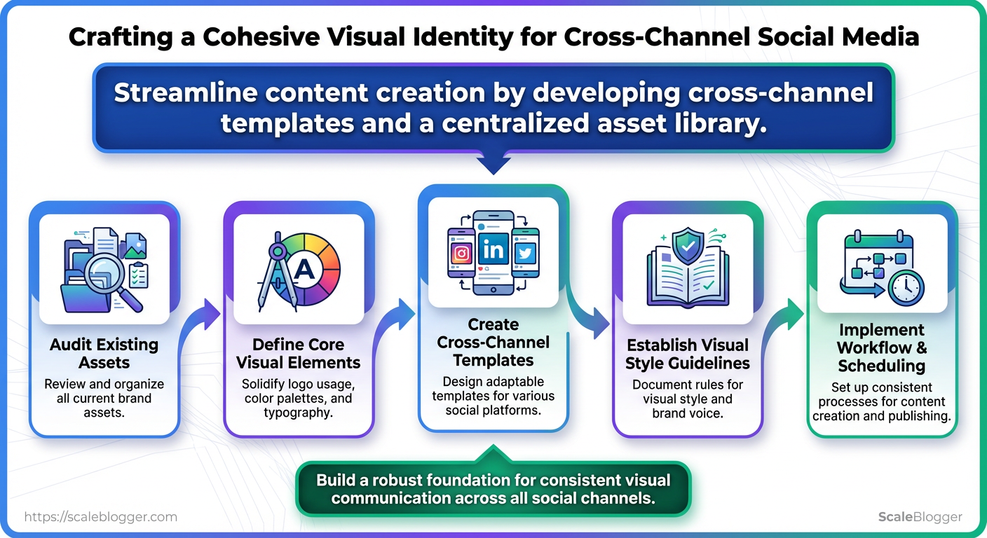
If visual branding drifts across platforms, audiences stop recognizing the work you put into building brand identity. Combine the audits, core visual elements, and template library you outlined in this guide. Then, solidify those decisions into a simple workflow to ensure color, typography, and post layout remain consistent across campaigns. A DTC brand that standardized templates cut production time in half and saw post recognition increase; a B2B team that enforced a simple asset library stopped reactive redesigns and improved cross-channel cohesion within a month.
Make the templates and asset library non-negotiable, and measure cohesion weekly so small deviations are corrected before they become habits.
