Why does a message feel sharp in one place and strangely generic in another? That gap usually appears when personalization in content is built for a single channel, not for how people actually move between formats.
A reader might arrive from a search result, skim a short product explanation on page, then come back through a retargeting email to compare pricing before they take action. If each touchpoint speaks in a different tone, the user experience starts to feel stitched together instead of seamless.
That is where a multi-modal content strategy matters.
It is not just about publishing across text, audio, image, and video; it is about making those formats carry the same intent, context, and timing without sounding copied and pasted.
The tricky part is that people do not want obvious personalization.
They want content that feels relevant because it fits their moment, their device, and their level of attention.
When that works well, the experience feels almost invisible, which is usually a good sign.
Quick Answer: Personalized multi-modal content strategy makes every touchpoint—blog, video, audio, email—match the user’s intent, context, and consumption style so the message feels consistent rather than copy-pasted across formats. It goes beyond swapping names by shaping depth, pacing, and cues for each channel, so relevance “travels with the message” as users move between formats. Use AI-assisted workflows to maintain consistency and add clearer measurement across the content lifecycle to verify which versions actually improve engagement.
Why Personalization Matters More in a Multi-Modal Content Strategy
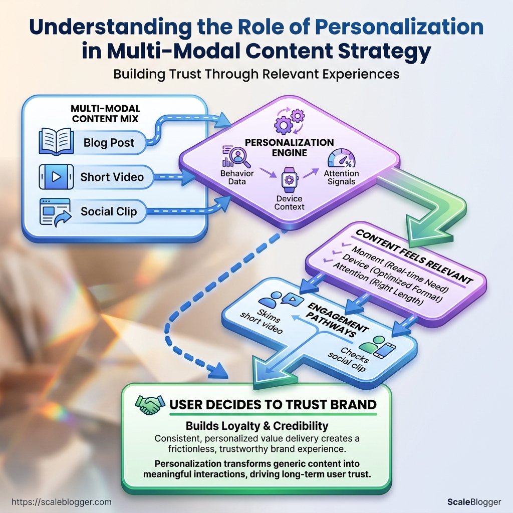
Ever notice how the same message feels sharp in one format and flat in another? That gap is exactly where personalization in content starts to matter.
Once a brand moves from a blog post to video, audio, or an interactive experience, relevance has to travel with the message, not stay trapped in the original article.
In a multi-modal content strategy, personalization is not just swapping in a first name or a location.
It means shaping the message so the core idea still fits the way someone prefers to consume it, whether that is reading, listening, watching, or tapping through a guided flow.
UX work in 2026 keeps pointing toward multimodal experiences and AI-driven personalization for a reason: people expect the content to feel tuned to them, not merely available to them, as noted in the 2026 experience design trends report and Contentful’s personalization framework overview.
A practical example helps.
Imagine a user who first meets a topic in a short blog intro, then sees a 30-second video recap, then hears a podcast-style summary later that day.
If each version uses the same angle but different depth, pacing, and cues, the message feels coherent and easier to remember.
That matters because attention is expensive.
- Text: Personalization can surface the most relevant angle first, which cuts scanning fatigue.
- Video: It can change pacing, examples, and on-screen emphasis to match intent.
- Audio: It can adjust tone and structure for easier listening and recall.
- Interactive content: It can adapt prompts, paths, and calls to action based on behavior.
Research and product thinking around multimodal systems points in the same direction.
TED’s product leadership has discussed building for multichannel and multimodal experiences, which reflects how audiences now move fluidly between formats, not in neat little boxes, as covered in TED’s multichannel and multimodal product discussion.
When the same audience insight shapes every format, user experience improves because the content feels familiar without becoming repetitive.
Attention stays higher, and recall gets a boost because the message is reinforced through multiple sensory paths.
That is why personalization matters even more once content stops living in only one place.
The strongest systems make each format feel distinct, while still carrying the same idea cleanly across the whole journey.
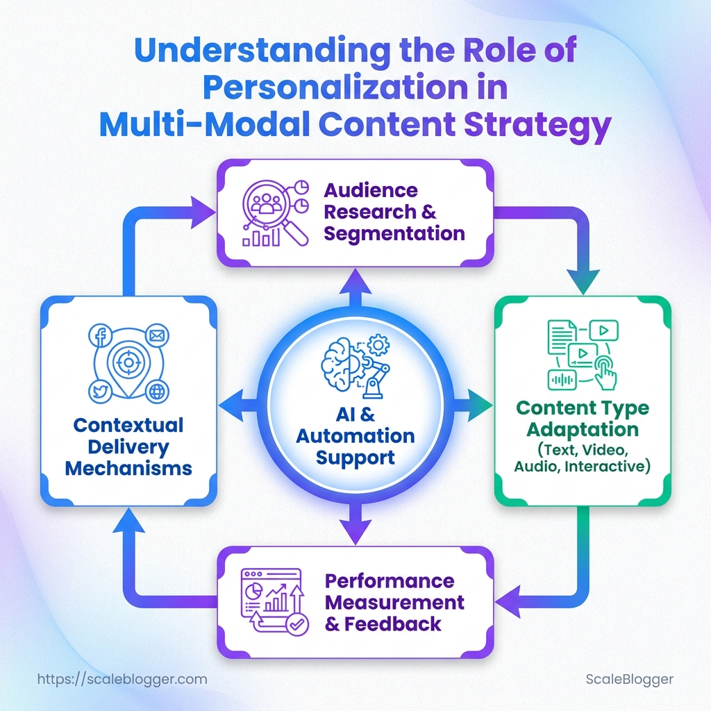
How Personalization Works Across the Content Lifecycle
A useful personalization system starts before a draft exists.
The strongest signals are usually small ones: search intent, entry source, device, and how much depth a reader seems willing to handle.
That is why format, tone, and depth should be planned together.
UX Design’s 2026 trend roundup points to AI-driven personalization and emotionally aware design as rising expectations in user experience, which makes the old “write one article and hope for the best” approach feel dated very fast. The most popular experience design trends of 2026
The planning stage works best when one message keeps a single spine.
Contentful’s personalization framework makes that point well: tailored experiences only matter when they still connect to a clear outcome, instead of drifting into random variations.
The power of personalization frameworks
How AI and automation support personalization without replacing editorial judgment
| Lifecycle stage | Personalization task | Best method | Human decision needed | AI or automation support |
|---|---|---|---|---|
| Audience research | Group readers by intent, source, and preferred depth | Human-led segmentation with AI tagging | Which signals are trustworthy and meaningful | Topic clustering, behavior grouping, query analysis |
| Content brief creation | Set angle, proof points, and content depth | Editorial brief with AI-assisted outlines | Which narrative stays consistent across formats | Brief drafting, gap detection, keyword grouping |
| Format adaptation | Recast one idea for article, video, email, or social | Template-based repurposing with review | Where format changes might distort the message | Structural reformatting, asset repurposing |
| Tone adjustment | Match formality, pace, and reading level | Editor-led style guide with AI suggestions | Which tone fits the audience and brand voice | Tone scoring, rewrite suggestions, style checks |
| Performance review | Compare engagement by segment and format | Human interpretation plus automated dashboards | Which changes are signal versus noise | Benchmarking, anomaly detection, reporting |
Multimodal Real-Time Content Personalization
That makes AI useful at the messy parts of the workflow.
It can sort signals, draft variants, and surface patterns across channels, but it cannot decide whether the piece still feels coherent or credible.
Recent research on multimodal systems and generative interfaces points in the same direction.
More input types create better adaptation, but only when human rules stay in the loop.
Personalization in Multimodal Systems and Efficient Personalization of Generative User Interfaces both reinforce that balance.
At our end, we treat AI as the sorting and drafting layer, not the final editor.
That keeps personalization in content useful instead of fragmented, and it helps every format feel like part of one conversation.
Building a Personalization Framework for Multi-Modal Content
Why does one person want a 90-second video while another needs a dense comparison page before they trust anything? That split is the whole game in personalization in content.
A useful framework starts by sorting people into three simple buckets: intent, familiarity, and content preference.
Intent tells you whether they are exploring, comparing, or ready to act.
Familiarity tells you how much context they already have.
Content preference tells you whether they move faster with text, audio, visuals, or a mix.
That structure matters because multi-modal content strategy is not about making every asset do everything.
It is about sending the right version of the same idea through the right channel.
Contentful describes a personalization framework as a way to connect tailored experiences to measurable outcomes, and current 2026 UX trends keep pointing toward multimodal, emotionally aware experiences as a real differentiator for user experience Contentful’s personalization framework overview and 2026 experience design trends on UX Design.
The trick is to build reusable message blocks, not one-off copies.
One block can become a blog section, a carousel slide, a short script, or a newsletter paragraph without rewriting the core idea.
- Explorers: Give them light framing, a visual hook, and one clear next step. Short explainers and annotated graphics work better than long-form detail.
- Comparers: Use side-by-side breakdowns, proof points, and screenshots. They need enough specificity to judge fit without digging through a white paper.
- Deciders: Focus on direct answers, pricing cues, implementation notes, and trust signals. They care less about novelty and more about risk.
A strong message block usually has three parts: a claim, a proof point, and a format-friendly close.
We use that logic in our own workflows at Scaleblogger, because a single source idea needs to travel cleanly across blog, social, and CMS publishing without losing its shape.
The best part is that this approach keeps the system sane.
Instead of personalizing every sentence from scratch, you personalize the assembly of the content itself, which is far easier to manage at scale.
Measuring Whether Personalization Is Working
A personalized article can get clicks and still miss the point.
That happens when the headline lands, but the content never earns attention.
The better test is whether people keep going, interact in the right places, and finish with less friction.
In a multi-modal content strategy, that usually means different formats need different scorecards, because a blog post, a video, and a carousel do not ask for the same kind of effort.
That approach lines up with how personalization is being discussed now in multimodal systems and content frameworks. Contadu’s overview of multimodal real-time content personalization and Contentful’s personalization framework article both point toward measuring outcomes across more than one signal, not treating every format like the same experience.
UX Design’s 2026 experience design trends piece also reflects the growing pressure to read engagement in a more nuanced way.
How to benchmark engagement across formats without comparing unlike content
A blog post should not be judged against a six-second social clip.
One is built for reading depth, the other for fast attention.
The clean way to compare personalized content is to score each format against its own job, then roll those results up into a shared view of user experience.
| Format | Primary engagement metric | Secondary metric | What success looks like | Common measurement mistake |
|---|---|---|---|---|
| Blog post | Average time on page | Scroll depth | Readers stay long enough to finish the argument | Judging by clicks alone |
| Landing page | Conversion rate | Form start rate | Visitors move from curiosity to action | Treating every visit as equal intent |
| Short video | Completion rate | Average watch time | Viewers finish the message, not just the hook | Comparing it to article dwell time |
| Carousel | Slide-through rate | Last-slide reach | People keep advancing instead of dropping early | Counting impressions as engagement |
| Click-to-open rate | Reply rate | The message drives a next step, not just opens | Using open rate as the main win | |
| Podcast or audio | Listen-through rate | Episode drop-off point | Listeners stay past the setup and into the substance | Assuming play count means interest |
A strong personalized piece usually improves the metric that matches the format’s purpose, not every metric at once.
That matters even more when the data starts guiding future decisions.
If a segment finishes long blog posts but drops out of short videos, the next round of personalization should favor reading-first paths for that audience.
If another segment responds well to video completions but ignores long-form pages, they probably want a quicker route to value.
A practical rule helps here: track one primary metric, one supporting metric, and one guardrail for each format.
Then compare segments only inside the same format, never across unrelated ones.
That keeps personalization in content honest, and it keeps user experience measurements from turning into a mess of false comparisons.
Good personalization should look different by format, but it should still point in the same direction: clearer relevance and less wasted effort.
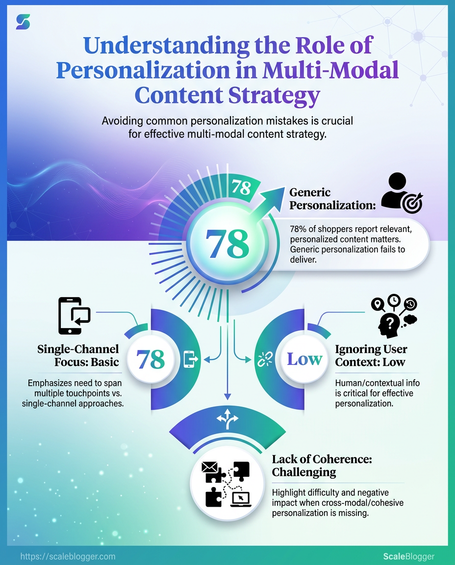
When a page starts feeling like it was written by five different brains, personalization has gone too far.
That usually happens when the copy, video, audio, and layout chase different signals instead of telling one clear story.
The first trap is over-personalizing at the expense of clarity.
A message can be technically relevant and still feel muddy, especially when every sentence bends to a tiny segment.
In multi-modal content strategy, the user experience suffers fast when the core point gets buried under too many variants, tones, or calls to action.
A second mistake is treating each format like its own campaign.
A blog post, short video, carousel, and email should not behave like unrelated projects with separate logic.
TED’s product team has talked about building for multichannel and multimodal experiences as one connected system, which is the saner path when you want consistency across touchpoints.
That same idea shows up in Contentful’s personalization framework article: tailored experiences work best when they sit on a shared editorial model, not a pile of isolated assets.
> The latest UX Design trends report for 2026 also points toward multimodal experiences and emotionally aware design, which makes coherence even more important.
The third mistake is relying on tools without the guardrails that keep variants aligned.
AI and automation can accelerate drafting, tagging, and repurposing—but if you don’t define what must stay invariant across formats, the system will “optimize” locally and drift globally.
That’s where teams get inconsistent proofs, mismatched claims, and CTAs that don’t map to the same user intent.
- No editorial invariants: The core claim, proof points, and promise/CTA mapping change from format to format.
- Variant chaos: Every segment gets its own phrasing, and the main idea gets diluted.
- Disconnected formats: Video says one thing, the article says another, and the social snippet adds a third angle.
- Tool-first publishing: The workflow becomes input-output automation without a human checkpoint for voice, intent, and sequence.
A cleaner approach is simple: define one message spine, then personalize the assembly with discipline.
The format can change—but the promise should stay recognizable, and the proof should stay consistent.
That’s what keeps personalization in content useful instead of noisy.
Without invariants and checkpoints, the system may look advanced and feel cheap.
Where Scaleblogger Fits in an AI-Assisted Content Workflow
An AI writing tool earns its place when it takes the slowest part of publishing off the team’s plate without touching the final judgment call.
That usually means first drafts, repurposing, format changes, and CMS-ready output, while editors still own the angle, claims, and brand voice.
That split matters more now that content is moving across text, video, social, and search at once.
The 2026 experience design conversation keeps circling back to multimodal experiences and AI-driven personalization, and that pushes content teams toward workflows that can adapt fast without turning sloppy, as discussed in the 2026 experience design trends roundup on UX Collective and Contentful’s personalization framework guide.
For our own workflow, that is where an AI-first pipeline fits best: it can move from topic clustering to draft generation, then hand the piece back for editorial review before publishing.
A setup like Scaleblogger is a strong match when a team needs volume, but still wants control over personalization in content, consistency, and the final user experience.
Here’s the practical test.
- You publish often: weekly or daily output makes manual drafting the bottleneck.
- You reuse ideas across formats: one article needs to become social copy, video scripts, or a newsletter.
- You need guardrails: editors want structured drafts, not blank-page chaos.
- You care about fit, not just speed: the tool has to support brand tone and topic targeting, not just fill words.
When evaluating AI writing tools, look at how well they handle prompt-to-draft consistency, how easily editors can revise output, and whether the system supports personalization signals without muddying the message.
Research on multimodal personalization and generative UI design keeps pointing to the same idea: richer inputs are useful only when the workflow still makes human review simple, as shown in Contadu’s piece on multimodal real-time content personalization and arXiv’s paper on efficient personalization of generative user interfaces.
A good AI content workflow should feel like a disciplined assistant, not a rogue co-author.
That is the lane Scaleblogger fits into best, and it keeps the editorial side in charge where it belongs.
Make the Message Fit the Moment
The strongest signal from all of this is simple: personalization in content works when it shapes the experience, not just the headline.
A name in an email is a weak trick; a message that matches intent, format, and context feels useful.
That is where a multi-modal content strategy starts to earn its keep, because people do not consume one neat channel at a time.
The example that matters most is the one where a single article becomes a blog post, a LinkedIn update, a short video, and a pinned social post, each with a different entry point but the same core idea.
That is good user experience in practice, not theory.
When the format changes with the audience’s moment, the message stops feeling recycled and starts feeling timely.
Pick one high-performing piece today and adapt it for three channels. Change the hook, the proof, and the call to action for each version, then watch which one gets the clearest response.
If that process feels hard to keep consistent, our AI-assisted workflow can help keep the moving parts aligned without flattening the content into something generic.
