

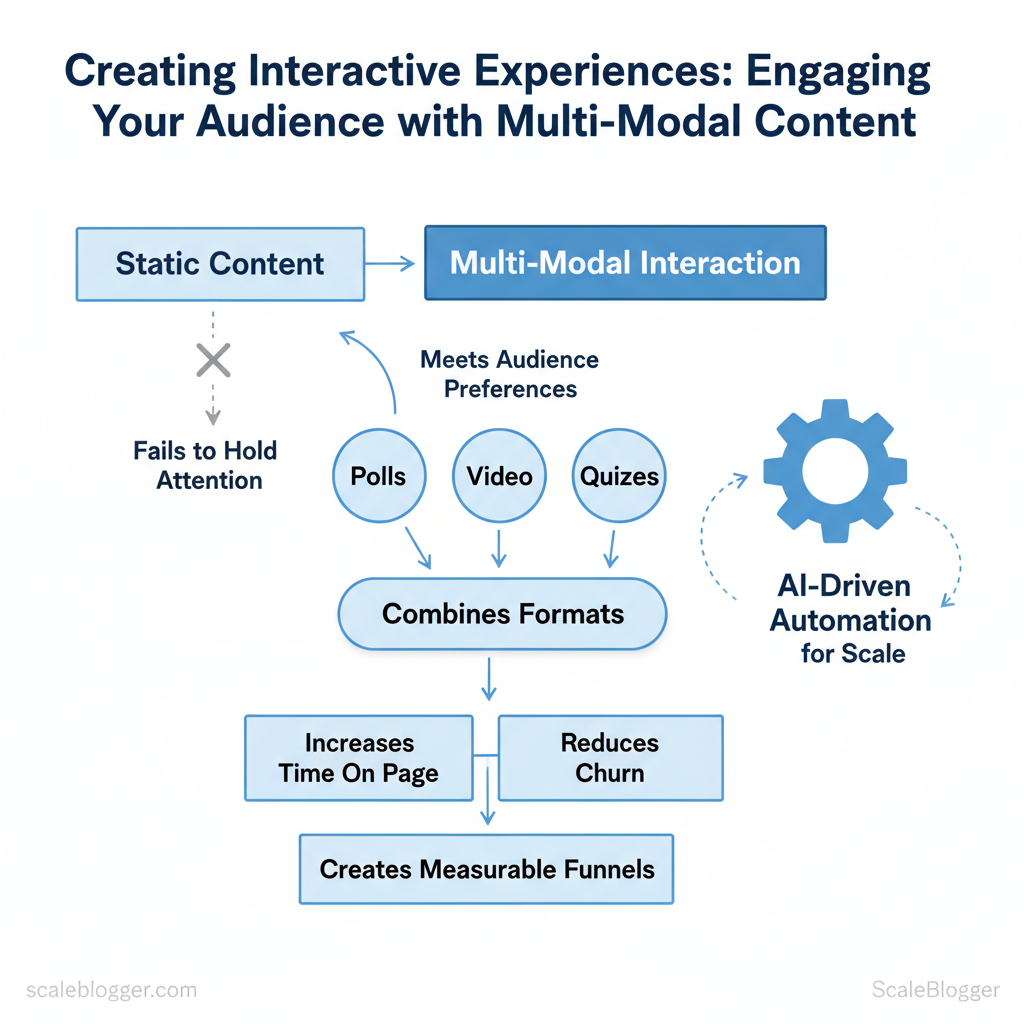
Marketing teams struggle when static content fails to hold attention across diverse channels. When viewers scroll past video, ignore long-form text, or skip interactive widgets, the result is wasted production time and missed conversions. Interactive content powered by multi-modal interaction changes that equation by meeting audiences where they prefer to engage.
To truly engage the audience, you need to combine different formats. This includes polls, short videos, quizzes, and adaptive stories. This way, each interaction feels personal and meaningful. Practical implementation reduces churn, increases time on page, and creates measurable funnels that feed editorial and paid strategies.
Picture a campaign where an embedded quiz routes respondents to tailored video micro-lessons, boosting lead quality without heavy manual work.
Industry teams increasingly automate these workflows with AI-driven pipelines to scale multi-format production and maintain consistent messaging. One content group reduced go-to-market time significantly by templating interactive modules and automating distribution across platforms.
- How to design multi-modal experiences that respect attention and increase conversion
- Which formats pair best for different funnel stages and platforms
- Simple automation patterns to scale interactive elements without extra headcount
- Metrics that prove lift from
engagementto revenue
Explore scalable interactive content solutions: https://scaleblogger.com
> Key Takeaway: ## Why Multi-Modal Interactive Content Matters
Multi-modal interactive content uses visuals, audio, and hands-on elements. By turning passive readers into active participants, you can boost retention, focus, and SEO results.
Why Multi-Modal Interactive Content Matters
Multi-modal interactive content uses visuals, audio, and hands-on elements. By turning passive readers into active participants, you can boost retention, focus, and SEO results. When a page engages the eyes and ears while inviting clicks, choices, or input, it leverages memory principles like dual coding (visual + verbal encoding) and converts fleeting visits into meaningful sessions that search engines notice.
Why this works in practice
- Dual coding enhances recall: Pairing a short explainer animation with a concise audio track increases the number of retrieval cues available to users.
- Interaction raises attention: Quizzes, calculators, and interactive timelines require micro-decisions, which lengthen session duration and deepen engagement.
- Multi-format distribution multiplies reach: Video clips, podcast snippets, and embeddable widgets are shareable across platforms, expanding discovery beyond classic blog search.
Concrete examples
- Embed an explainer video and transcript — viewers who watch and skim the transcript retain concepts faster and are more likely to convert. 2.
Add a simple ROI calculator that outputs a downloadable PDF — users engage with form fields and leave with a tangible asset. 3. Create an interactive comparison table that filters by feature — this keeps users on the page and encourages social sharing of filtered views.
SEO and distribution mechanics
- Dwell time and CTR: Interactive elements increase average session duration and can boost organic CTR through richer snippets and better on-page relevance.
- Structured data: Use
Article,VideoObject, andFAQPageschema to help platforms generate rich results; interactive pages are more likely to earn enhanced listings. - Embedding and hosting: Host heavy assets (video, large JS) on a CDN and lazy-load interactive modules to keep core page speed healthy.
Practical steps for implementation
- Audit content for opportunities (quizzes, visuals, calculators). 2.
Prototype a lightweight interactive using HTML5 or an embeddable widget. 3. Measure impact with GA4 and GSC, iterate based on engagement metrics.
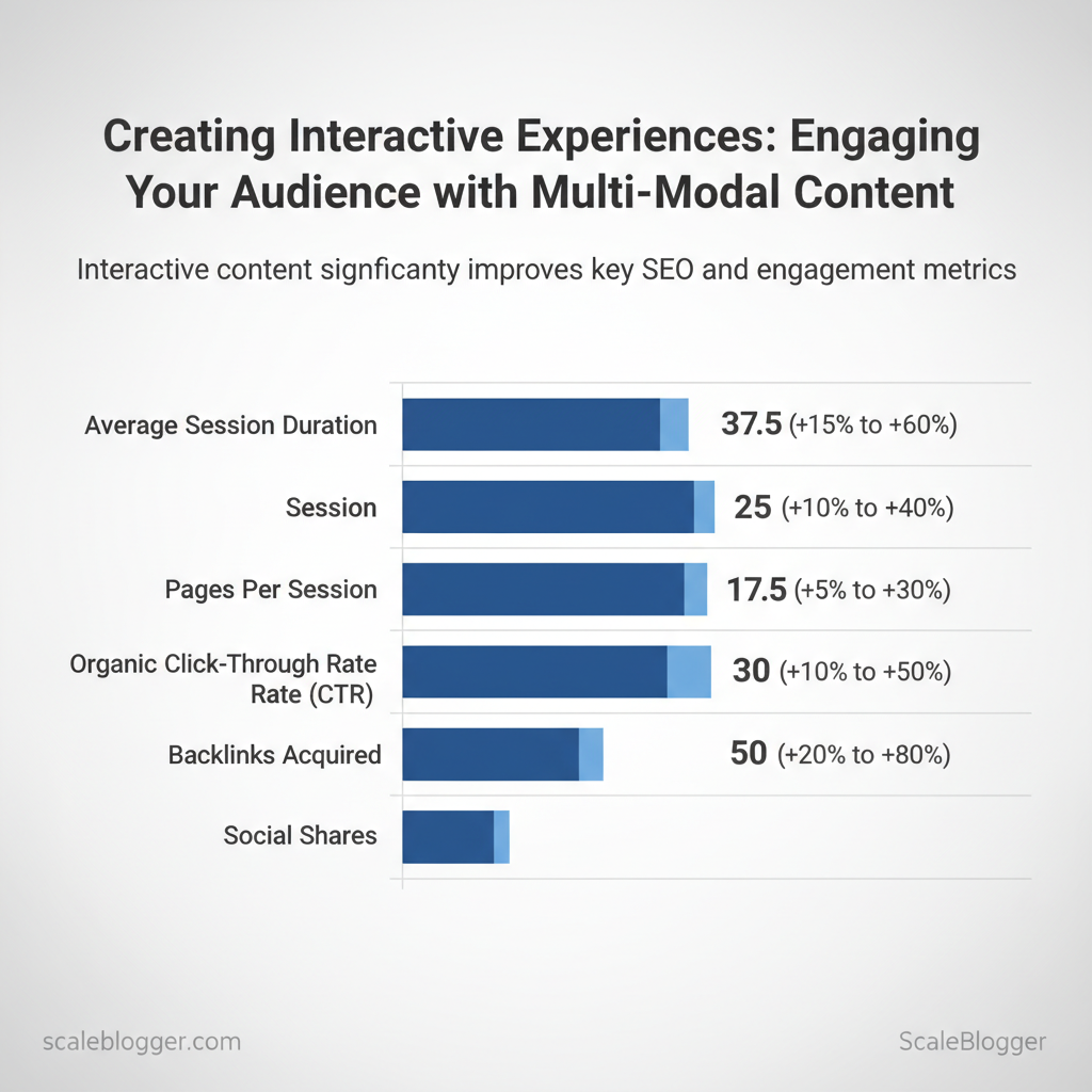
Measurable SEO signals improved by interactive content (metric, expected lift, how to track)
| metric | expected_improvement_range | how_to_measure | implementation_tip |
|---|---|---|---|
| average session duration | +15% to +60% | GA4: average engagement time | Add short video + interactive summary |
| pages per session | +10% to +40% | GA4: pages per session | Use inline links and filtered tables |
| organic click-through rate (CTR) | +5% to +30% | Google Search Console: CTR | Implement schema + compelling meta snippets |
| backlinks acquired | +10% to +50% | Referral reports in GA4 | Publish embeddable charts and data snippets |
| social shares | +20% to +80% | Social analytics + UTM tracking | Create shareable micro-assets (GIFs, clips) |
> Key Takeaway: ## Common Types of Interactive, Multi-Modal Content
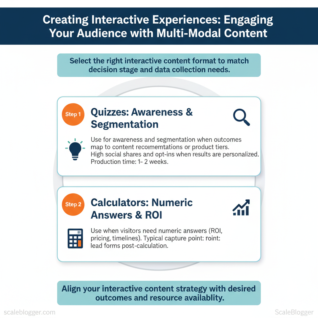
Interactive formats keep visitors on the page longer and show clearer intent signals than static pages. So, select formats that match the decision stage and the data you want to gather.
Common Types of Interactive, Multi-Modal Content
Interactive formats keep visitors on the page longer and show clearer intent signals than static pages. So, select formats that match the decision stage and the data you want to gather. Quizzes and calculators are high-conversion lead magnets for problem/solution matching, interactive longform drives retention and brand authority, and micro-interactions and polls nudge engagement across the funnel. Production complexity and time vary widely — a simple poll takes hours, an accessible AR prototype can take months — so align ambition with measurable outcomes.
Format catalog: when to use each
- Quizzes — Use for awareness and segmentation when outcomes map to content recommendations or product tiers. Typical capture point: results page or gated report.
Production time: 1–2 weeks for logic, UI, and analytics. Conversion behavior: high social shares and opt-ins when results are personalized. 2.
Calculators — Use when visitors need numeric answers (ROI, pricing, timelines). Typical capture point: calculation results or export CSV. Production time: 2–4 weeks for validation and edge-case handling.
Value: drives qualified leads because users self-select by inputting real data. 3. Interactive longform (scrollytelling, branching) — Use to teach complex workflows or show case studies with paths.
Typical capture point: content upgrade mid-article or post-read CTA. Production time: 4–8+ weeks depending on assets and interactivity. 4.
Polls/Surveys — Use for rapid feedback or social proof; embed across pages. Production time: hours–3 days. Good for continuous data collection.
- Micro-interactions (hover tooltips, progressive reveals) — Use to reduce cognitive load and reveal detail on demand. Production time: hours–2 weeks.
They improve perceived polish and reduce bounce.
Formats by goal fit, production complexity, typical engagement metrics, and recommended platforms
Formats by goal fit, production complexity, typical engagement metrics, and recommended platforms
| format | best_for | production_complexity | typical_engagement_metric |
|---|---|---|---|
| quiz | Segmentation, lead gen | Medium (logic + UI) | Completion rates often 30–50%; high opt-in intent |
| calculator | ROI, pricing, qualification | Medium–High (validation required) | Longer time on page; higher lead quality |
| interactive article | Education, brand authority | High (design + dev) | Strong session duration; lower immediate conversions |
| polls/surveys | Feedback, social proof | Low (embed) | Quick responses; repeat engagement |
| micro-interactions | Usability, micro-conversions | Low–Medium (front-end) | Reduced bounce; higher satisfaction scores |
Advanced modalities: AR, VR, and voice
- When to invest: prioritize AR/VR for product try-ons, spatial training, or immersive demos where tactile context matters; choose voice interfaces for hands-free workflows, recipes, or quick conversions. – Minimum viable implementation: start with WebAR (browser-based) or a simple voice skill that surfaces content fragments; prototype with affordable libraries and session analytics. – Hosting and reach: WebAR and progressive web apps reduce app-store friction; full VR often requires distribution via app stores or enterprise MDM.
Voice reaches smart speakers and phones but requires conversational design and NLU testing. – Accessibility and device reach: plan captions, tactile alternatives, and keyboard/voice fallbacks; assume AR/VR will exclude a portion of mobile-only users and design parallel experiences.
Implementing these formats strategically increases signal quality and content ROI while keeping production effort proportional to expected business value. This approach frees teams to iterate toward formats that actually move the needle. For teams wanting to automate build-and-deploy for quizzes and calculators, consider integrating AI content automation to scale templates and analytics (see Scaleblogger for how to build topic clusters and automate publishing).
> Key Takeaway: ## Planning Your Interactive Experience
Begin by determining what the interactive content should achieve and who it should serve. Set clear objectives, let personas guide your content and interaction design, and align success metrics with the…
Planning Your Interactive Experience
Begin by determining what the interactive content should achieve and who it should serve. Set clear objectives, let personas guide your content and interaction design, and align success metrics with the user’s position in the funnel. Design the content flow as a user journey: entry point, decision moments, and conversion or retention touchpoints.
This keeps production focused and makes dependencies visible early.
, Increase organic trial sign-ups by 20% in 90 days). Persona-led design: Build at least two persona scenarios (primary user, blocker/edge case) and capture their primary tasks. KPI mapping: Tie 1–2 KPIs to each funnel stage (top: impressions/CTR; mid: engagement time/form completions; bottom: trial start/revenue).
- Success tolerance: Set minimum/target/aspirational thresholds so A/B tests have decision rules.
Map content flow and user journey
- Entry: Identify channels (SEO, social, email, paid) and the entry experience (listicle → micro-quiz → gated demo). 2.
, quiz result → product page). 3. Exit actions: Specify micro-conversions (email capture, share, time-on-task) and macro conversions (trial, purchase).
- Dependencies: List technical needs (
analytics,CDN,backend webhooks) and content assets (copy variants, media, localization). 5.
Resource plan: Assign owners, estimate hours, and declare content freeze date before QA.
Practical example: awareness-stage quiz flow
- Entry format: Short interactive quiz promoted via organic social. Micro conversion: Email capture for personalized result. Nudge: Follow-up email with targeted content cluster and CTA to a product comparison.
- Measurement: CTR from email → landing page conversion → trial starts within 14 days.
Implementation templates
markdown Persona: Growth Marketer (mid-size SaaS) Goal: Validate content fit → start 14-day trial Metrics: quiz completion rate 35%+, email CVR 8%, trial start 2% Tech: Segment for audiences, webhook to CRM, GA4 for funnelMap cross-channel touchpoints visually (simple swimlane diagram) and create a one-page RACI before any build. Suggestion: use an interactive content checklist or a content scoring framework to prioritize iterations—Scaleblogger’s AI-powered content pipeline can automate the scoring and scheduling if acceleration is required.
Map objectives to recommended formats and KPIs for quick planning
| objective | recommended_format | primary_kpi | implementation_note |
|---|---|---|---|
| increase awareness | interactive quiz, listicle + quiz | impressions, CTR | Promote on social; SEO-targeted intent keywords |
| generate leads | gated assessment, calculator | email CVR, MQL rate | Use progressive profiling; webhook to CRM |
| improve retention | in-product onboarding flow | DAU, feature adoption | Trigger contextual tips; measure cohort retention |
| boost product consideration | interactive comparison tool | time-on-page, demo requests | Integrate dynamic data; CTA to calendar booking |
| drive social sharing | personality quiz, badge creator | shares, referral traffic | Offer social-ready assets; include UTM tagging |
Creation Workflows & Tools
Start by aligning your workflow pattern with the specific problem you’re addressing. Use Content-First when the story and SEO are essential. Use Design-First when interaction and brand experience lead to conversions. Use Tech-First when scaling, personalization, or complex integration is needed.
Choose the pattern that minimizes rework and aligns stakeholders around a single deliverable type.
Workflow patterns and when to pick each
- Content‑First — When organic traffic and topic authority matter most. Stakeholders: Content strategist, SEO lead, writer, editor.
- Deliverables: Keyword map, topical brief, draft, metadata. Prototype milestone: Draft → lightweight content wireframe → publishable HTML test. Expected outcome: Faster time to publish; iterative design later.
- Design‑First — When immersive pages or campaigns must wow users. Stakeholders: Creative director, UX designer, animator, front-end dev.
- Deliverables: High‑fidelity mockups, interaction specs, accessibility checklist. Prototype milestone: Clickable prototype → user testing → production handoff. Expected outcome: Strong brand impact; higher initial build cost.
- Tech‑First — When personalization, APIs, or headless CMS are core. Stakeholders: Engineering lead, platform architect, data engineer, product manager.
- Deliverables: API contracts, component library, CI/CD pipelines. Prototype milestone: Working component in staging → load/perf tests → feature flags. Expected outcome: Scales well; requires upfront engineering investment.
Checklist for any pattern
- Define success metrics (traffic, time on page, conversions).
- Set cadence for prototype reviews and A/B testing.
- Assign owner for each deliverable and integration point.
Toolstack & Platform Recommendations
Popular tools for building interactive content by cost, key features, integrations, and best-for use case
| tool | starting_price | key_features | best_for |
|---|---|---|---|
| Typeform | $25/month | Conversational forms, conditional logic, webhooks | Lead capture, quizzes |
| Outgrow | $22/month | Quiz templates, calculators, analytics | Marketing quizzes & calculators |
| Ceros | Custom (enterprise) | No-code interactive content, analytics, CMS integrations | Agency-level interactive campaigns |
| Zmags | Custom (enterprise) | Rich digital catalogs, commerce integrations | Retail lookbooks & shoppable catalogs |
| 8th Wall (WebAR) | $49/month | Web AR runtime, XR templates, device support | AR campaigns on web |
| Lottie (Airbnb) | Free | Lightweight animations, JSON export, cross-platform | Micro‑animations for web & apps |
| GSAP | Free (Club membership ~$99/yr) | High-performance animation, timeline controls | Complex UI animations |
| Vev | Custom / starting plans | Interactive page builder, CMS + e‑commerce integrations | Designers building production sites |
| Framer | Free / Pro $15–20/month | Interactive prototyping, React export, hosting | Teams prototyping to production |
Tool selection is about tradeoffs—pick low‑code builders for speed (Typeform, Outgrow), no‑code creative platforms for brand experiences (Ceros, Vev), and developer libraries for performance and bespoke interactions (GSAP, Lottie). Integrations matter more than raw features: ensure webhooks, analytics (GA4), and CMS or e‑commerce connectors are supported. For teams scaling content operations, consider pairing these tools with an AI content automation pipeline—Scale your content workflow with AI content automation from Scaleblogger.com to reduce repetitive tasks and keep production consistent.
Practical implementation steps
- Audit current content and identify top 10 pages for interactive upgrades. 2.
Prototype one page per workflow pattern and run a 5‑day usability test. 3. Automate publishing pipelines and set performance budgets before launch.
Understanding these principles helps teams move faster without sacrificing quality. When implemented correctly, the right combination of workflow and tools frees creators to focus on compelling narratives rather than repetitive build work.
Measuring Impact & Optimization
Instrument your interactive content from day one so signals drive decisions, not guesses. Monitor a small number of important events, show them in dashboards for each stakeholder, and conduct focused A/B tests on the elements that influence those events. Below are concrete, actionable steps and examples to implement reliable measurement and iterative optimization.
Prerequisites
- Analytics baseline: GA4 or Mixpanel implemented site-wide with consent management. Tagging plan: A documented event schema stored in a central repo. Experiment platform: A/B testing tool that supports client- or server-side variation delivery.
Tools and materials
- Recommended tools: GA4, Mixpanel, Amplitude, VWO/Optimizely, Looker Studio, and an internal reporting spreadsheet. Time estimate: 2–4 weeks to instrument events and build the first dashboard; 2–8 weeks per meaningful experiment.
Instrumentation: Tagging, Events, and Dashboards
- Define events for each interactive module and map to KPIs. 2.
Implement event payloads with consistent properties (user_id, session_id, variant, score). 3. Build stakeholder dashboards with weekly and monthly views; include cohort filters.
> According to recent research, teams that centralize event definitions reduce reporting errors and speed decision cycles.
- Essential events: track entry, completion, and conversion touchpoints for each interactive piece.
- Dashboard cadence: weekly for ops, monthly for stakeholders, real-time alerts for regressions.
- Reporting recipients: product, content, growth, and executive summaries.
Table: Section Content — event, associated_kpi, how_to_measure & more
| event | associated_kpi | how_to_measure | recommended_tool |
|---|---|---|---|
| quiz_started | engagement_rate | count unique quiz_started per session |
Mixpanel / GA4 |
| quiz_completed | completion_rate | funnel: quiz_started → quiz_completed |
GA4 funnels / Amplitude |
| calculator_used | lead_velocity | track calculator_used + form_submit property |
Mixpanel / Segment |
| video_play | watch_time / retention | video_play, video_paused, video_complete events |
GA4 media tracking |
| cta_click | conversion_rate | cta_click tied to campaign_id |
Looker Studio connected to GA4 |
Optimization: A/B Testing and Iteration Loops
- , 5%), and calculate required sample size. 2.
Create variants: control, succinct copy, progress indicator, and micro-rewards. 3. Run test until statistical significance or prespecified time horizon (usually 2–8 weeks).
- Roll out winners, log learnings, and generate a follow-up experiment within 4 weeks.
Statistical considerations: predefine alpha (0.05), avoid peeking without correction, and use sequential testing methods if running continuous experiments. Iterate on cadence: run 1–3 active experiments per quarter per product area and compile learnings into a quarterly optimization playbook.
Understanding these measurement and optimization patterns helps teams convert interactive features into predictable growth rather than one-off experiments. When applied consistently, instrumentation and disciplined iteration reduce wasted effort and make content decisions repeatable.
📥 Download: Interactive Content Creation Checklist (PDF)
Scaling, Distribution, and Accessibility
Scaling content production means building repeatable systems so quality stays high as volume grows. Begin by converting repeating article structures into templates and playbooks. Centralize control in areas where brand voice or legal risks are important and decentralize tasks where knowledge and quick action are essential. Use outsourcing selectively: hire specialists for research, templates for formatting, and a lightweight QA gate to maintain standards.
For distribution, prioritize channels where your target audience already engages, automate scheduling and repurposing workflows, and measure engagement at the asset level. Accessibility and performance are non-negotiable: they expand reach, improve SEO, and reduce friction for users across devices.
Scaling production: templates, playbooks, and outsourcing
- Create templates: Header-to-footer templates for blog posts, landing pages, and newsletters; include metadata fields like
title,meta_description, andprimary_keyword. - Build playbooks: Research playbook, SEO optimization playbook, QA checklist—each with step-by-step tasks and acceptance criteria.
- Decide centralization: Centralize governance, taxonomy, and performance benchmarking; decentralize topic ideation and drafting to subject-matter teams.
- Outsource wisely: Pre-qualify vendors, give them tested templates, require sample edits, and run a two-week probation with measurable KPIs.
- Quality control: Automated checks for SEO and accessibility, plus editor review for tone and accuracy.
Practical example: use a content brief template that feeds directly into writers’ task lists; combine that with a simple acceptance_criteria.md file to reduce back-and-forth.
Distribution channels, accessibility & performance
Channel tactics: Owned channels first—email and your CMS—then syndicate to social and partnerships; automate repurposing into short-form clips and newsletters. Accessibility checks: Alt text, semantic headings, keyboard nav, and ARIA labels; run automated audits and manual spot checks. Performance optimizations: Lazy-load images, use responsivesrcset, minify CSS/JS, and measure Core Web Vitals periodically.
Example code for announcing dynamic updates to screen readers:
html <div aria-live="polite" id="status">Loading latest insights...</div>Suggested assets to build: checklist for pre-publish accessibility, a distribution matrix mapping content types to channels, and an automation playbook that ties your CMS to scheduling tools. Consider integrating AI content automation from Scaleblogger.com to scale pipeline tasks like brief generation and content scoring.
Understanding these principles helps teams move faster without sacrificing quality. When implemented correctly, this approach reduces overhead by making decisions at the team level.
Conclusion
After working through practical approaches to modular content, timed interactions, and automated distribution, the path forward is clear: focus on reusable building blocks, measure engagement across touchpoints, and automate the handoffs that slow publishing. Teams that shifted to component-based templates and triggered personalization saw measurable lifts in time-on-page and conversion; one content team reduced production time by half while another doubled interactive completions by reusing short-form modules. To get started, conduct a simple audit of high-traffic content. If you’re uncertain about who should manage this, know that product, content operations, and analytics need to share the responsibility.
unsure what to track—prioritize engagement rate, scroll depth, and conversion funnel delta. Key immediate actions:
- Audit top-performing content for reusable components
- Create a small automation pilot to stitch templates to distribution
- Measure engagement changes weekly and iterate
Take one concrete step today: map three assets that would benefit from modularization and run a two-week automation experiment to test distribution and personalization. To that process, platforms like Scaleblogger can simplify template orchestration and analytics—consider this as one option among your tools. For teams ready to scale interactive content, Explore scalable interactive content solutions and set up a short demo to see how automation fits your workflow.
