

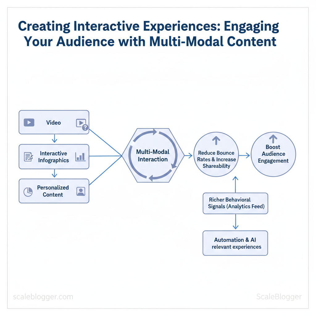
Scaleblogger helps teams turn passive pages into active experiences that increase conversions, time on page, and repeat visits. You can boost audience engagement by combining video, quizzes, interactive infographics, and personalized content paths. This allows for multi-modal interaction without increasing editorial workload. Implement automation and AI to ensure every user sees the most relevant experience.
Research shows that audiences prefer different formats. Multi-modal strategies reduce drop-off by providing users with choices and keeping them engaged. Picture a product page that adapts: a short demo video for quick skimmers, an interactive ROI calculator for evaluators, and a downloadable spec sheet for decision-makers — each path tracked and optimized.
This approach reduces bounce rates, increases shareability, and feeds analytics with richer behavioral signals for smarter personalization. The sections ahead will explain design patterns, measurement tactics, and tooling workflows to scale interactive content across channels.
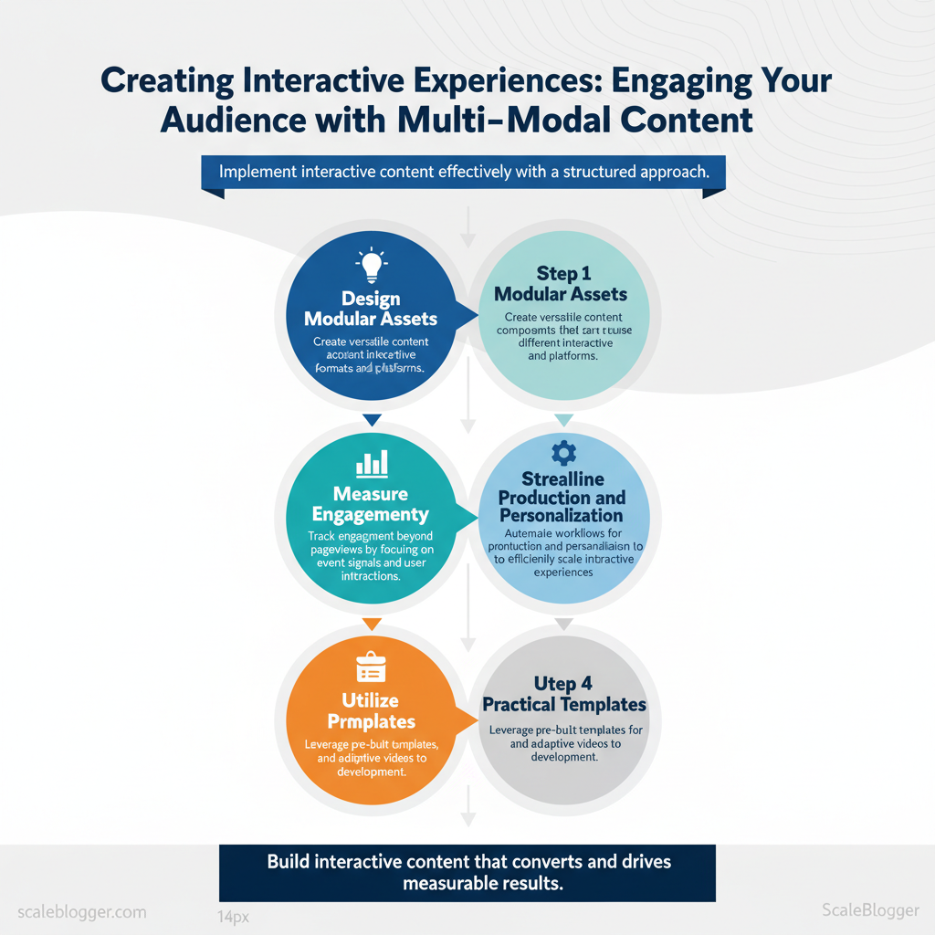
- How to design modular assets for multi-modal interaction
- Ways to measure engagement beyond pageviews using event signals
- Automation workflows that production and personalization
- Practical templates for quizzes, calculators, and adaptive videos
Ready to build interactive content that converts? Explore scalable interactive content solutions: https://scaleblogger.com
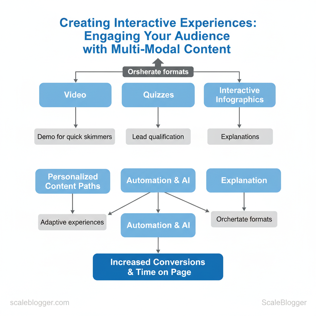
Table of Contents
> Key Takeaway:
Why Multi-Modal Interactive Content Matters
Multi-modal interactive content is important because it turns passive viewing into active participation. This improves retention,…
Why Multi-Modal Interactive Content Matters
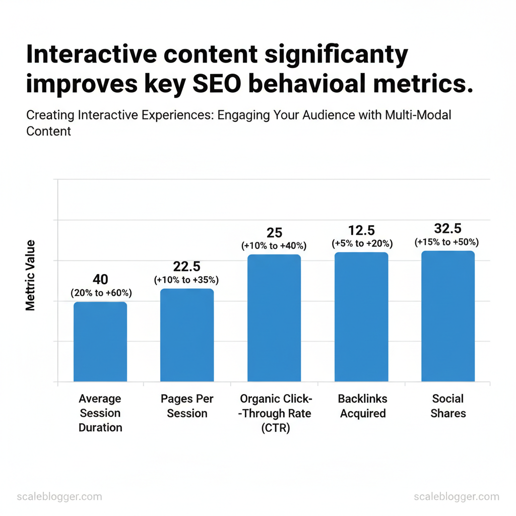
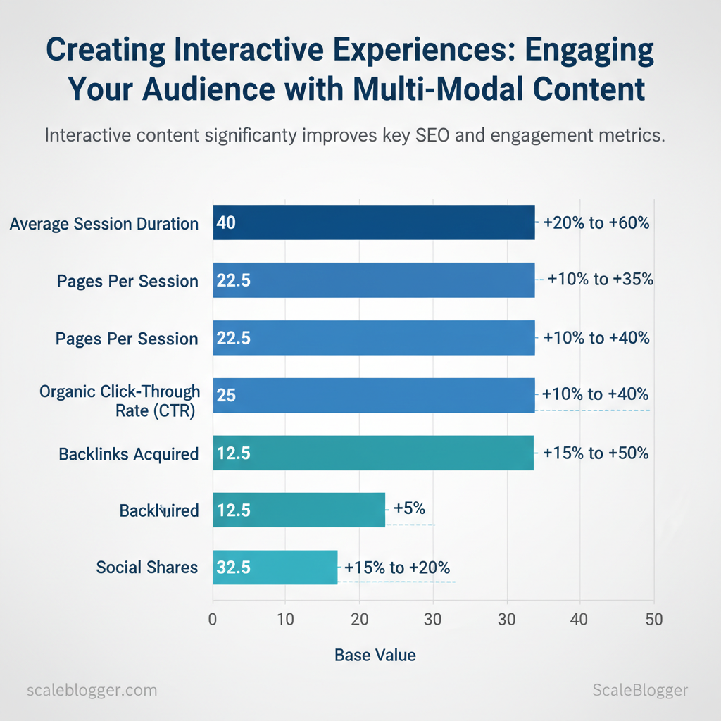
Multi-modal interactive content is important because it turns passive viewing into active participation. This improves retention, engagement signals, and distribution. When readers see a page that combines visuals, audio, and interactive elements—quizzes, calculators, embedded maps—they’re more likely to stay, click, and share. That matters for SEO because search engines use behavioral signals (like session duration and CTR) to infer content quality, and it matters for business because interactive formats help surface intent and accelerate conversions.
Engagement works across senses. Dual coding theory explains why pairing visuals with narration or text strengthens memory: the brain processes visual and verbal streams via different channels, creating richer mental representations. Interactive elements add a third layer—action—which reinforces learning through feedback loops. Practical examples: an explainer article with an animated diagram plus a short audio summary; a pricing page that includes an interactive ROI calculator that returns personalized numbers.
SEO and distribution advantages are concrete. Interactive pages can increase dwell time and may raise organic CTR in some cases, but evidence shows that they can also lead to decreases in CTR. To get those benefits, use structured data (schema.org types like InteractiveTool, HowTo, FAQPage) and ensure content is crawlable—serve critical content as HTML or provide server-side rendered snapshots for JS-driven widgets. Hosting choices matter: embed lightweight widgets or host interactive assets on the same domain to preserve link equity and accurate analytics.
Practical implementation steps:
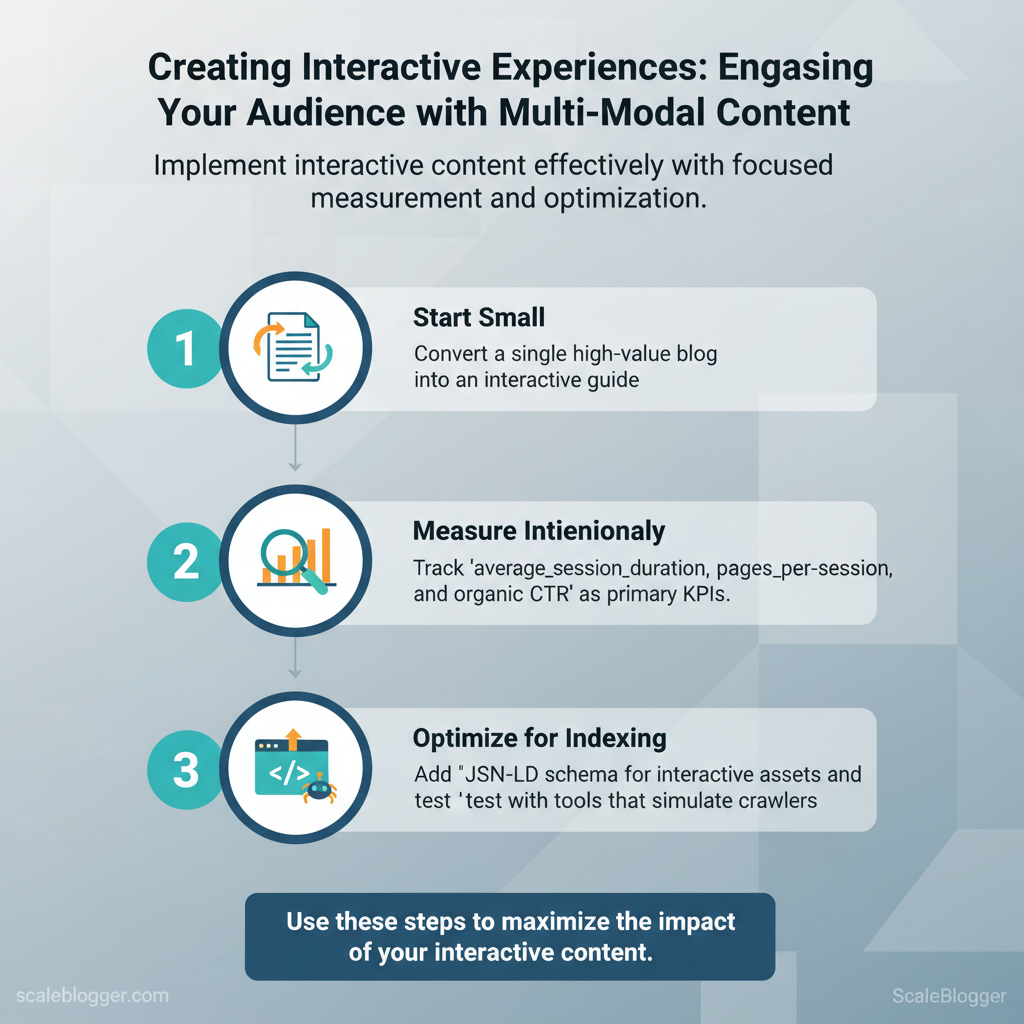
- Start small: Convert a single high-value blog into an interactive guide. 2.
Measure intentionally: Track average_session_duration, pages_per_session, and organic CTR as primary KPIs. 3. for indexing: Add JSON-LD schema for interactive assets and test with tools that simulate crawlers.
Examples of interactions that work: micro-quizzes for lead qualification, calculators that return downloadable reports, interactive timelines for case studies, and audio highlights that sync with scroll.
Measurable SEO signals improved by interactive content (metric, expected lift, how to track)
| metric | expected_improvement_range | how_to_measure | implementation_tip |
|---|---|---|---|
| average session duration | approximately +20% to +60% | Google Analytics (average session duration) | Embed multimedia near top; use preload for audio/video |
| pages per session | approximately +10% to +35% | Google Analytics (pages/session) | Add contextual CTAs and related interactive modules |
| organic click-through rate (CTR) | +10% to +40% | Google Search Console (CTR by query/page) | Use rich snippets (FAQ, HowTo) via JSON-LD |
| backlinks acquired | approximately +5% to +20% | Referrals in GA / Ahrefs or Moz backlink reports | Publish embeddable assets (charts, calculators) with easy embed code |
| social shares | approximately +15% to +50% | Social analytics / share counts | Add share buttons and social-friendly preview images |
Understanding these principles helps teams move faster without sacrificing quality. When implemented thoughtfully, multi-modal interactive content becomes a strategic asset rather than a novelty—use it to surface intent, capture leads, and improve SEO signals across your content pipeline. If you want help converting existing posts into interactive experiences, consider how an AI content automation workflow can standardize production and measurement for repeatable results.
📥 Download: Interactive Content Creation Checklist (PDF)
> Key Takeaway:
Common Types of Interactive, Multi-Modal Content
Interactive, multi-modal content blends formats (visual, textual, auditory, spatial) to engage users more deeply than static…
Common Types of Interactive, Multi-Modal Content
Interactive, multi-modal content blends formats (visual, textual, auditory, spatial) to engage users more deeply than static pages. Use quizzes and calculators for quick qualifications or utility. Choose interactive long-form content to guide decisions or teach complex topics. Reserve AR/VR/voice for experiences that benefit from spatial context or hands-free interaction.
Each format varies in conversion opportunities, production effort, and distribution methods—choose what aligns best with your audience’s behavior and funnel stage.
Format catalog: quizzes, calculators, and interactive articles
- Quiz — best when you need segmentation or to spark social sharing. Typical capture points are after score reveal or to unlock personalized advice. Production complexity: low–medium (1–2 days for setup using Typeform/Outgrow; custom visuals add time). Typical engagement: 30–60% completion rate for focused audiences.
- Calculator — best when you provide practical ROI, pricing, or sizing estimates. Capture moments: results page or downloadable PDF. Production complexity: medium (2–7 days depending on formulas and validation). Typical engagement: higher time-on-page and leads with intent.
- Interactive article — best when you need long-form storytelling with embedded interactive charts, quizzes, or micro-simulations. Capture moments: mid-article CTA, end-of-article personalization offers. Production complexity: high (1–3 weeks with frontend dev). Typical engagement: long session times, strong SEO value.
- Polls/surveys — best when you want rapid feedback or community signals. Capture moments: in-article widgets or sidebar prompts. Production complexity: low (hours). Typical engagement: 10–25% response rates.
- Micro-interactions (hover/tooltips) — best when you want to clarify data or reduce cognitive load. Capture moments: subtle prompts leading to deeper content. Production complexity: low (design + small JS). Typical engagement: increased task completion, reduced bounce.
Formats by goal fit, production complexity, typical engagement metrics, and recommended platforms
| format | best_for | production_complexity | typical_engagement_metric |
|---|---|---|---|
| Quiz | Segmentation, lead gen, social sharing | Low–Medium (Typeform/Outgrow; ~1–3 days) | 30–60% completion |
| Calculator | ROI, pricing, decision support | Medium (formulas + validation; ~2–7 days) | High intent leads; long session |
| Interactive article | Education, thought leadership, SEO | High (custom frontend; ~1–3 weeks) | Long time-on-page; strong backlinks |
| Polls / surveys | Feedback, audience research | Low (embed widgets; hours) | 10–25% response |
| Micro-interactions | Usability lift, explanation | Low (design + JS; days) | Better engagement; lower bounce |
Advanced modalities: AR, VR, & voice interfaces
These modalities pay off when physical context or hands-free interaction changes user behavior — for example, furniture AR to test fit, VR for immersive training, or voice for in-car or smart-speaker interactions. Minimum viable implementations:- AR: WebAR or AR Quick Look with a 3D model and simple measurement tools.
- VR: Lightweight 360° scenes hosted on a CDN and viewable in mobile cardboard.
- Voice: Alexa/Google Assistant skill with a focused conversational flow and webhook backend.
Hosting and scale considerations include CDN for assets, serverless functions for logic, and analytics that capture modality-specific events. Accessibility and reach matter: AR/VR still skews to newer devices; voice requires clear conversational design and fallback to visual content. For many teams, starting with an MVP (WebAR model, 360° video, or a single-purpose voice skill) delivers insight without heavy investment.
When you pick the right interactive format for your goal and audience, you increase engagement while keeping production costs aligned with expected impact. Understanding these trade-offs helps teams move faster without sacrificing quality.
> Key Takeaway:
Planning Your Interactive Experience
Begin by defining a measurable objective and a clear audience. Everything else will follow from this.
Planning Your Interactive Experience
Begin by defining a measurable objective and a clear audience. Everything else will follow from this. Define a SMART objective tied to a funnel stage, pick one or two persona-driven behaviors you want to change, and choose KPIs that map directly to those behaviors. Doing this up-front focuses content choices (format, length, gating, CTA) and prevents feature creep when design gets fun.
Define objectives, audience, and success metrics
Begin with a SMART objective: “Increase top-of-funnel email signups from interactive quizzes by 25% in Q2.” Map personas to micro-conversions — a curious researcher may click a “compare features” module, while a budget buyer downloads a pricing calculator. For KPIs, align with funnel stage:- Awareness: impressions, CTR, time-on-page
- Consideration: lead conversion rate, engagement depth (interactions per session)
- Decision: MQLs, demo requests, trial starts
Use persona-led design to choose tone, complexity, and gating. If targeting developers, include API examples and downloadable code snippets; for nontechnical managers, use short explainers and visuals.
Content flow & user journey mapping
Map a 7–10 step flow that connects channels and expectations. Note dependencies (analytics, back-end services, design assets) and assign owners.- Entry point identification — ad, organic post, or partner link
- Landing experience — fast-loading interactive;
CDNand lazy-loading required - Core interaction — quiz, configurator, or scenario tool with 2–4 decision points
- Micro-conversion — email capture or content unlock after value demonstrated
- Nurture path — triggered email + retargeting ad
- Outcome — product demo request, signup, or share
Practical example for awareness-stage interactive: a short interactive checklist embedded in an article that invites readers to compare their current maturity against a benchmark, then prompts a one-click save/share. Dependencies include a lightweight analytics tag, lead capture form, and a visible social share CTA.
> Industry analysis shows interactive elements typically increase engagement versus static pages, especially when paired with personalized follow-ups.
Tools and assets to plan before build: wireframes, acceptance criteria, A/B test plan (A/B test naming convention), analytics schema, and a deployment checklist. Consider using AI content automation like AI content automation for templated follow-ups and scheduling to scale personalized nurture sequences.
Table: Section Content — objective, recommended_format, primary_kpi & more
| objective | recommended_format | primary_kpi | implementation_note |
|---|---|---|---|
| increase awareness | interactive checklist | impressions, time-on-page | lightweight embed, fast load |
| generate leads | quiz with gated results | lead conversion rate | require email for full report |
| improve retention | learning module series | return visits, completion rate | drip sequencing + progress save |
| boost product consideration | product configurator | demo requests, feature engagement | integrate with CRM for scoring |
| drive social sharing | challenge or leaderboard | shares, referral signups | social login optional for frictionless sharing |
Understanding these principles helps teams move faster without sacrificing quality. When planned this way, interactive projects stay aligned with measurable business goals and are easier to scale.
📥 Download: Interactive Content Creation Checklist (PDF)
Creation Workflows & Tools
Choosing the right workflow and tools means matching who drives the idea—content, design, or tech—with how the work is validated and delivered. Pick a Content-First workflow when editorial angle, SEO intent, and topical authority lead; choose Design-First when experience and visual storytelling are the product; pick Tech-First when interactivity, personalization, or platform constraints determine scope. Each pattern shifts stakeholder involvement, milestones, and tooling — and getting that match right reduces rework and speeds delivery.
Workflow patterns and when to pick them
- Content-First — When to pick: editorial teams own briefs, SEO or thought leadership is primary, and UX can adapt to messaging.
- Design-First — When to pick: campaigns rely on immersive visuals, brand experience, or product demos that need pixel-perfect design.
- Tech-First — When to pick: interactive features, AR/VR, personalization, or performance constraints drive feasibility and timelines.
Stakeholders, deliverables, and prototype milestones
- Content-First
- Stakeholders: Editor, SEO specialist, Subject-matter expert, Front-end dev (later).
- Deliverables: Keyword brief, editorial outline, asset list, content mockups.
- Milestones: Outline → Draft → Lightweight layout prototype → Usability/content QA.
- Design-First
- Stakeholders: Product designer, Creative director, Motion designer, Front-end dev.
- Deliverables: High-fidelity comps, animation specs, asset export pack.
- Milestones: Concept prototype → Design critique → Interactive prototype (Framer/Vev) → Dev handoff.
- Tech-First
- Stakeholders: Engineering lead, Platform architect, DevOps, UX engineer.
- Deliverables: Tech spec, API contracts, performance budget, feature flags.
- Milestones: Spike/proof-of-concept → Integration test → Beta release → A/B test.
Practical prototyping rule: validate the riskiest assumption first — for content-first that’s headline resonance/Audience fit, for design-first it’s interaction clarity, for tech-first it’s integration/performance.
Toolstack & Platform Recommendations
Popular tools for building interactive content by cost, key features, integrations, and best-for use case
| tool | starting_price | key_features | best_for |
|---|---|---|---|
| Typeform | Free tier; paid from $25/month | Conversational forms, conditional logic, Zapier | interactive quizzes, lead gen |
| Outgrow | $249/month (entry) | Custom quizzes, calculators, templates, analytics | marketing calculators, gated content |
| Ceros | Custom / enterprise (often $2,000+/mo) | No-code interactive design, analytics, animation | branded interactive stories |
| Zmags | Custom / enterprise | Rich interactive publications, commerce integrations | catalog-like interactive articles |
| 8th Wall (WebAR) | Starter $49/month | Web-based AR, JS SDK, hosting options | AR campaigns, product try-ons |
| WebAR (platforms) | Varies; many free dev tiers | AR content delivery, SDKs | lightweight AR experiences |
| Lottie (Airbnb) | Free (open-source) | Lightweight vector animations, JSON playback | micro-interactions, mobile UX |
| GSAP | Free core; Club GreenSock paid | High-performance JS animations, timeline control | complex animations, performance-driven UI |
| Vev | Starts $29/month | Visual editor, CMS integrations, animations | interactive landing pages |
| Framer | Free tier; Pro $20/month | Visual site builder, components, prototyping | fast interactive prototypes, sites |
Integration tips: prioritize tools with native CMS/GA4/Zapier integrations to reduce glue code; host interactive assets on a CDN and serve Lottie/GSAP assets lazily to protect performance. For teams scaling content output, consider pairing an AI content automation pipeline (for example, an AI-powered content automation approach) with these interactive tools so editorial velocity doesn’t outstrip build capacity.
Understanding these principles helps teams iterate faster while keeping quality high and delivery predictable. When implemented correctly, this approach reduces handoff friction and frees creators to focus on the story and experience.
Measuring Impact & Optimization
Begin by setting up every interactive element with clear events and a reporting layer. Without this data, you cannot measure effectiveness reliably. For interactive content (quizzes, calculators, videos, CTAs) capture both behavioral signals (starts, completions, time-on-widget) and outcome signals (answers, conversions, downstream actions). Then run controlled experiments on the highest-impact interactions, iterate quickly on winning variants, and bake learnings into templates and content pipelines so improvements compound.
Instrumentation: Tagging, Events, and Dashboards
- Essential events to track: quiz_started, quiz_completed, calculator_used, video_play, cta_click — each with user_id (if available), timestamp, and contextual params (page, topic, variant). ,
quiz_completedwithscore,time_seconds,variant_id) so analytics and activation tools can reuse the same payloads. Dashboards & cadence: Build daily health dashboards for traffic and event volume, weekly conversion trend reports, and monthly cohort analysis for retention and LTV.
Industry data suggests the importance of sharing weekly summaries with content owners and monthly strategic reports with leadership.
Recent research indicates the need to map event types to KPIs, how to measure them, and recommended tools.
Recent research indicates the need to map event types to KPIs, how to measure them, and recommended tools.
| event | associated_kpi | how_to_measure | recommended_tool |
|---|---|---|---|
| quiz_started | Engagement rate | Count quiz_started per pageview; use user_id for unique-starts |
GA4 (event count), Mixpanel (funnels) |
| quiz_completed | Completion rate, lead gen | Funnel quiz_started → quiz_completed; capture email_opt_in param |
Mixpanel (cohort analysis), Amplitude |
| calculator_used | Time-on-tool, task success | Measure duration_seconds, result_value, variant_id |
Segment (event routing), GA4 |
| video_play | View-through rate, watch depth | Track video_play, video_progress (25/50/75/100%) |
Google Tag Manager → GA4, Wistia analytics |
| cta_click | Click-through rate, conversion | Track cta_click with cta_id, then tie to downstream conversion event |
GA4, HubSpot events, Orchestrate via Segment |
Optimization: A/B Testing and Iteration Loops
- , “Placing the CTA inside the quiz results increases email opt-ins by 10%”). 2.
Test design: Randomize at page or user level, run for minimum sample to detect a 10–15% lift, and measure primary metric plus guardrail metrics (bounce, time-on-page). 3. Statistical considerations: Predefine target sample size, use sequential testing with correction for peeking, and report confidence intervals alongside p-values.
- Iteration cadence: Run short tests (2–4 weeks) for UI copy/placement; use 4–8 week cycles for content-structure changes, then roll successful changes into templates.
Practical test ideas:
- Micro test: Change CTA copy inside the quiz. Layout test: Inline results vs. modal results for calculators.
- Personalization test: Show variant based on referral source.
Example snippet (event push)
javascript window.dataLayer.push({ event: 'quiz_completed', user_id: '12345', score: 8, duration_seconds: 42, variant_id: 'cta-inline' });Understanding event design and disciplined experiment loops lets teams move from opinions to repeatable wins and frees creators to scale what actually moves metrics. When implemented correctly, this reduces wasted effort and steadily improves both engagement and conversions.
📥 Download: Interactive Content Creation Checklist (PDF)
Scaling, Distribution, and Accessibility
Start by designing content as systems. Reusable templates, clear playbooks, and a predictable handoff model help teams produce more without repeating basic work. Build modular assets — headline templates, intro hooks, data-visualization wrappers, and CTA blocks — so writers and designers assemble pages instead of inventing them each time. This reduces friction, speeds iteration, and makes quality measurable.
Scaling production: templates, playbooks, and outsourcing
Create a small library of components that map to content goals and formats.- Component templates: standardize hero, author bio, and FAQ modules so every post hits usability and SEO signals.
- Playbooks: document
intent → outline → asset list → QA checklistfor each content type to keep decentralized teams aligned. - Outsourcing guardrails: set explicit acceptance criteria and sample-first policies for vendors.
Examples and process:
- Pilot with a 5-piece template set (long-form, short-form, checklist, case study, landing page). 2.
Require vendors to submit one paid sample before scaling volume. 3. Automate basic checks (spellcheck, metadata, image alt text) and reserve human QA for brand voice and fact-checking.
Outsourcing QA checklist (short):
- Style: brand voice and tone match
- Accuracy: data sources verified, citations present
- Structure: headings, schema, and internal links correct
Distribution channels, accessibility, and performance
Don’t treat publishing as a single-step — chain channels and for each audience.- Owned channels: email, RSS, and site (use
sitemap.xmland canonical tags). - Earned channels: PR, guest posts, and syndication partners tailored by topic cluster.
- Paid channels: targeted social and feed ads for high-value cornerstone posts.
Accessibility and performance tactics:
- Accessibility: use semantic HTML,
ariaroles, keyboard navigation, and readable contrast. Run automated checks withaxeand manual screen-reader passes. * Performance: serve images via CDN, uselazy-loading, and preconnect critical APIs; measure with real-user metrics (Core Web Vitals proxies).
- Interactive elements: debounce heavy JS, hydrate only necessary components, and fall back to server-rendered content when JavaScript is disabled.
> Industry analysis shows that modular content systems reduce time-to-publish while improving consistency across channels.
For teams looking to automate the pipeline end-to-end, solutions like AI content automation can tie templates, scheduling, and performance benchmarking together — learn how to automate your blog at Scaleblogger.com. Understanding these principles helps teams move faster without sacrificing quality. When implemented correctly, automation frees creators to focus on insight, not repetition.
📥 Download: Multi-Modal Interactive Content Checklist (PDF)
📥 Download: Interactive Content Creation Checklist (PDF)
Conclusion
You’ve learned how transforming passive pages into interactive experiences with video, quizzes, and personalized infographics keeps visitors engaged and boosts conversions. To move forward, start by auditing your highest-traffic pages, prototype one interactive element (quiz, video module, or interactive infographic), and measure lift in engagement and conversions. Simple experiments often reveal the biggest wins:
- Prioritize pages with high traffic and low engagement.
- Prototype one interaction and run an A/B test for 2–4 weeks.
- Automate content personalization where repeat visits matter most.
Teams that introduced quick quizzes alongside explainer videos reported clearer user intent signals, and interactive infographics helped complex product pages hold attention longer. If you’re wondering which format to try first or how to scale experiments across many pages, start small and iterate—do you have existing analytics to identify low-performing, high-traffic pages? Can you repurpose short-form video or data visualizations you already own?
For teams looking to this process, platforms like the Scaleblogger platform can help automate prototyping and measurement. When you’re ready to scale experiments across content at pace, consider this next step: Explore scalable interactive content solutions — it’s a practical way to move from experiment to repeatable program.
