A page can win on clicks and still lose on signups.
That happens fast when A/B testing touches text, images, and video at the same time.
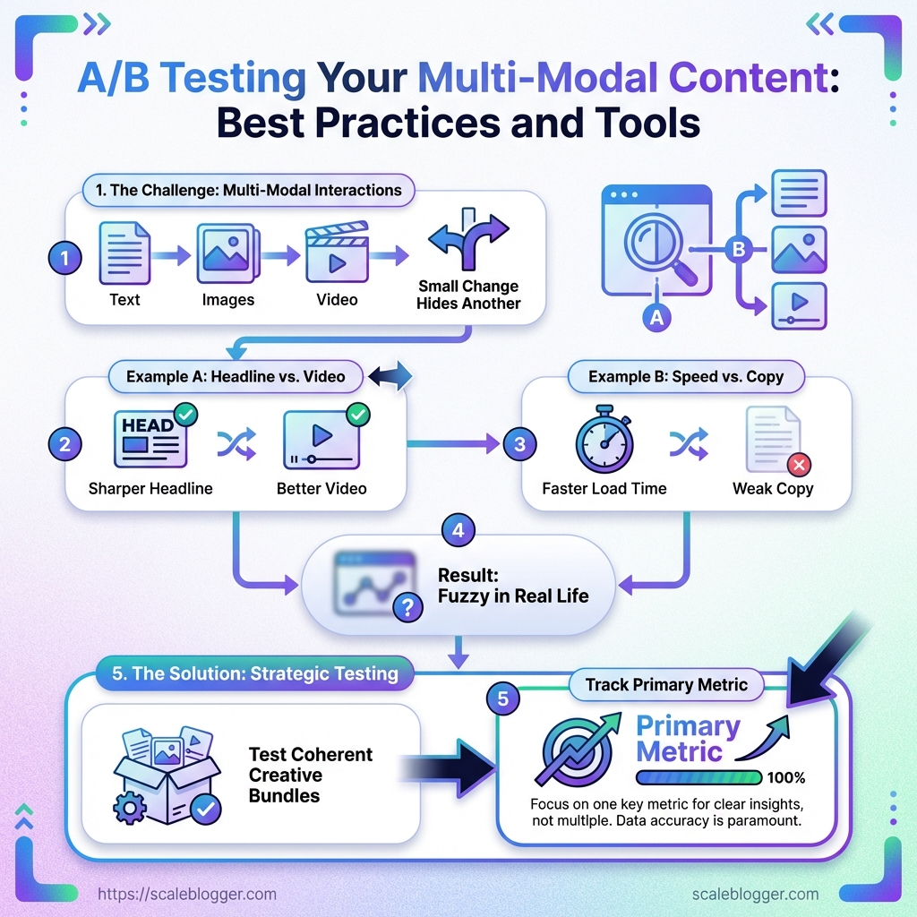
With multi-modal content, one small change can hide another.
A sharper headline may get credit for a better video, or a faster load time may mask weak copy.
That is why content optimization gets messy so quickly.
If the variant changes too many pieces at once, the result looks clear on paper and fuzzy in real life.
The better approach is simple, but not easy: test coherent creative bundles, track one primary metric, and watch the media signals around it.
Good multi-modal content tools make that measurement cleaner, but the thinking still has to be disciplined.
Otherwise, teams end up celebrating a “winner” that only worked because of placement, timing, or performance differences.
And that is how a neat experiment turns into expensive guesswork.
Why Multi-Modal A/B Testing Is Harder Than Standard Content Testing
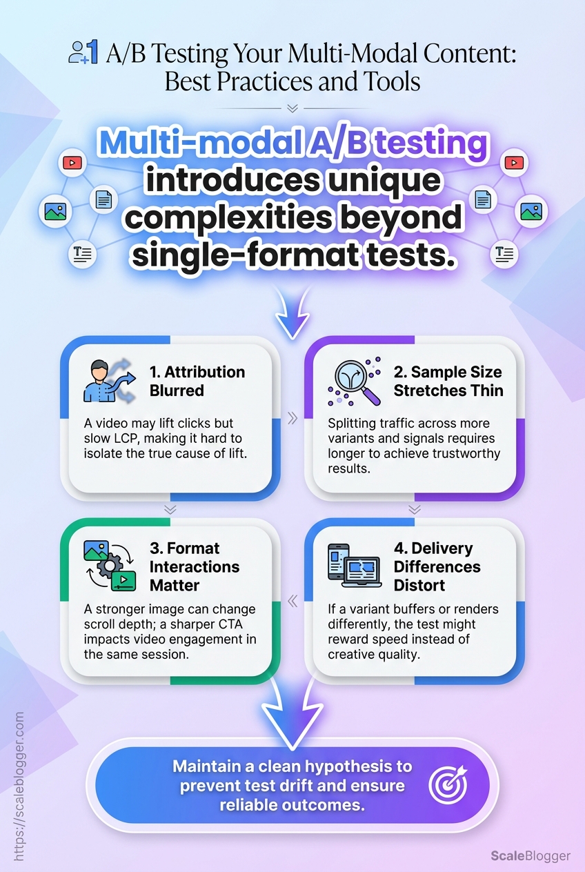
Multi-modal tests break in places single-format tests never touch.
Text, image, video, and layout all move together, so a winning result can hide several causes.
A headline test on a plain landing page is simpler because the variable stays narrow.
Once a page mixes formats, attribution gets messy fast, and content optimization turns into a measurement problem as much as a creative one.
-
Attribution gets blurred. A video may lift clicks, but it may also slow
LCP, so the lift is not really “just content.” -
Sample size stretches thin. Once you split traffic across more variants and more signals, each result takes longer to trust.
-
Format interactions matter. A stronger image can change scroll depth, while a sharper CTA can change video engagement in the same session.
-
Delivery differences distort the read. If one variant buffers or renders differently, the test may reward speed, not creative quality.
A clean hypothesis keeps the whole test from drifting.
It should name the bundled change, the audience, and the outcome you expect, not just the asset you want to swap.
That flowchart shows the path from a plain hypothesis to variant creation, then to measurement and a final decision.
It works as a sanity check, especially when multi-modal content tools and experimentation platforms like Optimizely or VWO are handling the test setup.
The best hypotheses are specific enough to fail. “A video hero will improve signups” is too loose.
“A short demo video in the hero will raise CTA clicks for returning visitors, even if watch time adds friction for new ones” gives you something real to measure.
It also tells the team which metric matters most, which side effect to watch, and when the test should end.
The harder the format mix, the more discipline the test needs.
Tight hypotheses and clean instrumentation are what keep multi-modal A/B testing from turning into expensive guesswork.
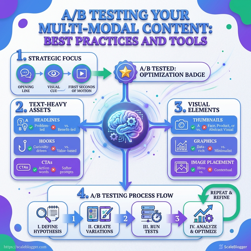
The Best Multi-Modal A/B Testing Use Cases to Prioritize
A dull headline can bury a strong idea in seconds.
That is why the first multi-modal A/B tests should focus on the parts people notice before they think: the opening line, the visual cue, and the first few seconds of motion.
In practice, that means text-heavy assets, thumbnails or graphics, and short-form video intros.
The fastest wins usually come from content that already has traffic or send volume.
A/B testing there gives cleaner data, and the results usually travel well across blog, social, and email.
Tools like Scaleblogger fit neatly into that workflow when variant creation and republishing need to stay organized.
Headlines, hooks, and CTAs on text-heavy assets
A page with strong copy and weak framing is still an uphill climb.
Start with headlines, first paragraphs, and CTA language on blog posts, landing pages, and newsletters.
These are the easiest places to isolate a single logical change, like a sharper promise, a clearer benefit, or a lower-friction CTA.
-
Headline angle: Compare a problem-led headline against a benefit-led one.
-
Hook length: Try a short opening against a more specific, detail-rich hook.
-
CTA wording: Test action words like “Get the checklist” against softer prompts like “See the example.”
When the text is doing most of the work, tiny wording shifts can move the click rate more than a full redesign.
That makes these tests perfect for early-stage content optimization.
Thumbnails, graphics, and image placement
People often blame the copy when the visual simply gets ignored.
Thumbnails, hero graphics, and in-article image placement are worth testing next, especially for social posts and blog content that depends on scroll-stopping appeal.
A simple image swap can change whether someone pauses, clicks, or keeps moving.
-
Thumbnail subject: Face, product, or abstract visual.
-
Graphic style: Clean illustration versus screenshot-style proof.
-
Image placement: Above the fold, mid-article, or near the CTA.
If the content has a strong visual layer, the right test can reveal whether the problem is attention, clarity, or trust.
That matters more than vanity metrics.
Short-form video intros, captions, and pacing
A two-second intro can decide the rest of the watch.
For short-form video, prioritize the opening frame, on-screen caption style, and pacing through the first 10 to 15 seconds.
This is where most drop-off happens, and where multi-modal content tools are most useful for producing clean variant sets.
A practical test might compare a fast hook with a slower setup, then track watch time, replays, and CTA clicks.
Caption density matters too, since some audiences need heavy context while others want the point instantly.
Pick the assets that shape attention first.
That is usually where A/B testing pays back fastest, and it gives you a clearer path for every other content decision after that.
A Practical Framework for Running Reliable A/B Tests
A clean A/B test starts with one decision: what are we actually trying to prove? If the goal is awareness, engagement, or conversion, the test should be built around that single outcome instead of mixing every possible improvement into one messy experiment.
That matters even more with multi-modal content.
A page or email can change in several places at once, so the safest approach is to treat the test as one coherent bundle and measure it with discipline.
1. Choose one variable that matches the business goal
The best tests are boring in a good way.
One change, one reason, one expected result.
If the business goal is conversions, compare a page with a different visual treatment only if the rest of the layout stays stable.
Platforms such as Optimizely, VWO, Adobe Target, and AB Tasty are built for this kind of controlled web experimentation.
For email, Mailchimp A/B testing works best when the creative block being tested is clearly defined and the send process stays consistent.
2. Set success metrics for awareness, engagement, and conversion
A primary metric keeps the test honest.
Secondary metrics show whether the variant improved attention without quietly hurting the rest of the funnel.
For example, a video-led variant might track video_started, video_50%_watched, and CTA clicks, while a static-image version may rely more on scroll depth and conversion completion.
That mix gives you a cleaner read on content optimization instead of guessing from one number.
3. Keep the test clean with controlled traffic, timing, and audience segments
Random assignment only works when the audience and delivery conditions stay comparable.
If one version loads faster, reaches a different segment, or is shown at a different time window, the result can tilt for reasons that have nothing to do with creative quality.
Sticky assignment helps here.
It keeps a visitor from bouncing between versions and seeing contradictory experiences, which is especially useful in multi-modal content tools where images, video, and copy can all shift together.
4. Decide when the result is strong enough to act
A result should earn its way into production, not sneak in by looking good for an afternoon.
The simplest rule is to check the plan before the test starts, then follow it all the way through.
Decision checklist
| Test Stage | Key Check | Why It Matters | Pass/Fail Signal |
|---|---|---|---|
| Hypothesis | One variable only | Prevents mixed signals | Pass if the test isolates a single change |
| Audience setup | Comparable segments | Reduces bias | Pass if traffic sources are balanced |
| Metrics | Primary and secondary metrics defined | Prevents hindsight decisions | Pass if success criteria are written in advance |
| Duration | Enough time for sample size | Avoids false winners | Pass if the test runs long enough to stabilize |
| Decision rule | Clear win threshold | Supports consistent action | Pass if the result meets the threshold |
The table does the heavy lifting here.
If any row fails, the result is still a draft, not a decision.
That kind of discipline saves teams from shipping noisy wins and calling it progress.
Reliable A/B testing is mostly about restraint, and that restraint pays off fast when content starts scaling.
Tools We Recommend for Multi-Modal A/B Testing
The cleanest testing stack is usually the one that makes bad results obvious fast.
If a variant lifts clicks but slows the page, or looks strong in email but falls apart on mobile, the tool stack should surface that without a lot of detective work.
That is why multi-modal content tools need to do three jobs well: measure behavior, manage variant creation, and keep publishing consistent.
Platforms like Optimizely, VWO, Adobe Target, and AB Tasty cover the formal experimentation layer, while workflow tools handle version control and approvals.
AI writing tools belong in the stack too, but only when they speed up variant generation without turning every test into random content.
Tools such as Scaleblogger make more sense when you need many on-brand copy variants, not when you are trying to judge one big creative shift.
What to look for before you commit
The best stacks usually pair one strong experimentation platform with one reliable analytics layer.
That combination makes it easier to separate creative lift from performance noise, which matters a lot when text, image, and video all change at once.
Publishing tools earn their keep when the same team manages multiple variants across channels.
A tidy CMS or content workflow system reduces accidental drift, especially when one version gets edited after another has already gone live.
AI tools should save time, not blur judgment.
If variant generation is slow, a system like Scaleblogger can help create more testable drafts without forcing the team to start from a blank page every time.
The real test is not feature count.
It is whether the stack gives you clean assignment, clean measurement, and a clean handoff from draft to publish.
When those three pieces fit, multi-modal A/B testing stops feeling fragile and starts feeling repeatable.
How to Interpret Results Without Misreading the Data
A variant can win on clicks and still lose the campaign.
That happens when the headline pulls attention, but the page never earns the next action.
Multi-modal A/B testing gets tricky because the signal is spread across layers.
A strong result might come from deeper scrolls, longer video watches, or more CTA clicks, not just a better headline.
In practice, that means reading the result like a chain, not a trophy.
Tools such as Optimizely, VWO, Adobe Target, and AB Tasty can show the experiment result, but the real story sits in the behavior behind it.
-
Start with depth, not just clicks: Check scroll behavior, video completion, image interaction, and form starts before you celebrate a lift in CTR.
-
Look for downstream actions: A winning creative should usually improve the action that matters next, such as signup completion, demo requests, or purchases.
-
Separate significance from value: A statistically clear lift can still be too small to matter if it does not change revenue, leads, or retention.
-
Ask whether the win is contextual: A result may only hold for one audience, device type, or channel, which makes it format-specific rather than broadly better.
That decision tree is useful because it forces a simple question: did the creative win everywhere, or only in one pocket of traffic? A video variant that works on desktop for returning visitors may look weak on mobile first-time users, and both results can be true at once.
The cleanest read comes from slicing the result by audience, device, and entry channel before changing anything.
If the pattern stays consistent across those segments, the format is probably doing real work.
If the lift disappears outside one slice, the audience or context is doing most of the heavy lifting.
A good habit is to keep a small interpretation checklist beside every experiment result:
-
Primary KPI first: Read the main metric before any secondary wins.
-
Behavioral proof next: Confirm that attention moved in the right direction.
-
Business test last: Ask whether the lift changes the outcome that pays the bills.
That keeps content optimization grounded in reality, not excitement.
The best multi-modal content tools help surface the pattern, but the judgment still comes from reading the full path, not the flashy top-line number.
Conclusion
When One Change Changes Everything
In multi-modal testing, the tricky part isn’t that results are noisy—it’s that they’re causal in more than one place at once.
For example: swapping a video hero may increase clicks because the first frame is clearer, but the same change can also shift page performance (rendering/LCP) and timing, which then affects whether users reach the form.
So instead of asking “Did it win?”, ask “What exactly did it move—and what else moved along with it?”
A quick diagnosis loop
- Confirm the primary KPI moved for the right reason. If the primary KPI is conversions, verify the lift is driven by the user journey (e.g., form starts → completion), not just top-of-funnel clicks.
- Check side effects tied to other modalities. If you changed video, review attention measures (video start/50% watched) and page-performance signals. If you changed images, review scroll depth and whether the new visual increases (or reduces) the time to reach the CTA.
- Validate context. If the lift is concentrated in one segment (device, audience type, channel/entry), treat it as a targeting insight, not universal creative proof.
If your workflow is still messy, use tools to keep variants organized and instrumentation consistent—so you can spend time interpreting behavior rather than untangling implementation drift.
Start today with one high-value page and one decision you actually care about: pick one primary KPI, change one modality at a time, and only scale when the win holds up across the behavior signals you set up in advance.
If you need help generating and maintaining clean variant drafts, tools like ScaleBlogger can help you keep creative iteration moving without turning each test into a manual rewrite.
