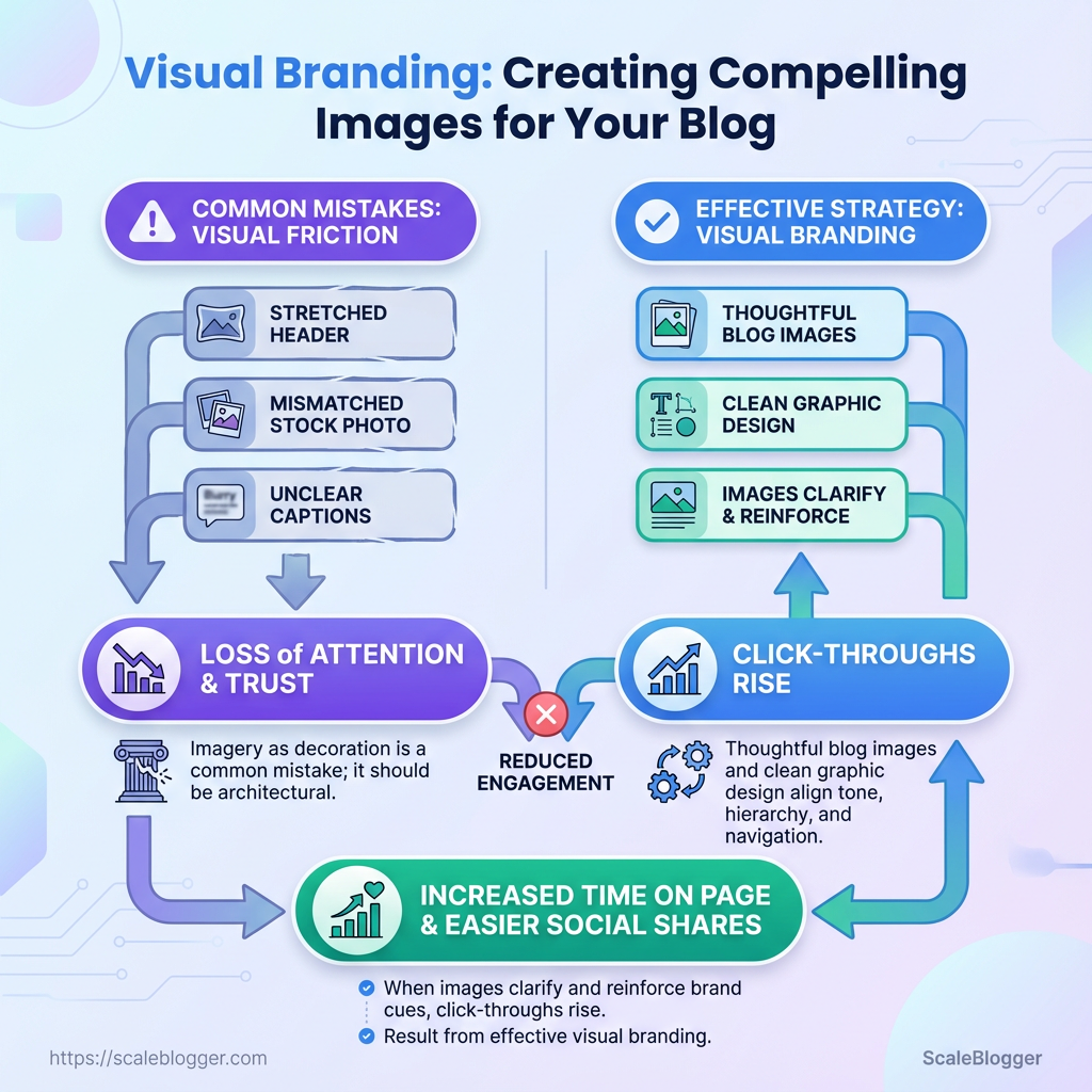
A reader lands on a post with a stretched header, stock photo mismatched to tone, and captions that don’t clarify the point — they scroll past. That small cascade of visual friction costs attention and trust because consistent visual branding is what turns curious visitors into repeat readers. Recognizing which visual choices break immersion is the first lever for more meaningful engagement.
Treating imagery as decoration rather than architecture is the common mistake. Thoughtful blog images and clean graphic design align tone, hierarchy, and navigation so visuals guide reading instead of interrupting it. When images clarify an argument and reinforce brand cues, click-throughs rise, time on page lengthens, and social shares become easier to predict.
What You’ll Need (Prerequisites)
Start by assembling a compact toolkit: the right apps, a consistent asset library, and clear export rules. These prerequisites prevent bottlenecks during production and keep visual branding consistent across posts.
Tools & software inventory: gather design, editing, and asset-management tools so the team knows where to create and where to store final files.
Design pipeline: pick one primary design tool for templates and one lightweight editor for quick image edits.
Asset management: centralize approved logos, fonts, and photo libraries in a shared folder or DAM to avoid version drift.
Core practical points to address before you start Design responsibility: assign a primary owner for templates and a reviewer for final images. Naming conventions: standardize file names like yyyy-mm-dd_topic_featured_v1.jpg. * Storage location: use a cloud folder with version control and clear access permissions.
- Decide the primary design tool and install team licenses.
- Build a shared asset library with logos, color codes, and approved imagery.
- Set export specs and a quick QA checklist (dimensions, alt text, compression).
File formats and export best practices: Featured image: JPG or WebP, 1200px minimum width, 72dpi, sRGB color profile.
Inline graphics / illustrations: PNG for transparency, SVG for scalable vectors, export with optimized compression.
Source files: Save editable masters as .psd, .fig, or .afdesign depending on the tool. Store export-ready copies separately.
Practical tips on image quality and performance: use WebP where supported for smaller file sizes, and run batch compression for older archives before publishing. Maintain two sizes per image — a large (1200–2000px) for social/featured use and a thumbnail (~400px) for cards.
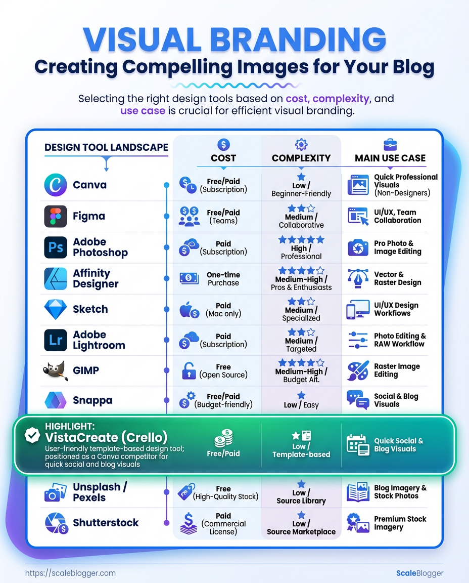
Recommended tools by cost, complexity, best use case, and platform support
| Tool | Best for | Cost | Complexity | Platform |
|---|---|---|---|---|
| Canva | Rapid templates, non-designers | Free; Pro $12.99/mo | Low | Web, macOS, Windows, iOS, Android |
| Figma | UI/templating, collaborative layouts | Free; Professional $12/editor/mo | Medium | Web, macOS, Windows, Linux (via browser) |
| Adobe Photoshop | Pixel-editing, complex retouch | $20.99/mo (Photography plan $9.99/mo w/ Lightroom) | High | macOS, Windows |
| Affinity Designer | One-time purchase vector/raster | $54.99 one-time | Medium | macOS, Windows, iPad |
| Sketch | Mac-first UI and template system | $99/yr | Medium | macOS |
| Adobe Lightroom | Photo edits, color grading | $9.99/mo | Medium | macOS, Windows, iOS, Android |
| GIMP | Free raster editor | Free | Medium-High | macOS, Windows, Linux |
| Snappa | Quick social graphics | Free; Pro $10/mo | Low | Web |
| VistaCreate (Crello) | Social templates alternative | Free; Pro ~$10/mo | Low | Web, iOS, Android |
| Unsplash / Pexels | Free stock photos, editorial use | Free | Low | Web |
| Shutterstock | Premium stock, broad coverage | Plans start ~$29/mo | Low-Medium | Web, macOS, Windows |
Key insight: Choose one primary design tool for templates (Figma or Photoshop) and one quick-edit tool (Canva, Snappa) for non-designers. Free photo sources cover many needs, but premium libraries like Shutterstock fill niche or commercial-license gaps. Maintaining editable source files in a standard format avoids rework and ensures on-brand visuals.
Definitions and assets to prepare before publishing
Brand kit: Include approved logo files, color hex codes, and typography guidelines.
Template masters: Create at least one featured-image template and one social card template.
Image library: Store high-resolution originals (RAW or >2000px) and export-ready copies.
Alt-text guideline: Short descriptive sentence + 1–2 keywords, 100 characters max recommended.
When the prerequisites are in place, the team spends less time fixing assets and more time on content that drives traffic. AI content automation can reduce repetitive tasks in this pipeline and keep visual assets synchronized across posts. This foundational work speeds publication and preserves brand consistency.
Step-by-Step: Define Your Visual Identity
Define the look so every piece of content feels like it came from the same team. Start by gathering emotional cues and practical constraints; then codify decisions so designers and writers make consistent choices without debate. The process below moves from inspiration to a reusable template system that scales.
- Create a Moodboard and Visual Guidelines
- Define Color Palette and Typography
- Create Logo and Clear-Space Rules
- Define Imagery Style and Photo Guidelines
- Create a Reusable Image Template System
Create a Moodboard and Visual Guidelines
Begin with 30–50 inspirational images that capture emotion, composition, and context. Favor images that share lighting, negative space, and subject framing over ones that merely match color.
- How to select images: prioritize emotion and composition; choose images that communicate the brand voice (confident, warm, technical).
- Extract color hexes: sample 5–8 dominant and accent tones, record hex, HSL, and suggested usage (background, text, accent).
- One-page visual guidelines should include: logo lockup, primary/secondary palette, two headline/body fonts, example hero and thumbnail compositions, and dos/don’ts.
Moodboard definition: A curated grid of imagery and color swatches that communicates tone and composition.
Define Color Palette and Typography
Choose palettes with contrast targets and font pairs that work across web and social. Run AA/AAA checks for text-on-background; if a headline fails, increase contrast or add a 20% opaque overlay.
- Contrast & accessibility: aim for AA for body text and AAA for headlines where feasible; use
#hex references in guidelines. - Font pairing rules: use one display font for headlines, one neutral sans for body, and one accent for captions; set web-safe fallbacks and a
font-display: swaprule. - Export & storage: export variable fonts and WOFF2 for web; store source files, license info, and usage examples in a single folder or design system.
Logo and Clear-Space Rules
Export master logo as SVG, provide PNG/JPEG fallbacks, and include a monochrome SVG for constrained uses.
- Clear-space rule: set minimum clear space equal to
1xof the logo height on all sides. - File exports: SVG (vector), PNG 72dpi for web, PNG 300dpi for print, and an optimized favicon (
32×32and16×16). - Minimum sizes: thumbnails ≥
48pxheight; favicons16px×16px.
Logo definition: Primary brand mark with variations and minimum-size guidelines.
Imagery Style and Photo Guidelines
Decide when photography wins and when illustration is better. Photography conveys realism and trust; illustrations support complex ideas and scale easily.
- Color grading: establish a single LUT or overlay (e.g., 10–20% color wash) and document RGB shifts.
- Cropping standards: featured images at
1200×628(landscape), in-post images at800×533, with subject-safe margins of 10%. - When to choose: use custom photography for flagship pages, illustrations for explainers, and AI-generated images for low-cost, fast prototypes.
Create a Reusable Image Template System
Build templates in your design tool with named layers, safe margins, and export presets.
- Template dimensions & safe margins: create
1200×628,1080×1080, and600×900with 8% safe margins. - Naming & version control:
project_assetname_v01and save master templates in a central repository with changelogs. - Export presets: WOFF2 for fonts, JPEG high-quality
80for hero images, WebP70for thumbnails.
This structured approach reduces review cycles and keeps creative decisions consistent as the team scales. When implemented correctly, it speeds execution while preserving brand quality.
Font pairings and when to use each (headlines, body, captions)
| Font Pair | Use Case | Readability | Notes |
|---|---|---|---|
| Montserrat + Inter | Headlines + Body | High | Clean geometric display with readable web body |
| Merriweather + Inter | Serif display + Sans body | High | Good for editorial brands needing gravitas |
| Playfair Display + Roboto | Display + Body | Medium-High | Elegant headlines; check small-caption legibility |
| Pacifico + Lato | Display script + Sans body | Medium | Use sparingly for accents or campaign lockups |
| Source Code Pro + Nunito | Monospace accent + Sans body | High | Technical snippets and data visuals |
| System fallback stacks | Body/system fallback | High | -apple-system, BlinkMacSystemFont, "Segoe UI", Roboto, "Helvetica Neue", Arial |
Key insight: Combine a distinct display face with a neutral sans for body text to keep headlines expressive while ensuring long-form readability; always include system fallback stacks and export WOFF2 for best web performance.
Imagery styles (photography, illustration, mixed) on brand fit, cost, scalability, and production time
| Imagery Style | Brand Fit | Cost per asset | Production Time | Scalability |
|---|---|---|---|---|
| Stock Photography | Broad, neutral | $0–$15 | Minutes | High |
| Custom Photography | Premium, authentic | $200–$1,500 | Days–Weeks | Low–Medium |
| Illustration | Conceptual, flexible | $50–$800 | Days | Medium |
| Iconography | UI clarity, compact | $5–$100 | Hours–Days | High |
| AI-generated images | Fast prototyping | $0.10–$5 | Minutes | Very High |
Key insight: Stock and AI images scale quickly for high output, while custom photography and bespoke illustration deliver distinctive brand value at higher cost and lead time.
For teams managing large editorial pipelines, integrate these guidelines into the design system and link templates directly to publishing templates—this is where automation yields the most operational leverage. Scale your content workflow to enforce export presets and asset versioning across the team.
Step-by-Step: Designing the Image (Creation Workflow)
Start by locking the visual constraints so design decisions are fast and repeatable. Set precise canvas sizes, enable a reliable grid, and embed brand tokens early — that ritual reduces back-and-forth and keeps images consistent across channels.
- Set Up Canvas and Grid
- Create canvases at the exact sizes you need:
1200x628px for featured images,1200x1200or1080x1080for social squares,1200x675for Twitter/Linked previews, and400x280for thumbnails. - Turn on rulers and set guides at 8px or 16px increments to align elements to a consistent baseline grid.
- Add a column grid (3–12 columns depending on layout complexity) and define safe margins: keep critical text inside a 1200px-wide central column or a 80px inset on smaller canvases.
- Apply Brand Colors, Fonts, and Logo
- Create a
ColorsandTypographypage in the project file and add color swatches as design tokens (--brand-500,--accent-300) and font styles as named text styles. - Embed vector logos and link to the source SVG; lock layers or place them in a non-destructive group so accidental moves don’t break exports.
- Do a quick export check: verify fonts are outlined or embedded, color mode is
sRGB, and SVGs maintain vectors. If using a design system, import tokens so updates propagate across files. - Compose Image: Focal Point and Hierarchy
- Place the main subject along rule-of-thirds intersections or use a central safe zone for mobile-first thumbnails.
- Improve legibility with contrast techniques: apply a semi-opaque overlay (
rgba(0,0,0,0.45)) behind light text or use a subtle gradient from image edge toward text. - Use drop shadows sparingly: soft shadow for separation (
Y:6px, Blur:18px, Opacity:18%) or 1px outline for thin type on busy backgrounds. Prioritize simple, high-contrast typography for headings. - Exporting and Optimization for Web
- Use
WebPfor photographs andPNGfor graphics with transparency; keep hero images under ~200–300KB where possible. - Adopt a naming convention:
post-slug__featured_1200x628.webpto make CMS ingest and responsive sourcing predictable. - Automate optimization in CI/CD with
imageminor on upload via CMS plugins; includesrcsetresponsive sizes in HTML.
Templates cut iteration time dramatically; duplicate a master file for each content type so layout, spacing, and export presets travel with the design.
Provide recommended export settings (format, quality, target file size) per image type and use case
| Image Use | Format | Quality/Compression | Target Max File Size | Responsive Sizes |
|---|---|---|---|---|
| Featured image (hero) | WebP | 75% quality (lossy) | 200–300KB | 1920w, 1200w, 800w |
| In-post full width | WebP / JPEG | 70–80% | 150–250KB | 1600w, 1200w, 800w |
| Thumbnail | WebP | 60–70% | 40–60KB | 400w, 200w |
| Social share image | PNG / WebP | 80% (PNG for alpha) | 100–150KB | 1200w, 600w |
| Favicon / tiny icon | PNG / ICO | Lossless small palette | 5–20KB | 16×16, 32×32, 48×48 |
Key insight: Use WebP for general web photos to reduce file size while preserving quality, reserve PNG for transparency needs, and keep hero images under ~300KB for faster load times. Responsive sizes and clear naming conventions ensure the CMS or CDN can serve the right file to each device.
Understanding these conventions speeds production and reduces rework. Teams that lock canvas sizes, brand tokens, and export rules early move faster and ship more consistent blog images—exactly the sort of predictable pipeline that scales with automation and content velocity. For teams looking to automate this flow end-to-end, integrating naming and export rules into the content pipeline yields large time savings.
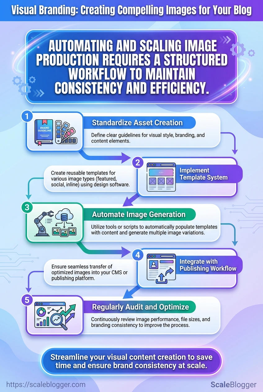
Step-by-Step: Automating and Scaling Image Production
Start by treating image production as a lightweight engineering pipeline: templates, inputs (data/CSV), processing, QA, and publish hooks. That mindset makes automation predictable and recoverable while keeping designers in control.
Step 10 — Batch Processing and Naming Conventions
- Install recommended plugins and tools.
- Adopt a deterministic naming pattern.
Figma: use Figma Tokens plus the Batch Export plugin for grouped slices. Canva: use Canva Teams with Bulk create for CSV-driven variations. Photoshop: add Generator and use Image Processor Pro* or Export As scripts for automated slices.
- Pattern example:
YYYYMMDD_slug_size_variant.ext - Concrete example:
20251201_how-to-scale-images_1200x630_author-jane_v2.jpg - Why it works: embeds date, content slug, pixel size, and version for easy sorting and rollback.
- Validate before full runs.
- Test run: export 10 representative images across sizes and templates first.
- Checks: file integrity, color profile, filename parsing in CMS, and image dimension correctness.
- Tip: automate the test with a small script that verifies file count and dimensions (
identifyfrom ImageMagick is sufficient).
Step 11 — Dynamic Templates Using APIs and CMS Integration
- Decide generation timing.
- On-publish (pre-generate): use when images must be indexed, hosted on CDN, or when SEO requires stable URLs.
- On-request (generate at publish/serve): use for heavy personalization and to save storage when cache-hit rates are high.
- Handle personalization and fallbacks.
- Personalization fields: author, category, date, profile photo. Inject via templating variables.
- Fallbacks: include a
default_assetfield; ifauthor_imagemissing, usedefault_author.png.
- Integration points.
- CMS hooks: run generation on webhooks (publish/unpublish) or via serverless functions.
- API gateway: secure API keys and rate limits; cache outputs at CDN edge.
Dynamic image generation services by API features, cost, latency, and output formats
| Service | API features | Cost Model | Latency | Best Use Case |
|---|---|---|---|---|
| Cloudinary | Transformation API, auto-format, asset management | Pay-as-you-go, free tier | Low (CDN-backed) | Full media pipeline, SEO images |
| Canva API | Template editing, brand kits, export formats | Usage-based, partner tiers | Medium | Brand-managed templates for teams |
| Imgix | On-the-fly transforms, caching, URL-based params | Monthly + bandwidth | Very low (edge) | Real-time resizing + performance |
| Thumbor (open source) | Image resizing, filters, extendable | Self-hosted (infra costs) | Variable (depends on infra) | Cost-controlled, custom filters |
| Custom Lambda functions | Fully custom transforms, integrate ML steps | Pay-per-execution (AWS Lambda) | Medium-low | Custom pipelines, proprietary processing |
Key insight: choose CDN-backed, edge-transform services for latency-sensitive sites; pick self-hosted or Lambda when customization and cost control matter.
Step 12 — QA and Version Control
- Automate basic QA.
- Automated checks: filename regex, pixel dimensions, color profile, and perceptual hash duplicates.
- Tooling: CI step using ImageMagick +
comparefor visual diffs.
- Manual QA and creative review.
- Spot checks: review 5–10% of a batch across templates and devices.
- Design sign-off: keep a simple checklist for contrast, cropping, and brand rules.
- Version tagging and rollback.
- Version tagging: append
v1,v2in filename and add metadata in CMS (image_version: v2). - Rollback strategy: maintain prior 2–3 versions in storage and map CDN to the preferred version via aliasing.
- Document changes.
- Change log: record template changes, affected posts, and deploy timestamps in a shared doc.
- Notify writers/designers: push a short release note when templates change.
Understanding these steps helps engineering and editorial teams move faster without sacrificing brand control or search performance. When implemented, this approach reduces rework and lets creators focus on storytelling rather than repetitive production.
Step-by-Step: Publishing and SEO for Images
Good image publishing starts with practical rules you can repeat across posts so quality and discoverability scale. Describe images clearly, let structured data declare the canonical visual, and make social previews predictable — while keeping load times low and accessibility intact. Below are concrete steps and examples for alt text, file naming, structured data, Open Graph/Twitter Cards, and the accessibility/performance checks that should be part of every publish pass.
Step 13 — Alt Text, File Names, and Structured Data
- Write descriptive alt text for each image, aiming for one concise sentence that conveys function and content.
- Use human-first descriptions: A golden retriever running on a beach at sunset with a red ball in its mouth.
- Avoid keyword stuffing; include keywords only when they naturally describe the image (e.g., author headshot — Jane Doe, product designer).
- Standardize filenames:
yyyy-mm-dd-topic-featured-beach-dog.jpgto support editorial workflows and versioning. - Add structured data to indicate the primary image for a page using
ArticleorNewsArticleschemaimageproperty and includewidth/heightwhere possible.
Alt text best practices: Be specific: Describe the scene and any text in the image. Be functional: Explain purpose for decorative vs. informative images. Be succinct: Keep under ~125 characters for screen-reader usability.
Step 14 — Social Sharing and Open Graph / Twitter Cards
- Recommended OG size: 1200×630 px for Open Graph.
- Recommended Twitter size: 1200×675 px for summary_large_image.
- Ensure correct image selection: Declare
og:image,og:image:width,og:image:height,twitter:card, andtwitter:image. - Test and debug: Use social debuggers to refresh caches and preview shares.
> Use platform debuggers to force cache refreshes after updates so social feeds use the intended preview.
Step 15 — Accessibility and Performance Checks
- WCAG checks: Provide alt text for non-decorative images, ensure contrast for overlaid text, and avoid conveying meaning by color alone.
- Performance budget: Keep total article image payload ≤ 300–400 KB where possible; prioritize one high-quality hero plus compressed in-post variants.
- Responsive images: Implement
srcsetand sizes attributes and useloading="lazy"for offscreen images. - Automation: Integrate image optimization in build (automated resizing, WebP generation, and CDN delivery).
Provide example alt text and file name mappings for common image types to standardize publishing
| Image Type | Filename Example | Alt Text Example | SEO Note |
|---|---|---|---|
| Featured image | 2025-11-15-climate-policy-featured.jpg | Aerial view of city skyline at sunset with captioned policy overlay | Use as og:image; include dimensions |
| In-post photo | 2025-11-15-report-figure1.jpg | Researchers discussing data around a conference table | Descriptive for context and indexing |
| Infographic | 2025-11-15-infographic-emissions.png | Infographic: emissions by sector with annotated percentages | Include transcript and structured data |
| Thumbnail | 2025-11-15-thumb.jpg | Small thumbnail showing article topic icon and title | Optimized small size for listings |
| Author headshot | jane-doe-headshot-400×400.jpg | Headshot of Jane Doe, senior editor | Use author structured data and alt text with role |
Key insight: Consistent filenames and alt text reduce editorial friction and improve accessibility while structured data tells search engines which image represents the page. Standardized dimensions streamline social previews and lower the risk of cropping issues.
Understanding these principles helps teams move faster without sacrificing quality. When implemented correctly, image publishing becomes repeatable, accessible, and search-friendly — freeing creators to focus on storytelling rather than fixing avoidable errors.
Troubleshooting Common Issues
Images that look fine locally but fail in production usually come down to export settings, CMS behavior, or platform caching. Start by confirming the original asset quality and then follow targeted fixes for downscaling, legibility, and social sharing quirks—these steps eliminate 90% of visual-branding problems quickly.
Why images become blurry after upload
- Check the original file on disk.
- Verify export settings: use
PNGfor graphics with text,JPEGat quality 80–90 for photos, orWebPfor a good size/quality tradeoff. - Inspect your CMS image settings and any automatic resizing or CDN transforms.
- Original mismatch: A low-resolution master will always look bad when upscaled.
- Export artifacts: Too-high compression or wrong color profile causes softness.
- CMS downscaling: Many CMSs auto-generate small variants; the template might be linking to a smaller size.
Practical fix: export a 2x or 3x raster (e.g., 1200–2400px wide for hero images), add a srcset with those variants, and prefer WebP where supported. If the CMS strips metadata or downscales, enable preserve original or upload a high-res src and let srcset handle responsive sizes.
Text over image is hard to read
- Contrast test: Place the image behind a 1:3 text sample and check readability on mobile zoom.
- Overlay guidance: Use a semi-opaque overlay—40–60% black for bright images, 30–45% white for dark images.
- Gradient tip: Apply a bottom-to-top gradient when text sits near the lower third to preserve image detail.
On small screens, increase overlay opacity and use a larger, bolder font. If the headline is long, move text off-image or keep a solid background behind text. Use simple contrast checks rather than guessing: view on an actual phone, not just a desktop emulator.
Social platforms pick the wrong image
Social scrapers read specific tags in this order and then cache results. 1. Ensure og:image points to the canonical image and is an absolute URL. 2. Add twitter:card and twitter:image for Twitter. 3. Include a fallback meta image with proper dimensions and aspect ratio.
If the platform shows an old image, clear the cache via the platform’s debugger/validator (for example, Facebook Sharing Debugger or Twitter Card Validator) and re-scrape the URL. When immediate control is needed, append a cache-busting query string to the image URL (e.g., image.jpg?v=20251216) but avoid doing this repeatedly—use it as a last resort.
Fallback meta tag patterns: og:image: https://domain.com/path/hero.webp twitter:card: summary_large_image twitter:image: https://domain.com/path/hero.jpg
Practical asset-management tooling helps. For large programs, centralize images with an automated pipeline that outputs optimized WebP variants and consistent og: metadata. For teams optimizing at scale, consider a production-ready content pipeline like Scale your content workflow to automate exports, srcset generation, and meta tag injection.
Understanding and applying these checks keeps visual branding consistent across pages and platforms, and saves time when diagnosing regressions. When visuals are treated as part of the content pipeline, teams ship better-looking pages with fewer revisions.
📥 Download: Visual Branding Checklist for Blog Images (PDF)
Tips for Success (Pro Tips)
Treat governance and experimentation as core content infrastructure — not optional overhead. Run lightweight A/B tests against clear hypotheses, instrument with simple metrics, and create a one-page governance playbook that keeps content moving while preserving brand and accuracy.
A/B testing ideas and success metrics Start small: Split headlines, meta descriptions, or CTAs to validate resonance before touching body copy. Measure what moves business: Focus on organic CTR, engagement rate (time on page or scroll depth), and conversion rate tied to the content’s goal. * Test cadence: Run tests for a minimum of 2–4 weeks or until statistical significance is reasonable; shorter tests can be useful for fast signals.
Governance model (owners, approvals, versioning)
Owner: Assign a single content owner per topic cluster responsible for accuracy and updates.
Approver: Designate an approvals role for legal or subject-matter review where necessary.
Versioning: Implement content_id + version_number in the CMS and retain a changelog for each public update.
- Create a governance one-pager defining ownership, approval SLAs (e.g., 48 hours), and emergency rollback paths.
- Map responsibilities to roles — creator, editor, approver, publisher — and document them in the CMS profile.
- Add automated version tags and a visible
last-reviewedfield on every live page.
Training and onboarding quick wins Micro-trainings: Publish three 15-minute recorded sessions: content brief standards, A/B testing basics, and governance workflow. Starter templates: Provide headline, meta, and subhead templates that match brand voice. * Shadow reviews: Pair new writers with a reviewer for the first three pieces to accelerate quality alignment.
Practical examples and signals Editorial experiment: Swapping long-form introduction for a concise value-first intro increased average time on page in multiple tests. Governance win: Setting a 48-hour legal SLA reduced publish delays by 30% without adding approvals.
> Market teams that automate routine checks and keep decisions close to content owners ship updates faster and maintain brand consistency.
Consider using an AI-assisted pipeline to automate tagging, versioning, and simple QA checks — for example, integrating tools that flag broken links or inconsistent tone. When implemented pragmatically, these practices reduce rework and let teams focus on higher-value storytelling. Understanding these principles helps teams move faster without sacrificing quality.
Conclusion
Fixing the tiny visual frictions that make readers bounce — a stretched header, a mismatched stock photo, or captions that don’t clarify — pays off. Reinforce your visual branding by standardizing templates, refining color and typography choices, and creating a predictable image workflow that ties directly to SEO for blog images. When automation is introduced thoughtfully, teams cut production time and increase click-through rates; for example, publishers who templated thumbnails and automated alt-text generation saw measurable uplifts in engagement. If you’re not a designer, start with constrained templates and clear briefs; if you worry automation will look generic, add simple human checkpoints to preserve tone.
- Standardize templates to save time and protect brand consistency.
- Automate repetitive steps (export sizes, alt text, compression) to scale without sacrificing quality.
- Measure impact on CTR and time-to-publish to justify further automation.
For the next step, map your current image workflow, pick one repeatable asset to template, and run a two-week pilot to compare metrics. To streamline this process, platforms like Streamline your content production with Scaleblogger can automate image and content pipelines while preserving design constraints, which is especially helpful for teams focused on visual branding, blog images, and consistent graphic design. Take that pilot, iterate, and treat image production as an engine for attention rather than a last-minute chore.
