

To engage different audiences, you need more than solid writing.
We must create personalized experiences that meet their various needs.
Each reader has different goals.
A first-time visitor wants guidance.
A returning reader looks for depth.
A buyer-ready reader needs actionable steps.
By using micro-personalization, we can effectively connect with them without making the user journey complicated.
By integrating dynamic CTAs, smart blocks, and optimized reader paths, we sustain the clarity of the message while enhancing the connection with each unique reader persona.
The crux lies in ensuring content relevance; when we provide timely prompts tailored to intent, we foster engagement through trust and understanding.
Quick Answer: Micro-personalization makes each blog post feel relevant to all visitors.
It does this by matching the content on the page to their intent.
First-time readers get orientation, returning readers gain momentum, and buyer-ready readers receive clear next steps.
We can achieve this by using dynamic CTAs, smart content blocks, and reader-path logic.
This way, the right prompt is shown at the right time, boosting engagement and clicks without needing to rewrite the entire article.
Table of Contents
- What problem micro-personalization solves for bloggers
- Build the foundation: reader persona signals, intent, and page context
- Design dynamic CTAs that match intent instead of forcing one conversion path
- Insert smart blocks that change the experience without rewriting the whole article
- Map reader paths so every visitor sees a logical next step
- Measure whether personalization is improving engagement and relevance
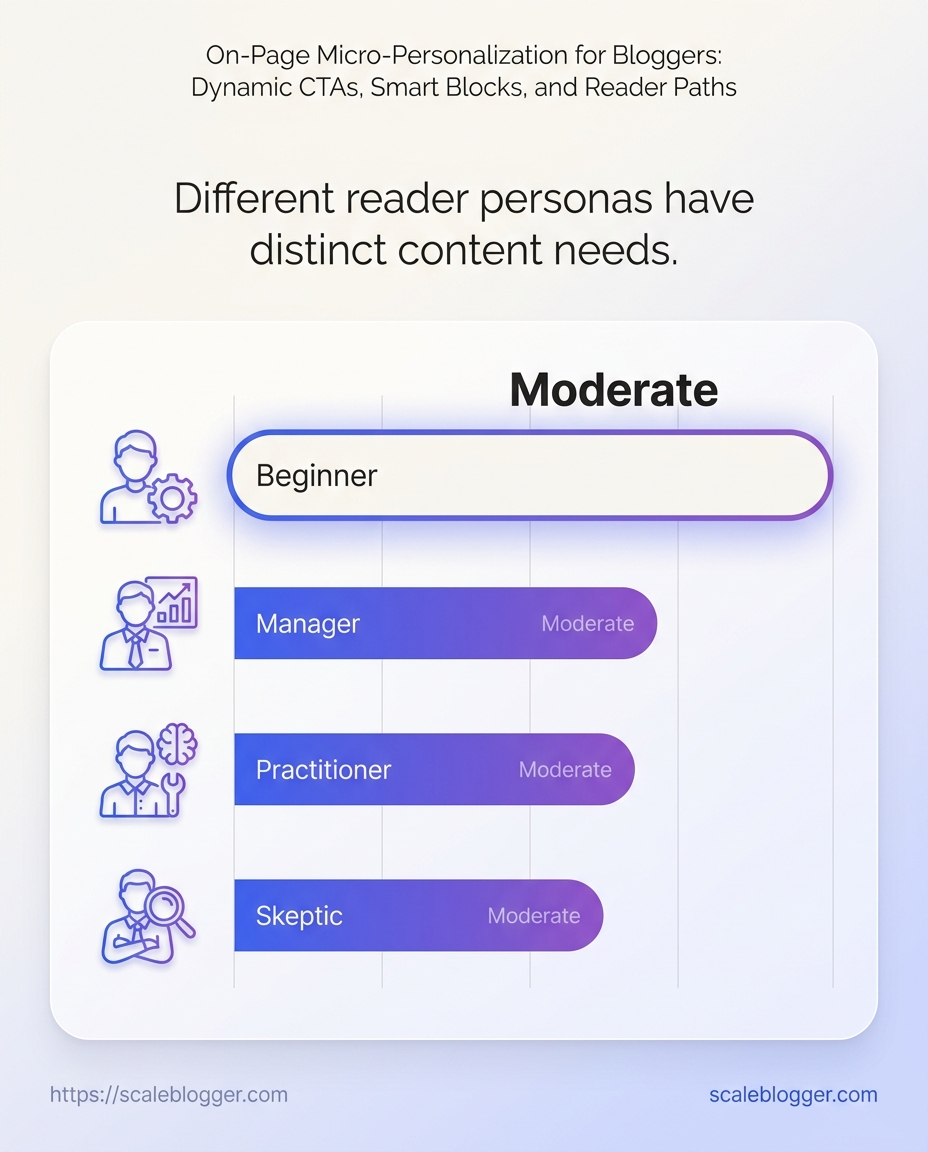
Building the foundation: reader persona signals, intent, and page context
Understanding reader intent is essential.
This is especially true when attracting visitors from comparison keywords or educational queries.
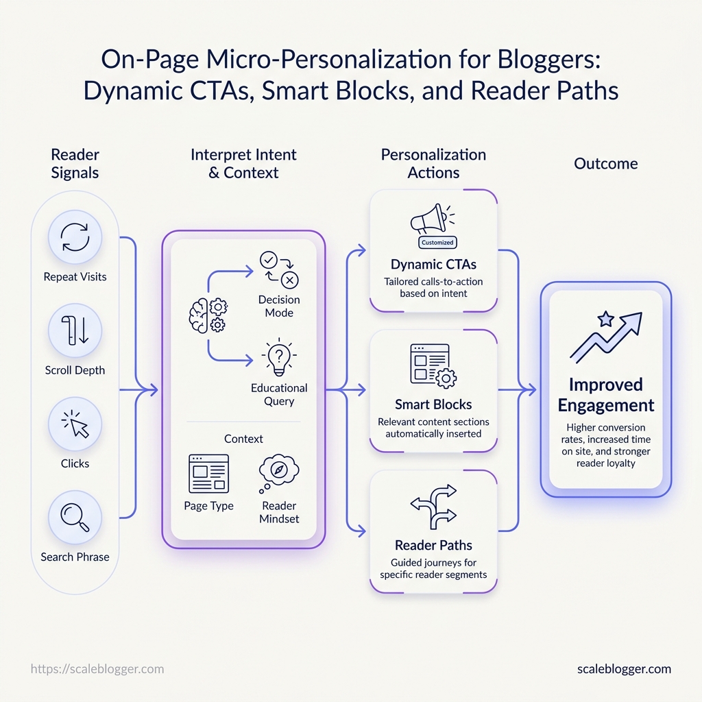
The first step to effective personalization is identifying signals.
We need to know who our visitors are and why they are engaging with our content.
Valuable indicators include scroll depth and click behavior, each hinting at engagement levels.
A simple way to map signals to intent
This systematic approach allows us to prioritize high-intent pages based on user behavior analytics.
By personalizing content with clear intent and keeping generic elements, we maximize engagement.
This approach also preserves clarity.
> **Key Takeaway:** >Design dynamic CTAs that match intent instead of forcing one conversion path
A reader who lands from search is rarely ready for the same ask as a returning subscriber.… >
Design dynamic CTAs that match intent instead of forcing one conversion path
A reader who lands from search is rarely ready for the same ask as a returning subscriber.
One…
Design dynamic CTAs that match intent instead of forcing one conversion path
A reader who lands from search is rarely ready for the same ask as a returning subscriber.
One person wants a better explanation, another wants proof, and a third is already close to action.
A single hard Call to Action (CTA) ignores these differences.
It usually hurts audience engagement.
The better pattern is simple: match the CTA to content relevance and reader persona, then move the reader one step forward.
That means awareness readers see an educational next step, consideration readers see a softer conversion, and action-ready readers get a direct offer.
The trap is overload.
Two competing buttons, three unrelated offers, or a banner that fights the article’s main point all create hesitation.
A clean CTA path keeps attention moving without making the page feel pushy.
CTA types by intent stage
| Intent stage | CTA type | Reader signal | Best placement | Expected outcome |
|---|---|---|---|---|
| Awareness | Educational CTA | New visitor, low time on page | Top or mid-article | More clicks to related content |
| Consideration | Soft conversion CTA | Returning reader, strong scroll depth | After a key insight | Higher email or tool interest |
| Action | Direct conversion CTA | High engagement, repeat visits | End of article or sidebar | More demo, trial, or signup actions |
That is especially true when the reader persona is still forming an opinion.
Here is the do-vs-don’t pattern that keeps the page focused:
Do: keep one primary CTA per page section.
Do: use a softer ask when the article is educational.
Do: repeat the same offer only when the page length justifies it.
Don’t: mix a newsletter signup, demo request, and related post link in the same visual block.
Don’t: place a high-friction CTA above a paragraph that is still building trust.
Don’t: let every button point to a different goal.
A simple example: an awareness-stage post about content relevance should send readers to a related guide, while a comparison post can move them toward a trial or consultation.
That shift respects intent instead of fighting it.
When we build Scaleblogger workflows, the same logic applies to content automation: the call to action should follow the reader’s readiness, not force it.
Keep the path narrow and clear.
The strongest CTA is usually the one that feels obvious after the paragraph above it.
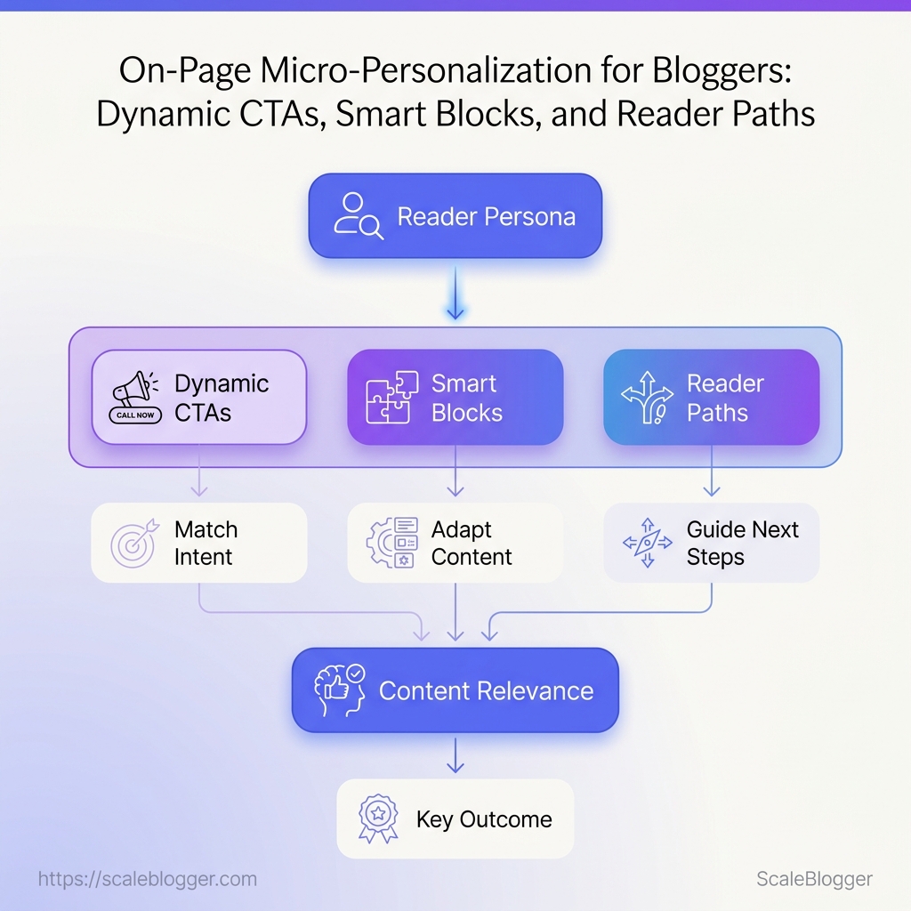
Insert smart blocks that change the experience without rewriting the whole article
The strongest personalization often lives in one block, not the whole page.
A… >
Insert smart blocks that change the experience without rewriting the whole article
The strongest personalization often lives in one block, not the whole page.
A well-placed…
Insert smart blocks that change the experience without rewriting the whole article
The strongest personalization often lives in one block, not the whole page.
A well-placed module can change the reading experience fast, without forcing a full rewrite that slows publishing and muddies the structure.
That matters because content relevance rises when the reader sees the right next step at the right moment.
A beginner, a skimmer, and a technical reader can all stay on the same article while seeing different support.
Choose the right smart block types for bloggers
Not every block deserves to be dynamic.
The best candidates are the ones that change interpretation, reduce friction, or point to the next useful action.
A good rule: if a block helps a reader persona move forward faster, it belongs in the personalization layer.
Contextual resource blocks: Show a checklist, template, or tool only when the page signals a matching need.
Proof blocks: Swap in a case study, benchmark, or example when readers need credibility more than explanation.
Glossary blocks: Surface a plain-English definition for newer readers without interrupting advanced readers.
Next-step blocks: Offer a deeper guide, comparison, or internal link when intent looks strong.
Format blocks: Change a long explanation into a short summary, code sample, or step list for different habits.
A small block can change the whole read
Consider a tutorial on content optimization.
A beginner lands on the article and sees a resource block with a starter checklist.
An experienced marketer lands on the same page and sees a benchmarking template instead.
The main article stays intact, but audience engagement improves because each reader gets a more relevant entry point.
Use this placement framework for long-form tutorials
Map the friction point: Find the place where readers usually stall, skim, or drop.
Match one block to one need: Keep the block narrow.
One job is enough.
Place it near the decision moment: Put it before a hard concept, after a proof point, or before a recommended action.
Write the trigger plainly: Use simple rules like
if reader is beginnerorif page is comparison intent.Measure one outcome: Track clicks, scroll depth, or time on page before changing the block again.
For long tutorials, this approach keeps the article stable while the experience shifts underneath it.
That is usually where the best gains appear.
> **Key Takeaway:** >Map reader paths so every visitor sees a logical next step
A reader lands on a tutorial about keyword research, skims half the page, and then clicks into a deeper guide… >
Map reader paths so every visitor sees a logical next step
A reader lands on a tutorial about keyword research, skims half the page, and then clicks into a deeper guide on search…
Map reader paths so every visitor sees a logical next step
A reader lands on a tutorial about keyword research, skims half the page, and then clicks into a deeper guide on search intent.
That second click matters more than a generic “read more” link, because it matches the reader’s actual goal.
Internal paths work best when they mirror content depth, not just topic similarity.
A beginner should move toward explanation, a returning reader should move toward comparison or proof, and a high-intent reader should move toward action.
More links do not automatically create better audience engagement.
Too many choices can scatter attention, especially when every link points sideways instead of forward.
A tighter path usually wins because it respects the reader’s energy and the page’s main job.
New visitors: Send them to a narrower, more basic page that fills the gaps left by the first article.
A person arriving through search often needs context before they need a tool or offer.
Return visitors: Move them into deeper material that expands the original topic.
They already know the basics, so they respond better to frameworks, comparisons, and examples.
High-intent readers: Guide them to pages that reduce doubt fast, such as pricing, implementation steps, or a strong case study.
These readers do not need more breadth; they need confidence.
A useful way to think about this is a library, not a maze.
Similar books sit near one another, but the next recommendation depends on how far the reader has already gone.
That logic also supports stronger content relevance and a clearer reader persona experience.
One persona wants orientation, another wants depth, and another wants proof that a decision is safe.
When we build path maps, we keep the number of exits small and the purpose of each exit obvious.
That discipline is often the difference between a site that feels busy and a site that feels genuinely useful.
Good path design makes the next click feel inevitable.
It keeps attention moving, without forcing every reader down the same road.
Measure whether personalization is improving engagement and relevance
Sometimes a single button change can shift reader behavior more than a complete rewrite.
That is why personalization should be judged by movement, not by taste.
A page might seem smart but still fail to engage readers.
If readers do not click, stay, or explore further, then added complexity is unnecessary and does not provide value.
The cleanest measurement stack starts with audience engagement and content relevance together.
Engagement shows whether the experience holds attention; relevance shows whether the reader found the right next step for their reader persona.
Click-through rate on personalized elements: Track whether custom CTAs, modules, or links earn more clicks than the default version.
Engaged time on page: Look for healthier reading time, not just longer sessions caused by confusion or slow load behavior.
Scroll depth to the personalized block: A strong block placed too early or too late can underperform for placement reasons, not message quality.
Next-page quality: Measure whether the next click leads to deeper topic coverage, not just any click.
Exit rate after the personalized element: A sharp drop can signal mismatch, especially when the block promises one thing and delivers another.
Repeat visits from the same segment: Returning readers often reveal whether the first personalized experience felt useful enough to come back.
A useful test plan keeps variables narrow.
Change only one thing at a time, or the result turns into noise.
Start with the CTA.
Test one offer, one label, and one placement against a control version.
Move to smart blocks.
Compare a personalized module against a generic module with the same page position.
Then test path order.
Reorder the follow-on links or recommended articles and check whether readers move into a better sequence.
Hold the segment constant.
Test one reader persona at a time so the result reflects that audience, not a blended average.
Watch for second-order effects.
A higher click rate is weak if it also raises exits or lowers return visits.
This kind of workflow becomes more practical when the content system can score variants, publish them consistently, and compare results across pages.
At Scaleblogger, our AI-assisted pipeline is built to support that loop, so the testing does not stop at one page.
Personalization only earns its keep when the numbers improve together.
Better clicks, better path quality, and better match to intent matter more than a prettier page.
Conclusion
Turn One Post Into the Right Next Step
Micro-personalization works because it turns one article into several relevant experiences.
Readers who arrive with research intent should not see the same CTA as someone comparing options, and that mismatch is where content relevance starts to fade.
When the page reflects the reader persona, audience engagement rises because the content feels written for that moment, not for a generic crowd.
The clearest example was the dynamic CTA approach: one post, different next steps.
A blog article about a problem can present a diagnostic checklist to one visitor and a product demo or deeper guide to another, without rewriting the entire piece.
That keeps the article coherent while making each path feel intentional.
Start with one page today: choose a high-traffic post, define two reader persona signals, and swap in one intent-based CTA or smart block.
Track scroll depth, click-throughs, and return visits for a week.
If the numbers move, expand the pattern; if they do not, the issue is usually the signal, not the content.
What is on-page micro-personalization for bloggers?
On-page micro-personalization for bloggers means adjusting what a visitor sees on a page.
This matches their intent and reader persona, without altering the article’s main message.
It addresses the common problem where the same content lands on every reader even when goals differ, which shows up quickly in audience engagement.
How do dynamic CTAs work based on reader behavior or persona?
Dynamic CTAs show different next-step prompts depending on reader intent and persona rather than forcing one conversion path.
For example, awareness readers see an educational next step, consideration readers see a softer conversion, and action-ready readers get a direct offer—using relevance to move the reader forward while avoiding CTA overload.
What are smart blocks in content personalization and how do you implement them?
Smart blocks are modular sections on a page that change the reading experience by showing different support at the right moment, without rewriting the whole article.
Implementation starts with choosing block types that can alter interpretation or add relevant guidance, then displaying the appropriate version based on signals like repeat visits, scroll depth, clicks on related links, and the search phrase that brought the reader in.
How can I create reader paths on my blog to increase engagement and conversions?
Create reader paths by routing visitors to the next piece of content that matches their current stage and content depth, not just topic similarity.
For instance, a beginner should be guided toward explanation, a returning reader toward comparison or proof, and a high-intent reader toward a direct action step—so internal links reflect how far they’ve progressed (e.g., skimming and clicking deeper guides).
What data do I need to personalize content by audience persona (without being creepy)?
Use practical, non-invasive signals that indicate intent and effort level, such as repeat visits, scroll depth, clicks on related links, and the search phrase that brought the reader to your blog.
These data points let you infer persona and readiness without relying on sensitive personal details, and they keep personalization grounded in content relevance.
