

Marketing teams lose valuable reach when repurposed content is too text-heavy or lacks visuals. Turning blog posts, reports, and webinars into engaging visual content boosts audience interaction, reduces attrition, and enables measurable reuse across various channels. Industry research indicates that audiences prefer eye-catching infographics and multimedia over just plain text. Engagement increases even more when visuals align with platform standards.
A good visual strategy transforms one long-form asset into several impactful touchpoints. These may include social carousels, short videos, slide decks, and data-filled infographics that encourage sharing and clicking. That lift directly affects distribution efficiency, creative throughput, and lead quality for demand teams.
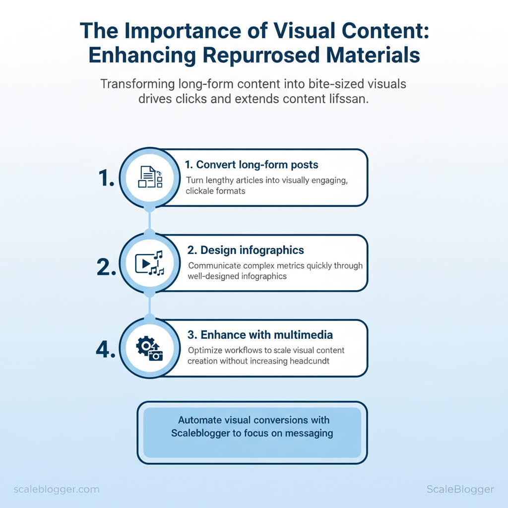
- How to convert long-form posts into bite-sized visuals that drive clicks
- Ways to design
infographicsthat communicate metrics in seconds - Multimedia enhancement tactics that increase content lifespan
- Workflow tweaks to scale visual repurposing without adding headcount
Scaleblogger helps automate these conversions so teams can focus on messaging, not manual assembly. Picture a weekly report automatically generating shareable visuals and short clips ready for scheduling. The next sections show practical steps to build that pipeline, select the right visual formats, and measure impact across channels.
Scale your visual repurposing with Scaleblogger — https://scaleblogger.com
> Key Takeaway: ## Why Visual Content Amplifies Repurposed Materials
Visuals enhance attention, understanding, and memory. They also change audience behavior, leading to more clicks, shares, and higher conversion rates.
Why Visual Content Amplifies Repurposed Materials
Visuals enhance attention, understanding, and memory. They also change audience behavior, leading to more clicks, shares, and higher conversion rates. When changing long-form content into social posts, slide decks, videos, or infographics, including images, charts, and short clips lowers cognitive load. This helps create memory hooks and makes the same idea easy to understand in different formats.
The result: repurposed assets perform not as diluted versions of the original, but as optimized entry points that feed readers back into the funnel.
How that works in practice:
- Attention: Visuals act as cognitive beacons—readers scan and stop on images, bold visuals, and data-driven charts.
- Memory: The picture superiority effect links a concept to an image, increasing recall and making follow-up messaging easier.
- Comprehension: Visual metaphors and labeled diagrams compress complex ideas into a single glance, speeding understanding and reducing churn.
Here are some quick tests you can try
- Create a 60-second explainer video from a 1,500-word post; run an
A/B teston CTR to landing page versus the text-only teaser. 2.
Pull 3 data points into a single infographic and promote as a download—track email opt-ins and share rates. 3. Convert one section into a carousel post with annotated screenshots; measure time-on-post and comments.
> According to Jakob Nielsen, users typically read only about 20% of on-page text, so converting key lines into visuals increases the chance those ideas are actually seen.
Behavioral effects are measurable and repeatable. Visual posts routinely produce higher CTRs and shares, and they shorten the conversion path by clarifying benefits and reducing friction. Teams that standardize simple visual templates for repurposing move faster and keep message consistency intact.
com/blog/insights/industry-benchmarks/” class=”internal-link”>Scaleblogger’s AI-powered content pipeline is one option for automating template generation and scheduling when scaling these tests across multiple topics.
Cognitive outcomes for text-only vs. visual-enhanced repurposed formats
Cognitive outcomes for text-only vs. visual-enhanced repurposed formats
| Metric | Text-only (repurposed) | Visual-enhanced (repurposed) | Practical implication |
|---|---|---|---|
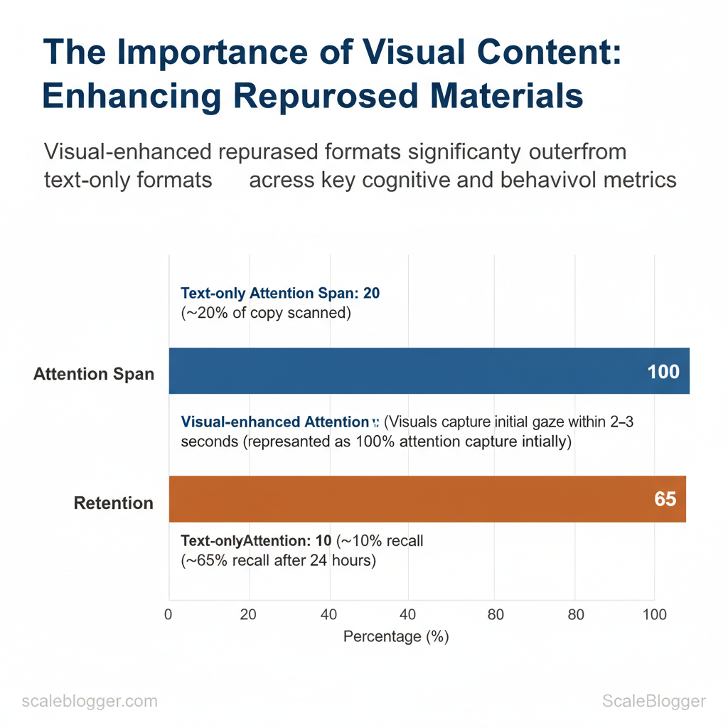
| Attention span | ~20% of copy scanned (scan-first behavior) | Visuals capture initial gaze within 2–3 seconds | Use bold visuals to stop scrollers immediately |
| Retention after 24 hours | ~10% recall typical for standalone text | ~65% recall with image pairing (picture superiority) | Pair headlines with imagery to anchor memory |
| Shareability | Lower—text shares rely on strong headlines | Much higher—visual posts get substantially more shares | Use visuals for social-first distribution |
| Comprehension speed | Slower; needs sequential reading | Faster; diagrams and metaphors convey meaning instantly | Use diagrams for complex processes |
| Call-to-action response | Lower conversion lift without visual cues | Higher conversion lift when visuals show outcome | Show the result, not just the ask |
> Key Takeaway: ## Types of Visual Content for Repurposing
Choose a visual format that matches the source material and the distribution channel. This choice affects production effort, audience attention, and SEO results.
Types of Visual Content for Repurposing
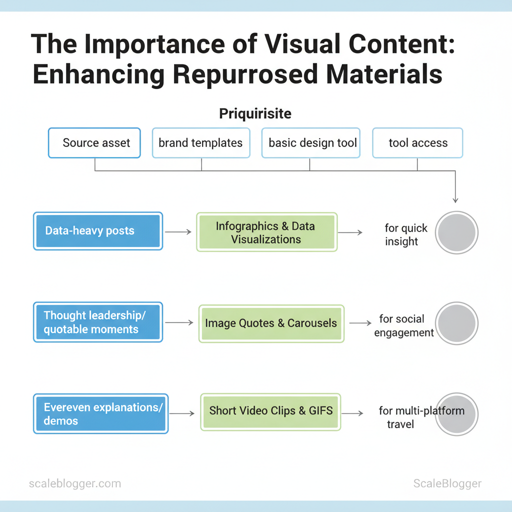
Choose a visual format that matches the source material and the distribution channel. This choice affects production effort, audience attention, and SEO results. For data-heavy posts, prioritize infographics and data visualizations to surface insight quickly. For thought leadership or quotable moments, use image quotes and carousels to boost social engagement.
For evergreen explanations or demos, cut short video clips and GIFs that travel across Reels, Shorts, and Twitter/X.
Prerequisites
- Source asset ready: full blog post, dataset, webinar recording, or transcript.
- Brand templates: color palette, typography, logo variants.
- Basic design tool access: Canva, Adobe, or a visualization tool like Flourish.
Tools and materials
- Design: Canva Pro ($12.99/mo), Adobe Express, Figma
- Visualization: Flourish (free/paid tiers), Datawrapper
- Video editing: CapCut, Descript, Adobe Premiere Rush
- Automation:
Scaleblogger.comfor AI content automation and scheduling
Infographics, data visualizations, and image quotes
- When to choose an infographic vs. image quote
- Infographic: use when the post contains a process, timeline, or multi-step framework that benefits from structured visuals.
Ideal for blog-to-longform social posts. – Image quote: use for single high-impact lines or statistics intended to drive shares and saves on Instagram and LinkedIn. 2.
Speed production
- Templates: keep 3 reusable infographic templates (process, comparison, stat card). – Data pipelines: export tables as CSV, import to Flourish or Datawrapper, then export PNG/SVG. 3.
Data accuracy checklist
- Confirm source: cite original dataset or paragraph. Verify numbers: cross-check calculations, use
=SUM()/=AVERAGE()in the spreadsheet. Label axes: include units and date ranges.
- Accessibility: include alt text and a plain-language caption.
Short videos, GIFs, and interactive elements
- Clip selection criteria: pick the clearest moment that answers a single question, lasts ≤30 seconds, and includes captions in the first three seconds.
- Accessibility: always generate captions and a short transcript; prioritize readable fonts and 16:9 or 9:16 safe zones.
- Interactive reuse: embed small interactive charts on archive pages to re-engage returning visitors and surface new session metrics.
Match visual format to source content and distribution channel
| Visual Format | Best Source Asset | Production Effort | Top Distribution Channels |
|---|---|---|---|
| Infographic | Long-form blog post or how-to | Medium (Canva template, 30–90 min) | Blog, LinkedIn, Pinterest |
| Data visualization | Datasets, research, reports | Medium–High (Flourish/Datawrapper, 1–3 hrs) | Blog embeds, Twitter/X, LinkedIn |
| Image quote | Interviews, key paragraphs | Low (Canva, 5–15 min) | Instagram, LinkedIn, Twitter/X |
| Carousel/slide | Listicles, step-by-steps | Medium (Canva/Figma, 30–90 min) | Instagram, LinkedIn, Facebook |
| Short video clip | Webinars, demos, podcasts | Medium–High (editing, captions, 30–120 min) | Reels, YouTube Shorts, TikTok |
Understanding these formats speeds production and improves distribution outcomes, allowing teams to repurpose more content without losing clarity. When visuals follow the source logic, they scale consistently across channels.
> Key Takeaway: ## Workflow: Turning Existing Assets into Visuals
Start by identifying which assets will move the needle fastest: choose pieces with steady traffic, high engagement, and evergreen value. Audit using a simple scoring model that weights recent…
Workflow: Turning Existing Assets into Visuals
Start by identifying which assets will move the needle fastest: choose pieces with steady traffic, high engagement, and evergreen value. Audit using a simple scoring model that weights recent traffic, on-page engagement (time on page, scroll depth, social shares), and evergreen potential (topic longevity, update frequency). That score drives prioritization so design and production resources focus on outputs that amplify reach and conversions.
- Audit and selection: choosing high-impact candidates
- Gather data from analytics and social insights for each asset.
- Score assets using weighted criteria: Traffic (40%), Engagement (35%), Evergreen (25%).
- Apply thresholds: total score ≥70 = high priority; 50–69 = medium; <50 = low.
- Example use-case: a top-performing how-to post becomes a three-panel infographic series, each panel repurposed as a carousel post and an email visual.
Scoring matrix for selecting repurposing candidates (content audit repurposing, prioritize repurposing)
| Content Title | Traffic (30d) | Engagement Score | Evergreen Score | Total Priority |
|---|---|---|---|---|
| Post A | 8,400 sessions | 78 (time, shares) | 85 (evergreen topic) | 82 (High) |
| Post B | 2,100 sessions | 52 (low shares) | 60 (timely) | 50 (Medium) |
| Webinar X | 1,750 sessions | 88 (Q&A engagement) | 70 (recording useful) | 76 (High) |
| Podcast Y | 900 sessions | 65 (listens, drops) | 55 (timeliness) | 59 (Medium) |
| Whitepaper Z | 420 sessions | 45 (downloads) | 95 (evergreen lead magnet) | 65 (Medium) |
- Production and automation: templates, tools, and handoffs
- Essential templates: infographic master (modular sections), social carousel (5-slide grid), slide-to-video (16:9 storyboard).
- Recommended tools: Figma for design systems, Canva Pro for fast templating, Lumen5 or
ffmpegscripts for quick video exports, and automation via Zapier or Make for asset distribution. - Automation opportunities: auto-generate headline variants from
H2tags, export blog excerpts into slide templates, push final assets to scheduled social posts. - Team handoff checklist (recommended timeline):
- Content owner: deliver approved asset + summary (Day 0).
- Designer: produce first draft using template (Day 2–4).
- Content editor: QA and accessibility check (Day 5).
- Marketing ops: schedule and automate distribution (Day 6–7).
Practical examples include converting a long-form guide into a 6-slide carousel and a 60-second animated clip that drives newsletter signups. Use a single source-of-truth folder and naming conventions to keep iterations low-cost. For teams scaling visuals across dozens of posts, integrating an AI content pipeline or an automation partner like Scaleblogger.com to handle templating and scheduling reduces friction and accelerates throughput.
Understanding how to score and systematize repurposing shortens production cycles and ensures design effort targets the highest-impact content. When done right, visual repurposing moves performance metrics upward while keeping creative overhead predictable.
Design Principles for Effective Repurposed Visuals
Effective repurposed visuals have one clear goal: to communicate an idea quickly and reliably across formats. Establish a visual hierarchy that leads the eye, maintain strong contrast and readable typography so the message survives size and context changes, and design for variability—different languages, captions, and platform crops. This reduces friction when converting a long-form asset into social cards, thumbnails, or embedded images and keeps creative velocity high without redoing layouts each time.
Core rules: hierarchy, contrast, and legibility
- Establish a focal point first. Use scale, color, and placement to make one element dominant so viewers know where to look.
- Enforce contrast minimums. Aim for WCAG AA contrast ratios for text over backgrounds; avoid decorative backgrounds that break legibility at small sizes.
- Use readable type scales. Desktop body at ~16–18px, mobile body no smaller than ~14px; headline weights should be visibly distinct.
- Keep spacing consistent. Use a 4–8–16px spacing system and align to a 4px grid to simplify reflow across crops.
- Design for variable copy length. Localized text often grows by 20–40%; allow flexible text containers and avoid hard line breaks.
Practical example: Create a master template with a pinned headline area and an expand/collapse subtitle block so translations fit without manual tweaks. Use line-height: 1.4 for headlines and 1.6 for body text to preserve legibility when scaled.
> Industry analysis shows that assets with clear hierarchy and optimized contrast retain attention across platforms and reduce rework time.
Localization and accessibility baked in
- Always include meaningful
alttext—describe purpose, not just appearance. - Provide captions for context and indexing.
- Test with longer strings to ensure UI doesn’t truncate crucial content.
- Use semantic export names (
thumbnail_1200x628,card_1080x1080) so automation maps assets correctly.
Example alt template:
"Alt: Infographic summarizing 5-step SEO workflow; highlights step 3: keyword mapping; blue accent."Designers should instrument templates so automation (or services like AI content automation from Scaleblogger.com) can swap copy, reflow layouts, and export accessible variants without manual intervention. When teams adopt these principles, they move faster and preserve clarity across every repurposed visual. This approach reduces back-and-forth between designers and localizers while keeping brand and message consistent.
Design checklist comparing correct vs. incorrect implementations
| Design Principle | Good Example | Common Mistake | Quick Fix |
|---|---|---|---|
| Hierarchy | Large headline, smaller supporting copy, clear CTA | Competing headline sizes, no focal point | Scale headline 1.6x body; add whitespace around CTA |
| Contrast | Dark text on light background; WCAG AA (~4.5:1) | Low-contrast overlays; patterned backgrounds | Increase text weight; apply solid overlay with 60% opacity |
| Typography | System + web fonts, defined scale (16/20/32) | Tiny fonts (<12px) and mixed weights | Standardize scale; set body ≥14px mobile |
| Spacing | 4px grid, consistent padding, balanced margins | Crowded elements, inconsistent gutters | Reapply 4/8/16 spacing; align to grid |
| Color usage | Limited palette, accessible accents, semantic colors | Overuse of decorative colors, unclear meaning | Restrict palette to 4 colors; label semantic tokens |
Distribution Strategies for Visualized Repurposed Content
Begin by matching each visual asset to the platform where it works best. Use short-form videos and single-frame infographics for social feeds, longer visuals and multi-image carousels for owned channels, and optimized static graphics for discovery platforms. Prioritize platform intent—professionals on LinkedIn want actionable charts, Instagram audiences engage with polished visuals and micro-stories, while Pinterest favors step-by-step infographics that continue to drive traffic over months.
Practical playbook and sequencing
- Platform-first selection: map every repurposed visual to a primary platform and two secondary placements.
- Cadence rule: publish the primary placement, then repackage and stagger secondary placements over 2–6 weeks.
- Repackaging cap: create no more than three distinct visual variants per original asset to avoid audience fatigue.
- Prepare assets: export original infographic as
PNGat 1200–1800px for social,1080x1350for Instagram portrait, and PDF for newsletters. - Schedule primary distribution (day 0) on the chosen platform with a CTA tailored to intent.
- Recycle variants on days 7 and 21, changing headline tone and CTA to test conversion differences.
Post copy and CTA templates
language LinkedIn: Lead with a data point → 1-sentence insight → CTA: "Download the one-page summary" Instagram: Hook (emoji) → 2-line micro-story → CTA: "Save this post for later" Email subject: Benefit + number → Preheader: single value prop → CTA button: "Read the full guide"Measurement and iterative optimization
- Primary KPIs: engagement rate, CTR, time on page, email open rate, repins/saves.
- Conversion KPIs: lead signups, content downloads, trial starts.
- Testing cadence: run A/B tests on visuals for 7–14 days with equal traffic splits; test
visual A vs visual BandCTA A vs CTA Bindependently.
A/B test setup checklist
- Define success metric (CTR or signup rate). 2.
Segment traffic equally, control for time-of-day. 3. Run until statistical confidence (minimum 1,000 impressions or comparable expected conversion events).
- Iterate based on lift; fold winners into the next cycle.
> Industry analysis suggests that visual-first posts may increase discoverability and extend content lifespan across channels.
Platform-specific format, ideal visual types, and CTA examples
| Platform | Recommended Visuals | Optimal Size/Length | CTA Example |
|---|---|---|---|
| Data-rich carousel, charts | 1200×628 px, up to 10 slides | “Download one-pager” | |
| Twitter/X | Single-frame GIF, short video (30s) | 1200×675 px, ≤30s | “Read thread” |
| Carousel, Reels (15–60s) | 1080×1350 px / 9:16 for Reels | “Save for later” | |
| Long vertical infographic | 1000×1500–1000×2100 px | “Visit guide” | |
| Email newsletter | Hero image + inline infographic | 600–800 px width, image + PDF link | “View full report” |
Understanding these principles helps teams move faster without sacrificing conversion-focused thinking. When executed across social, email, and owned media, visual repurposing becomes a repeatable growth lever that feeds into the next content cycle and performance benchmarks.
📥 Download: Visual Content Repurposing Checklist (PDF)
Scaling Visual Content: People, Process, and Tools
Scaling visual content requires aligning roles, predictable handoffs, and an automation-minded tool stack so teams produce more without chaos. Centralized teams minimize duplication and protect design quality; distributed teams increase speed and context sensitivity. Choose intentionally based on volume, brand risk, and speed needs.
Team structures and role responsibilities
- Centralized model — Use when brand control matters and volumes are moderate. Pros: Consistent visual standards, easier quality control.
- Cons: Bottleneck risk; higher coordination overhead. Core roles: Design Lead (style system, approvals), Producer (scheduling, briefs), Motion Designer/Illustrator, Data Designer (for infographics), QA (format checks). 2.
Distributed model — Use when teams need fast, localized content. Pros: Faster iteration and domain expertise. Cons: Style drift; duplicated effort.
- Core roles: Content Owner (topic expert), Visual Generalist (templates, rapid production), Template Librarian (governance).
com for AI-driven content workflows and scheduled publishing Two practical automation recipes Files uploaded to CDN; publish scheduled in CMS. 4. Performance metadata sent back to tracking dashboard. Outputs pushed to staging and a Slack approval channel. How Scaleblogger fits: use it to automate content scheduling, produce SEO-aware captions and alt text, and benchmark visual asset performance alongside blog content.
Figma frames to PNG via API.
Zapier detects new files, triggers ffmpeg to build short video variants. 3.
Figma template via plugin.
n8n generates multiple size variants and alt text using GPT prompts. 3.
| Visual Type | Avg Production Time | Estimated Cost (in-house) | Estimated Cost (outsourced) |
|---|---|---|---|
| Infographic (single) | 6–12 hours | $300–$1,000 | $500–$1,500 |
| Short video clip | 8–20 hours | $600–$2,000 | $400–$2,500 |
| Carousel/slide deck | 3–6 hours | $150–$600 | $200–$900 |
| Interactive element | 40–120 hours | $4,000–$12,000 | $5,000–$18,000 |
| Batch image set (10) | 6–15 hours | $350–$1,200 | $300–$1,000 |
Understanding these principles helps teams move faster without sacrificing quality. When implemented correctly, this approach reduces overhead by making decisions at the team level. This is why modern content strategies prioritize automation—it frees creators to focus on high-impact work.
Conclusion
Transforming text-heavy materials into engaging visual assets boosts audience interaction. Focus on visuals that tell a story, create batch templates for consistency, and automate repetitive tasks to increase creative capacity. Teams that turned a single webinar into short social clips and slide carousels reported a noticeable lift in reach and lead interactions; likewise, repurposing high-performing blog posts into short-form video increased on-platform dwell time for another marketing group. Practical steps to start: audit top-performing content, define three visual formats to reuse, and set a weekly batching routine to keep output steady.
- Audit: identify content with high engagement potential
- Formats: choose 2–3 repeatable templates (social clips, carousels, short videos)
- Automate: build a pipeline for export, captioning, and scheduling
Questions about timeline, resources, or design needs fade once priorities are set: most teams see momentum within 4–8 weeks when they focus on a few repeatable formats, and basic templates plus lightweight automation reduce the need for heavy design overhead. To this process, platforms like Scale your visual repurposing with Scaleblogger can automate slicing, captioning, and template application so teams scale faster. Start by selecting one pillar asset to repurpose this week, commit to a two-week batching cadence, and measure engagement to iterate from real results.
