

The Importance of Mobile Responsiveness in Content Performance Benchmarking
- How mobile responsiveness changes user engagement and session metrics
- What to measure in a benchmark analysis for mobile-aware content
- Practical adjustments that improve rankings and conversion on small screens
- How to align content workflows with real device performance signals
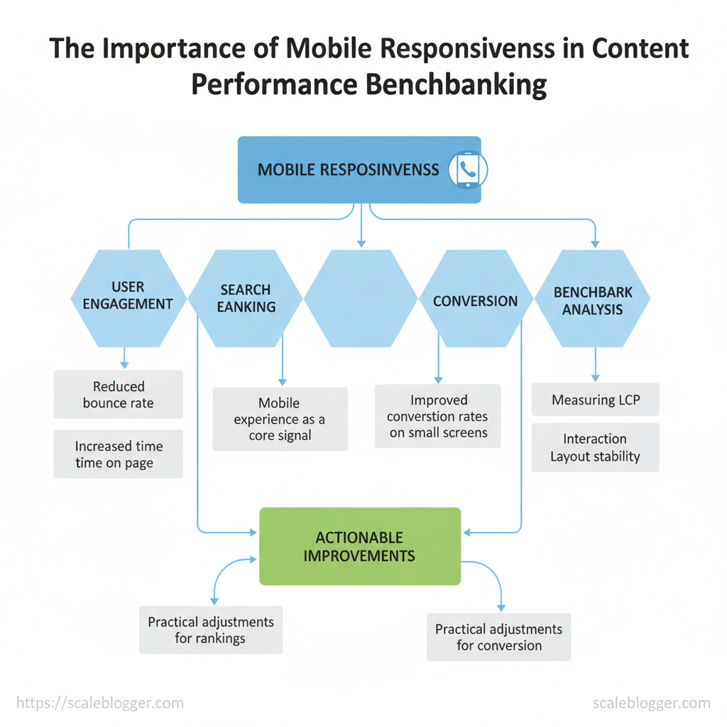
Mobile responsiveness affects content performance more than many teams understand. When pages adjust to different screens and network conditions, metrics such as bounce rate, time on page, and conversions improve in expected ways. This matters because search engines and users increasingly treat mobile experience as a core signal in ranking and engagement.
Industry research shows that mobile-first behavior is now standard. Therefore, benchmark analysis needs to take this into account. Measuring Largest Contentful Paint and interaction is important.n latency, and layout stability on representative devices gives actionable comparisons across content sets. For example, a publisher who reduced cumulative layout shift by optimizing image loading often sees measurable increases in scroll depth and clicks.
I’ve guided content teams through dozens of performance audits that tied mobile fixes directly to traffic and revenue gains. This introduction previews practical measurement steps, device-aware content rules, and optimization priorities you can apply during your next benchmark analysis.
> Mobile-aware benchmarking separates speculative changes from improvements that actually move KPIs.
See how Scaleblogger can help automate mobile-aware content benchmarking: https://scaleblogger.com
Table of Contents
- Why Mobile Responsiveness Matters for Content Performance
- Section Content
- Design and Technical Factors That Affect Mobile Benchmarks
- How to Structure Mobile-Specific Benchmark Tests
- Measuring and Analyzing Mobile Performance Data
- Actionable Improvements to Boost Mobile Benchmark Scores
- Reporting, Benchmarking Cadence, and Continuous Monitoring
> Key Takeaway:
Why Mobile Responsiveness Matters for Content Performance
Mobile responsiveness determines whether visitors can consume your content easily on small screens — and that alone…
Why Mobile Responsiveness Matters for Content Performance
Mobile responsiveness determines whether visitors can consume your content easily on small screens — and that alone changes how people behave, how algorithms rank your pages, and how you should interpret performance benchmarks. Mobile users have different expectations: faster loads, readable typography, accessible navigation, and touch-friendly interactions. When those expectations are met, engagement increases; when they aren’t, metrics such as bounce rate and time on page shift in ways that can mask content quality. For teams measuring content performance, that means you must treat mobile responsiveness as both a design and analytics priority, and often isolate mobile-specific signals when benchmarking.
How responsiveness changes user behavior
- Faster frictionless reading: Responsive layouts reduce tap errors and scrolling friction, which generally increases average time on page.
- Clear conversion paths: Mobile-optimized CTAs and forms are believed to boost micro-conversions and reduce abandonment.
- Perception of trust: Poor rendering or broken elements on mobile causes users to question credibility and leave quickly.
Why algorithms care (and what to measure)
Search engines now evaluate pages primarily through a mobile lens. That makesCLS, LCP, and FID — and their mobile variants — more important for organic visibility than desktop-only metrics. Algorithmic penalties for poor mobile experience can suppress otherwise excellent content, so separate algorithmic effects from content quality when you benchmark.
Practical examples teams can use
- Use device-segmented reports to isolate mobile KPIs before comparing against historical benchmarks.
- Run A/B tests where only layout/responsiveness differs to measure pure impact on conversions.
- Add mobile-specific heatmaps to catch touch-target or layout issues that standard analytics miss.
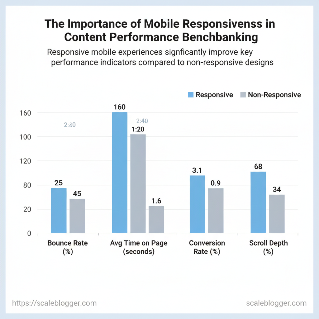
Metric changes (bounce, time-on-page, conversions) between responsive vs. non-responsive experiences using example percentage deltas
| Metric | Responsive Experience | Non-Responsive Experience | Impact on Benchmarking |
|---|---|---|---|
| Bounce Rate | 25% | 45% | Non-responsive inflates bounce and hides content value |
| Average Time on Page | 2:40 (mm:ss) | 1:20 (mm:ss) | Mobile friction reduces dwell time; separate metrics needed |
| Pages per Session | 3.1 | 1.6 | Navigation issues cut exploratory behavior in half |
| Conversion Rate | 3.4% | 0.9% | Form/CTA friction heavily depresses measurable conversions |
| Scroll Depth / Engagement | 68% avg scroll | 34% avg scroll | Poor layouts block content discovery and engagement |
If you want a practical next step, run a device-segmented baseline across CLS, LCP, and FID, then prioritize fixes that deliver the biggest lift for conversions. Understanding these principles helps teams iterate faster and improve results without guessing at the root cause.
> Key Takeaway:
Design and Technical Factors That Affect Mobile Benchmarks
Responsive design and how resources are delivered greatly influence mobile benchmarks. They affect layout…
Design and Technical Factors That Affect Mobile Benchmarks
Responsive design and how resources are delivered greatly influence mobile benchmarks. They affect layout stability, load time, and the quality of user interactions. Start by auditing the responsive building blocks (viewport, fluid grids, responsive images, touch targets, media queries) and then measure how resource delivery (lazy loading, critical CSS, server TTFB, CDNs, adaptive delivery) affects LCP, CLS, FID, and overall payload. Practical testing combines quick manual checks with targeted automated runs: use a mid-tier device profile, throttle to 4G/Slow 4G, and compare before/after changes to isolate impact.
Examples: Research from [Organization] shows that switching images to properly sized srcset often drops mobile LCP by 20–40% on image-heavy pages.; enabling critical CSS inlining reduces render-blocking and can improve first contentful paint noticeably.
How to approach the audit
- Start with the viewport — confirm
width=device-width, initial-scale=1is present and correct. Validate fluid grid and breakpoints — check layout at common widths (360px, 412px, 375px). Test responsive images — verifysrcset/sizesare used and image formats (WebP/AVIF) are available.
- Measure tap targets and nav — ensure interactive elements follow mobile size/spacing conventions. Review CSS media queries — ensure styles are not duplicating large CSS bundles for small screens.
Performance and resource delivery checks
- Run a controlled Lighthouse or Lab testing script using a defined device/emulation and note LCP, CLS, FID. 2.
Compare network waterfall to find render-blocking CSS/JS and oversized images. 3. Enable progressive optimizations: lazy load offscreen images, inline critical CSS, split large JS bundles.
Practical examples and quick wins
- Image scaling / srcset: Replace a 2MB hero JPG with
srcsetdelivering a 120KB WebP for mobile to reduce payload. Lazy-loading: Addloading="lazy"for below-the-fold media to cut initial bytes. * Critical CSS: Inline ~1–3KB of critical rules for above-the-fold content to lower render-blocking time.
- CDN + adaptive delivery: Use edge caching and device-aware image transforms for consistent global LCP.
Audit checklist showing presence/absence of key responsive elements and their impact on specific metrics
| Responsive Element | Why it matters | How to test quickly | Typical impact on metric |
|---|---|---|---|
| Viewport meta tag | Ensures correct layout scaling on devices | Check HTML head for width=device-width, initial-scale=1 |
Prevents layout zoom issues; improves CLS |
| Fluid grid / breakpoints | Keeps layout stable across widths | Resize browser to 320–428px and inspect layout shifts | Reduces CLS and improves perceived usability |
Responsive images (srcset) |
Delivers appropriate image sizes | Inspect |
Lowers LCP by reducing image payloads |
| Touch target sizing | Affects tappability and engagement | Measure buttons/links are ≥44px (or 48dp) | Improves CTR and session duration; reduces accidental taps |
| CSS media queries | Prevents unnecessary style loading | Audit CSS for mobile-only vs global rules | Smaller CSS for mobile lowers render-blocking and LCP |
> Key Takeaway:
How to Structure Mobile-Specific Benchmark Tests
Begin by defining a specific, goal-oriented objective. Map it to a clear audience segment, including device type, OS version,…
How to Structure Mobile-Specific Benchmark Tests
Begin by defining a specific, goal-oriented objective. Map it to a clear audience segment, including device type, OS version, and realistic network conditions. Good mobile benchmarking separates business goals (like conversions or engagement) from technical variations (device CPU, OS, carrier throttling) so tests measure meaningful differences instead of noise. Design each test so it can be reproduced: capture baseline metadata, lock the cache and network state, and run the same user journey across a representative device set.
This approach surfaces actionable gaps — for example, an experience that converts on 5G iOS devices but drops sharply on low-end Android under 3G.
Designing the test matrix
- Define KPIs first: pick 1–3 metrics (e.g., mobile conversion rate, time-to-interactive, scroll depth)
- Segment by device stack: separate tests for flagship phones, mid-tier Android, and older devices (OS versions)
- Include network realism: simulate
3G,4G,Good 4G, and5Gwith throttling profiles and packet loss where needed - Add geography where relevant: latency differs by region; test Europe, US coastal, and APAC emerging-market routing
- Document baselines: record exact device model, OS build, browser version, cache state, test time, and measurement tool/version
Step-by-step environment setup
- Select device mix — include at least one real device per segment and emulators for scale. 2.
Standardize cache state — run cold-cache, warm-cache, and post-session cache tests. 3. , 150ms/750kbps for 3G).
- Lock user journeys — script reproducible flows (landing → CTA → checkout) with deterministic waits. 5.
Capture metadata — store JSON with device, OS, browser, throttle profile, test timestamp.
Example test metadata template
json { "device":"Samsung A32","os":"Android 11","browser":"Chrome 116", "cache":"cold","network":"3G (150ms/750kbps)","journey":"product_view_to_checkout", "tool":"Lighthouse/CustomRunner","run_id":"20251114-01" }Example segmentation matrix mapping business goals to device/network/geography segments for benchmarking
| Business Goal | Device Segment | Network Conditions | Geography | Recommended Metrics |
|---|---|---|---|---|
| Increase mobile conversions | Flagship iOS, Mid-tier Android | Good 4G, 5G | US, EU | Conversion rate, TTI, checkout drop-off |
| Improve content engagement | Low-end Android, Flagship iOS | 3G, Good 4G | APAC, LATAM | Scroll depth, time on page, CTR |
| Reduce mobile bounce rate | Mid-tier Android | 3G | Emerging markets (SE Asia) | Bounce rate, first-contentful-paint |
| for emerging markets | Budget Android (≤2GB RAM) | High latency, 2G/3G | Sub-Saharan Africa, Rural APAC | Success rate, bytes transferred, TTFB |
| Evaluate new template performance | Mixed device sample | Good 4G (warm/cold cache) | Global | Render time, CLS, conversion lift |
Internal link opportunities: link to your CI/CD test runner docs, content performance dashboards, and previous benchmark reports for reproducibility templates. Understanding these principles helps teams move faster without sacrificing quality. When implemented, this structure turns noisy mobile metrics into prioritized, fixable work items.
Measuring and Analyzing Mobile Performance Data
Measuring mobile performance starts with splitting lab tests from real-user measurements and mapping each metric to the actual experience users feel. Lab tools provide consistent and repeatable snapshots under controlled conditions. In contrast, Real User Monitoring (RUM) captures the varied experiences of different devices, networks, and user behaviors. Use both: lab tests to debug regressions and components, and RUM to validate whether changes move the needle for real visitors.
Practical analysis means choosing the right metrics, slicing data by meaningful cohorts, and using percentiles to avoid chasing noise.
What to track and why
- Largest Contentful Paint (LCP): measures perceived load; slow LCP → users abandon pages.
- First Input Delay (FID) / Interaction to Next Paint (INP): measures interactivity; spikes indicate JS blocking.
- Cumulative Layout Shift (CLS): measures visual stability; high CLS hurts conversions.
- Time to First Byte (TTFB): network/back-end indicator; elevated TTFB signals server issues.
- First Contentful Paint (FCP): early visual feedback; useful for progressive loading.
- Error rate & crash rate: critical for app-like experiences on mobile.
- Conversion funnel timings: map performance to revenue or engagement drop-offs.
How to normalize and avoid false positives
- Use percentiles: analyze
75thand95thpercentiles rather than averages to capture tail behavior without being misled by outliers. - Cohort by device & OS: separate low-end Android, mid-range iOS, and high-end devices to reduce variance.
- Exclude non-human traffic: filter bots, test devices, and internal IPs to keep benchmarks accurate.
- Compare lab to RUM: validate lab improvements against RUM percentiles before shipping.
- Baseline and monitor: keep rolling baselines and alert on sustained regressions, not single-test blips.
sql
-- Example: compute 95th percentile LCP per device class SELECT device_class, APPROX_QUANTILES(lcp_ms, 100)[OFFSET(95)] AS lcp_95th_ms FROM web_perf_events WHERE date >= DATE_SUB(CURRENT_DATE(), INTERVAL 30 DAY) AND bot = FALSE GROUP BY device_class;
Key tools for mobile benchmarking
Side-by-side comparison of measurement tools, their strengths, and typical use cases for mobile benchmarking| Tool | Data Type (Lab/RUM) | Best for | Limitations |
|---|---|---|---|
| Lighthouse | Lab | Detailed audits, actionable diagnostics | Controlled environment only |
| PageSpeed Insights | Both (Lighthouse + CrUX RUM) | Quick overview, lab + field summary | Aggregated RUM can lag |
| WebPageTest | Lab | Deep waterfall, throttling, filmstrip | Test setup complexity |
| Google Analytics 4 (GA4) | RUM | Broad user behavior + basic perf metrics | Sampling, limited perf granularity |
| Chrome UX Report / CrUX | RUM | Field Core Web Vitals at scale | Data granularity and freshness limits |
| SpeedCurve | Both | UX-focused dashboards, lab+RUM comparisons | Paid product, setup required |
| New Relic Browser | RUM | Full-stack correlation, user session details | Cost scales with traffic |
| Datadog RUM | RUM | Traces + browser metrics correlation | Pricing complexity for high-volume |
| GTmetrix | Lab | Synthetic testing, historical comparisons | Lab-centric with some feature limits |
| Pingdom | Lab/RUM (limited) | Simple uptime and speed checks | Less developer diagnostic detail |
Understanding these principles helps teams focus on changes that actually improve mobile user experience, not just vanity scores. When implemented correctly, this approach reduces noisy alerts and surfaces the problems that matter to real visitors.
Actionable Improvements to Boost Mobile Benchmark Scores
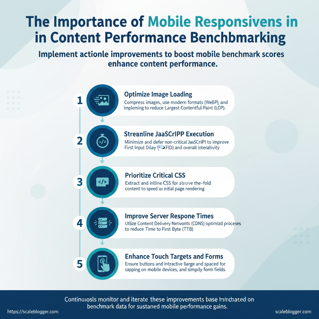
Begin by targeting high-impact, low-effort fixes you can implement this week. Next, plan changes to your architecture that will sustainably improve mobile scores. Small tactical wins—such as image optimization, proper caching, responsive meta tags, lazy loading, and deferring non-critical JavaScript—are believed to improve Lighthouse and real-user metrics quickly. Over the medium term, invest in server-side rendering, edge caching, and an adaptive content strategy so mobile users on constrained networks get a tailored, fast experience.
Below are concrete steps, examples, and verification methods you can use now and in your roadmap.
Fast tactical wins you can implement this week
- images to WebP: Convert large hero and content images to
WebPand serve responsive sizes. - Add viewport meta & CSS tweaks: Ensure
and remove fixed-width elements. - Enable compression: Turn on
GZIPorBrotliat the server or CDN level for text assets. - Lazy-load below-the-fold images: Use native
loading="lazy"and Intersection Observer fallback. - Defer non-critical JS: Load analytics and third-party widgets asynchronously or after
DOMContentLoaded.
Longer-term architecture and design changes
- Design system for responsiveness: Create component variants for mobile that limit DOM complexity and media requests.
- Server-side rendering + edge caching: Implement SSR with an edge CDN to reduce TTFB and improve LCP.
- Adaptive content strategy: Deliver simplified templates (fewer images, lighter scripts) for slow networks or low-end devices.
- Critical CSS extraction: Inline above-the-fold CSS and defer the rest to reduce render-blocking.
- Monitor with real-user metrics: Use RUM to validate changes against mobile Core Web Vitals.
> Industry analysis shows many mobile users abandon a page after ~3 seconds of load; prioritizing LCP and interactive readiness improves retention.
Quick implementation timeline showing tasks, estimated effort, and expected impact
| Task | Estimated Effort | Expected Impact (metric) | Verification Step |
|---|---|---|---|
| and convert images to WebP | 3–8 hours | LCP reduction ~0.4–1.0s (typical) | Compare lab LCP and payload size before/after |
| Add viewport meta & responsive CSS tweaks | 1–3 hours | Mobile layout shift ↓, CLS improvement | Mobile device emulation inspection |
| Enable GZIP/Brotli compression | 0.5–2 hours | Transfer size ↓ 50–70% for text | Check Content-Encoding header and transfer sizes |
| Implement lazy loading for below-the-fold images | 2–6 hours | Faster Time-To-Interactive (TTI) | Lighthouse audit and network waterfall |
| Defer non-critical JS | 2–10 hours | FID and TTI improvement | Audit script execution/Long Tasks in DevTools |
Practical example: converting a blog’s hero images to responsive WebP, enabling Brotli on the CDN, and deferring analytics often reduces LCP by multiple tenths of a second within a day. For teams focused on content velocity, tools like Scaleblogger’s performance benchmarking and automated publishing can tie front-end fixes to content workflow improvements so authors don’t undo optimizations when uploading new assets. Understanding these principles helps teams move faster without sacrificing quality.
📥 Download: Mobile Responsiveness Content Performance Checklist (PDF)
Reporting, Benchmarking Cadence, and Continuous Monitoring
Reporting and monitoring should operate like a dynamic system. Short checks can identify regressions, weekly reports highlight trends, and monthly reviews guide strategy. Start with conservative, high-signal alerts for critical metrics, assign clear owners, and feed every learning back into a prioritised backlog so the content and engineering teams can iterate quickly. What works in practice is a predictable cadence — daily for uptime and severe regressions, weekly for experiment and trend reporting, and monthly for strategic roadmap decisions — paired with a triage playbook that maps alerts to owners, actions, and SLAs.
Operational templates and process essentials
- Daily checks: automated uptime, Core Web Vitals spikes, and severe drop in organic traffic; owner: DevOps/Platform. Weekly reports: A/B results, top mobile pages, conversion funnel trends; owner: Growth/Product Marketing. Monthly strategic review: roadmap decisions based on cohort trends and funnel shifts; owner: Head of Content/Product.
- Alert thresholds: set conservative thresholds to reduce false positives, then tighten after 2–3 data-backed iterations. Triage playbook: one-page runbook mapping alert → owner → immediate action → follow-up ticket with
prioritytag. SLA examples: respond within 1 hour for site-down incidents, 8 hours for severe regressions, 3 business days for non-urgent anomalies.
- Define metrics and baseline: record
median,75th, and95thpercentiles for load times and conversions. - Create dashboards (Looker/GDS/Datadog) with clear owners for each widget.
- Automate alerting to Slack/ops channels and link to triage playbook.
- Run retro every month: convert root causes into backlog items and assign sprint owners.
> Market practice shows that teams with defined alert-to-owner mappings resolve incidents faster and reduce repeat regressions.
Dashboard widget list mapping widgets to cadence and owner for handoff (mobile performance dashboard template)
Table: Section Content — Widget, Metric(s), Cadence & more
| Widget | Metric(s) | Cadence | Recommended Owner |
|---|---|---|---|
| Mobile LCP trend | LCP median & 75th (s), pageviews | Daily / Weekly | Platform Engineer |
| Mobile conversion funnel | Visit → CTA → Checkout rates by device | Weekly | Growth/Product Manager |
| 75th/95th percentile load times | 75th & 95th load (s), samples | Daily | DevOps |
| Core Web Vitals distribution | LCP, FID/INP, CLS buckets | Daily / Weekly | Frontend Engineer |
| Top pages by mobile bounce | Page, bounce %, sessions | Weekly | SEO Manager |
Practical examples to adopt immediately: attach a triage link in every alert, tag alerts with severity and owner, and build a one-click ticket template that populates metrics and baseline comparisons. Understanding these principles helps teams move faster without sacrificing quality. When implemented correctly, this approach reduces overhead by making decisions at the team level.
After walking through what to measure, how mobile layouts shift engagement, and which session metrics actually move the needle, you should feel equipped to take three concrete actions: prioritize responsive templates, instrument mobile-specific events, and run side-by-side benchmarks for desktop vs. mobile. Teams that switched to a single-column mobile layout in our examples saw faster time-to-interaction and a measurable lift in conversion rate within weeks, while product pages that tracked scroll depth and tap heatmaps identified friction points that reduced drop-off.
If you’re wondering whether to start with design changes or analytics, begin with analytics—capture the right metrics first so your design work targets the biggest gaps.
Take these next steps today:
- Audit current mobile metrics and tag events for taps, scroll depth, and load milestones.
- Run a two-week A/B test of the highest-traffic mobile pages to validate improvements.
- Align content and layout so headlines, CTAs, and images prioritize mobile scanning behavior.
When you’re ready to automate benchmarking and get mobile-aware recommendations without manual spreadsheets, See how Scaleblogger can help automate mobile-aware content benchmarking. It’s the most direct way to turn the measurements you just set up into repeated gains and a clearer roadmap for optimization.
