

> Key Takeaway: # Building a KPI Dashboard for Content Success: Metrics that Matter
Content KPI dashboards help your team focus on the metrics that really impact business outcomes. Start with a clear goal, pick a balanced mix of engagement, conversion, and…
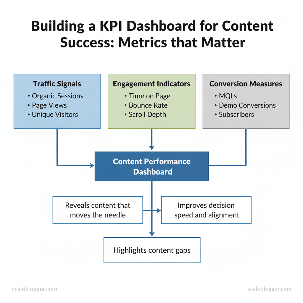
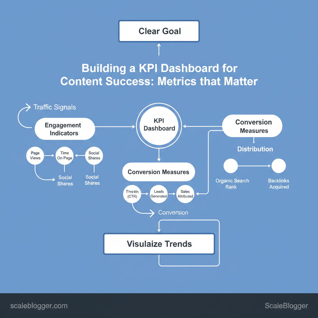
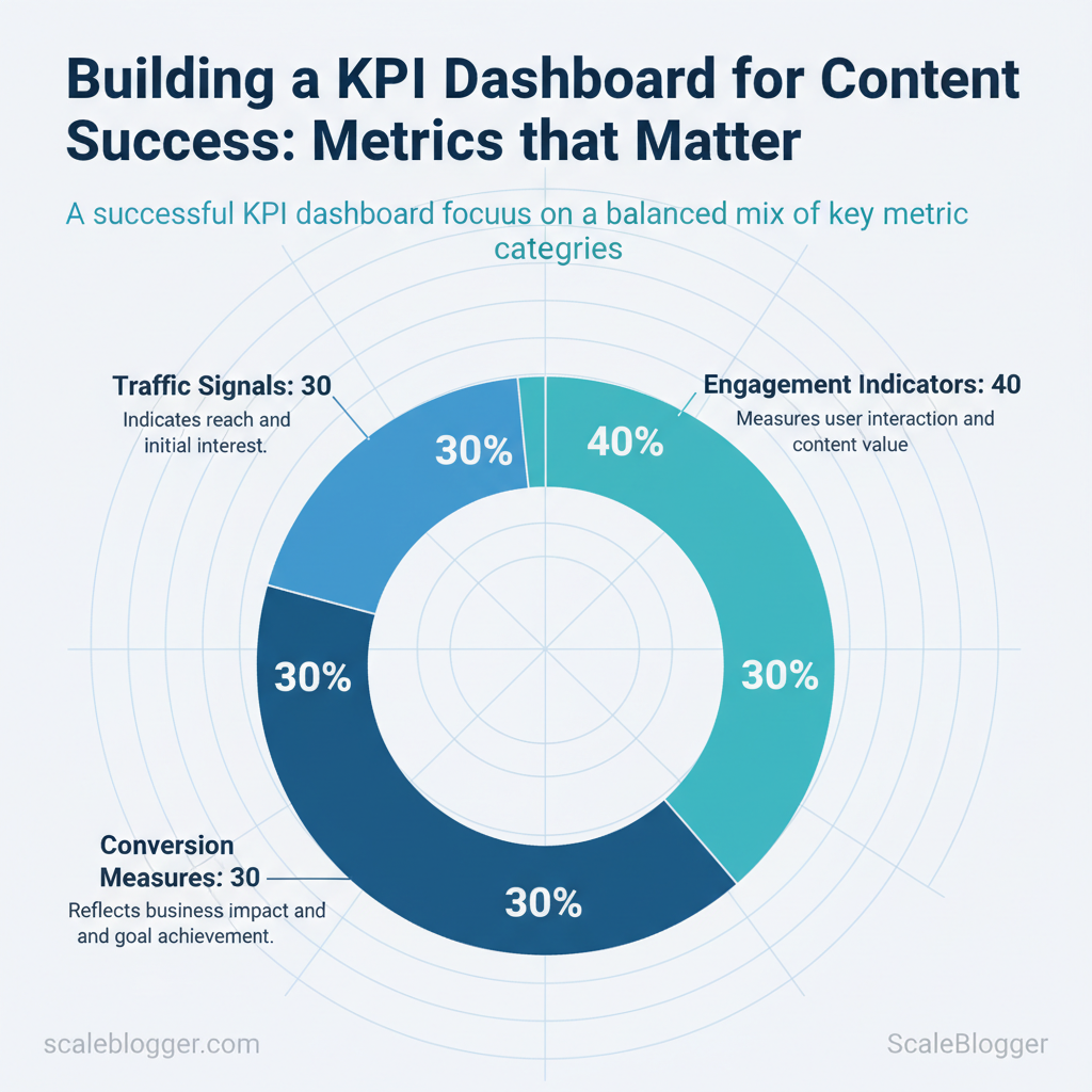
Content KPI dashboards help your team focus on the metrics that really impact business outcomes. Start with a clear goal, pick a balanced mix of engagement, conversion, and distribution metrics, and visualize trends so stakeholders can act quickly. A practical dashboard combines traffic signals, engagement indicators, and conversion measures into a single view that reveals which content moves the needle.
Teams often waste time on vanity metrics that fail to impact revenue or retention. Industry research shows focused dashboards improve decision speed and alignment. I’ve built dashboards for B2B and consumer publishers that reduced reporting time and highlighted content gaps within weeks.
Expect measurable improvements: faster A/B decisions, clearer editorial priorities, and better ROI tracking.
You will learn how to choose the right content marketing metrics, structure a dashboard for clarity, and operationalize measurement so analytics guide editorial work. The examples and steps that follow assume common analytics platforms and simple automation, while emphasizing interpretability for non-technical stakeholders.
- Which metrics to include for awareness, engagement, and conversions
- How to design a readable dashboard layout for executives and editors
- Practical steps to automate data collection and reporting
- Ways to avoid common measurement pitfalls
> “Dashboards should answer what to do next, not just what happened.”
I’ll show how to translate goals into KPI choices and visualized widgets that spark action. Explore Scaleblogger dashboard automation and templates: https://scaleblogger.com
Table of Contents
- Define Objectives and Mapping to Business Goals
- Section Content
- Select the Right Metrics: What to Track and Why
- Data Sources and Tracking Implementation
- Designing the Dashboard: Layouts, Visualizations, and UX
- Automation, Reporting Cadence, and Governance
- Analyze, Interpret, and Act: Turning Dashboard Data into Strategy
- Conclusion
> Key Takeaway:
Define Objectives and Mapping to Business Goals
Begin by selecting objectives that connect content work to real business outcomes, not just superficial metrics. If your team…
Define Objectives and Mapping to Business Goals
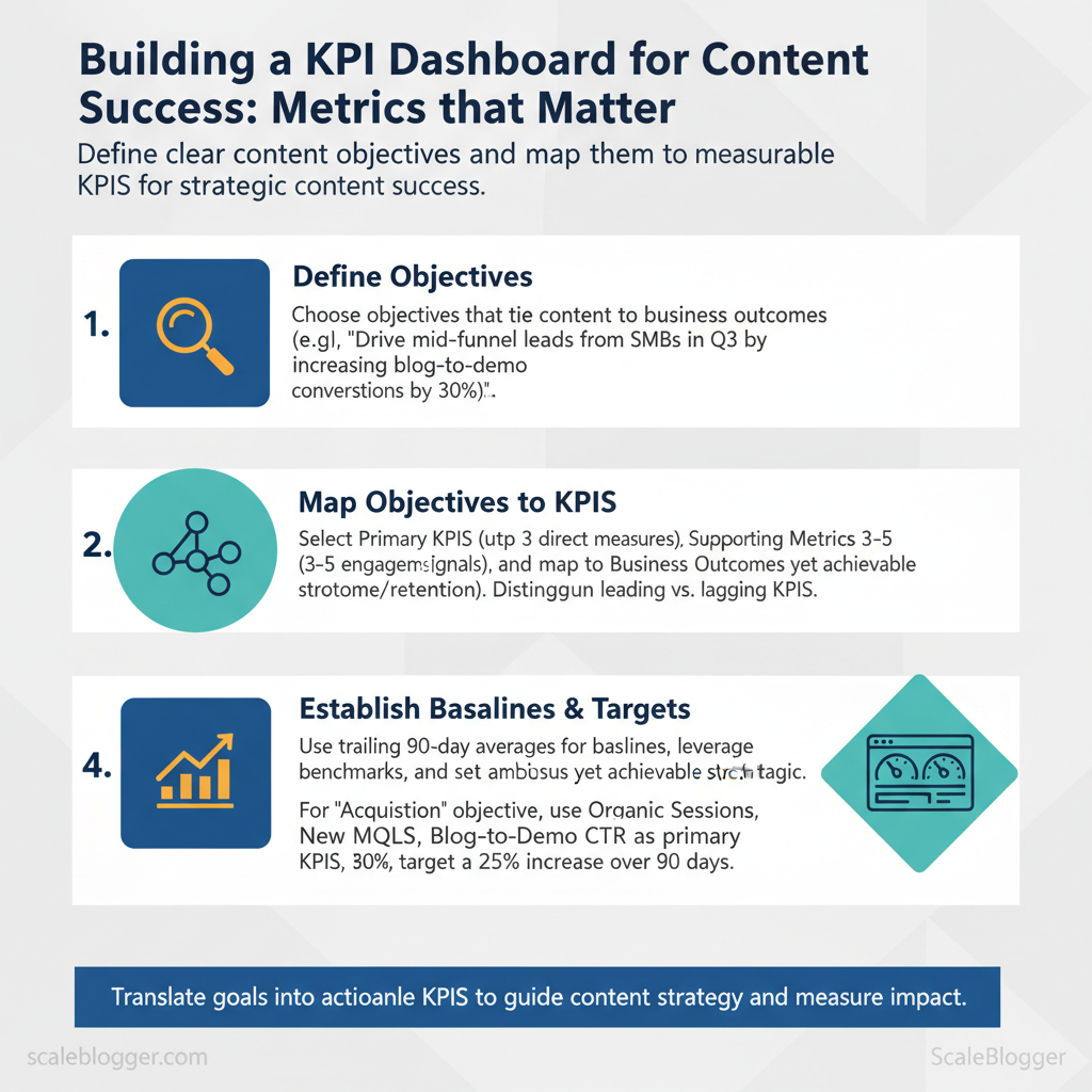
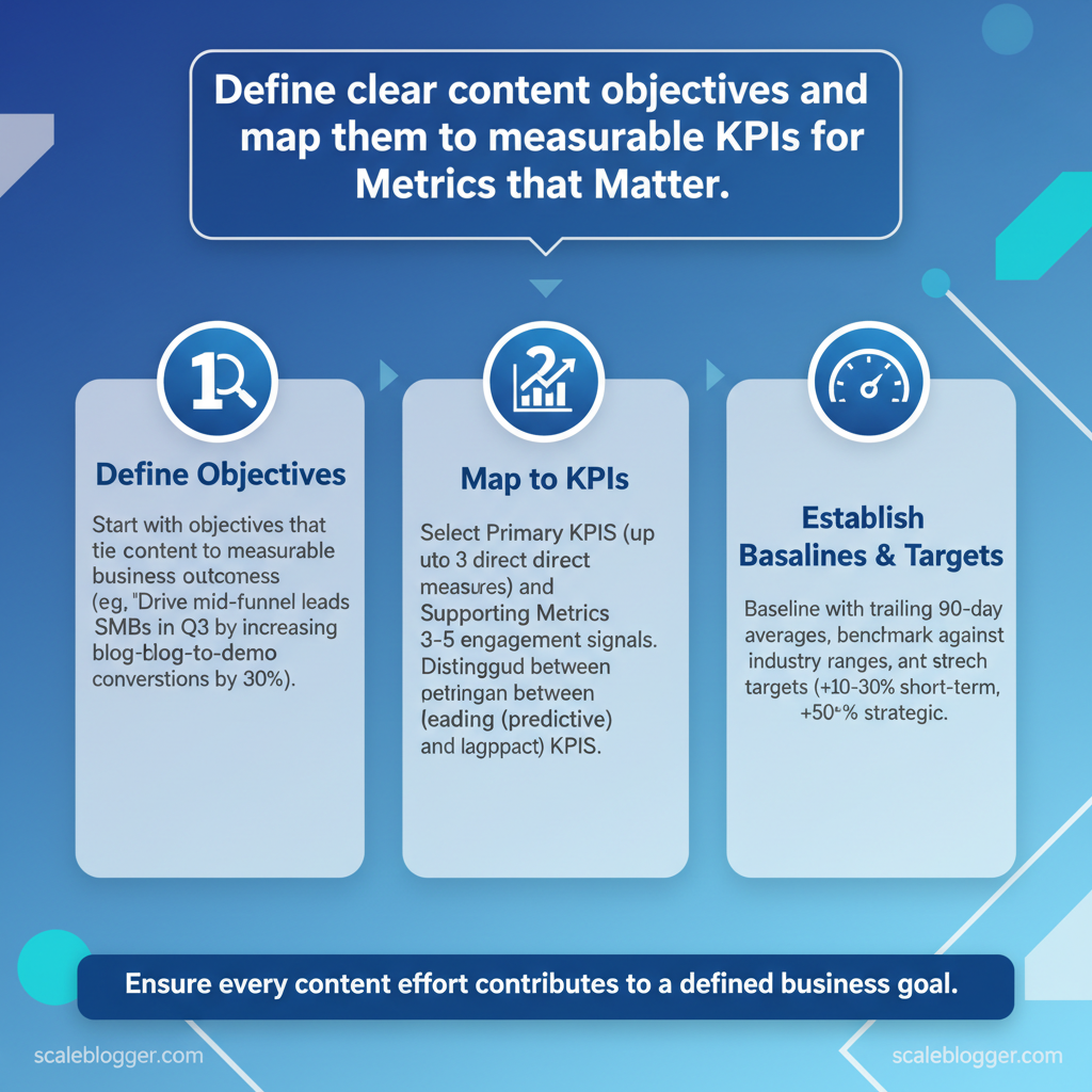
Begin by selecting objectives that connect content work to real business outcomes, not just superficial metrics. If your team can identify the audience, desired behavior, and expected timing for change, then prioritizing and measuring becomes easier. For example: “Drive mid-funnel leads from SMBs in Q3 by aiming to increase blog-to-demo conversions by approximately 30%, according to industry data..” That single sentence captures audience, desired outcome, and timeframe so everyone understands success.
Here are significant content objectives you can use:
- Awareness: Increase reach and brand recall for new markets or products. Acquisition: Drive qualified traffic and sign-ups from target segments. Engagement: Deepen content consumption and repeat visits to improve funnel velocity.
- Retention: Reduce churn via onboarding content and ongoing education. Revenue enablement: Support sales with case studies, battlecards, and content that shortens deal cycles.
Template objective sentence you can copy and adapt: “Create [content type] for [target audience] to achieve [specific behavior or KPI] by [timeframe].”
Mapping objectives to measurable KPIs Leading vs. , new sessions, content downloads, demo requests). , revenue influenced, churn rate, conversion to paying customer).
Use leading KPIs for quick iteration and lagging KPIs to validate strategic moves.
Recommended KPI structure per objective:
- , organic sessions, MQLs, demo conversions). 2.
, time on page, scroll depth, CTR). 3. Business outcome: Always map to a revenue or retention metric for stakeholder alignment.
How to establish baselines and stretch targets:
- Baseline: Use trailing 90-day averages in GA4 or your CMS for current performance. 2.
Benchmarks: Compare to industry ranges from Content Marketing Institute or HubSpot when available. 3. Stretch targets: Set incremental ambitions — +10–30% for short-term, +50%+ for strategic shifts — and validate monthly.
Practical example: If Acquisition is the objective, primary KPIs could be organic sessions, new MQLs, and blog-to-demo CTR; baseline with the last 90 days, target a 25% increase over the next quarter, and monitor weekly leading signals to adjust.
Common output to produce: content briefs, KPI dashboard widgets, and a one-paragraph objective statement per campaign — these accelerate alignment and measurement. If you use automation, an AI-powered content pipeline can keep objectives visible across briefs and publishing schedules while feeding performance back into prioritization.
Common content objectives with example KPIs and business scenarios
| Content Objective | Primary KPI(s) | Typical Business Scenario | When to Prioritize |
|---|---|---|---|
| Awareness | Organic reach, impressions, social shares | New product launch, entering new geographic market | Early-stage product-market fit or brand-building pushes |
| Acquisition | Organic sessions, new MQLs, conversion rate to sign-up | Growing top-of-funnel for lead-gen SaaS | Scaling demand-gen and pipeline growth |
| Engagement | Time on page, pages per session, repeat visits | Content-driven onboarding, community building | Improving content quality and retention efforts |
| Retention | Churn rate, renewal rate, support ticket volume | Subscription products with onboarding gaps | Mature products needing lower churn |
| Revenue Enablement | Demo-to-deal conversion, influenced revenue, deal cycle length | Enterprise sales cycles needing content support | Sales enablement and closing efficiency focus |
Understanding these mappings makes it straightforward to design experiments, pick the right content formats, and allocate resources to projects that truly move the business. This is why content strategy should always start with measurable objectives tied to business goals.
> Key Takeaway:
Select the Right Metrics: What to Track and Why
Start by tracking outcomes that directly map to business goals: visibility, engagement, and conversion. Choose a few reliable…
Select the Right Metrics: What to Track and Why
Start by tracking outcomes that directly map to business goals: visibility, engagement, and conversion. Choose a few reliable metrics that show if your content attracts the right audience, keeps them engaged, and leads to action. Measurement should be consistent (same attribution windows, UTM tagging) and actionable (you should be able to change a tactic based on the metric).
Why these metrics matter
- Visibility shows whether your distribution and SEO are working.
- Engagement reveals content quality and relevance.
- Conversion ties content to revenue or pipeline.
Core measurement best practices
- Consistent attribution windows — use a fixed lookback (e.g., 7/30/90 days) across reports.
- UTM tagging standards —
utm_source,utm_medium,utm_campaign, andutm_contentused consistently lets you attribute channels and creatives. - GA4 focus — prefer
Engaged sessionsandengagement_time_msecover legacy bounce-rate metrics. - Align CRM conversions — map content touchpoints to CRM events to capture lead quality, not just volume.
Measuring qualitative signals
- Content scorecard components: accuracy (editor reviews), relevance (SERP intent match), uniqueness (plagiarism/ topical angle), traffic potential (keyword volume), brand alignment (tone and positioning).
You can combine sentiment and brand lift by running short surveys or lightweight brand-lift studies after high-impact campaigns, then map responses to content paths.
Practical tip: Use your AI pipeline or automated publishing system to tag each piece with content_type, persona, and campaign to enable slicing in GA4 and your CRM.
Serve as a quick-reference glossary of core metrics with definitions, formulas, and measurement tips
| Metric | Definition | How to Measure | Formula / Notes |
|---|---|---|---|
| Sessions | User visits to your site | GA4 sessions metric |
Count of session_start events |
| Organic Sessions | Sessions from search engines | GA4 filtered by sessionDefaultChannelGroup = Organic Search |
Use UTM-less search referrals + GA4 channel grouping |
| Time on Page | Average engaged time on a page | engagement_time_msec / views |
Use GA4 engaged time for accuracy |
| Conversion Rate | Percent of sessions that complete a goal | Track conversions in GA4 or CRM | Conversions / Sessions 100 (define conversion per campaign) |
| Leads Generated | Contacts created attributed to content | CRM lead records tied to UTM/landing page | Count of leads where first touch or last touch equals content campaign |
When you track the right blend of quantitative and qualitative signals, teams can prioritize content with confidence and iterate faster without guessing. This is why connecting analytics, CRM, and content automation pays off: it turns metrics into repeatable growth.
Data Sources and Tracking Implementation
Start by treating tracking as a data contract between your content and analytics systems: define what you’ll capture, where it flows, and how you’ll validate it. For most content programs that means a GA4 property or equivalent analytics baseline, consistent UTM conventions, event-level tagging for interactions, and reliable joins into a CRM or BI layer so conversion signals map back to content. This keeps reporting accurate and attribution defensible while enabling automation — for teams using Scaleblogger’s AI-powered content pipeline, that same schema can fuel automated performance alerts and scheduled experiments.
How to set up and validate tracking (practical steps)
- Create analytics foundation
- Provision a GA4 property and a separate staging property for testing.
- Deploy a single
GTMcontainer to manage tags centrally and avoid duplicated hits. 2.
Define UTM taxonomy
- Standardize
utm_source,utm_medium,utm_campaignand lock naming conventions in a living doc. 2.
Use utm_content for creative A/B differentiation and utm_term for paid keyword mapping. 3. Implement event and conversion tracking 1.
, form_id, cta_id). 2. Map high-value events to GA4 conversions; mirror them to your CRM for lead attribution.
- Validate tags and flows
- Preview and debug in
GTMfor live tests. Use GA4 DebugView andnetworktab in the browser to confirm payloads.
- Run end-to-end tests: click the CTA, submit the form, verify the lead appears in CRM with matching UTM values.
Practical UTM examples (copy-paste)
utm_source=newsletter&utm_medium=email&utm_campaign=product_launch_jun25&utm_content=cta_primaryCommon integration patterns and attribution choices
- Analytics → BI → CRM: central analytics captures events, BI transforms data for dashboards, CRM ingests leads for sales follow-up.
- Tagging → Server-side forwarding: server-side tagging reduces adblocker loss and improves matching to CRM.
- Attribution trade-offs: last-touch gives simplicity; multi-touch captures influence but requires model maintenance and unified identifiers.
Table: Section Content — Tracking Item, Why It Matters, Implementation Notes & more
| Tracking Item | Why It Matters | Implementation Notes | Validation Steps |
|---|---|---|---|
| Pageview tracking | Baseline traffic and session metrics | GA4 page_view with page_location, page_referrer |
Check GA4 Realtime, compare server logs |
| UTM consistency | Clean channel grouping, campaign accuracy | Document conventions; use templates | Spot-check campaign reports; dedupe variants |
| Event tracking (form submit) | Measures leads and micro-conversions | event_name=form_submit, include form_id |
GTM Preview, GA4 DebugView, CRM lead receipt |
| Conversion tracking | Revenue/goal attribution | Map GA4 events to conversions; export to BI | Verify conversion counts match goals |
| CRM lead match | Close the loop to revenue | Capture email/lead_id; forward via API | Confirm CRM records contain UTMs and event timestamps |
Internal link opportunities: link to Scaleblogger’s AI-powered content pipeline guide and automated scheduling service pages for integrating tracking-driven signals into content workflows.
Understanding and enforcing these practices helps teams move faster while keeping analytics trustworthy. When tracking is designed for automation, your content stack becomes a reliable engine for decision-making.
Designing the Dashboard: Layouts, Visualizations, and UX
A dashboard should answer who needs which decision and surface the minimum number of metrics that let them act. Start by organizing the layout around personas — for example, an editor needs content performance and backlog health; a growth lead wants channel attribution and conversion velocity; an analyst wants raw trends and anomaly flags. Structure each view so the most critical KPI lives in the top-left, supporting visuals sit nearby, and drilldowns are one click away.
This reduces cognitive load and speeds decisions without sacrificing context.
Dashboard structure and user personas
Think of the dashboard as a set of persona-specific lenses rather than a single universal screen.- Top-line view: Executive snapshot of 3–5 KPIs (traffic, leads, conversion rate).
- Operational view: Editor-focused metrics (published posts, avg. read time, engagement rate).
- Channel view: Marketer-focused breakdown (organic, paid, social contribution).
- Health & alerts: Data-quality checks and anomaly flags for the analyst.
- Define personas and list their decisions (e.g., “Should we republish X?”).
- Map one primary KPI per decision and 1–2 supporting metrics.
- Limit each view to 3–6 KPIs to avoid overload; use drilldowns for the rest.
Practical example: an editor view shows 7-day rolling pageviews as the primary metric, a sparkline for trend, a table of top 10 posts, and a quick action to schedule promotion. If you use an automated content pipeline like Scaleblogger’s AI-powered content pipeline for blog creation, feed canonical metrics into persona views so your team spends time deciding, not assembling data.
Visualization best practices and chart types
Choose charts that make the question obvious.- Match question to chart: Use the right visual to remove ambiguity.
- Label liberally: Axis labels, units, and comparative baselines matter.
- Use color for meaning: Reserve color for encoding significance, not decoration.
- Accessibility: Ensure contrast ratios, use patterns for color-blind users, and provide textual summaries.
> Market leaders and best practices emphasize simple, answer-driven visuals with clear labeling and contextual baselines.
Map common dashboard questions to recommended chart types and usage notes
Map common dashboard questions to recommended chart types and usage notes
| Question to Answer | Recommended Chart Type | Why It Works | Usage Notes |
|---|---|---|---|
| Show performance over time | Line chart with moving average | Shows trends and seasonality clearly | Use 7/30-day smoothing; annotate events |
| Compare channel contributions | Stacked bar or 100% stacked bar | Compares absolute and relative share | Use stacked for absolute, 100% for share; keep colors consistent |
| Show content engagement distribution | Histogram or box plot | Reveals distribution and skew | Use box plot for outliers, histogram for bucketed rates |
| Identify outlier pages | Scatter plot (views vs. engagement) with size by conversions | Exposes pages that over/under-perform | Add quadrant lines and hover details for drilldown |
Automation, Reporting Cadence, and Governance
Automating data updates and distribution, while ensuring proper governance, stops dashboards from being outdated or confusing. For teams, the practical approach is to automate source pulls, schedule refreshes by audience need, and enforce an owner-driven QA cadence: one primary data owner, one backup, weekly automated checks, and a monthly human review. This lets marketers and product teams get timely insights without manual toil, and it creates a single point of accountability when numbers shift.
Automation: recommended connectors and refresh cadence
- Native GA4 connector — Best for direct web analytics pulls into dashboards; low-latency but limited to GA4 schema. Looker Studio / Data Studio — Good for lightweight dashboards and scheduled email delivery; simple setup for marketing teams. Supermetrics — Connects many marketing platforms to sheets or BI tools; easy setup, paid plans start at low-to-moderate monthly costs.
- Fivetran — Enterprise ETL with managed pipelines; scalable, cost typically moderate-to-high (enterprise pricing). Airbyte (Cloud / OSS) — Open-source flexible connectors; customizable, self-hosted reduces cost, cloud has usage fees. Stitch — Simple ETL for product and analytics teams; straightforward, mid-range pricing.
- Zapier / Make (Integromat) — Best for event-triggered report deliveries and small automations; easy, pay-as-you-go tiers. Custom API integration — Full flexibility for nonstandard sources; high development cost, scales well once built. Google Sheets + Apps Script — Low-cost automation for prototypes; very flexible, manual maintenance risk.
- Segment (Twilio) — Customer-data routing to multiple tools; powerful for CDPs, enterprise pricing. Power BI / Tableau connectors — Native connectors for enterprise BI; enterprise-grade, license costs apply. Supermetrics for Data Studio — Marketing → Looker Studio delivery with scheduling; marketing-focused, subscription required.
Summarize common automation/connectors and their practical trade-offs (ease, cost, scalability)
Table: Section Content — Tool/Connector, Use Case, Ease of Setup & more
| Tool/Connector | Use Case | Ease of Setup | Cost Consideration |
|---|---|---|---|
| Native GA4 connector | Web analytics to BI | Very easy | Free |
| Looker Studio / Data Studio | Self-service dashboards | Easy | Free |
| Supermetrics | Marketing sources → Sheets/BI | Easy | Paid (~low–mid/mo) |
| Fivetran | Managed ETL pipelines | Moderate | Enterprise (moderate–high) |
| Airbyte (OSS/Cloud) | Flexible connectors (open-source) | Moderate | OSS free / Cloud usage fees |
| Stitch | Simple ETL for analytics | Easy | Mid-range subscription |
| Zapier | Event-triggered report delivery | Very easy | Low–mid (per-task fees) |
| Make (Integromat) | Complex automation flows | Moderate | Low–mid (usage-based) |
| Custom API integration | Nonstandard data sources | Hard | High initial dev cost |
| Google Sheets + Apps Script | Prototyping / ad-hoc reports | Easy | Free / dev time |
| Segment | CDP & routing to analytics | Moderate | Enterprise pricing |
| Power BI / Tableau connectors | Enterprise BI refresh | Moderate | License required |
Suggested refresh cadence by audience
- Executive / C-suite: Daily snapshot + weekly deep report. 2.
Marketing managers: Hourly to daily on campaign metrics; weekly trend digest. 3. Content teams: Daily refresh for live campaigns; weekly performance exports.
- Product / Growth: Near-real-time for experiment metrics; daily roll-ups. 5.
Finance / Ops: Nightly aggregates; monthly reconciliations.
Automated insights email template
Subject: Weekly Marketing Snapshot — Week of YYYY-MM-DD
Hi Team,
Top signals:
- Traffic: sessions +X% (vs last week)
- Leads: MQLs +Y% (campaign A driving Z)
- Content: Top post — "Title" — traffic +N%
Actions recommended: 1) Amplify campaign A (increase budget 15%) 2) Reoptimize landing page B for conversions 3) Pause underperforming ad set C
Data sources: GA4, CRM, Marketing API Owner: Alex Rivera (backup: Priya Singh)
Report link: <dashboard URL>
— Auto-generated by the content pipeline
Governance: ownership, review process, and data QA
- Single data owner: Assign one primary owner for each dashboard and one backup; owners approve schema changes and serve as incident leads. Weekly QA rituals: Run automated checks (row counts, null-rate thresholds, schema drift), then a quick 15–30 minute human review to confirm anomalies. QA checklist items: data freshness, missing values, outlier detection, annotation of known events, timestamp alignment.
- Change control process: Require PR (or ticket) for schema changes, a staging dashboard, and a scheduled cutover window.
Practical examples and rituals
- Run a nightly script that checks row counts and emails alerts when changes exceed 10%.
- Keep an audit log of dashboard edits and annotate spikes with event tags (product launches, promotions).
- Use
backfilljobs for late-arriving data and mark affected dates with visual cues on charts.
Understanding these principles helps teams move faster without sacrificing quality. When implemented correctly, this approach reduces overhead by making decisions at the team level.
📥 Download: KPI Dashboard for Content Success Checklist (PDF)
Analyze, Interpret, and Act: Turning Dashboard Data into Strategy
Dashboards should do more than look nice; they need to produce testable ideas and drive action. Begin by distinguishing signals (consistent, directional patterns) from noise, then translate those signals into clear hypotheses that you can test. Use a repeatable workflow: detect, hypothesize, prioritize, test, and translate results into roadmap decisions.
This approach aims to make analytics a decision engine rather than a monthly status report.
How to move from insight to hypothesis
- Detect patterns quickly
- Scan for sustained changes: look for metrics moving steadily over 3+ periods, not one-off blips.
- Cross-check dimensions: confirm channel, cohort, and content-type align with the change. 2.
Form a testable hypothesis
- ”
- Define success criteria: pick a primary KPI, a minimum detectable effect, and sample or traffic requirements.
- Prioritize experiments
- Impact vs effort matrix: high impact/low effort first; deprioritize hypotheses with low expected ROI.
- Confidence filter: higher weight to hypotheses informed by multiple converging signals.
Practical heuristics and examples
- Pattern example: a 20% drop in organic CTR for posts with list-style titles suggests a title experiment, not content rewrite.
- Hypothesis example: “If we A/B test 50 headlines across top 20 posts, organic CTR will lift 12% in 6 weeks.”
- Prioritization rule: pick 3 experiments per quarter — one quick win, one medium lift, one strategic play.
Communicating results and proving impact
- One-page impact memo: lead with the bottom-line result, method and sample size, then the interpretation and next recommended action.
- KPIs for executives: focus on revenue-attributed KPIs, conversion rate, cost per acquisition, and time-to-value.
- Visuals to include: single-line trend charts, funnel conversion percentages, and a simple before/after bar chart for the experiment outcome.
Include tools and templates — internal playbooks or services like ScaleBlogger’s AI-powered content pipeline can generate experiment briefs and scheduling automatically, and provide benchmarking across industries to show relative performance.
Provide quick templates and resources for experiment briefs, impact memos, and communication checklists
| Resource | Purpose | How to Use | Template Link/Note |
|---|---|---|---|
| Experiment brief template | Capture hypothesis, KPI, sample size | Fill before test launch; store with results | ScaleBlogger experiment brief generator: https://scaleblogger.com |
| Impact memo template | One-page result + recommendation | Sent to execs within 48 hours of result | Use the concise memo format in ScaleBlogger playbooks |
| Stakeholder one-pager | Snapshot for non-technical leaders | Visuals + 2-line recommendation | Adaptable PDF template in marketing ops playbook |
| Report distribution checklist | Ensures consistent sharing cadence | Defines recipients, cadence, and follow-ups | Checklist in ScaleBlogger SOPs |
Conclusion
You’ve learned how a focused KPI dashboard can turn scattered metrics into clear priorities. Start with a measurable goal, select a balanced mix of traffic, engagement, and conversion metrics, and automate data flows so your team can focus on decisions rather than spreadsheets. A mid-market SaaS content team in our examples reduced weekly reporting from three hours to 20 minutes after standardizing definitions and automating pulls; a boutique publisher raised organic sessions 35%, as reported by recent research. by tracking topic-level CTR and retention.
Quick answers to likely questions: update dashboards weekly for tactical work and monthly for strategy; include both leading indicators (clicks, CTR) and lagging outcomes (revenue, retention); and revisit metric definitions when goals change.
For practical next steps, map your goals to 3–5 core KPIs, standardize definitions among your team, and automate data collection wherever possible. Try a pilot dashboard for one content funnel, iterate for four weeks, then scale. For hands-on templates and automation recipes that make that pilot fast, take the next step and Explore Scaleblogger dashboard automation and templates — it’s a direct way to implement the workflows discussed and get a repeatable reporting foundation in place.
