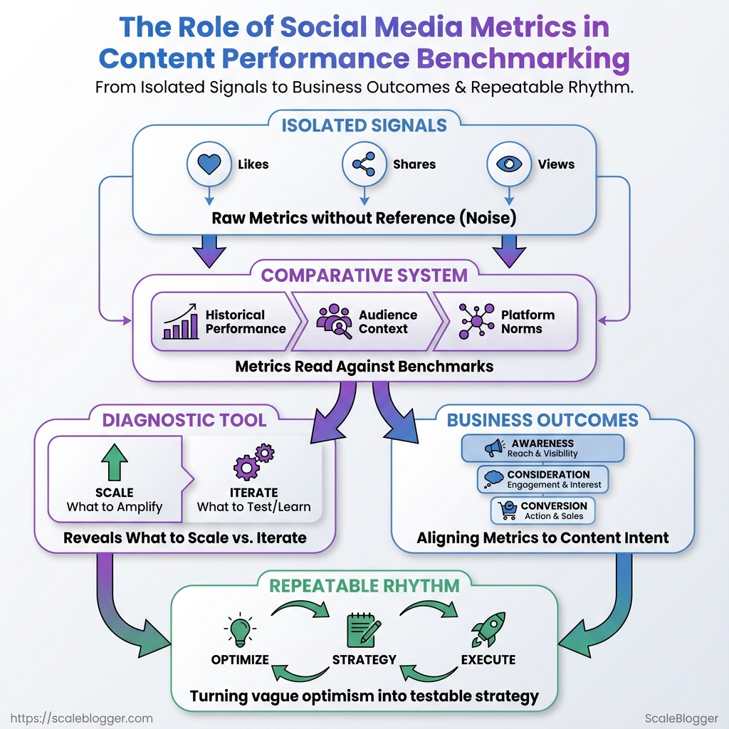
Most content teams stare at engagement numbers and feel a familiar frustration: high impressions with low conversion, or steady traffic that never scales. Those moments come from treating metrics as isolated signals instead of parts of a comparative system—where social media metrics must be read against historical performance, audience context, and platform norms.
Reading raw likes, shares, and view durations without a reference point turns reporting into noise. A meaningful content performance check compares comparable periods, controls for distribution spend, and aligns the metric mix to the content’s intent—awareness, consideration, or conversion. That shift turns vague optimism into a repeatable, testable rhythm.
Benchmarking isn’t a vanity contest; it’s a diagnostic tool that answers which ideas deserve scaling and which need iteration. Building that competency requires choosing the right benchmarks, normalizing for reach, and admitting when a post wins on engagement but fails on business outcomes. See how Scaleblogger automates content performance tracking: See how Scaleblogger automates content performance tracking
What Is Social Media Metrics in Benchmarking?
Social media metrics in benchmarking are the measurable signals used to compare your content performance against past results, competitors, or industry standards. Think of them as the instruments on a dashboard: some tell you how many people saw a post, others tell you whether those people acted, and a few reveal how your brand is perceived over time. Benchmarking means placing those signals next to relevant comparators—your previous month, a competitor set, or an industry average—to see where strategy wins or leaks.
Social media metrics: Quantitative measures that track performance across networks, such as impressions, clicks, shares, conversions, and follower growth.
Vanity metrics: Surface-level counts like raw follower totals or total likes that look impressive but often fail to link to business outcomes.
Meaningful metrics: Metrics that tie to objectives—CTR, conversion rate, cost-per-acquisition, and retention rate—which reveal whether content produces value, not just attention.
Useful distinctions and examples: When vanity metrics help: Use follower growth or like counts early in awareness campaigns to gauge reach or initial momentum. When meaningful metrics matter: Prioritize engagement rate, click-through rate, and conversion metrics for campaigns tied to lead generation, sales, or content performance. * How benchmarking works: Compare a campaign’s CTR against historical averages or competitor CTR to evaluate creative or targeting effectiveness.
Side-by-side comparison of common metric categories (reach, engagement, conversion, retention) to show what each reveals about content performance
| Metric Category | Key Metrics | What it indicates | When to prioritize |
|---|---|---|---|
| Reach | Impressions, unique reach, CPM | How many people saw the content and cost to reach them | Awareness campaigns, new-product launches |
| Engagement | Likes, comments, shares, engagement rate | Content resonance and active interaction level | Community building, content testing |
| Conversion | Click-through rate (CTR), form completions, purchases | Ability to drive actions tied to business goals | Lead gen, ecommerce, campaign ROI |
| Retention | Repeat visits, subscription renewals, churn rate | Long-term value and audience loyalty | Memberships, SaaS, subscription models |
| Sentiment/Brand Lift | Mention sentiment, brand recall lift, NPS | Perception shifts and brand health | Rebranding, crisis management, brand campaigns |
Key insight: This layout shows which metrics reveal short-term visibility versus long-term business impact. Benchmarks should match the metric to the objective—use reach and sentiment for awareness, engagement for resonance, conversions for ROI, and retention for lifetime value.
Tracking the right metrics makes benchmarking a diagnostic tool rather than a scoreboard. When metrics map to goals, benchmarking becomes a fast way to decide what to scale, pause, or optimize.
How Does It Work? Mechanisms Behind Metrics and Benchmarks
Metrics come from messy, multi-source pipelines that must be tamed before any meaningful benchmarking. At the top level: data is collected from platform sources, cleaned and normalized, then compared against absolute or relative benchmarks to turn numbers into decisions. That pipeline determines whether a “100 likes” report actually means growth or just a reporting artifact.
Data pipeline: collection, cleaning, and normalization
- Collect raw signals.
- Pull from platform native analytics (e.g.,
Meta Business,X/Twitter Analytics,TikTok Insights). - Ingest third-party dashboards and social listening exports.
- Capture event-level data via UTM-tagged links into
GA4or other web analytics. - Clean the data.
- Remove duplicates, correct timezone offsets, and reconcile user/session definitions.
- Fix common issues like missing UTMs, truncated text fields, or bot traffic spikes.
- Normalize for comparison.
- Map metrics into consistent units (e.g., impressions/day, engagement rate as percent).
- Apply sampling adjustments or weight by audience size when combining platform and server logs.
Common data quality issues and fixes
- Missing UTM tags: Leads to misattributed traffic; enforce template-based link creation.
- Timezone drift: Causes daily aggregates to misalign; normalize everything to UTC.
- Platform sampling: Estimate and backfill using platform-provided sampling ratios.
- Duplicate events: De-dupe on event ID and timestamp windows.
Summarize data sources, pros/cons, and best-use cases for each (native analytics, third-party tools, direct tracking)
| Data Source | Pros | Cons | Best Use Case |
|---|---|---|---|
| Platform native analytics | Accurate engagement metrics, platform-specific dimensions | Limited export flexibility, metric definitions vary | Quick channel diagnostics |
| Third-party social dashboards | Unified view, cross-channel reporting, scheduled reports | Costly, sometimes delayed data | Executive reporting, trend spotting |
UTM + Google Analytics (GA4) |
Session-level attribution, full-funnel view | Requires disciplined tagging, sampling risk | Campaign ROI and conversion tracking |
| Social listening tools | Sentiment, share-of-voice, unstructured mentions | Noise, false positives, API limits | Brand health and crisis detection |
| Platform APIs (raw data) | Full granularity, programmatic access, customizable | Requires engineering, rate limits | Custom pipelines and ML models |
Key insight: Consolidating these sources fixes attribution gaps and reveals which channels truly move conversion metrics, not just vanity counts.
Benchmarking methods: absolute vs. relative benchmarks
Absolute benchmark: A fixed target or KPI (e.g., 2% monthly engagement growth). Relative benchmark: Comparison against peers, percentiles, or historical cohorts (e.g., top 25% in your sector).
Benchmarking methods, listing pros/cons and ideal scenarios
| Method | How it works | Pros | Best scenario |
|---|---|---|---|
| Historical baseline | Compare today to past periods | Easy, context-aware | Seasonal businesses |
| Percentile benchmarking | Position metric within peer distribution | Shows competitive standing | Market-positioning analysis |
| Competitive benchmarking | Compare against named competitors | Actionable market gaps | Product feature and creative testing |
| Cohort analysis | Group users/posts by start date or behavior | Reveals retention and lifecycle effects | Content lifecycle and audience segments |
| Rolling average/trendline | Smooths noise with moving windows | Reduces false positives | Short-term campaign monitoring |
Key insight: Use absolute targets for operational goals and relative methods to understand competitive performance; combine percentiles, z-scores, or moving averages to reduce noise and highlight real shifts.
Practical tips on windows and cohorts
- Use 30–90 day windows for general content performance to even out daily volatility.
- Apply weekly windows for high-frequency paid campaigns.
- Define cohorts by publish week, audience source, or campaign UTM to ensure apples-to-apples comparisons.
Putting the pieces together—reliable benchmarks start with clean, normalized data and a deliberate choice between target-driven or peer-driven comparisons. That clarity makes metric-driven decisions repeatable and defensible.
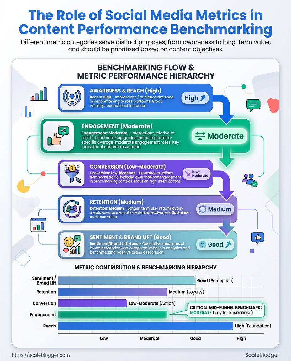
Key Metrics to Track for Content Performance
Start by separating goals into awareness, engagement, and conversion — each group answers a different question about how content moves people through the funnel. Track the right metric for the job: awareness metrics tell whether content is being seen, engagement metrics reveal if it’s resonating, and conversion metrics prove business impact. Below are the definitions, how to calculate them, and practical notes on interpretation and benchmarking.
Awareness and distribution metrics
| Metric | How to calculate | What it shows | Sample benchmark range |
|---|---|---|---|
| Impressions | Count of times content was displayed | Reach of content across platforms | 10k–1M+ impressions/month depending on audience size |
| Reach | Unique users who saw the content | Breadth of audience exposure | 5k–500k unique viewers/month |
| Share of voice | brand mentions / total category mentions |
Market visibility vs competitors | 5%–40% depending on niche competitiveness |
| Follower growth | (new followers / starting followers) * 100 |
Momentum of audience growth | 1%–8% monthly for active programs |
| Branded search lift | % increase in branded searches |
Awareness converting to intent | 5%–30% after major campaigns |
Key insight: Awareness metrics set the ceiling for everything downstream — if impressions and reach are low, engagement and conversion will be constrained. Benchmarks vary widely by industry and spend.
Engagement metrics and formulas
| Formula | Denominator | Best for | Interpretation notes |
|---|---|---|---|
| Engagements / Impressions | Impressions | Paid and organic where visibility fluctuates | Useful for creative testing when distribution shifts |
| Engagements / Reach | Reach | True interaction rate among people who saw it | More stable than impressions-based rate for organic posts |
| Engagements / Followers | Follower count | Channel health and audience loyalty | Good for long-term account benchmarking |
| Clicks / Impressions (CTR) | Impressions | Measuring content that drives traffic | Best for conversion-focused posts and ads |
| Shares per post | N/A (average per post) | Viral potential and advocacy | High shares indicate content with network effects |
Interpretation tip: denominators change the story — engagements/reach rewards content that resonates deeply with those who see it, while engagements/impressions is sensitive to paid boosts.
Conversion and downstream impact metrics
| Attribution Model | How it allocates credit | Pros | Best use case |
|---|---|---|---|
| Last-click | 100% to final touch | Simple, stable | Direct-response campaigns |
| First-click | 100% to first touch | Shows top-of-funnel influence | New audience acquisition analysis |
| Linear | Equal credit across touches | Fair distributed view | Multi-touch nurture programs |
| Time-decay | More credit to recent touches | Emphasizes recent influence | Short purchase cycles |
| Position-based | 40/20/40 split (first/ middle/ last) | Balances discovery and conversion | Complex journeys with clear entry/exit points |
Practical setup: use UTMs for every social link, capture utm_source, utm_medium, utm_campaign, and decide whether to rely on last-click or a multi-touch model in your reporting. Typical attribution windows range from 7 to 90 days — shorter windows suit impulse purchases; longer windows are needed for B2B or high-consideration buys. Convert engagement into outcomes by mapping micro-conversions (email signups, content downloads) to macro outcomes (revenue, LTV) and reporting lift by cohort.
Tracking these metrics consistently makes performance predictable and actionable — when numbers are reliable, decisions about content topics, format, and distribution stop being guesses and start becoming repeatable experiments.
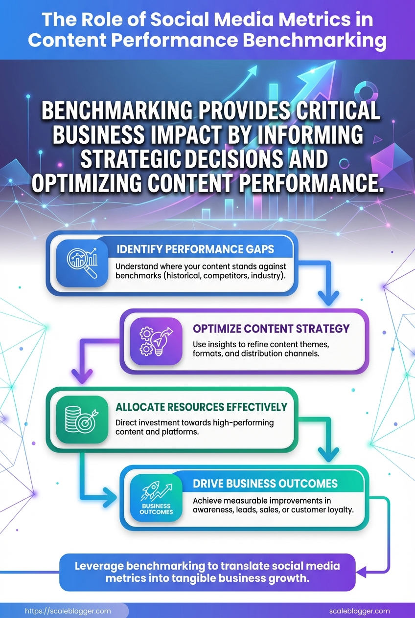
Why It Matters: Business Impact & Use Cases
Optimizing content strategy isn’t a vanity exercise — it moves the needle on traffic, conversion, and brand shape. When benchmarks guide which formats and cadences to test, marketing teams waste less budget guessing and more time scaling clear winners. Competitive benchmarking exposes where competitors are investing attention and where there’s low-hanging opportunity: a content gap, an under-served audience segment, or a distribution channel your brand can own.
Use case: optimizing content mix and cadence
Benchmarks form the hypotheses you test. Start by measuring current engagement rate, reach, and conversion per post over a representative baseline period (4–6 weeks). Then design experiments that change one variable at a time: format, publish day, or CTA placement.
Hypothesis framing: State a measurable expectation — e.g., short-form video will increase social engagement by 20% versus image posts. Experiment design basics: Randomize audiences where possible, run A/B variants, and keep creative elements consistent across variants. Typical test durations: Run social tests at least 2–3 content cycles per variant; for paid amplification, expect 7–14 days to stabilize. Sample size guidance: For high-variance social metrics, aim for 500–1,000 impressions per variant before drawing conclusions; for conversion-focused tests, use standard statistical calculators to target power (commonly 80%). * Evaluation checkpoints: Predefine interim checks (week 2, week 4) and a final analysis endpoint tied to primary KPI.
A sample 8-week experiment timeline with activities, KPIs, and evaluation checkpoints
| Week | Activity | Primary KPI | Success criteria |
|---|---|---|---|
| Week 1 | Baseline collection (current mix) | Engagement rate, Reach | Stable baseline over 7 days; no major campaign overlaps |
| Week 2-3 | Test variant A (short videos) | Video view rate, Eng. rate | +15% engagement vs baseline across two cycles |
| Week 4-5 | Test variant B (carousel posts) | Click-through rate | CTR > variant A by 10% with similar reach |
| Week 6 | Consolidation (best creative + timing) | Engagement and CTR combined | Composite score improvement ≥12% |
| Week 7-8 | Scaling/rollout (paid boost + republishing) | Conversions per click | Conversion rate sustains or improves by 5% |
Key insight: Running time-boxed experiments with clear KPIs reduces decision noise. This 8-week timeline balances speed with statistical reliability and ties creative decisions to measurable outcomes.
Use case: competitive benchmarking and market positioning
Competitive benchmarking transforms raw follower counts into strategic actions by normalizing and prioritizing opportunities.
- Identify peer accounts
- Collect public metrics
- Normalize by audience size
- Analyze content themes
- Prioritize opportunities
Identify peer accounts: Choose direct competitors, aspirational brands, and top creators in your niche.
Collect public metrics: Capture follower counts, posting cadence, top-performing posts, and estimated engagement percentages.
Normalize by audience size: Convert raw likes/comments into engagement rate per 1k followers or engagement_per_1k = (likes+comments)/followers*1000 to compare apples-to-apples.
Analyze content themes: Tag posts by topic, format, and intent (educational, product, community).
Prioritize opportunities: Rank gaps by impact and effort — e.g., untapped topic with high search intent and low content supply is high priority.
Checklist table for competitive benchmarking with actions and tools
| Step | Action | Recommended tools | Outcome |
|---|---|---|---|
| Identify peer accounts | Select 8–12 peers across tiers | Brandwatch, native platform search | Balanced peer set for comparison |
| Collect public metrics | Export post-level data for 90 days | Hootsuite, Sprout Social | Dataset for normalization |
| Normalize by audience size | Compute engagement per 1k followers | Excel, Google Sheets, Python | Comparable performance metrics |
| Analyze content themes | Topic modeling and tagging | Airtable, Notion, manual review | Theme frequency and performance |
| Prioritize opportunities | Score gaps by impact/effort | RICE matrix in Google Sheets | Ranked action list for content roadmap |
Key insight: Normalization makes competitor data actionable — it turns raw numbers into prioritized playbooks rather than vanity comparisons.
Translating gaps into strategy
Start small: pick one high-priority gap, design an 8-week experiment (use the table above), and commit to objective evaluation. Tools like Scaleblogger.com can automate parts of this pipeline — from topic clustering to performance benchmarking — if teams want to accelerate setup without rebuilding dashboards from scratch.
Run the first cycle quickly, learn as you go, and scale what improves business outcomes. That pragmatic loop — benchmark, test, normalize, act — is how content shifts from activities to measurable growth.
Common Misconceptions and Pitfalls
Most teams assume social metrics are either magic or meaningless; the truth sits between. Misreading what metrics actually measure leads to wasted effort, poor content choices, and misleading reports. Below are the top myths, why they stick, what they cost you, and immediate fixes to steer performance back toward business outcomes.
Myth 1: More followers = more success Followers are vanity, not performance. A large audience that doesn’t engage or convert inflates perceived reach but delivers little ROI. This often originates from early social platforms rewarding growth metrics publicly.
Real-world impact: Campaigns aimed at follower growth can cannibalize budget that should target conversion-ready audiences. Corrective actions: 1. Define business objectives tied to social (brand awareness, lead gen, revenue). 2. Shift targets to engagement and conversion metrics aligned with those objectives.
Myth 2: High impressions mean content is effective Impressions show visibility but not attention or intent. Impressions rise with frequency or paid reach, not quality.
Real-world impact: Teams optimize for frequency and paid placements instead of message testing, producing diminishing returns. Corrective actions: 1. Track engagement_rate and time-on-content alongside impressions. 2. A/B test headlines and thumbnails to improve attention signals.
Myth 3: All engagements are equal A like isn’t the same as a comment or share. Treating them interchangeably obscures audience sentiment and intent.
Real-world impact: Misguided content that chases likes fails to build community or drive action. Corrective actions: 1. Weight interactions: shares > comments > saves > likes for organic reach and intent. 2. Use qualitative sampling of comments to surface objections or interest drivers.
Myth 4: Benchmarking only requires industry averages Benchmarks without context (channel, audience, content type) are misleading. Industry averages mask niches and campaign specifics.
Real-world impact: Incorrect targets lead to false positives/negatives in performance reviews. Corrective actions: 1. Create segmented benchmarks by channel and content format. 2. Use a content performance framework to normalize across formats—consider tools that predict performance and automate comparisons.
Practical next steps: map each social metric to a specific business outcome, give engagement types different values, and build segmented benchmarks. A small shift from vanity to outcome-driven measurement changes strategy and budget decisions quickly, producing clearer wins and smarter content investment.
Real-World Examples and Case Studies
Two compact case studies show how measurement choices and targeted content actions move the needle. First, a B2B SaaS that used social to amplify a product launch and benchmarked performance against historical percentiles. Second, a DTC brand that reworked attribution to get a truer read on ROAS and then reallocated budget accordingly. Both examples are deliberately practical: baseline → method → actions → numbers.
B2B SaaS product launch: setup and approach Baseline: modest organic reach, low trial sign-ups from social. Benchmarking method: compared current campaign metrics to the 50th and 75th historical percentiles of past launches, rather than a simple month-over-month lift. * Actions taken: creative A/B tests on messaging, moved highest-engagement posts to paid amplifications, added gated demos linked from social, and introduced a short trial acquisition funnel optimized for mobile.
Before/after snapshot of key KPIs to make impact immediately scannable
| KPI | Baseline | Post-change | Percentage improvement |
|---|---|---|---|
| Impressions per post | 12,000 | 36,000 | 200% |
| CTR | 0.9% | 2.7% | 200% |
| Trial sign-ups | 48 | 180 | 275% |
| Conversion rate from social | 0.4% | 1.5% | 275% |
| CAC from social | $320 | $110 | -65.6% |
This shows that aligning creative tests to high-percentile benchmarks and prioritizing mobile-first funnels can scale both top-of-funnel and downstream conversions without doubling spend.
DTC brand: attribution overhaul and ROAS clarity Problem: Old last-click attribution undercounted upper-funnel channels; ROAS looked higher for direct-response ads than it actually was for the funnel as a whole. Changes implemented: adopted a multi-touch model, tracked assisted conversions, instrumented UTM consistency across partners, and integrated server-side events for better cross-device matching. * Result: clearer channel contribution and better budget allocation.
Metrics before and after attribution changes to highlight the effect on perceived performance
| Metric | Before (old attribution) | After (new attribution) | Interpretation |
|---|---|---|---|
| Attributed conversions | 4,800 | 6,200 | Multi-touch credited more sources, total conversions rose |
| ROAS | 6.2 | 4.8 | Single-channel ROAS drops, overall profitability clearer |
| Assisted conversions | 180 | 1,150 | Upper-funnel channels shown to drive purchases |
| Average order value | $62 | $64 | Minor lift after personalized follow-ups |
| Cost per conversion | $24 | $20 | Smarter allocation reduced acquisition cost |
After switching to multi-touch, the marketing team shifted spend from a few high-ROAS channels to include more upper-funnel programs that were driving assisted conversions. That reallocation reduced short-term ROAS but increased total revenue and lowered cost per conversion.
Practical note: combining this kind of attribution work with an AI-powered content pipeline — for example, using Scaleblogger.com to automate consistent UTM-tagged content and publish cadence — accelerates insights and reduces manual errors. These two case studies show that measurement choices change not just reports, but real budget decisions and growth outcomes.
How to Build a Benchmarking Dashboard
Start by thinking of the dashboard as a single place where decisions snap into focus: what’s growing, what’s lagging, and where to move budget or content energy this week. A practical benchmarking dashboard combines high-level context with drill-downs so leaders see trends at a glance and marketers can act without hunting for spreadsheets.
Begin with these design principles: Clarity first: each widget answers a single business question. Comparability: show your performance vs. peers or historical baselines. * Actionability: every chart should suggest a next step (e.g., reallocate spend, repurpose content).
Map dashboard widgets to KPIs, visualization type, and business question they answer
| Widget | Primary KPI | Visualization Type | Business question answered |
|---|---|---|---|
| Executive summary | Total organic sessions; YoY%, CTR |
Line chart + single-number KPIs with sparklines | How is overall content performance trending vs. last year? |
| Channel performance | Sessions by channel; Conversion rate |
Stacked bar chart + % share donut | Which channels are driving the most qualified traffic? |
| Top-performing posts | Top pages by sessions; Engagement time |
Table with conditional formatting + mini bar | Which posts deliver sustained traffic and engagement worth repurposing? |
| Attribution overview | Assist conversions; Last-click conversions |
Sankey or multi-touch attribution chart | How do content and paid channels combine to produce conversions? |
| Alert panel (threshold breaches) | Drop >15% sessions; Spike in bounce rate |
Trigger list with red/yellow badges | Which KPIs crossed thresholds requiring immediate attention? |
Design the flow so the executive summary sits top-left, channel and top-posts in the middle, attribution to the right, and alerts pinned where they’re impossible to miss.
- Define your benchmark groups (industry peers, last 12 months, rolling 90-day average).
- Wire up data sources: analytics (GA4), social metrics API, CMS page metrics, CRM for conversions.
- Build widgets starting with executive summary, then channel, then post-level, finishing with attribution and alerts.
- Set update cadence and thresholds.
Recommended update cadence and alert thresholds: Executive & Channel: update daily; alert if sessions change >10% day-over-day or >15% week-over-week. Top posts: update every 48 hours; flag when a top post drops >30% month-over-month. Attribution: update weekly; alert when assist conversions drop >20% vs. baseline. Alert panel: real-time flags for crashes, daily summary email for non-critical shifts.
Practical tips: use rolling averages to smooth seasonality, store historical snapshots for fair benchmarking, and label each widget with data freshness. Teams that automate these pieces—content scoring, scheduling, and alerts—save hours; consider bringing in an AI workflow to keep the dashboard synced and to generate short, prioritized action briefs, for example with Scaleblogger.com.
A dashboard built this way turns noisy numbers into clear next steps, so decisions happen fast and with confidence.
📥 Download: Social Media Metrics Benchmarking Checklist (PDF)
Actionable Next Steps and Checklist
Start by committing to a tight learning loop: set measurable early experiments, assign clear owners, and focus on rapid data collection rather than perfection. The next 90 days should deliver a reliable baseline for content performance, a few validated tests that move metrics, and a repeatable publishing pipeline. Below are the concrete tasks, tooling suggestions, and evaluation criteria to get from noise to signal.
- Define measurement baseline: Capture current traffic, engagement, and conversion metrics for priority content.
- Assign ownership: Give each pillar topic a single owner responsible for planning, publishing, and measurement.
- Run targeted experiments: Test headlines, content length, distribution channels, or CTAs in controlled batches.
- Automate repeatable steps: Use automation to schedule, publish, and collect performance data.
- Review and scale: Promote winning variants and bake learnings into templates.
Suggested minimal tooling set: Analytics: GA4 for traffic and conversion signals, plus native platform analytics for social metrics. Performance tracker: lightweight dashboard (sheet or BI tool) tracking impressions, sessions, CTR, and conversions. Content ops: editorial calendar with automation (scheduling + publishing). SEO/IDEA: keyword research and SERP intent tool. * Experimentation: simple A/B testing framework or UTM conventions for tracking variants.
- Day 1–7: Run a data audit and establish reporting templates.
- Weeks 2–4: Build baseline benchmarks and prioritize 3 pillar topics with owners.
- Weeks 5–8: Execute 4–8 small experiments (headlines, CTA, snippet format), collect two-week rolling results.
- Month 3: Scale winners — republish top variants, expand distribution, and automate the pipeline.
- Ongoing: Monthly review cadence with retro, backlog grooming, and new experiments.
Lay out the 30/60/90 day plan as a task timeline with owners and success criteria
| Timeframe | Task | Owner | Success criteria |
|---|---|---|---|
| Days 1-7 | Data audit: traffic, conversions, content inventory | Analytics lead | Baseline dashboard created; missing tracking fixed |
| Weeks 2-4 | Baseline benchmark & prioritization | Content strategist | Top 3 pillar topics prioritized with owners |
| Weeks 5-8 | Run tests: headlines, meta, distribution | Topic owners | 4+ experiments completed; clear winners by uplift |
| Month 3 | Scale winners and automate publishing | Ops lead | 2x weekly publishing automated; 10-20% metric lift on winners |
| Ongoing | Monthly review & optimization | Cross-functional team | Monthly report, updated backlog, repeatable playbook |
Key insight: This timeline forces a rhythm—audit, benchmark, test, then scale—so decisions are data-driven and ownership is clear. Early wins come from small experiments; scaling amplifies impact once success criteria are met.
How to evaluate early success: Short-term: measurable uplift in CTR or sessions for test pages within two weeks. Mid-term: improved engagement (time on page, reduced bounce) across prioritized topics. * Operational: automated publishing and a single source-of-truth dashboard owned by a role.
For teams wanting automation built-in, consider integrating an AI content workflow like AI-powered content automation to speed up the publish-test-scale loop. This approach turns ambiguity into actionable data, so each iteration improves both content and process.
Pulling all that together, think of benchmarking as the bridge between raw numbers and smarter decisions: focus on the handful of metrics that tie to outcomes (engagement rate, click-to-conversion, share velocity), measure them consistently against peers or past campaigns, and build a dashboard that makes trends obvious. A retail campaign mentioned earlier shows how shifting from impressions to engagement rate revealed a content mismatch that, when fixed, doubled on-site conversions; a B2B team cut reporting time in half by automating benchmark analysis and spotlighting underperforming topics. If you’re wondering which metric to prioritize first, start with the one that maps directly to revenue or lead quality; if the question is how often to recalibrate benchmarks, quarterly checks with monthly monitoring usually surface meaningful shifts without noise.
For practical next steps, pick three outcomes to track, set baseline benchmarks, and automate recurring reports so insights land in the hands of decision makers, not spreadsheets. To streamline that process, platforms like See how Scaleblogger automates content performance tracking can handle data pulls, visualizations, and alerts — a useful option for teams looking to scale benchmarking without hiring a data team. If the work feels overwhelming, start by exporting one channel’s monthly report and comparing it to last quarter; that small habit surfaces the patterns that turn metrics into momentum.
