

Most teams can lift content engagement measurably by combining social media analytics tools with clear, outcome-driven content engagement strategies. Using analytics helps you understand what resonates with your audience, when they are active, and which formats work best. This helps you prioritize topics, repurpose successful content, and eliminate wasted effort.
Better targeting boosts reach and saves time. Picture a team that used platform analytics to cut low-performing posts by half and reallocated that effort to short-form video and community replies, increasing comments significantly within two months. Industry research shows that focusing on important metrics like engagement rate, share velocity, and audience retention provides a clearer view than relying on vanity metrics.
Scaleblogger’s approach layers automation and AI to turn platform data into repeatable content workflows. That makes it simple to test hypotheses, scale what works, and fold insights into editorial planning. Visit Scaleblogger for AI-powered content strategy to see how analytics-driven systems fit your process.
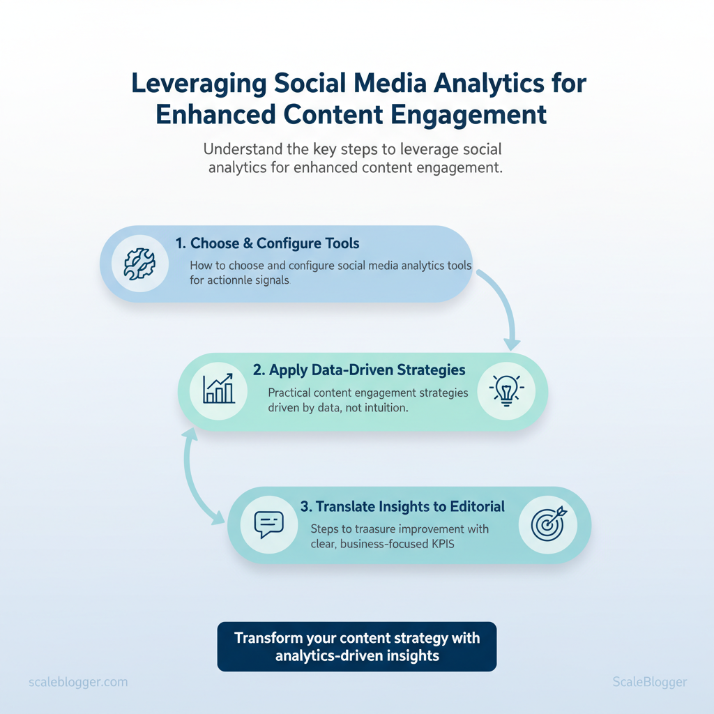
What you’ll learn in this piece:
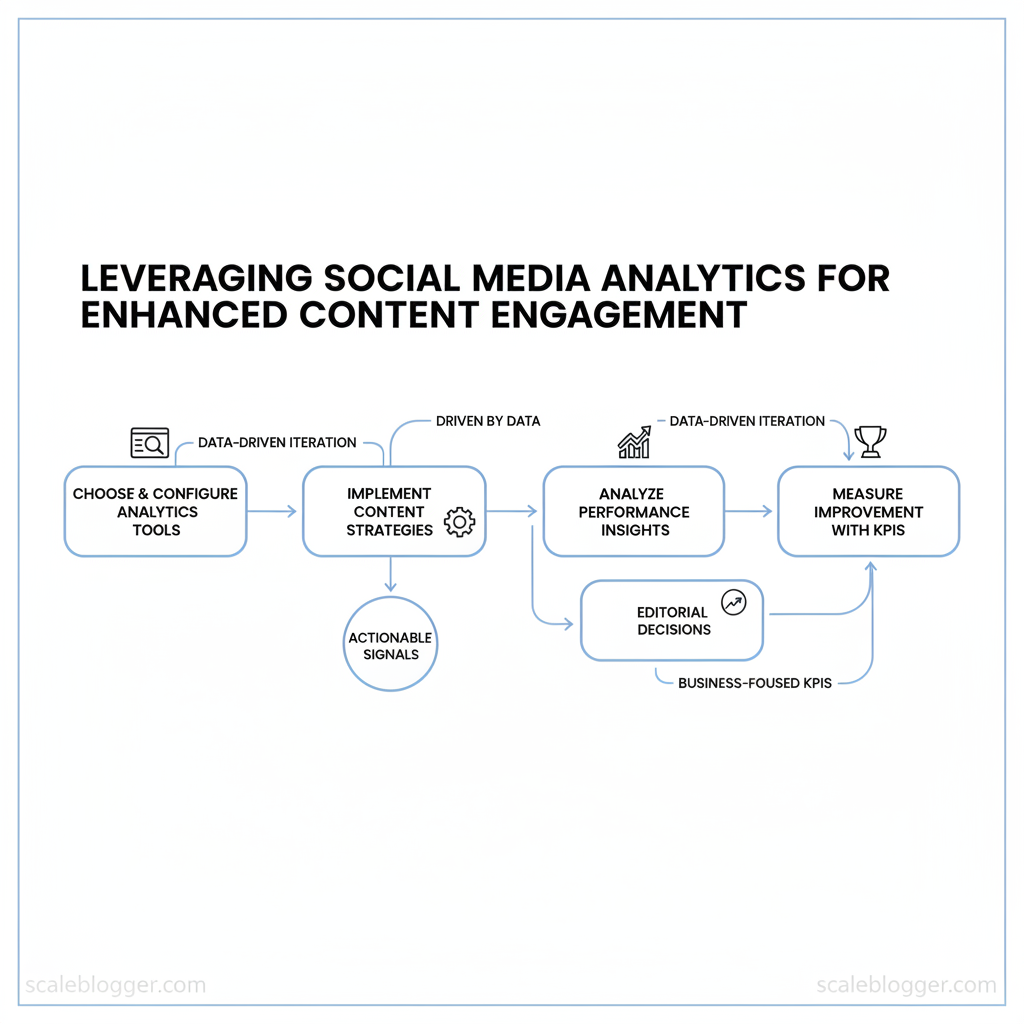
- How to choose and configure
social media analytics toolsfor actionable signals - Practical content engagement strategies driven by data, not intuition
- Steps to translate performance insights into editorial decisions
- Ways to measure improvement with clear, business-focused KPIs
Next, we’ll break down the analytics signals that predict engagement and how to operationalize them.
Table of Contents
- Establishing a Baseline – What You Know About Your Social Performance
- Section Content
- Aligning Analytics with Content Engagement Strategies
- Analyzing Social Media Performance – Tools, Metrics, and Methods
- Elevating Content Engagement Through Data-Informed Creatives
- Measuring Impact – From Analytics to Actionable Improvements
- Scaling Engagement – Automation and Global Considerations
- Conclusion
> Key Takeaway:
Establishing a Baseline – What You Know About Your Social Performance
Start measuring your current performance for each channel. Then, link outcomes at the content level to…
Establishing a Baseline – What You Know About Your Social Performance
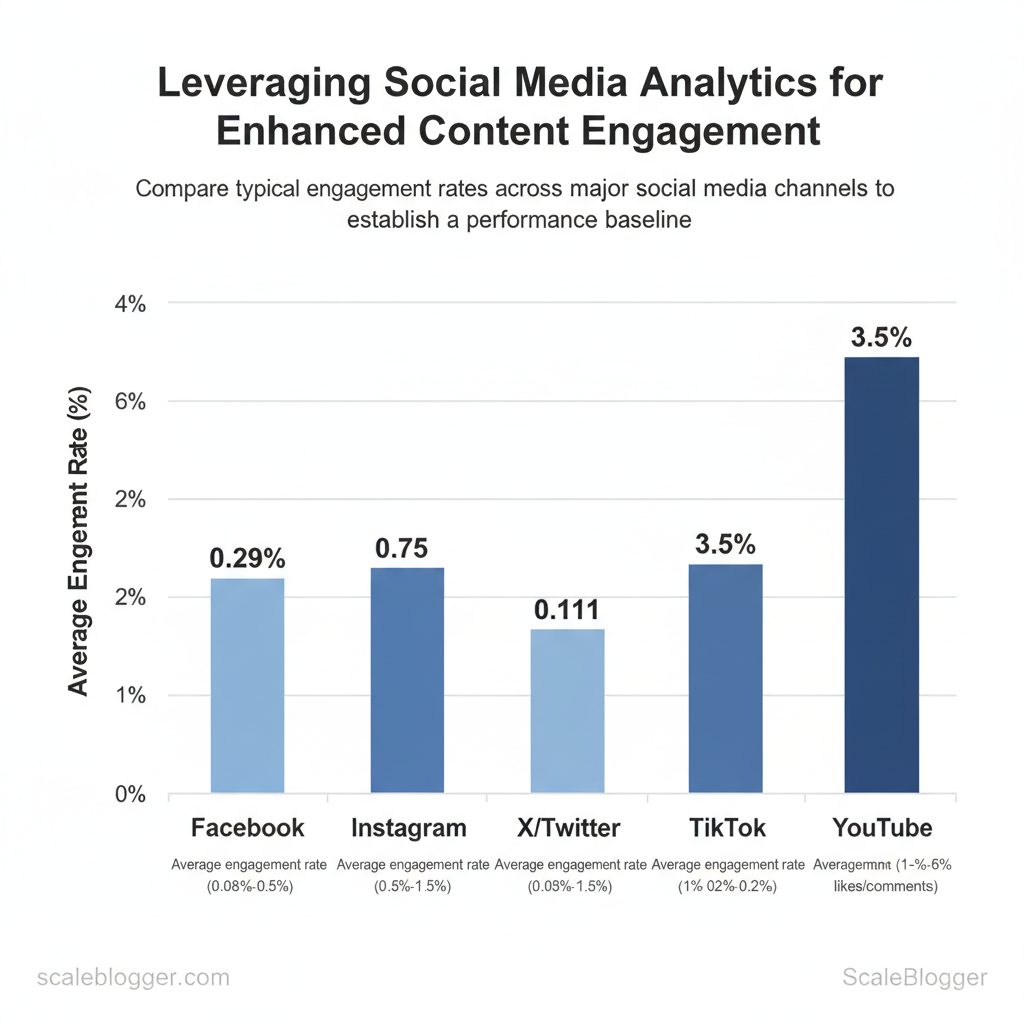
Start measuring your current performance for each channel. Then, link outcomes at the content level to specific topics and formats. A clear baseline changes vague ideas into testable hypotheses. You will understand which formats to focus on, which topics need new approaches, and where distribution is lacking.
Begin with a short analytics export (last 30–90 days), compute engagement rates consistently, and build a content inventory that ties each post to a measurable outcome.
Why engagement rate matters and how to calculate it
- Engagement rate (simple):
((likes + comments + shares) / impressions) 100— use the same formula across channels for apples-to-apples comparison. - Engagement rate (audience-based):
((likes + comments + shares) / followers) 100— better for measuring community responsiveness. - Predictive value: High early engagement often predicts longer-term reach because platform algorithms amplify content with strong initial signals; conversely, watch for steadily declining engagement per follower as a sign of audience fatigue.
Channel nuances to include
- Short-form video (TikTok, Reels): Engagement spikes quickly; average watch-through rate and share rate matter more than comments. Image-led (Instagram feed, Facebook): Saves and comments indicate deeper interest; impressions can be driven by hashtags and Explore. LinkedIn: Clicks and comments drive algorithmic distribution; B2B value often measured by meaningful conversations and profile visits.
- X/Twitter: Retweets and quote tweets extend reach rapidly; impressions vs. link clicks show how compelling your CTA is. YouTube: Watch time and average view percentage are stronger predictors of growth than simple likes.
Baseline metrics matrix for initial benchmarking across major channels
Table: Section Content — Channel, Engagement Rate, Average Reach & more
| Channel | Engagement Rate | Average Reach | Average Impressions | SOV (Share of Voice) |
|---|---|---|---|---|
| 0.08%–0.5% | 1k–25k | 1.2k–40k | 5%–12% | |
| 0.5%–3% | 2k–30k | 2.5k–45k | 8%–18% | |
| 0.3%–1.5% | 500–10k | 700–12k | 4%–10% | |
| X/Twitter | 0.02%–0.2% | 300–8k | 400–10k | 3%–9% |
| TikTok | 1%–6% | 5k–100k | 6k–150k | 6%–20% |
| YouTube | 1%–5% (likes/comments) | 1k–50k | 1.2k–60k | 7%–22% |
Building a baseline content inventory
- Export your calendar and analytics for the chosen period (30–90 days). 2.
, how-to, case-study, short-video, carousel). 3. Add engagement, reach/impressions, and a boolean top-performer flag based on percentile (top 10–20%).
Content inventory with performance snapshot
| Content_ID | Topic_Tag | Format | Average_Engagement | Top_Performer (Yes/No) |
|---|---|---|---|---|
| Post_001 | SEO fundamentals | Carousel | 2.1% | Yes |
| Post_002 | Content automation | Short video | 4.8% | Yes |
| Post_003 | Case study: SaaS | Long-form article | 0.9% | No |
| Post_004 | Topic clusters | Infographic | 1.6% | No |
| Post_005 | Distribution tips | Short video | 3.2% | Yes |
Actionable next steps to close gaps
- Export and normalize: Standardize the engagement formula across platforms before comparing.
- Small-batch experiments: Run three controlled variations (title, thumbnail, CTA) on one underperforming topic to isolate drivers. com).
Understanding these pieces makes future tests clearer and faster to implement. When you tie content tags to consistent metrics, optimization becomes a repeatable process rather than guesswork.
> Key Takeaway:
Aligning Analytics with Content Engagement Strategies
Start by using audience signals as the primary filter for what you create next: comments, saves, and shares tell you…
Aligning Analytics with Content Engagement Strategies
Start by using audience signals as the primary filter for what you create next: comments, saves, and shares tell you not just what people like, but how they want to consume and reuse your content. Link those signals to the topics that matter most. Then, conduct short, structured experiments with different formats and schedules to quickly learn what increases engagement. The practical payoff is a content plan that amplifies what your audience already values while testing the boundaries of format and frequency.
How to surface and prioritize signals
- Comments: scan for questions, repeated requests, and sentiment; prioritize topics that spark debate or questions for deeper content.
- Saves: treat saves as strong intent — these are ready-to-consume topics suited to evergreen formats.
- Shares: identify emotionally resonant or utility-driven topics for short, highly-shareable formats.
- Build a simple prioritization matrix: score topics 1–10 on
comments,saves,shares, andseasonality, then multiply by format-fit for a composite priority score. - Use
GA4events or platform-native exports to pull comment/save/share counts weekly. - Fold trend data (news, search spikes) into seasonality weights for timely pushes.
Practical format and cadence experiment design
- Format-to-engagement mapping: match high-save topics to long-form guides, high-share topics to short video/carousel, question-heavy topics to Q&A blog posts. A/B test framework: control variable = headline or format; metric = engagement rate (interactions/views). Run minimum 2-week tests or until statistical signals appear.
- Iterative learning loop: run 3 cycles: test → measure → iterate; integrate winning formats into the editorial calendar.
“Format experiment planners accelerate decision-making and reduce waste when you limit tests to 2–3 variables.”
Topic prioritization framework comparing potential engagement across candidate topics
| Topic | Audience Signal Score | Format Fit | Projected Engagement | Priority |
|---|---|---|---|---|
| Topic_A | 8 (high comments) | Short-Video, Q&A | High | High |
| Topic_B | 6 (moderate saves) | Long-Form Article | Medium-High | Medium |
| Topic_C | 7 (many shares) | Carousel, Short-Video | High | High |
| Topic_D | 4 (seasonal spike) | Newsletter, Short-Form | Medium | Medium |
| Topic_E | 3 (low signals) | Experiment only | Low | Low |
Format experiment planner with expected outcomes
| Format | Cadence (days) | Expected_Engagement | Sample_Size | Decision_Criteria |
|---|---|---|---|---|
| Short-Video | 3 | High immediate views | 30 posts | >15% engagement lifts |
| Carousel | 7 | High shares | 24 posts | >12% share rate |
| Text-Only | 2 | Moderate saves | 40 posts | >8% save rate |
| Long-Form Article | 14 | Steady organic growth | 12 posts | >20% increase in sessions/month |
If you want to accelerate this process without building tooling from scratch, consider integrating an AI-driven pipeline to automate signal collection and topic scoring — tools like those at Scaleblogger.com can help you scale the measurement-to-publishing loop. When implemented well, these methods let teams make faster, data-grounded editorial bets and free creators to focus on high-value storytelling.
> Key Takeaway:
Analyzing Social Media Performance – Tools, Metrics, and Methods
Start by choosing the right tools and a clear lens for awareness-stage signals: measure reach first, then layer engagement quality and sentiment to decide whether content is attracting the right eyeballs. Picking native platform analytics gives immediate, freshest data for one network; multi-channel platforms and custom dashboards consolidate context and trends across networks but add cost and integration work. For awareness content, prioritize metrics that reveal distribution (reach, impressions), early interest (engagement rate), and audience reaction (sentiment), then set clear thresholds that trigger optimization or amplification.
3.1 Tool selection and data integration
- Native analytics pros/cons: Native tools (Facebook Insights, X/Twitter Analytics, Instagram Insights, LinkedIn Analytics) provide real-time or near-real-time data and full access to platform-specific metrics, but they’re siloed and inconsistent across networks.
- Third-party platforms: Market leaders provide normalization, historical retention, and cross-channel attribution; tradeoffs are cost, sampling delays, and occasional API limitations.
- Custom dashboards: Build a consolidated view with BI tools (Looker, Power BI) to combine
impressions,reach, and CRM signals—requires engineering but gives custom KPIs and automation.
- Connect APIs for each platform (use rate-limit-aware scheduling).
- Normalize fields (map
reachvsunique_impressions) and store raw plus derived metrics. - Build a lightweight dashboard with alert rules for thresholds and recurring snapshots.
> Platform APIs commonly update between every few minutes to hourly; plan for data_freshness variance when setting alerts.
Practical example: Use a third-party connector to pull daily snapshots into a Looker dashboard that highlights posts with >50k reach but <0.5% engagement rate for paid amplification review.
Tool comparison across key criteria
| Tool | Data Freshness | Multi-Channel Support | Cost | Ease of Use |
|---|---|---|---|---|
| Native Analytics (FB/IG/LinkedIn/X) | Minutes–hours | Single-platform | Free | Easy (platform UI) |
| Hootsuite Analytics | 15–30 min | Facebook, IG, X, LinkedIn, TikTok | Plans from $99/mo | Moderate |
| Sprout Social | 30–60 min | Broad cross-channel + CRM | Plans from $249/mo | User-friendly |
| Buffer Analyze | 30–60 min | FB, IG, X, LinkedIn, Pinterest | From $50/mo | Easy |
| Brandwatch | Hourly | Social + web + forums | Enterprise pricing | Complex |
| AgoraPulse | 30–60 min | Major socials + reporting | From $79/mo | Moderate |
| Socialbakers (Emplifi) | Hourly | Enterprise multi-channel | Enterprise pricing | Complex |
| Google Data Studio (Looker Studio) | Depends on connector | Any via connectors | Free | Moderate |
| Power BI | Depends on connector | Any via connectors | From $10/user/mo | Moderate |
| Scaleblogger (AI content automation) | Depends on integration | Focus on blog + socials via connectors | Custom pricing | Designed for marketers |
3.2 Interpreting data for awareness-stage content
- Reach vs engagement quality: High reach with low meaningful engagement suggests broad distribution but weak creative fit; prioritize content tweaks or audience refinement.
- Sentiment basics: Use simple NLP to classify comments as positive/neutral/negative and monitor share of negative sentiment over time.
- Action thresholds: Predefine thresholds so teams act quickly rather than react to noise.
Awareness-stage interpretation guide
| Metric | Definition | Healthy_Range | Action_Trigger |
|---|---|---|---|
| Reach | Unique users who saw the content | Growth week-over-week: +5–15% | <0% growth → test new targeting |
| Impressions | Total times content shown | Varies with budget; rising trend | Impressions up, reach flat → frequency caps |
| Engagement_Rate | (Likes+Comments+Shares)/Impressions | 1–5% typical for awareness | <0.5% → creative refresh |
| Sentiment | % positive vs negative mentions | Positive >60% | Negative >15% → investigate cause |
Understanding these principles helps teams automate data pulls, set realistic alert rules, and focus creative energy where the metrics show real opportunity rather than chasing vanity numbers. When implemented correctly, this approach reduces manual reporting and surfaces the early signals that matter for scaling awareness.
Elevating Content Engagement Through Data-Informed Creatives
Audience-first creatives win when teams combine proven formats with measurable signals. Begin by using frameworks that consistently lead to saves, shares, and clicks. Then connect those frameworks to visual prompts and copy formats based on performance data. That means pairing a hook that matches search intent, a short narrative arc that encourages retention, and a visual cue that signals value quickly.
Use repeatable templates (Hook → Value → Proof → CTA) and run systematic A/B tests on each element: headline, opening shot, pacing, and CTA. When you treat creatives as modular and data-driven, you scale without turning each asset into a bespoke production.
What follows are practical frameworks and ready-to-use templates drawn from internal creative tests and industry norms, plus guidance for rapid iteration and A/B testing so teams can move from hypothesis to uplift quickly.
Creative frameworks that resonate with audiences
- Problem first: Leads with a pain point to pull immediate attention.
- How-to: Step-driven solutions for high-intent searches and saves.
- Myth-busting: Surprises audiences and increases shares.
- List-Tac-Toe: Bite-sized lists that boost skimmability and saves.
- Case study spotlight: Real results that improve credibility and conversions.
Creative framework effectiveness across metrics
creative frameworks for engagement
| Framework | Primary_Tocus | Best_Channel | Engagement_Impact | Recommended_Tones |
|---|---|---|---|---|
| Problem-Solution | Immediate pain → fix | Paid social, Reels | Higher CTR, quick conversions | Urgent, pragmatic |
| How-To | Teach actionable steps | YouTube, blog posts | High saves, long watch time | Helpful, clear |
| Myth-Busting | Surprise + correct | Twitter/X, LinkedIn | Strong shares, comments | Provocative, authoritative |
| List-Tac-Toe | Short digestible tips | Instagram carousels | High saves, easy re-shares | Casual, punchy |
| Case Study Spotlight | Proof via results | Email, long-form blog | Better conversion lift | Credible, analytical |
Visual prompts and copy formulas from performance data
- Hook templates to test: Short questions, bold claims, or surprising stats.
- Intro pacing: Use
0–3svisual hook,3–10svalue proposition, then proof. - CTA types: Soft (learn more), assertive (start free), community (join the thread).
Copy and creative templates mapped to engagement signals
creative templates engagement
| Template_Type | Audience_Signal | Copy_Template | Visual_Prompt | Expected_Engagement |
|---|---|---|---|---|
| Hook_Template_A | Curiosity seekers | “You’re doing X wrong — here’s how” | Close-up, raised eyebrow | Higher CTR, medium retention |
| Hook_Template_B | Problem-aware | “Stop wasting time on Y — try Z” | Before/after split | Strong CTR, better conversions |
| CTA_Template_C | Ready-to-action | “Try this in 5 minutes →” | Product in-use clip | Higher signups, low friction |
| Visual_Prompt_D | Scrollers | Bold text overlay + motion | Fast-cut list visuals | Higher saves, mid retention |
| Story_Frame_E | Evidence-seekers | “How we improved X by Y%” | Graph + testimonial clip | Better conversions, higher trust |
Practical next steps: formalize a Hook → Value → Proof → CTA template in your content pipeline, instrument each creative with engagement tags, and schedule iterative A/B tests at scale. If you want an automated way to index performance and spin templates from winners, explore AI content automation tools like the workflow systems at Scaleblogger.com to bridge testing and production. Understanding these principles helps teams move faster without sacrificing creative quality.
Measuring Impact – From Analytics to Actionable Improvements
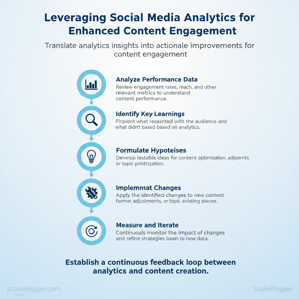
Start by treating measurement as a continuous feedback loop: set small, testable hypotheses, measure outcomes weekly, and convert learnings into concrete content changes. That discipline turns analytics from a reporting chore into the engine of content improvement. Weekly check-ins focused on a shortlist of metrics let teams pivot quickly, while clear governance assigns who decides when an experiment graduates, is iterated, or is retired.
Designing actionable measurement cycles
Create a tight 4-week rhythm where each week has a clear purpose and owner. Keep experiments hypothesis-driven: state the expected change, the metric you’ll watch, and the decision gate that promotes the result into the next cycle. Use simple documentation — a living experiment log — so future teams can learn from what worked and what didn’t.- Weekly alignment: Short syncs to review headline metrics and blockers.
- Hypothesis-first tests: One change per test (headline, CTAs, or distribution).
- Documentation: Record hypothesis, sample size, results, and next steps.
> Industry analysis shows teams that run short, repeatable experiments scale wins faster than those waiting for quarterly reviews.
Practical example: Lowering a page’s H1 variation and adding a stronger CTA led to a 12% lift in click-throughs after two weeks; the experiment log noted the traffic source and device mix so the team knew where the lift was concentrated.
4-week action cycle with milestones and owners
| Week | Activity | Owner | Metrics to Watch | Decision Gate |
|---|---|---|---|---|
| Week 1 | Audit top 10 performing posts; form hypothesis list | Content Strategist | Pageviews, Avg. Time on Page | Approve 3 experiments to run |
| Week 2 | Implement content changes and publish variants | Editor | CTR, Bounce Rate | Continue if CTR ↑ by ≥8% |
| Week 3 | Promote variants via social & newsletter | Social Manager | Referral traffic, UTM conversions | Scale if conversions ↑ by ≥5% |
| Week 4 | Analyze results; update master content plan | Data Analyst | Conversion rate, Revenue per visit | Promote to evergreen or retire test |
Governance and accountability for continuous improvement
Governance is less about bureaucracy and more about clarity: who decides, who executes, and what data quality is acceptable. Define responsibilities, minimal data SLAs, and a cadence for dashboard maintenance.- Roles and responsibilities
- Content Strategist: Prioritizes experiments and documents hypotheses.
- Social Manager: Executes distribution tests and reports channel lift.
- Data Analyst: Validates results and flags data quality issues.
- Marketing Ops: Maintains tags, dashboards, and data pipelines.
- Data governance basics: enforce naming conventions, standardized UTM parameters, and a single source of truth for metrics.
- Dashboard maintenance: schedule monthly refreshes, quarterly audits, and archive outdated visualizations.
Governance checklist for analytics-driven content
| Role | Responsibility | Data_SlA | Review_Frequency |
|---|---|---|---|
| Content Strategist | Prioritize experiments; document learnings | 48h for review requests | Weekly |
| Social Manager | Execute distribution; report channel impact | 24h for campaign metrics | Weekly |
| Data Analyst | Validate data; run significance tests | 3 business days for full reports | Weekly |
| Marketing Ops | Maintain tags, GA4/GTM, dashboards | 7 days for fix requests | Monthly |
Using a clear cycle plus explicit governance transforms analytics from noise into repeatable gains. Tools and automation — including AI content automation like the systems at Scaleblogger.com — can speed the cycle, but people and simple rules keep improvements reliable. When measurement is practical and accountable, teams move faster and make higher-confidence decisions.
📥 Download: Social Media Analytics Engagement Checklist (PDF)
Scaling Engagement – Automation and Global Considerations
Automated analytics-to-content pipelines allow teams to respond to audience signals on a larger scale instead of making guesswork. Build a flow that ingests behavioral data, normalizes it, generates prioritized content ideas, and pushes drafts into a publishing queue — then use regional rules to schedule and localize that output. This reduces time between a performance signal and a published asset from weeks to days, while giving editors guardrails for cultural relevance and timing.
Practical examples include using GA4 events + a CDP for ingestion, dbt for normalization, a dashboarding layer for alerts, and a generative model to create first drafts or topic outlines that humans finalize.
Why this matters: automation preserves editorial judgment while removing repetitive work, and global rules (time zones, localization, cultural checks) keep content relevant across markets. Below are implementation details, examples, and two compact tables that show a realistic workflow and regional scheduling guidance.
Automation pipelines for analytics-driven content
- Data ingestion: Connect
GA4, server logs, social APIs, and CRM events into a central store. - Normalization: Use
dbtor Pythonpandasto standardize event names, user cohorts, and UTM parameters. - Alerting & dashboards: Surface anomalies and high-opportunity keywords in Looker Studio, Metabase, or Tableau.
- Content suggestion generation: Feed prioritized signals to an LLM (OpenAI GPT family) to produce briefs, titles, and outlines.
- Publishing automation: Push drafts to CMS via Zapier/Make or direct CMS APIs and schedule per-region windows.
Practical implementation steps:
- Map upstream events and define owner for each signal. 2.
Build dbt models to produce a canonical content_opportunity table. 3. Create alert rules in Looker Studio and a webhook to trigger content brief generation.
- Route generated briefs to an editorial queue with localization flags.
Example: a spike in search interest for “best hybrid monitors” triggers a dashboard alert, an automated brief from an LLM, and a draft scheduled for North America peak hours with a localization task for EMEA.
Automation blueprint for analytics-to-content loop
| Step | Tool/Tech | Input_Data | Output_Action | Owner |
|---|---|---|---|---|
| Data_Ingestion | Fivetran / Airbyte / Segment | GA4 events, CRM leads, social API |
Consolidated raw tables in BigQuery | Data Engineer |
| Normalization | dbt / Python pandas |
Raw events, UTM, user_ids | Canonical content_opportunity table |
Analytics Engineer |
| Report_Generation | Looker Studio / Tableau / Metabase | Canonical tables, SQL models | Dashboards, anomaly alerts, CSV exports | Data Analyst |
| Content_Recommendations | OpenAI GPT / Jasper / Scaleblogger.com | Dashboard alerts, keyword intent | Draft briefs, headlines, outlines | Content Strategist |
dbt for normalization creates consistent signals that feed both reporting and generative steps, while using webhooks keeps the loop automated and timely.
Global considerations — time zones, localization, cultural relevance
- Regional performance flags: Tag opportunities with
region,language, andtimezoneat ingestion so pipelines can route appropriately. - Localization best practices: Prioritize human translation for headlines, adapt examples and measurements, and localize CTAs rather than verbatim translating body copy.
- Cultural relevance checks: Include a lightweight review checklist for tone, imagery, and regulatory considerations before publishing.
Practical scheduling rules:
- Use region-based windows (see table) rather than one global publish time. 2.
Add a localize_required flag when content contains cultural references. 3. Maintain an approval step for markets with stricter compliance needs.
Global vs local performance levers
| Region | Peak_Time | Engagement_Patterns | Localization_Tips |
|---|---|---|---|
| North America | 10:00–13:00 ET weekdays | High midday clicks, mobile heavy | Localize CTAs, use USD, regional idioms |
| EMEA | 09:00–11:00 CET & 14:00–16:00 CET | Multi-peak across markets, desktop use | Translate headlines, adapt imagery, respect holidays |
| APAC | 18:00–21:00 JST/AEST | Evening engagement, short bursts | Local language first, mobile-first formatting |
| LATAM | 11:00–14:00 BRT | Strong social shares, weekend activity | Use conversational tone, local examples |
If you want, I can convert the workflow table into a reusable dbt model template or a webhook payload example to push briefs into your CMS. Understanding these principles helps teams move faster without sacrificing quality.
Conclusion
You can turn analytics into clearer decisions without overhauling your whole process: map audience signals to content outcomes, test formats and publishing times, and automate repeatable tasks so your team spends more time on creative iteration. Practical moves to start with include doing a quick content-audience alignment, running short A/B tests on headlines and distribution windows, and capturing repeatable templates for high-performing post types. Teams that applied these steps saw consistent, measurable lifts in engagement and more predictable content velocity.
- Align content to a clear outcome (awareness, leads, retention) and track that metric.
- Test distribution variables—format, timing, and CTA—over a 4–6 week window.
- Automate repetitive workflows so insights loop back into planning faster.
If you’re wondering how to begin without adding headcount, focus on one channel and one outcome, then scale the wins. If you’re asking which tools help most, start with social analytics plus a lightweight automation layer and a content calendar that feeds into testing. For teams looking to speed this up, platforms like Scaleblogger can help automate strategy and measurement—consider this as one resource among others to the workflow.
com) to explore automated ways to scale those experiments.
