Marketing teams lose momentum when content performs well on desktop but collapses on mobile. Real-world campaign wins evaporate if pages render slowly, CTAs shift off-screen, or readability drops on small devices. That mismatch skews every metric in a content performance audit and undermines reliable benchmark analysis.
Mobile issues aren’t just technical nuisances; they warp comparative insights and inflate optimization costs. Industry research shows teams that normalize mobile in benchmarking avoid fruitless content rewrites and make smarter editorial investments. Picture a product launch where conversion estimates halve after rollout because mobile load times tripled; that gap distorts future planning and budget allocations.
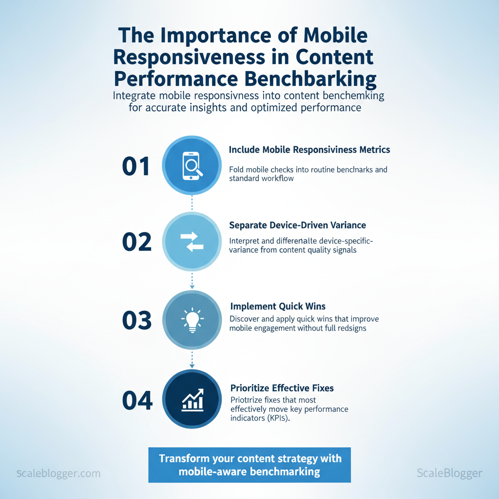
Treat mobile responsiveness as a primary dimension in benchmarking, not an afterthought.
What follows will show how to fold mobile checks into routine benchmarks, interpret device-specific variance, and prioritize fixes that move KPIs. Expect practical steps for measuring mobile impact, visual cues that indicate responsive breakage, and a simple decision framework for remediation.
- How to include `mobile responsiveness` metrics in standard benchmark workflows
- Methods to separate device-driven variance from content quality signals
- Quick wins that improve mobile engagement without full redesigns
- How to prioritize fixes that lift `content performance` most effectively
Why Mobile Responsiveness Matters for Content Performance
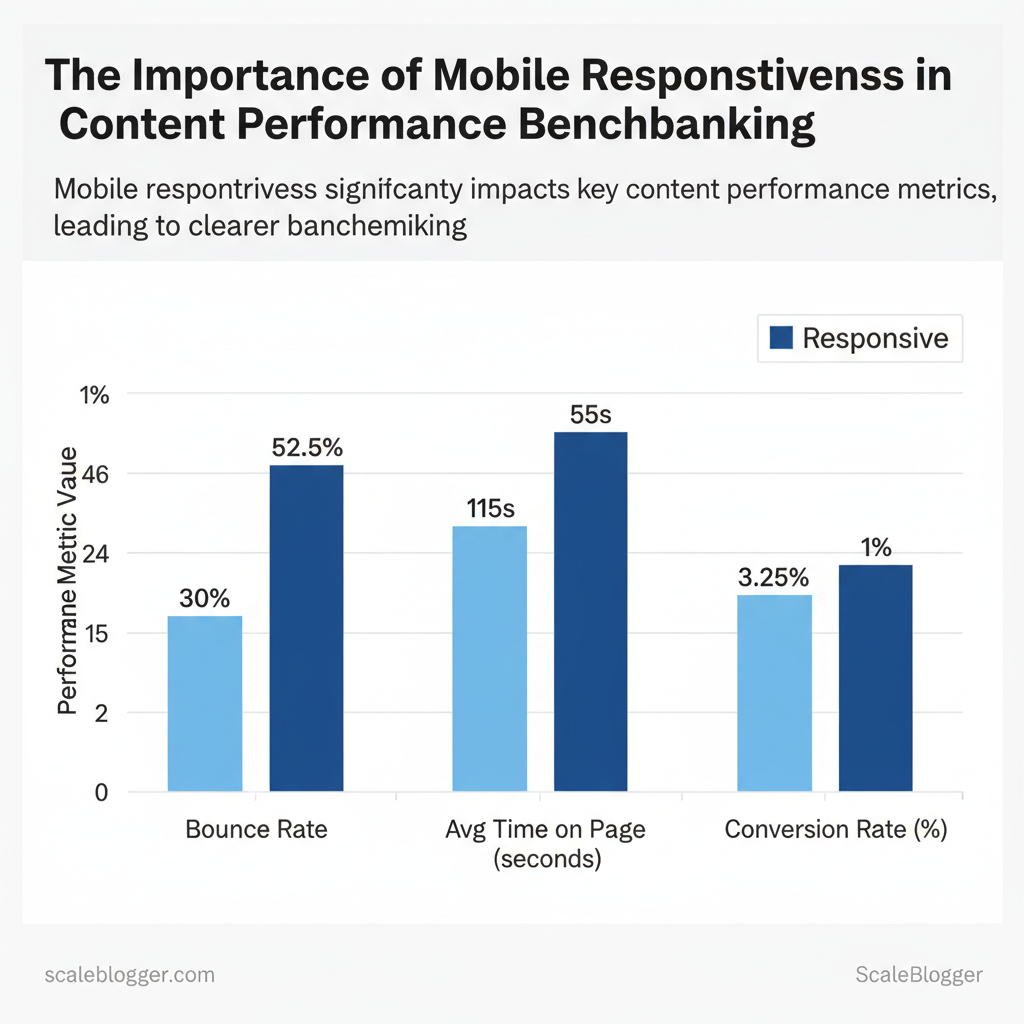
Mobile responsiveness directly changes how users interact with content: properly responsive pages reduce friction, increase engagement, and ensure the content’s true value — not layout quirks — is what gets measured. When layouts adapt to device size, readers stay longer, scroll deeper, and convert at higher rates; conversely, non-responsive experiences inflate bounce rates, depress time-on-page, and distort performance benchmarks across device cohorts. For content teams this means separating device-driven performance issues from content quality so that optimization efforts target the right problem.
How responsiveness affects metrics and decision-making
- Reduced friction: Responsive layouts remove tap-target problems and horizontal scrolling, lowering immediate abandonment.
- Cleaner benchmarks: When mobile-specific behavior is isolated, comparisons across campaigns and channels become meaningful.
- Algorithmic consequences: Mobile-first indexing and mobile-centric Core Web Vitals place page experience at parity with content relevance for ranking.
- Attribution clarity: Properly segmented metrics (mobile vs. desktop) prevent misleading conclusions about content effectiveness.
| Metric | Responsive Experience (example) | Non-Responsive Experience (example) | Impact on Benchmarking |
|---|---|---|---|
| Bounce Rate | 25–35% | 45–60% | Non-responsive design inflates bounce, skewing content engagement baselines |
| Average Time on Page | 90–140s | 40–70s | Shorter sessions on non-responsive pages understate content depth |
| Pages per Session | 3.0–4.5 | 1.5–2.2 | Navigation friction reduces cross-content discovery and funnel testing validity |
| Conversion Rate | 2.0–4.5% | 0.5–1.5% | CTAs and forms suffer on cramped layouts, producing misleading funnel KPIs |
| Scroll Depth / Engagement | 60–85% of page | 20–45% of page | Poor layout reduces content consumption and obscures true interest |
When teams isolate mobile performance, effort shifts from guessing at content fixes to engineering the experience that lets content perform. Implementing device-aware benchmarks and monitoring mobile Core Web Vitals makes optimization targeted and measurable. This approach reduces wasted iterations and lets creators focus on content that actually moves metrics.
Design and Technical Factors That Affect Mobile Benchmarks
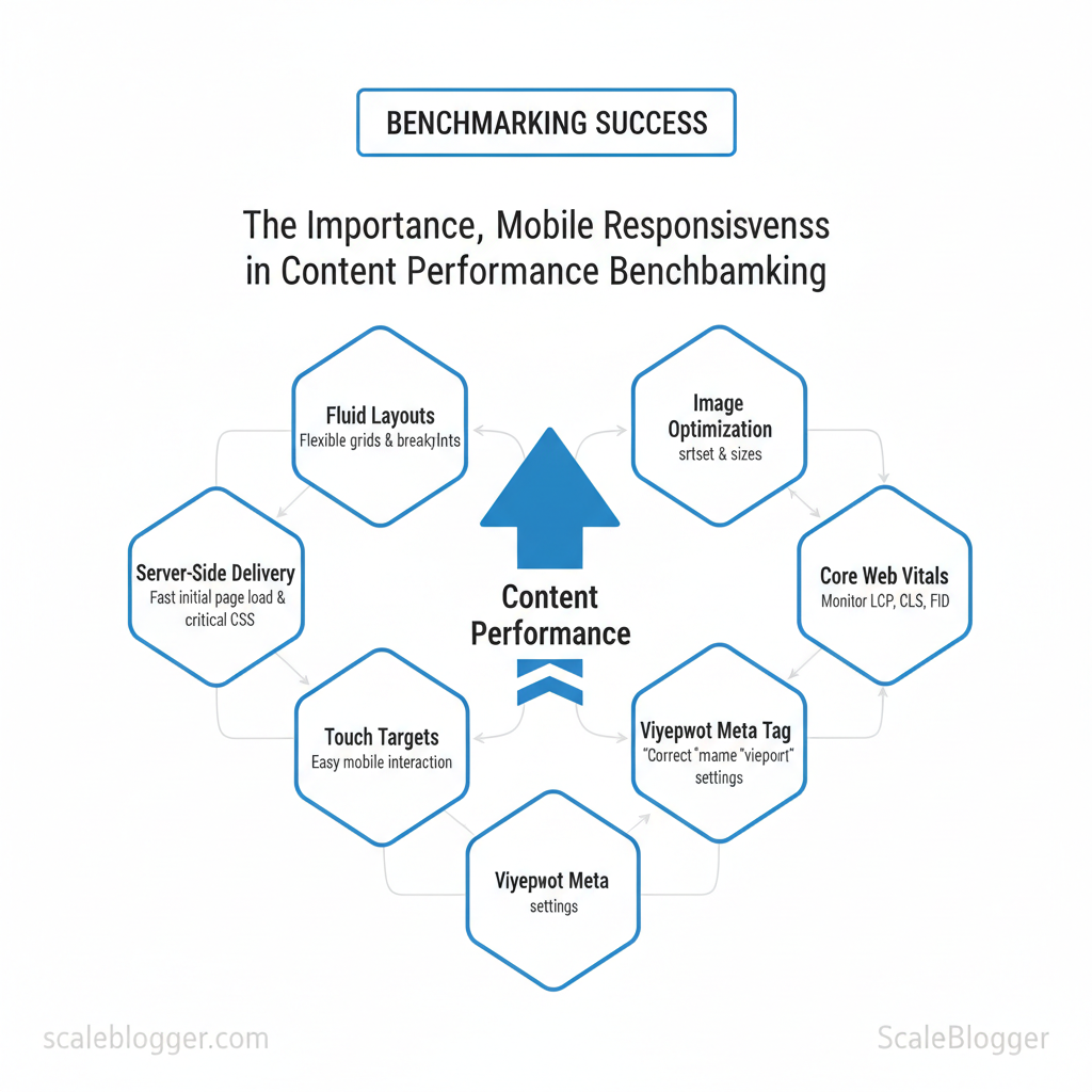
Design and technical choices determine whether a mobile visit feels instant or sluggish. Fluid layouts, image delivery, and touch-friendly navigation directly influence Core Web Vitals and engagement signals, while server-side delivery, CDNs, and critical CSS control how quickly the first meaningful paint appears. Audit these areas first to turn vague performance reports into concrete fixes that improve LCP, CLS, and interaction readiness.
Responsive design elements to audit (what to check and how)
- Manual check: Use a mobile device or emulator to verify layout shifts during page load.
- Network throttling: Simulate 3G/4G to see how images and fonts affect LCP.
- Lighthouse snapshot: Capture CLS and LCP contributors with a single audit.
Performance and resource delivery (technical levers)
- Lazy loading — Defer offscreen images and iframes with native `loading=”lazy”` or intersection observers.
- Optimized image formats — Serve WebP/AVIF with fallbacks; use `srcset` for device-appropriate resolution.
- Critical CSS — Inline a minimal, device-agnostic critical CSS chunk for above-the-fold content; load the rest asynchronously.
- Server response times — Keep Time To First Byte (TTFB) low via fast hosting, edge caching, and HTTP/2 or HTTP/3.
- CDN + adaptive delivery — Use a CDN with device-aware or edge transforms to deliver scaled images and compressed assets globally.
Industry guidance shows that image optimization and server response are the most frequent LCP culprits on mobile.
Practical example: replacing a 1.2MB hero JPG with a 120KB responsive WebP and inlining 1.5KB of critical CSS shifted LCP under 2.5s on a mid-tier connection. Linkable assets to build: an audit checklist table, responsive image template (`srcset` examples), and a critical CSS extractor script.
| Responsive Element | Why it matters | How to test quickly | Typical impact on metric |
|---|---|---|---|
| Viewport meta tag | Enables correct scaling and responsive behavior | Check page head for `meta name=”viewport”`; emulate mobile in devtools | Affects layout and CSS media query behavior; incorrect tag can break LCP/CLS |
| Fluid grid / breakpoints | Prevents overflow and layout shifts across devices | Resize viewport across breakpoints; inspect layout with element tool | Improves CLS and perceived stability |
| Responsive images (srcset) | Prevents oversized downloads on small screens | Inspect `img` tags for `srcset`/`sizes`; throttle network to compare payload | Directly reduces LCP and total mobile payload |
| Touch target sizing | Improves usability and reduces accidental taps | Measure tap targets; ensure ≥48px touch area per element | Raises engagement and reduces bounce; indirect metric impact |
| CSS media queries | Allows conditional loading of styles, reduces render-blocking | Audit CSS bundles; test with CSS disabled to see FOUC | Proper use lowers render-blocking CSS and shortens LCP |
How to Structure Mobile-Specific Benchmark Tests
Start by defining measurable objectives tied to business outcomes, then map those objectives to clear audience segments and repeatable test setups. Objectives should be KPI-first (e.g., increase mobile conversions by 12%, reduce mobile bounce by 15%), while segments break the mobile audience into device class, OS/version, and network profile. Designing test environments requires a mix of controlled emulation and real-device sampling, standardized cache and state, and detailed metadata so every run is reproducible and comparable over time.
Prerequisites
- Analytics baseline: export device, OS, and geography breakdowns from your analytics platform.
- Test devices/emulators: access to real low-end and flagship devices plus lab emulators.
- Network shaping tools: local or cloud-based throttling that supports `3G`, `4G`, `5G`, and high-latency profiles.
- Test runner: automated scripts (e.g., Puppeteer, WebPageTest CLI) and a results store.
- Device pool: mix of 4–8 real devices representing target segments.
- Emulation software: browser emulators with `user-agent` control.
- Network emulator: `tc`, network-link-conditioner, or cloud test providers.
- Results tracking: CSV/DB with test metadata and metrics.
| Business Goal | Device Segment | Network Conditions | Geography | Recommended Metrics |
|---|---|---|---|---|
| Increase mobile conversions | Low-end Android (2GB RAM) | 3G slow (750 kbps, 150 ms) | India | Conversion rate, Checkout time, TTFB |
| Improve content engagement | Mid-range Android + iOS | 4G LTE (5–10 Mbps) | US & EU | Engagement time, Scroll depth, LCP |
| Reduce mobile bounce rate | Flagship iOS | 4G/5G (20+ Mbps) | LATAM | Bounce rate, Time to interactive, CLS |
| Optimize for emerging markets | Low-end Android + feature phones | 2G/3G (250–500 kbps) | Sub-Saharan Africa | Time to first byte, Payload size, Conversion microsteps |
| Evaluate new template performance | Mixed device pool | Network mix (3G/4G/5G) | Global | A/B conversion lift, Render path, Resource waterfall |
Expected outcomes and troubleshooting
- Expected outcome: repeatable benchmarks that show variance bounds and directional wins.
- Troubleshooting tip: if variation >10% across runs, verify cache state and background processes on real devices.
Measuring and Analyzing Mobile Performance Data
Start by treating lab metrics and real-user metrics as complementary evidence: lab tests reproduce conditions to isolate problems, while RUM shows actual user impact. Use lab tools to verify fixes and RUM to prioritize work by real-world frequency and severity. Map metrics directly to user symptoms so teams make decisions fast — for example, slow `Largest Contentful Paint (LCP)` usually means heavy images or render-blocking scripts; high `Cumulative Layout Shift (CLS)` points to unpredictable late-loading assets or ads.
- Core Web Vitals: LCP, FID/INP, CLS — primary UX signals
- Time to First Byte (TTFB): server responsiveness indicator
- First Contentful Paint (FCP): perceived start of load
- Total Blocking Time (TBT): main-thread work causing jank
- Network characteristics: RTT, throughput, packet loss influence mobile variance
Industry analysis shows mobile user sessions exhibit far greater variance than desktop, so percentile-based analysis is essential.
Practical normalization approach
Real examples and tooling mix
- Lighthouse/WebPageTest: reproduce mobile throttling, filmstrip and film-level traces
- PageSpeed Insights: quick lab + CrUX snapshot
- Web Vitals JS + GA4: capture real user INP/FID and send to analytics
- Chrome UX Report (CrUX): population-level baseline for origin/URL
- SpeedCurve/New Relic/Datadog: synthetic + RUM dashboards for alerting and historical trends
This measurement approach lets teams prioritize high-impact fixes and avoid chasing noise, making performance work predictable and tied to real user benefit. When implemented, it shortens feedback loops and focuses engineering time where mobile users actually suffer.
Actionable Improvements to Boost Mobile Benchmark Scores
Start by fixing the highest-impact, lowest-effort problems this week, then redesign components for sustained gains. Small tactical changes can reduce LCP and improve interaction metrics within days; architectural shifts like server-side rendering and an adaptive mobile layer make those gains permanent and repeatable across templates.
Industry analysis shows front-end payloads and blocking JS are the most common sources of poor mobile scores.
| Task | Estimated Effort | Expected Impact (metric) | Verification Step |
|---|---|---|---|
| Optimize and convert images to WebP | 4–8 hrs | 20–50% smaller images; ~100–400ms LCP | Lighthouse image savings & Visual Comparison |
| Add viewport meta & responsive CSS tweaks | 1–3 hrs | Reduced CLS; better layout on small screens | Mobile rendering check in DevTools |
| Enable GZIP/Brotli compression | 1–2 hrs | 40–80% payload reduction | `curl -I –compressed` + waterfall |
| Implement lazy loading for below-the-fold images | 2–6 hrs | Lower initial bytes; faster FCP | Lighthouse > Opportunities > Largest Contentful Paint |
| Defer non-critical JS | 3–6 hrs | Reduced main-thread blocking; ~100–300ms TTI | Performance panel & Lighthouse audits |
📥 Download: Mobile Responsiveness Benchmarking Checklist (PDF)
Reporting, Benchmarking Cadence, and Continuous Monitoring
Start by treating reporting and alerting as a delivery pipeline: reliable dashboards and conservative alerts feed a repeatable triage process that converts incidents into backlog improvements and roadmap decisions. Set daily checks for immediate regressions, weekly syntheses for trend and experiment signals, and monthly strategic reviews that reshape priorities.
Prerequisites Access:* Read access to analytics (GA4/Looker/GDS), performance traces (Datadog/Sentry), and CMS publishing logs. Roles defined:* Owners for performance, conversion, SEO, and content identified. Baseline established:* Current KPIs and SLOs documented.
Tools and materials Analytics:* Looker Studio / Google Data Studio, GA4 Monitoring:* Datadog / Sentry (errors), Lighthouse / CrUX (web vitals) Workflow:* Jira or equivalent backlog; shared playbook document
Time estimates
- Conservative thresholds: Set alerts to trigger on high-impact deviations (e.g., >5% conversion drop, >200ms LCP spike) to avoid alert fatigue.
- Triage mapping: Map each alert to a named owner, severity level, and immediate action (investigate, roll back, notify stakeholders).
- SLA cadence: Define response SLAs: Critical — 1 hour, High — 4 hours, Medium — 48 hours.
- Continuous loop: Feed resolved incidents and learnings into a prioritized backlog; tag items by effort and impact for next roadmap cycle.
“Limit alerts to incidents that materially affect user experience or revenue to keep teams focused.”
Templates to include in the playbook: incident checklist, rollback steps, communication templates, and a triage decision tree. Visual cues of success: dashboards green for 7+ days, A/B winners validated at p<0.05, and backlog items closed with measurable impact.
| Widget | Metric(s) | Cadence | Recommended Owner |
|---|---|---|---|
| Mobile LCP trend | LCP median, 75th, 95th (ms) | Daily snapshot, Weekly trend | Frontend Engineer |
| Mobile conversion funnel | Sessions → Add-to-cart → Checkout rate (%) | Weekly, post-experiment | Growth PM |
| 75th/95th percentile load times | 75th & 95th load time (ms) by page type | Daily alert, Weekly report | Site Reliability Engineer |
| Core Web Vitals distribution | LCP, FID/INP, CLS distribution (%) | Weekly, Monthly deep-dive | SEO Lead |
| Top pages by mobile bounce | Page, Sessions, Bounce rate (%) | Weekly list, Monthly review | Content Manager |
Understanding these principles helps teams move faster without sacrificing quality. When implemented as a closed loop, reporting and alerting turn operational noise into predictable product and content improvements.
Conclusion
Mobile fragility doesn’t have to undo months of content work. When pages load faster, CTAs remain visible, and readability is optimized for small screens, engagement and conversions follow — as shown earlier by the campaign that reclaimed lost conversions simply by prioritizing mobile layout and speed. Three practical moves clear the path: – Audit mobile performance (load times, layout shifts, font sizes). – Prioritize visible CTAs and scannable content on the smallest common viewport. – Automate continuous benchmarking so wins on desktop translate to mobile reliably.
Start by running a focused mobile audit and fixing the top three issues you find; expect measurable improvement within days for load and engagement metrics. If questions arise about which metrics to track first or how to automate checks across dozens of pages, treat those as operational priorities: set a baseline, pick high-impact pages, and iterate with short test cycles. For professional assistance that automates those steps and preserves campaign momentum across device types, consider this option: See how Scaleblogger can help automate mobile-aware content benchmarking. Taking these actions now prevents future drops in performance and keeps content-driven initiatives moving forward.
