

Design teams struggle to make images, videos, and text work together as a strong, persuasive experience. Visual assets are added too late, layouts confuse users, and content loses its impact across different formats. This gap decreases engagement and cuts conversion rates for campaigns and product launches.
When teams prioritize visual content design and multi-modal styles, audiences engage longer, and messages are clearer. Industry practitioners observe that consistent content visual hierarchy reduces cognitive load and boosts recognition across channels. Picture a product launch where thumbnails, hero images, and social clips all share a unified color system and focal point; click-throughs and retention climb measurably.
Scaleblogger helps teams achieve consistency by automating thumbnail and asset creation while applying visual rules across different platforms. Use these ideas to align brand, reduce production time, and sharpen creative decisions.
- What makes multi-modal aesthetics drive attention and memory
- How to build a content visual hierarchy that translates across formats
- Practical patterns for image, video, and microcopy alignment
- Metrics to watch when redesigning multi-modal assets
- Workflow tips to automate visual output without losing design control
This introduction previews practical tactics and governance models that follow. Try Scaleblogger to automate thumbnail and asset generation — https://scaleblogger.com — and continue to the guide for hands-on patterns and measurable steps.
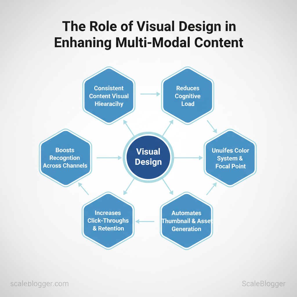
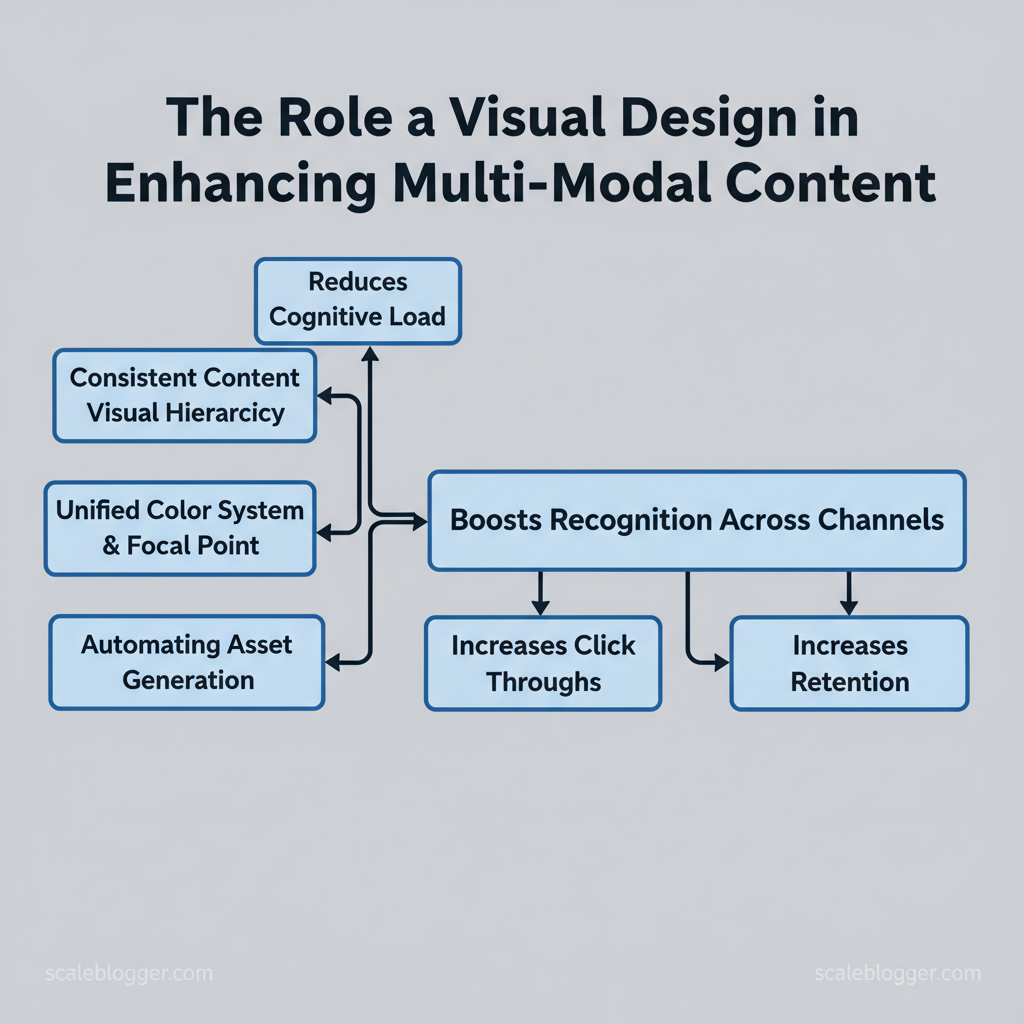
Table of Contents
> Key Takeaway:
H2: Fundamentals of Visual Design for Multi-Modal Content
Effective visual design for multi-modal content begins with viewing every asset—text, images, videos, and…
H2: Fundamentals of Visual Design for Multi-Modal Content
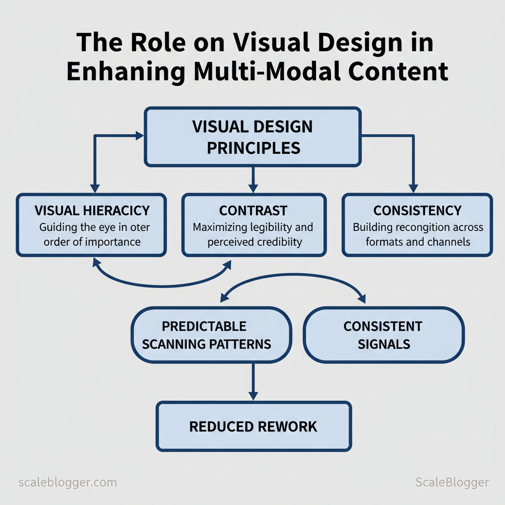
Effective visual design for multi-modal content begins with viewing every asset—text, images, videos, and infographics—as parts of one communication system. When you craft that system with predictable scanning patterns and consistent signals, audiences swiftly transition from discovery to action, reducing rework for teams. This means creating a clear visual hierarchy, using strong contrast for readability, and ensuring consistency so brand messages are understood across different screens and formats.
Core Principles (Hierarchy, Contrast, Consistency)
Visual hierarchy is about guiding the eye in order of importance. Use size, weight, color, and placement so a reader can scan a page and immediately see the most important element. For example, a blog hero might use bold 36px headline, subheadline at 18–20px, and a CTA button with a contrasting color and microcopy that signals action.
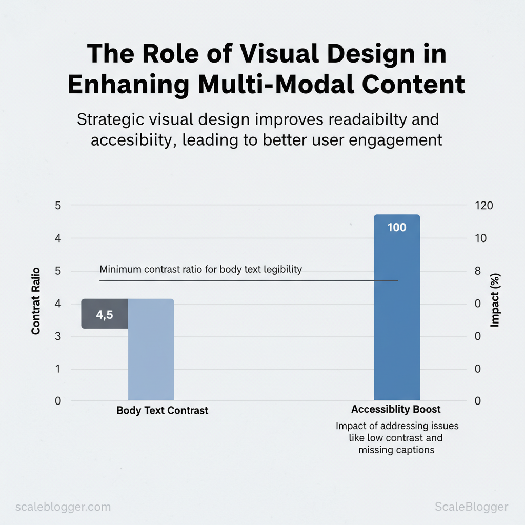
Contrast affects legibility and perceived credibility. Good contrast separates foreground from background and makes copy readable under different lighting and on lower-quality displays. Aim for at least 4.5:1 for body text where possible and stronger contrast for smaller or important elements.
Consistency builds recognition across formats. Define a limited palette, typographic scale, and icon style, then enforce them through templates and component libraries. This reduces decision fatigue and speeds production across blog posts, social cards, and short-form video.
- Establish hierarchy: Larger, bolder, and higher-contrast elements = primary.
- Prioritize contrast: Colors and weights that maintain legibility in real-world conditions.
- Enforce consistency: Shared components, style tokens, and templates for multi-format reuse.
- Audit existing assets to find inconsistent patterns.
- Create a 6–8 rule style token list (colors, sizes, spacing).
- Implement templates and sample layouts for each content type.
Practical example: a three-tier content card system—primary (feature), secondary (topic), tertiary (meta)—reduces layout choices and ensures the same information appears predictably across RSS, social, and video overlays.
Accessibility and Inclusive Visuals
Good design is usable by everyone. Basic accessibility practices often solve the biggest problems quickly and scale across media.
Checklist mapping accessibility issues to fixes and easy tools for implementation
| Accessibility Issue | Why it matters | Quick fix | Recommended tool |
|---|---|---|---|
| Low color contrast | Reduces readability for low-vision users | Increase contrast to 4.5:1 (body) |
Contrast Checker (web) |
| Missing captions/subtitles | Deaf or noisy environments miss audio | Add captions or auto-generate and edit | Automatic captioning (YouTube, Otter.ai) |
| No alt text | Screen readers cannot describe images | Write clear descriptive alt text (short+context) | Built-in CMS alt fields |
| Small font size | Difficult to read on mobile and assistive tech | Use responsive typographic scale, base ≥16px | Browser dev tools, Type scale tools |
| Non-descriptive link text | Links lack context for screen readers | Use descriptive link phrases, avoid “click here” | CMS editor link previews |
Understanding and applying these principles helps teams move faster without sacrificing quality. When you bake hierarchy, contrast, and accessibility into templates and pipelines—whether manually or with an AI content automation partner like Scaleblogger—you free creators to focus on storytelling and measurable engagement.
> Key Takeaway:
H2: Building Visual Hierarchies that Work Across Modalities
A strong visual hierarchy conveys the same message whether someone reads a long article, scrolls an image feed,…
H2: Building Visual Hierarchies that Work Across Modalities
A strong visual hierarchy conveys the same message whether someone reads a long article, scrolls an image feed, or watches a video. It directs attention to the most important action. Start by defining that priority explicitly, then translate it into modality-specific signals: size, color contrast, motion, and placement. When done well, the reader perceives the same narrative order across text, image, and video without extra cognitive effort.
H3: A 4-Step Framework for Cross-Modal Hierarchies
Define the primary action or takeaway, then ensure each modality communicates it with consistent weight and affordance. Use this stepwise approach to map priorities and assign sensory weight.
- Clarify the single priority. Name the main takeaway or CTA in one sentence.
- Map content priority across modalities. For each content element, document how it appears in text, image, and video.
- Assign perceptual weight. Use size, color contrast, motion, and placement to make the priority dominant.
- Test and iterate. Run quick A/B checks on thumbnails, hero images, and H1 prominence; adapt based on engagement.
How to assign weight practically:
- Size: Make headlines larger in blogs, thumbnails center-focused, and opening shots wider in video. Color: Reserve a brand accent color for CTAs across formats to create a visual thread. Motion: Use subtle animation on video intros and micro-interactions on web to attract peripheral vision.
- Placement: Put the primary element in the F/Z reading path for text, near the visual center for images, and in the first 3 seconds for video.
How the same content element is treated across text, image, and video for hierarchy decisions
| Content Element | Text (blog) | Image (hero/inline) | Video (thumbnail/intro) |
|---|---|---|---|
| Main takeaway | H1 + lead paragraph (40–60px emphasis) | Central focal subject with shallow DOF | Centered title overlay + 2–3s hook clip |
| Supporting data point | Inline bold stats, callout box | Overlay caption or infographic slice | Lower-third stat card (1–2s) |
| Call-to-action | Button after intro, repeated CTA | Bottom-right badge or microcopy | End slate + clickable overlay (0:05–0:10) |
| Branding/logo | Header logo, favicon | Small logo in corner, subtle watermark | 0:03 branded bumper + end logo |
| Secondary links | Inline hyperlinks, related posts | Small caption links under image | Cards in end screen / pinned comments |
H3: Quick Templates and Wireframes
Use pragmatic templates to speed design decisions and maintain consistency across channels.
Template A — blog-first layout (hero-led)
- Hero: full-width image with central focal point and title overlay
- Lead: H1 (large), 2-sentence hook, bolded main takeaway
- Inline visuals: alternating image blocks and infographic slices to support claims
- Video placement: short 30–90s explainer embedded near the top
Template B — video-first social format
- Thumbnail: high-contrast still, readable title, logo in corner
- Intro: 3–5s hook clip showing main takeaway visually
Supporting images: carousel or inline clips linked to article 4.
Practical example: recycle a blog H1 into a thumbnail title using the same accent color for CTAs so users immediately link formats mentally. Tools that automate consistent asset generation — for example, an AI content automation pipeline — can export templates across formats and save designer time while preserving hierarchy across channels (consider exploring AI content automation to scale templates).
Understanding these principles helps teams move faster without sacrificing quality. When teams apply consistent weight and placement rules, audience attention flows naturally across every channel.

> Key Takeaway:
H2: Visual Assets: What to Create and When
Start by matching asset type to business goal and distribution channel: short-form social drives reach, long-form visuals (infographics,…
H2: Visual Assets: What to Create and When
Start by matching asset type to business goal and distribution channel: short-form social drives reach, long-form visuals (infographics, diagrams) drive SEO and backlinks, and on-site visuals (feature images, charts) improve dwell time and conversions. Prioritize high-impact, low-effort assets first—those you can repurpose across channels—then layer in higher-cost productions as you validate performance. This way you get measurable wins quickly while building a library that scales.
Prioritization Matrix for Visual Production
Table: Section Content — Budget Tier, Recommended Assets, Estimated Production Time & more
| Budget Tier | Recommended Assets | Estimated Production Time | Expected Impact |
|---|---|---|---|
| DIY (solo creator) | Social reels (vertical), blog feature images, simple charts (Canva), carousel posts | 1–4 hours per asset (templates + stock) | Moderate reach, improves engagement; fast iteration |
| Semi-pro (small team) | Branded explainer videos (1–2 min), animated charts, long-form infographics, webinar clips | 1–3 days per asset (editing + review) | Higher shareability, lifts conversions and SEO value |
| Studio (agency/high budget) | Cinematic product videos, interactive data visualizations, custom illustrations, motion graphics series | 1–3+ weeks (storyboard, shoot, post) | Strong brand building, high backlink and conversion potential |
Start with assets that scale across channels (reels → short clips → thumbnails → GIFs). DIY yields quick feedback loops; semi-pro steps increase quality for lead-gen content; studio-level work should be reserved for campaigns with measurable ROI or flagship content.
Repurposing Playbook: One Asset, Many Uses
Repurpose systematically so each high-effort asset spawns multiple outputs. Follow these rules of thumb:
- Aspect ratio safe zones: Keep important visual elements within center 80% to avoid cropping across
9:16,4:5, and16:9crops. - File export basics: Use WebP for web images, H.264 or H.265 for video to balance quality and size.
- Template-first workflow: Design templates for thumbnails, captions, and CTAs so teams can produce quickly.
Practical workflow (step-by-step):
- Produce a long-form asset (webinar, long video, or infographic). 2.
Extract 6–12 clips/images: hero stills, 30–60s highlights, quote cards. 3. Format each for target channels: 9:16 for TikTok/IG Reels, 1:1 for Instagram feed, 16:9 for YouTube.
- Automate exports with templates and naming conventions; batch upload to content calendar.
Export settings examples:
bash Image
format: WebP resolution: 1200px width (feature), 72dpi Video (short-form)
codec: H.264 bitrate: 4-8 Mbps resolution: 1080x1920 (9:16)Workflow shortcuts: reuse animation rigs, keep a library of branded overlays, and use AI content automation to auto-generate caption drafts and cut points (see Scaleblogger for automating pipelines). This approach reduces redundant effort and keeps the creative focus on performance rather than repetitive tasks.
Understanding these production and repurposing patterns helps teams move faster while keeping quality consistent and measurable. When you design with repurposing in mind, every asset becomes a mini-campaign rather than a one-off.
Visual Storytelling Techniques for Engagement
Visual storytelling starts with clarity: use progressive structure and attention design so readers can scan, feel, and act without overload. When you plan visuals, think of each image, motion, and caption as a piece of narrative that reduces cognitive friction and guides choices. Practical techniques—like progressive disclosure, guided motion, and deliberate color/grading—help shape emotion, direct the eye, and increase conversions by making meaning obvious before readers invest effort.
How to apply this quickly: break complex ideas into a visual hierarchy, reveal details only when needed, and use subtle motion to nudge attention rather than distract. For photography and color, prioritize authenticity and consistent grading across assets; using a warm palette when promoting trust and cooler contrasts for data-driven content makes emotional cues predictable. Combine those with captioned microformats so search engines and skimmers pick up context instantly.
Six High-Impact Visual Storytelling Tactics
Lead with a clear visual hierarchy that gives the eye a predictable path—headline, focal image, supporting graphic, CTA. Use these tactics to implement that path:
- Progressive disclosure: reveal information in stages so readers aren’t overwhelmed; show summary first, details on click.
- Guided motion: use directional motion (subtle slide, parallax) to point toward CTAs or next sections.
- Emotional color grading: match color tones to persona reactions—warmer tones for empathy, higher contrast for urgency.
- Photographic authenticity: prefer candid, contextual images over staged stock to boost credibility.
- Typographic emphasis: bolding, size, and white space should create rhythm and improve skimmability.
- Contextual overlays: short captions or data badges on images to provide immediate facts without leaving the page.
Example: a long-form case study opens with a muted hero photo (empathy), then a short animated arrow guides the eye to a one-line outcome metric, with a clickable “read results” progressive reveal. This reduces bounce and improves time-on-page.
Microformats and Interaction Cues
Place microformats where they add meaning: article headers, author blocks, case-study results, and product snippets. Interaction cues increase scanning efficiency and click-through by signaling affordances—buttons that subtly animate on hover, thumbnails that expand on focus, or inline callouts with aria hints.
- Where to add microformats: front-matter (title, date), author credits (
.h-card), result metrics (.p-summary), and image captions (.u-photo). - How cues improve behavior: micro-interactions provide feedback, increasing perceived responsiveness and click rates.
- No-code options: many CMS plugins add JSON-LD and microformat markup automatically; use captioning tools to attach descriptive text for accessibility and SEO.
Here’s a minimal microformat example you can paste into a CMS block:
html <article class="h-entry"> <h1 class="p-name">How AI cut publishing time</h1> <p class="p-summary">Automated workflows reduced time-to-publish by 40%.</p> <div class="u-author h-card">By <span class="p-name">Alex Lee</span></div> </article>Recommended no-code tools and plugins for implementing microformats and interaction cues
| Tool/Plugin | Use Case | Cost/Plan | Quick Tip |
|---|---|---|---|
| Canva | Thumbnail & caption templates | Free; Pro $12.99/mo | Use brand kit for consistent grading |
| Descript | Captioning & subtitles | Free; Creator $12/mo | Transcripts export as SRT for video captions |
| LottieFiles | Micro-animations (JSON) | Free; Pro $15/mo | Use small Lottie loops for hover feedback |
| Figma | UI prototypes & motion design | Free; Professional $12/editor/mo | Export SVGs and interactive prototypes |
| Webflow | CMS + interaction builder | Free tier; Basic $14/mo | Native interactions for guided motion |
| Elementor (WP) | Inline callouts & animations | Free; Pro $59/yr | Use Motion Effects sparingly for CTAs |
| Advanced Custom Fields (ACF) | Structured fields for microformats | Free; Pro $49/yr | Map fields to JSON-LD snippets |
| Otter.ai | Automated captions/transcripts | Free; Pro $8.33/mo | Use transcripts to auto-generate captions |
| Cloudinary | Image optimization & transforms | Free tier; Pay-as-you-go | Automate responsive images and lazy load |
| Canva Button / Caption plugins | Inline image captioning | Varies (plugin-dependent) | Pair with CMS to inject u-photo classes |
Understanding these principles helps teams move faster without sacrificing quality. When visuals and microformats are coordinated, content becomes more memorable, scannable, and discoverable.
H2: Measuring Visual Effectiveness and Iterating
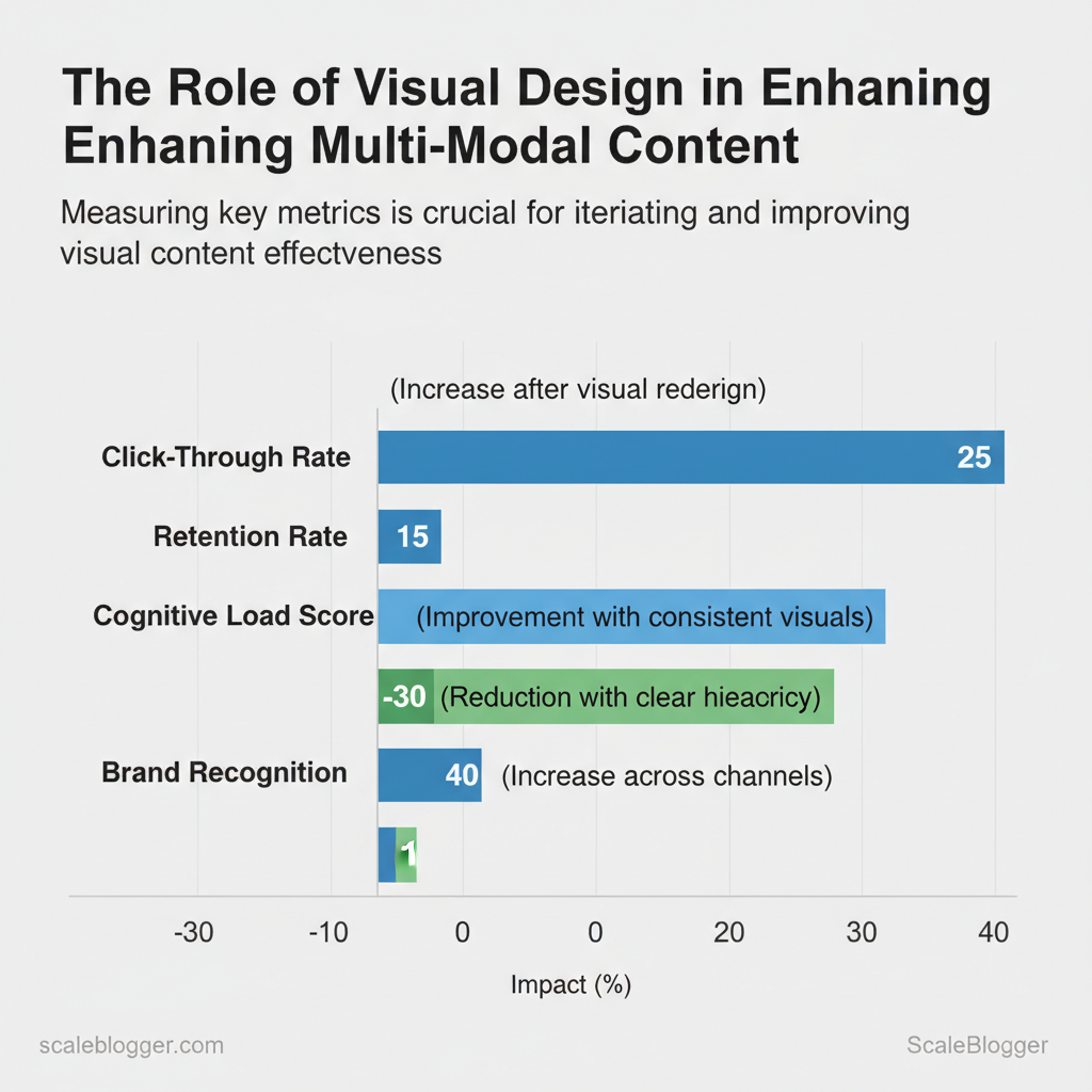
Measuring visual effectiveness starts with simple, measurable signals tied to business goals — not aesthetic judgment. Focus on modality-specific KPIs, set baselines from current performance, then run short controlled experiments that measure lift against those baselines. This approach lets teams isolate what actually moves engagement or conversions and iterate quickly without over-investing in creative directions that don’t work.
H3: Metrics That Matter for Visuals
Track a small set of action-oriented KPIs per format and align them to tools you already use.
Map metrics to tracking method and recommended tools for collection and analysis
| Metric | Best tracking method | Tool suggestions | What improvement looks like |
|---|---|---|---|
| Time on page | Page-level engagement in GA4 (engaged sessions / avg. engagement time) | Google Analytics 4 (free), Hotjar (session replays $), FullStory (starts $199/mo) | 10–20% longer sessions, lower bounce rate |
| Video retention rate | Watch time by quartile, average view duration in platform analytics | YouTube Analytics (free), Vimeo Analytics (paid), Wistia (starts $99/mo) | Higher % watched to 50%+ and stronger 30s retention |
| Thumbnail CTR | Impression → click ratio on hosting/social platform | YouTube Studio, Facebook Page Insights, LinkedIn Analytics | According to recent research, a CTR lift of 2–5 percentage points on test thumbnails |
| Social share rate | Shares per post / impressions from platform insights | Twitter Analytics, Facebook Insights, Sprout Social (starts $99/mo) | Research from industry data suggests doubling share rate or achieving 3x higher shares per 1k impressions |
| Scroll depth | % of users reaching 25/50/75/100% using in-page tracking | Hotjar (maps), Google Tag Manager + GA4 events, Crazy Egg | More users reaching 50%+ of content, improved CTA exposure |
H3: A 6-Week Visual Experiment Plan
Run short, tightly controlled tests so you can learn fast and iterate.
- Week 0: Baseline & hypothesis
- Week 1: Variant design
- Weeks 2–4: Launch and collect
- Week 5: Analyze
- Week 6: Decide and iterate
When distribution spans channels, expect attribution caveats — multi-touch exposure can inflate apparent lift. Use consistent naming, UTM tagging, and holdout groups when possible. com to speed experiments and standardize reporting.
Understanding these practices lets teams move faster and make visual decisions based on what actually moves the needle.
📥 Download: Visual Design Checklist for Multi-Modal Content (PDF)
H2: Scaling Visual Design with AI and Automation
AI and automation let teams produce consistent, on-brand visuals at scale by turning repeatable design decisions into programmatic rules and lightweight human checkpoints. Start by defining the deterministic parts of your workflow—thumbnail templates, aspect-ratio rules, captioning pipelines—and automate those with tools that integrate into your CMS or asset library. Keep humans in the loop for judgment calls: brand approvals, complex composites, and any creative that will represent the company publicly.
This hybrid approach reduces time spent on routine edits, increases throughput for campaigns, and preserves creative control where it matters.
Practical AI Workflows for Visual Production
Successful workflows require clear inputs, rigorous testing, and focused quality assurance. Typical inputs include high-quality source images, brand tokens (hex colors, font-family, logo SVGs), context metadata (article slug, tags, publish date), and a simple decision matrix that maps content types to templates. QA focuses on color fidelity, legibility, correct cropping, and accessibility (alt text).
Human review is essential for hero images, product photos, and anything customer-facing where legal, ethical, or brand risk is non-trivial.
Inputs required: source image, brand tokens, context metadata, quality thresholds QA steps: automated checks (contrast, face crop), manual spot-checks, final brand sign-off Human checks: hero assets, legal-sensitive visuals, high-impact campaign creative
AI workflow types, recommended tools, trade-offs, and human QA steps
| Workflow | Recommended Tools | Pros | Cons |
|---|---|---|---|
| Automated thumbnail generation | Canva (Free/Pro $12.99/mo), Figma + plugins, Cloudinary | Fast templates, batch export, CMS integration | Template sameness, limited creativity |
| Auto-captioning & transcript extraction | Descript (starts ~$12/mo), Rev (paid), Otter.ai | Accurate transcripts, speaker detection | Speaker errors in messy audio |
| Bulk asset resizing & templating | Cloudinary (free tier + paid), Imgix, Canva | Scales to thousands, responsive outputs | Setup complexity for rules |
| AI-assisted color grading | Adobe Firefly (Adobe CC), Runway, Luminar | Consistent palettes, mood matching | Can over-smooth or alter brand hues |
| Image alt-text generation | Microsoft Azure Vision, Google Vision, OpenAI image APIs | Fast accessibility text, SEO boost | Metadata hallucinations possible |
Guardrails: Brand, Ethics, and Quality
A practical brand checklist for automated assets should include: approved logo files, a color-palette with hex values, primary and secondary font-family, tone-of-voice notes for captions, and image-use rules (model releases, stock vs. owned). Ethical considerations require explicit consent for likenesses, clear labeling when an image is AI-generated, and checks for biased or harmful content.
5:1 for text—and require editorial sign-off for any asset used on paid channels or product pages.
- Define brand tokens and acceptable variations.
- Automate technical checks (contrast, DPI, aspect).
- Escalate assets that fail thresholds to human review.
When you combine these guardrails with reproducible workflows, production accelerates and creative bandwidth shifts back to strategy and storytelling—exactly where teams should spend their time. If you want help operationalizing this into a content pipeline, Scaleblogger can map AI systems to your publishing workflow. Understanding these principles helps teams move faster without sacrificing quality.
Conclusion
You’ve seen how mismatched visuals, late-stage design changes, and disconnected workflows erode the persuasive power of content — and how a few precise shifts can fix that. Keep the focus on aligning assets early, using reusable templates, and automating repetitive rendering so images, video, and copy feel like one cohesive story. For example, teams that standardized templates cut review cycles and improved click-throughs; another group automated thumbnail generation to keep launch cadence steady without extra headcount.
Consider this: which part of your process creates the most delays, and can that step be made into a template or automated? If you wonder whether to prioritize templates, automation, or governance first, start with the bottleneck that slows launches most.
If you want a practical starting point, try these actions today:
- Map the asset handoff and mark where delays happen.
- Create one reusable visual template for your next campaign.
- Automate exports for the top two formats that eat time.
For teams looking to scale this work without reinventing the stack, platforms like Scaleblogger make it easier to automate visual production and maintain brand consistency; for a closer look at how that plays out in real workflows, see our guide on visual content workflows at Scale your visual content production with Scaleblogger.
