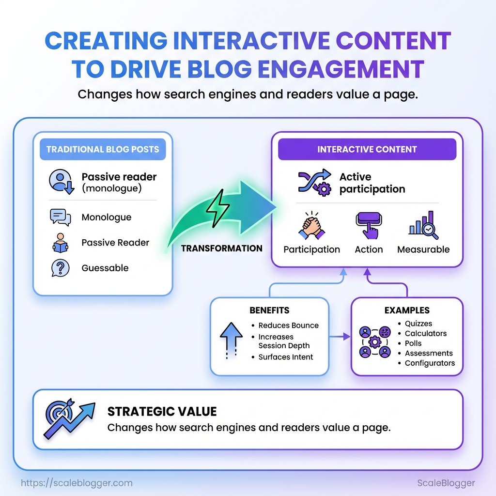
Most blog posts are still monologues: long paragraphs, a passive reader, and a prayer that traffic will stick. When scroll time matters more than pageviews, interactive content cuts through by turning visitors into participants. A quick quiz, calculator, or poll collapses attention into action and makes the page measurable instead of guessable.
Creators who treat interactivity as garnish miss its strategic value—embedded assessments, step-by-step configurators, and decision trees change how search engines and readers value a page. Smart use of quizzes and lightweight widgets reduces bounce, increases session depth, and surfaces intent signals that traditional posts never capture. Think of these elements as small experiments that reveal what readers actually need, not what writers assume.
For teams juggling content calendars and analytics, repeatable workflows matter as much as the creative spark. Automate interactive content assembly, publishing, and reporting so those experiments scale without becoming a maintenance nightmare. Automate interactive content workflows with Scaleblogger: https://scaleblogger.com
What You’ll Need (Prerequisites)
Interactive content demands a slightly different stack than static blog posts. Start with a CMS you can control, a way to build the interaction itself, analytics wired to capture events, and content assets tuned for the audience. Without those pieces in place the quiz or calculator will either not publish correctly, or it will generate data that can’t inform future content decisions.
CMS access: Confirm you have admin or editor access to your CMS (WordPress, a headless setup like Contentful, or similar). You must be able to insert embed code or shortcodes and edit template files when needed.
Interactive builder options: Choose between no-code builders (fast) and developer-driven implementations (flexible). No-code tools shorten time-to-launch; custom code gives total control over UX and data capture.
Analytics & event tracking: Have Google Analytics 4 or a tag manager (e.g., Google Tag Manager) installed and working. Set up custom events before launch so every quiz completion, step drop-off, or score share fires an event you can act on.
Content assets: Prepare hero images, thumbnails, microcopy for questions and results pages, and persona data for tailoring outcomes. High-quality imagery and concise, personality-driven copy boost participation rates.
Skills required: Basic HTML/CSS and comfort pasting embed snippets for no-code builds; JavaScript or React familiarity for custom builds; and an analyst’s mindset for mapping events to business outcomes.
Practical checklist (use this to validate readiness): CMS permissions: Confirm editor/admin rights and ability to add script tags. No-code builder account: Trial or paid plan with embed support. Analytics: GA4 + GTM container with at least 5 custom events planned. Assets: 3–5 images, final copy for 8–12 questions, result templates. * Persona data: Two audience personas with goals and pain points.
- Verify CMS access and ability to add embed code.
- Pick builder approach (no-code or custom).
- Map analytics events and create tags in GTM.
- Upload assets and draft all question/result copy.
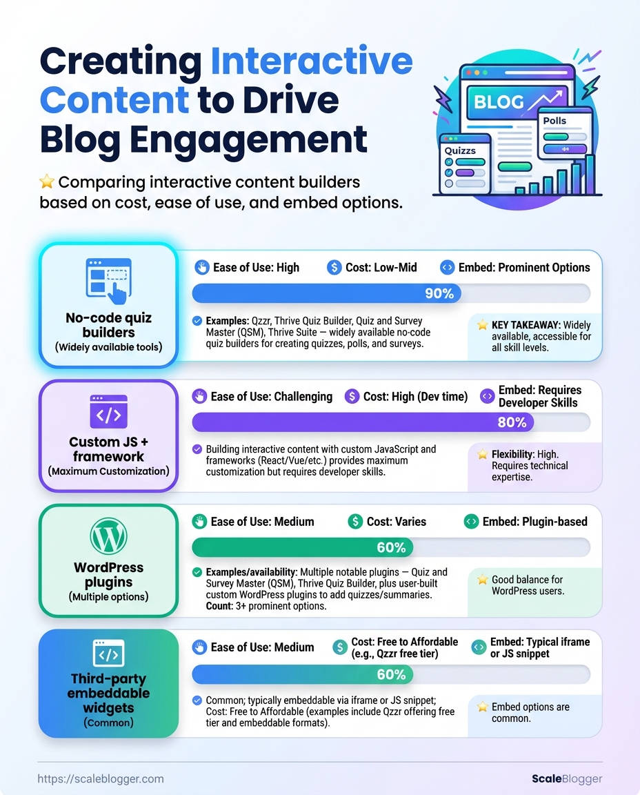
Recommended interactive builders by cost, ease-of-use, embed options, and data export
| Tool | Pricing | Ease of Use | Embed Options |
|---|---|---|---|
| No-code quiz builders (Typeform / Outgrow / Interact) | Free tier / paid from ~$15–$99/mo | Very easy — templates, drag-and-drop | iFrame, JS embed, direct link |
| Custom JS + framework (React/Vue custom app) | Dev cost or hosting fees ($0–$100+/mo) | High — requires dev skills | Full control: API, webhooks, direct DOM |
| WordPress plugins (H5P, Quiz And Survey Master) | Free / premium add-ons $30–$150 one-time | Easy–moderate — within WP admin | Shortcodes, block editor, iFrame |
| Third-party embeddable widgets (Playbuzz / Outgrow) | Free tiers / $25–$200+/mo | Very easy — fast embed | iFrame, JS snippet, analytics hooks |
| Analytics integration options (GA4, Segment, Snowplow) | Free (GA4) / paid for enterprise | Moderate — requires mapping | Event APIs, webhooks, data export to BI |
Key insight: No-code builders are fastest to launch and include basic export/analytics hooks, while custom JS gives full control over UX and data capture. WordPress plugins sit in the middle for teams already on WP. Plan analytics first—your data model determines whether a tool’s export options are sufficient.
Market data shows interactive formats measurably increase engagement—interactive quizzes and assessments often outperform static content for time-on-page and lead capture (see Forbes on interactive content engagement)[https://www.forbes.com/sites/forbescontentmarketing/2024/06/20/engage-your-audience-with-interactive-content/].
If building at scale, consider automating the pipeline: systems that generate question variants, push results into CRM, and schedule follow-ups reduce manual work. For an end-to-end approach that ties content production to performance and publishing, see Scaleblogger.com for AI-enabled workflows that speed up creation and measurement.
Get these prerequisites in place and the rest becomes execution—faster launches, cleaner data, and interactions that actually move the needle.
Plan Your Interactive Piece
Start by deciding what the piece must accomplish and how you’ll measure success. Pick one primary objective — awareness, lead gen, retention, or data capture — then choose a format that maps cleanly to that goal. That alignment stops fancy features from becoming distraction and makes it straightforward to design questions, CTAs, and analytics. Industry guidance shows interactive formats far outperform static content for attention and engagement, so use that advantage strategically rather than adding interactivity for its own sake (Forbes on interactive content effectiveness). For a working definition of interactive content, see Storyly’s concise overview (What is interactive content?).
- Define objective and target action.
- Choose format that maps to that objective and pick primary metric(s).
Primary metrics: Time on page, click-through rate, lead conversion rate, responses captured, social shares. Secondary metrics: bounce rate, scroll depth, form completion quality.
Project objective example: Create a short, branded assessment that helps mid-market CMOs identify their top three content gaps, captures an email and company size, and increases time on page by 60% compared to our baseline blog posts.
Format-to-objective mapping (which formats best for awareness, leads, retention, and data capture)
| Format | Best For | Primary Metric | Complexity |
|---|---|---|---|
| Quiz | Awareness, lead qualification | Time on page / Lead conversion | Medium — content + branching logic |
| Calculator | Lead capture, ROI proof | Form submissions / Shares | High — requires accurate formulas |
| Poll | Awareness, quick engagement | Response rate / Social engagement | Low — one-question frictionless |
| Interactive infographic | Retention, brand storytelling | Time on page / Scroll depth | High — design + micro-interactions |
| Checklist | Retention, activation | CTR to next step / Completion rate | Low — simple logic, high utility |
Key insight: Quizzes and calculators drive longer sessions and better qualification when paired with a lightweight gating strategy; polls and checklists are easy to A/B test rapidly. Interactive infographics work great for complex topics where retention matters, but they demand heavier design and dev investment.
Practical tips: build a concise content brief, document required data points, and wireframe user flows before development. When automation makes sense, consider integrating with an AI content pipeline or tool for templating and scaling — for example, AI content automation can speed production and A/B test variants. Keep metrics tight and review analytic events within the first week to iterate quickly.
Design the Flow and UX
Start by sketching every screen and CTA so the product’s journey reads like a short, predictable story. Good wireframes remove decision friction; crisp microcopy carries personality and guides action. Think of this phase as building the map and the voice that people follow.
- Create a screen-by-screen wireframe showing primary actions, alternate paths, and fallback states.
- Annotate each CTA with intent, success state, and failure state.
- Write the microcopy for each interactive element: buttons, error text, empty states, and onboarding hints.
- Validate the flow on mobile and with accessibility tools, then iterate based on quick usability checks.
Wireframe: Low-fidelity visual that outlines layout, controls, and user paths.
Microcopy: Short, personality-driven text that clarifies next steps and reduces hesitation.
Start wireframing by prioritizing tasks: place the primary CTA above the fold on mobile, group secondary actions, and show minimal options per screen. Sketch flows for optimistic and pessimistic outcomes (success + error). For each CTA document:
- Purpose: Why the user would tap it.
- Outcome: What happens next.
- Fallback: Error copy and recovery path.
When writing UX copy, favor clarity and voice. Replace generic “Submit” with contextual verbs: “Save draft”, “See price estimate”, or “Start quiz”. Use inline code for accessibility attributes like aria-label on icons and ensure button labels stand alone—screen readers should make sense of them without extra context.
of effective microcopy: Onboarding CTA: “Show me quick tips” — invites discovery without commitment. Empty state: “No saved searches yet — try this filter” — suggests next steps. * Error: “We couldn’t save this. Try again or email [email protected]” — gives options.
Accessibility and mobile-first checks: Contrast: Ensure 4.5:1 for normal text. Touch targets: Minimum 44x44px on mobile. * Keyboard: All interactive elements reachable via Tab.
Market trends show interactive content drives attention; use quizzes or calculators where they advance a decision rather than distract (Forbes on interactive content engagement, Storyly glossary on interactive content). For teams ready to scale UX copy variants, consider integrating an AI content automation workflow like Scaleblogger.com to generate microcopy variations and test them quickly.
Designing the flow and UX this way saves hours in development and improves conversion because users reach outcomes with less friction. Keep wiring and copy simple, test fast, and let real user behavior decide the final wording.
Build the Interactive Element
Start by creating the concrete project in your chosen builder, then configure data capture and styling so the piece looks and behaves like part of the site. This is where the concept becomes a working piece: wire the user flows, capture leads reliably, and verify the experience on a staging URL before pushing live.
Prerequisites
Design brief: A one-page spec with goals, target outcomes, and KPI definitions. User flow map: Simple sketch of steps a visitor takes through the interaction. Staging environment: A test URL or dev site where embeds and scripts can run safely.
Tools & materials
No-code builder or widget: e.g., Outgrow, Qzzr, or Flourish. Analytics & CRM hooks: Google Analytics / GA4, and your CRM or workspace. A staging page: WordPress staging, Netlify preview, or similar. CSS snippet editor: Theme customizer or developer console access.
- Create the project in the builder and scaffold the flows.
- Configure lead-capture fields, validation, and data-export endpoints.
- Style the component to match your brand and test on staging.
Create the project and test flows 1. Pick the right template or start from blank and name the project. 1. Build the question/interaction nodes and add conditional branching where needed. 1. Run the internal preview to validate transitions and decision paths.
Add lead-capture and data export settings 1. Add only the fields you truly need to lower drop-off (email, one qualifying question). 1. Configure field validation and success messages. 1. Connect the builder to your CRM or a webhook; test one submission to confirm delivery.
Embed and test on staging 1. Embed using iframe or the provider’s script snippet on a staging page. 1. Test across devices and browsers; validate analytics events and form submissions. 1. Confirm data export (CSV/webhook/API) and retention settings for privacy compliance.
Common checks to run before launch: Interaction flow: All branches lead to an end state. Data delivery: Submissions arrive in CRM/warehouse within expected latency. * Styling parity: Fonts, spacing, and colors match site styles.
Build approaches: no-code vs plugin vs custom dev across speed, customization, and data ownership
| Approach | Speed to Deploy | Customization | Data Ownership |
|---|---|---|---|
| No-code builder | Days — fast templates | Moderate — theme overrides, limited code | Usually platform-hosted; export available |
| WordPress plugin | Days — depends on plugin | Good — hooks and PHP templates | Data stored in WP DB; full access |
| Custom JS implementation | Weeks — build from scratch | High — unlimited control | Full ownership; store where you choose |
| SaaS embeddable widget | Hours — quick embed | Limited to widget API | Platform-owned storage; exports often available |
| Hybrid (plugin + custom) | 1–2 weeks | High — plugin scaffolding + custom code | Mostly owned, some vendor dependencies |
Key insight: No-code and SaaS widgets get you live fastest, plugins give a balance, and custom builds maximize control and data ownership. For many teams, a hybrid approach hits the sweet spot between speed and long-term flexibility.
Industry pieces show interactive formats outperform static content for attention and engagement, so prioritize clean lead flows and analytics hooks early (Forbes on interactive content). For definitions and types, refer to the interactive-content glossary at Storyly for clarity when specifying features (Storyly interactive content glossary).
If automation of content workflows or measuring content performance matters, consider integrating with an AI content pipeline like Scaleblogger.com to scale tests and surface what interactions drive conversions.
Building the interactive element is where strategy turns into measurable activity — get the flows tight, the data flowing, and the styling consistent, and the piece will both engage users and feed growth systems.
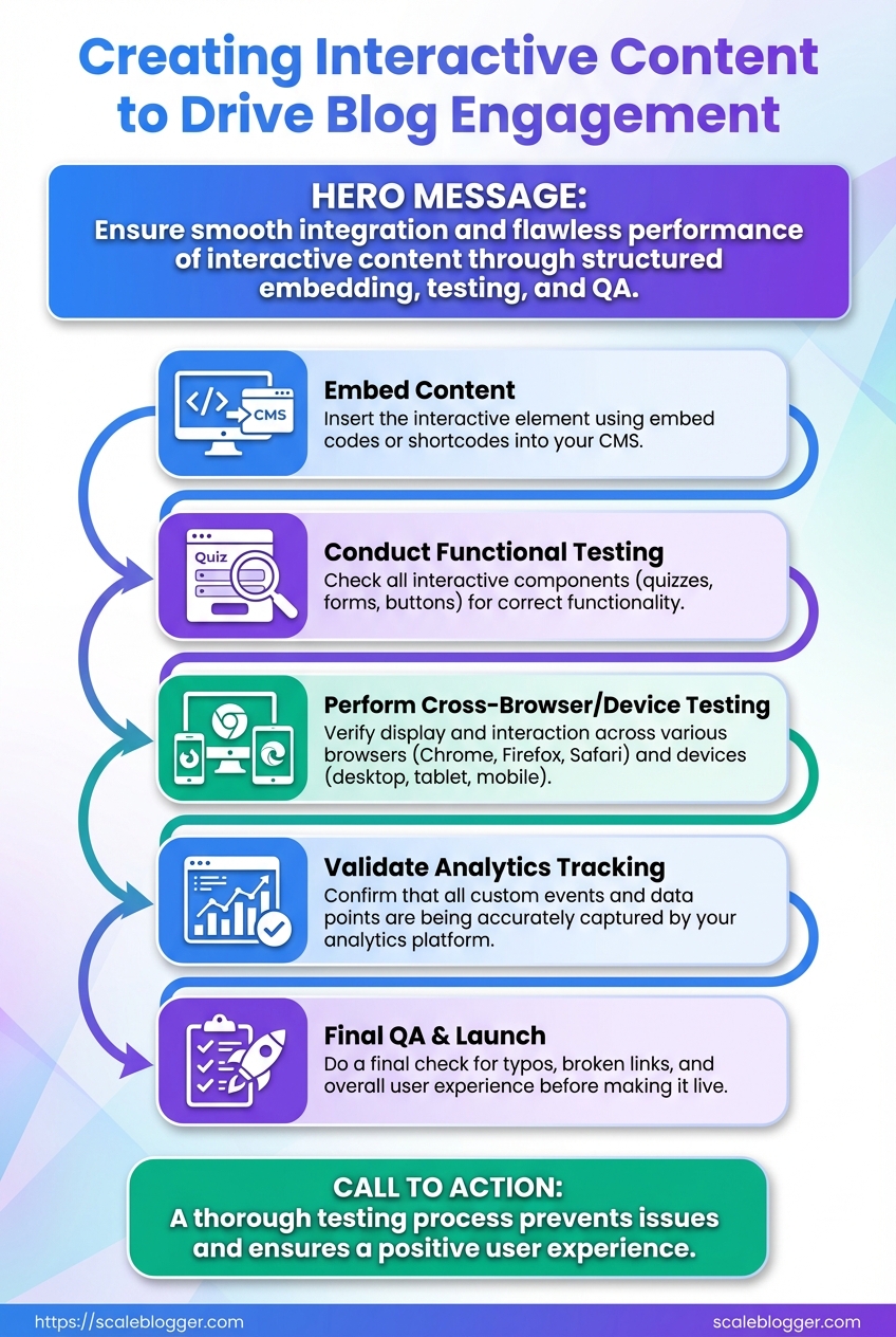
Embed, Test, and QA
Start by embedding the interactive asset cleanly in the page, then validate tracking, performance, and privacy before publishing to ensure the experience actually moves the needle.
Approved build: Final HTML/JS/CSS bundle or embed snippet from your interactive tool.
Access: CMS editor rights, Google Tag Manager (GTM) or equivalent, analytics view, and privacy/compliance contact.
Tools & materials
- GTM or server-side tag manager: For event wiring and quick fixes.
- Browser devtools: Network, performance, and console inspection.
- Staging environment: A parity environment to avoid publishing regressions.
- Accessibility checker: Axe or Lighthouse for basic WCAG checks.
- Publish the embed to a staging page using the CMS’s recommended method (inline script, iframe, or plugin) and ensure the snippet loads asynchronously to avoid blocking render.
- Add instrumentation: push interaction events to
dataLayeror call your analytics library. Use consistent event names likeinteractive_start,quiz_submit,calc_resultand include relevant props (quiz_id,score,time_spent). - Configure tag manager rules to map those events to analytics goals and conversion tags. Set test triggers to fire only on your staging domain.
- QA tracking by performing canonical flows while inspecting the
dataLayerand network requests. Verify that events appear in realtime analytics and that parameters match your spec. - Run performance tests: measure TTI, LCP, and bundle size impact. If the embed increases LCP by >200ms, consider lazy-loading or service-worker caching for assets.
- Check privacy and consent: confirm that no persistent identifiers are set before consent, and that event payloads avoid PII. If using third-party tools, validate their data residency and processing terms.
- Accessibility checks: keyboard navigation, focus states, proper labeling, and ARIA roles. Use Lighthouse and a manual screen-reader pass.
- Cross-device and browser regression testing: desktop, mobile, and at least two major browsers. Test slow network throttling to simulate real users.
Common verification signals to look for: Successful page_view then interactive_start then interactive_complete sequence; correct goal value in analytics; no console errors.
> According to Forbes on interactive content effectiveness, interactive formats boost attention — but that only matters if they load fast and report cleanly.
For teams wanting to automate these checks, integrate them into CI: synthetic tests that assert event emissions, bundle size thresholds, and Lighthouse scores. When everything passes, promote to production and monitor the first 24–72 hours for unexpected drops or spikes. For an AI-driven option to automate tagging and performance monitoring, consider Scaleblogger.com for streamlining the pipeline.
Get the embed right, verify the metrics, and the piece will become measurable value—not just a shiny widget.
Promote and Distribute
Launch day needs more than a publish button — it demands orchestration. Start by blasting owned channels while the content is fresh, then layer paid and partner amplification, and finally squeeze more life from the asset by turning results and interactions into follow-up content. Use share-ready result screens, social-first snippets, and short, data-driven assets to convert early attention into measurable traffic and links.
Step-by-step launch and syndication
- Publish the asset and confirm canonical, meta, and schema are correct.
- Immediately push to owned channels:
- Website hero: Feature the interactive element or result page for 24–72 hours.
- Email: Send a short, benefit-led announcement to segments most likely to engage.
- Social: Post native cards with a clear CTA and
share-readyvisual or result screenshot.
- 24–72 hours: Monitor analytics and amplify best-performing variations with paid social and search.
- Day 4–10: Run paid tests concentrating on high-intent audiences; iterate creative using the top-performing result screens.
- Day 11–20: Outreach to partners and niche publishers with personalized angles and data snippets from your interaction results.
- Day 21–30: Repurpose interactions into long-form posts, data stories, and downloadable assets to re-fuel organic channels.
Use these content formats to increase shareability and shelf-life: Short result cards: Two-line summary + image ready for sharing. Data posts: Charts and top-line metrics from aggregated user responses. * Long-form analysis: A deep-dive article that expands on patterns revealed by the interactive tool.
Interactive elements boost attention and sharing — marketers report strong engagement lift when audiences can participate rather than passively consume. See the practical approaches and toolset recommendations in the Forbes piece on interactive content and a roundup of interactive tools for creative formats. Forbes: Engage Your Audience With Interactive Content and Shorthand: The 10 best tools to create interactive content
Suggested 30-day promotion timeline with actions, channels, and KPIs
| Day Range | Action | Primary Channel | KPIs |
|---|---|---|---|
| Day 0 (Publish) | Feature on homepage + email blast | Website, Email | Pageviews, CTR, vanity social shares |
| Day 1-3 (Owned social & email) | Push multiple social formats, share-ready results | LinkedIn, X, Instagram | Engagement rate, shares, traffic |
| Day 4-10 (Paid amplification) | Paid social & search A/B tests | Meta Ads, Google Ads | CPA, conversion rate, CPC |
| Day 11-20 (Outreach & partnerships) | Partner syndication + guest posts | Niche publishers, newsletters | Backlinks, referral traffic |
| Day 21-30 (Repurpose & analyze) | Long-form posts, data visualizations | Blog, Medium, PR | Organic traffic lift, content longevity |
Key insight: Front-load owned promotions to capture early momentum, use paid to scale validated creative, and treat user interactions as raw material for follow-up content that earns links and sustained traffic. For automating scheduling and performance benchmarking, consider integrating an AI-powered workflow like Scaleblogger.com to shorten the time between publish and optimization.
This approach turns a single interactive asset into a month-long campaign that builds reach, collects first-party data, and creates a pipeline of derivative content that keeps performing after the initial spike.
Measure Success and Iterate
Set up analytics to capture the right events first, then turn those events into measurable hypotheses to test. Start by instrumenting four clear event types: start, progress, completion and share. Those events are the measurement backbone for any interactive content — quizzes, calculators or assessments — because they map directly to engagement and funnel movement.
Start: Tracks when a user begins an interactive piece (first click or focus). Progress: Tracks meaningful midpoints (question 3 of 7 answered, section completed). Completion: Tracks when the user finishes and receives a result or value. Share: Tracks clicks to social or email share flows, plus copy/URL generation.
- Instrument events in your analytics platform and tag user context (page, traffic source, referral).
- Benchmark current completion and share rates, then set realistic targets based on content type and channel.
- Run iterative A/B tests and collect qualitative feedback to move metrics toward target.
- Implement a controlled A/B test with
variant_idand run until statistically relevant (or until practical business thresholds). - Combine quantitative results with user feedback (micro-surveys, session replays) to understand “why.”
- Roll forward winning variants and document learnings for future builds.
Instrumentation details matter. Capture user_id or session bucket, variant_id for A/B, time_on_activity, and score or result_type where applicable. Use event_category and event_label consistently so queries stay simple.
Practical benchmarks and targets: Completion rate: Many successful quizzes see 30–60% completion depending on length; shorter flows trend higher. Share rate: For assessment-driven content, 3–10% share rates are realistic when results are personalized. * Dropoff hotspots: Identify steps where >20% of users abandon — those are prime optimization targets.
Iterate with an optimization loop: 1. Form a hypothesis tied to a metric (e.g., “Reducing quiz length by two questions will lift completion by 10%”).
Use lightweight experiments first: copy tweaks, progress indicators, and micro-rewards. Then move to structural changes like gating, personalization, or result detail. Tools and frameworks speed this: tracking via your analytics (GA4/Amplitude), experimentation layers, and content automation to rapidly deploy variants. Scaleblogger.com fits naturally here if scaling the pipeline and automating variant rollout across many posts is a priority.
Measure small wins and compound them; iterative testing turns one-off interactive hits into a predictable growth driver.
📥 Download: Interactive Content Creation Checklist (PDF)
Troubleshooting Common Issues
When interactive content misbehaves, the fastest wins come from tight diagnostics followed by a short-term workaround and a durable fix. Start by reproducing the problem, note the environment (browser, device, network), then apply one of the targeted fixes below. That approach gets you usable results quickly while you work toward a permanent resolution.
Common quick checks Clear cache: Force-refresh or clear site cache to rule out stale assets. Try Incognito: Isolate extensions and login state problems by testing in a private window. * Check the console: Look for 404 or Uncaught errors in DevTools that point to missing scripts or runtime exceptions.
- Reproduce the issue on a clean profile.
- Capture a screenshot and a console log (
Ctrl+Shift+J/Cmd+Option+J). - Apply the first-fix in the table below, then rerun the reproduction.
- If resolved, schedule the long-term fix and add a regression test.
> Market research shows that interactive formats outperform static content for engagement, making it worth the troubleshooting investment (Forbes on interactive content effectiveness).
Quick diagnostic table mapping symptom to likely cause and first-step fix
| Symptom | Likely Cause | First Fix | Validation Step |
|---|---|---|---|
| Widget not visible | Script blocked or CSS hidden | Check console for 404; enable script and remove display:none |
Widget renders in page DOM and loads assets (no console errors) |
| Branching incorrect | Logic error in decision tree | Validate JSON/conditions in editor; test branch with sample inputs | Branch output matches expected node for test cases |
| Events not in analytics | Missing tracking calls or blocked by adblocker | Verify analytics.js/gtag calls in network tab; whitelist domain |
Events appear in analytics debug view or real-time report |
| Low completion rate | UX friction or slow load | Add a short loader and reduce initial questions; track step drop-offs | Completion % increases after UX tweak in A/B test |
| Slow page load | Large JS bundle or third-party widgets | Defer noncritical scripts, lazy-load interactive modules | Lighthouse load metrics improve; interactive becomes usable faster |
Key insight: The table shows most failures trace to either blocked assets, logic/config errors, or performance/UX problems. Start with the console and network tab to identify which bucket a failure falls into.
Long-term fixes generally include adding automated tests for branching logic, implementing monitoring alerts for analytics events, and using code-splitting or server-side rendering for heavy widgets. For teams scaling interactive content, consider an AI-powered pipeline to automate deployment and quality checks—AI content automation can speed repetitive validation and reduce regression risk.
Fixing the immediate pain while instrumenting for prevention saves time and preserves engagement metrics that matter. Keep those validation steps in your deployment checklist so fixes stick.
Tips for Success & Pro Tips
Start by reducing friction for users and making every interaction earn its keep. Small changes to how you collect data, display sharable content, and turn interaction outcomes into evergreen assets compound quickly—especially when scaling interactive content like quizzes, calculators, or assessments.
Use progressive profiling to reduce friction and improve data quality.
Progressive profiling: Collect minimal information up front (email only), then ask one contextual question each subsequent interaction to build richer profiles without scaring users off.
Optimize the share screen so previews work for social platforms.
Social meta tags: Ensure og:title, og:description, og:image, and twitter:card are set dynamically per result page so shared quiz outcomes look polished and drive clicks.
Repurpose interaction results into SEO-friendly pages.
Repurposing strategy: Turn high-performing quiz outcomes, calculator results, or common user journeys into landing pages or blog posts with search intent-focused headings, structured data, and internal links.
Practical steps to scale and improve
- Audit the current funnel for friction points.
- Implement progressive profiling.
- Automate share-screen generation.
- Repurpose top outcomes into content.
Use session recordings to spot where people drop off and remove any required fields that don’t directly affect conversion.
Start with email only, then ask role, then pain_point across sessions; tie each new field to a clear personalization benefit.
Create a template system that injects result_title, result_image, and short share_text per outcome; test across Facebook and LinkedIn.
Convert the three most-shared quiz results into long-form SEO posts, each targeting a related keyword cluster and internal linking to the interactive entry point.
Tactical pro tips and quick wins
- A/B test microcopy: Small wording changes on CTA buttons can lift completion rates.
- Cache dynamic images: Serve pre-rendered
og:imagevariants to avoid missing preview thumbnails. - Use analytics events: Track
quiz_start,quiz_complete,share_clickas distinct goals. - Batch-content from results: Group similar outcomes into one pillar post for efficiency.
- Automate notifications: Send personalized follow-ups based on profile progress to re-engage users.
For ideas on which interactive formats work best and tools to build them, see the Forbes piece on interactive content effectiveness and the list of interactive content tools for makers at Shorthand: Engage Your Audience With Interactive Content and The 10 best tools to create interactive content.
If operational speed matters, consider pairing these tactics with an AI pipeline to automate outcome pages and scheduling—solutions like Scaleblogger.com make it easier to turn interactive engagement into consistent, searchable content.
Get the mechanics right and the interactions will scale into real traffic and richer user data—those two levers drive meaningful growth.
Conclusion
You now have a clear path from concept to measurement: start with a focused goal, design an experience (a quiz, calculator, or interactive timeline) that answers a single reader need, and build the simplest version you can test quickly. Expect early wins in engagement by swapping long paragraphs for answer-driven interactions; one team’s lead-gen quiz turned a passive article into a conversion engine within two weeks, and another’s ROI calculator doubled time-on-page. Questions about tools or timing are normal — choose lightweight engagement tools first, give the first iteration 1–2 weeks of traffic to gather signals, and measure outcomes with simple KPIs like completion rate and lead conversion.
For the next steps, prototype a single interactive element, run a short A/B test, and use the results to prioritize further enhancements. If the workflow becomes repetitive or data needs consolidating, consider automation: platforms and engagement tools can speed distribution and reporting, and research from Forbes confirms interactive formats consistently boost participation. For teams looking to scale and automate these workflows, Automate interactive content workflows with Scaleblogger offers automation and analytics tailored to interactive content and quizzes — a practical option to save time and sharpen insights.
