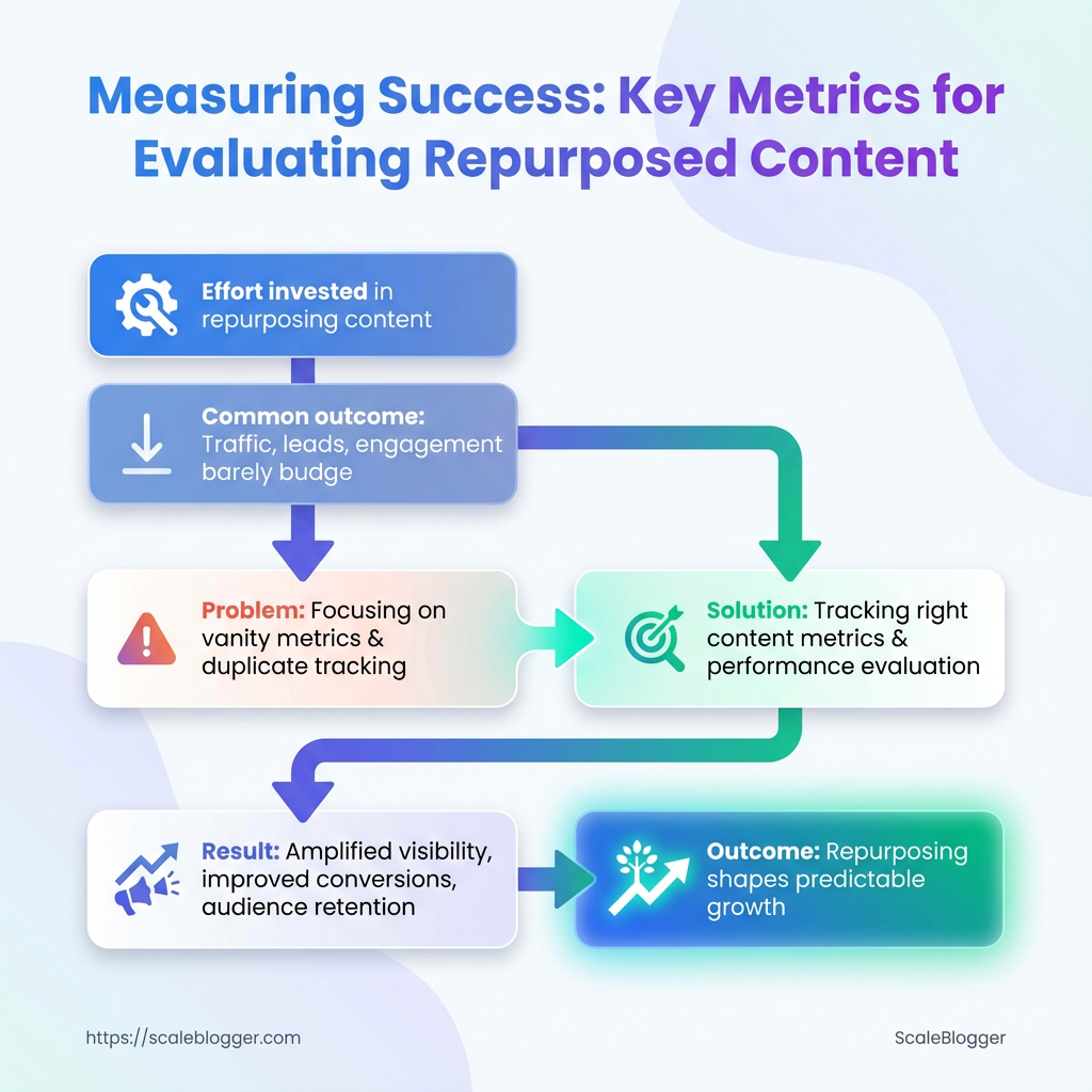
You poured time into a long-form piece, sliced it into social posts, and turned key sections into video clips—yet traffic, leads, and engagement barely budged. That mismatch between effort and outcome is the telling moment most teams ignore.
Pinpointing why requires more than impressions and likes; it demands tracking the right content metrics, understanding how repurposed assets feed broader goals, and applying smart performance evaluation. Teams often chase vanity numbers or duplicate metrics across platforms, missing how content fragments influence search visibility, conversion paths, and audience retention.
Treat measurement as the editorial control room rather than an afterthought: the right blend of qualitative signals and analytics tools exposes which formats amplify visibility, which headlines convert, and which distribution channels waste time. Get those signals right and repurposing stops feeling like busywork and starts shaping predictable growth.
What You’ll Need (Prerequisites)
Start with the tools, access, and baseline skills that make measuring repurposed content practical rather than guesswork. This section lists the must-haves and nice-to-haves so the analytics work that follows is efficient, reliable, and repeatable.
- Tools: Core measurement platforms and lightweight utilities to capture traffic, attribution, and engagement.
- Access: Who needs what—analytics, CMS, ad accounts, and the content inventory itself.
- Skills: The minimum fluency to interpret reports, tag links, and tie content changes to outcomes.
Tools & materials
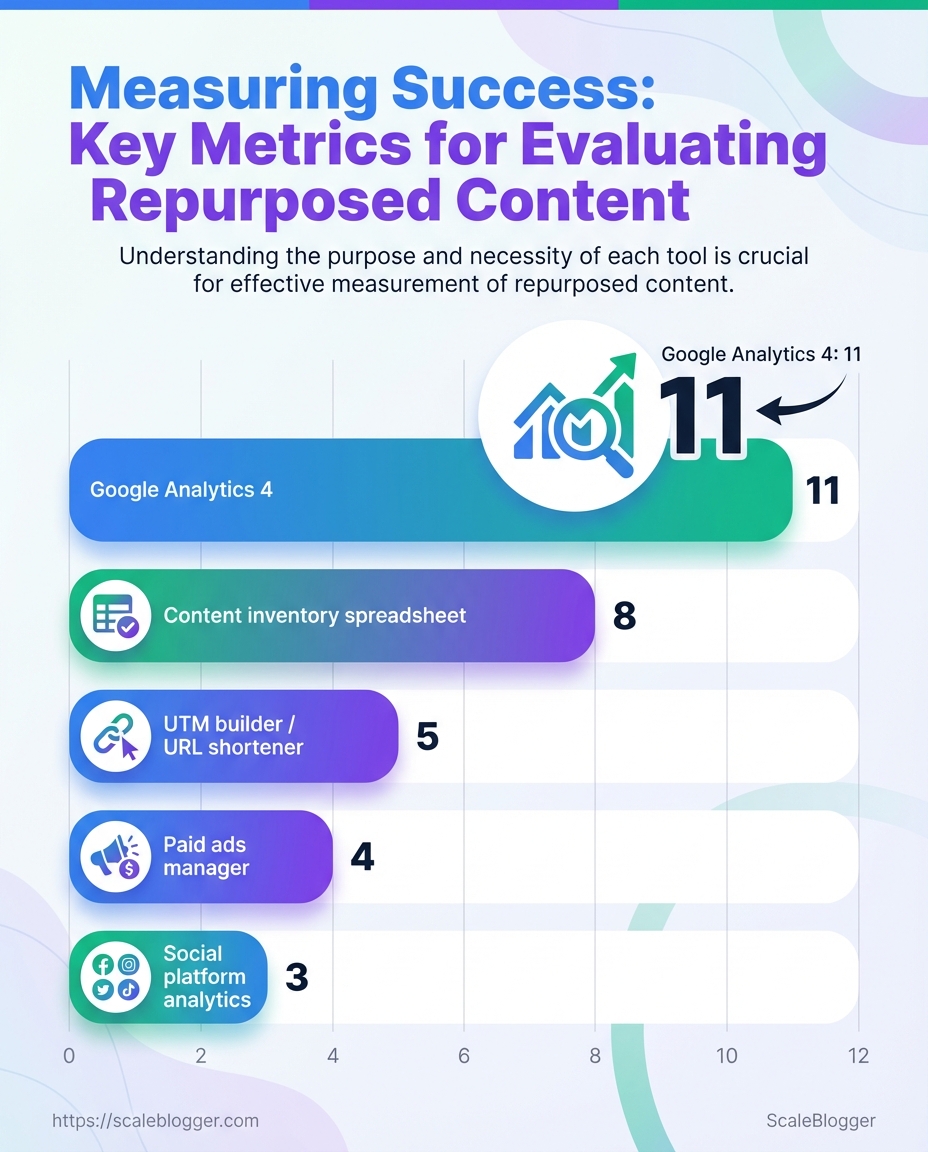
- Google Analytics 4 (
GA4): Site-level traffic, events, and conversion funnels. - Social platform analytics: Native metrics on Facebook, X/Twitter, LinkedIn for referral and engagement tracking.
- UTM builder / URL shortener: Consistent campaign tagging and share-ready short links.
- Content inventory spreadsheet: Centralized list of URLs, publish dates, topics, and performance baselines.
- Paid ads manager (Google Ads / Meta Ads): Required only if content promotion or paid amplification is used.
Access
Analytics account access: Read/write to GA4 or equivalent, plus permission to export data.
CMS access: Ability to edit meta, update canonical tags, and publish updated pages or variations.
Ad account access (optional): Manager or advertiser role in Google Ads or Meta Ads if running promotion.
Skills
Basic analytics reading: Comfortable with sessions, users, engagement rate, and event-driven metrics.
UTM tagging familiarity: Knows how to build utm_source, utm_medium, utm_campaign strings and avoid duplicate tags.
Conversion mapping: Can identify and map micro and macro conversions relevant to content goals.
Required vs optional tools and what each enables for measuring repurposed content
| Tool | Purpose (measurement) | Required/Optional | Quick setup tip |
|---|---|---|---|
| Google Analytics 4 | Tracks sessions, events, conversions; cross-device reporting | Required | Enable Enhanced Measurement and set up event-to-conversion mapping; export to BigQuery if you need raw data |
| Social platform analytics (Facebook Insights, X Analytics, LinkedIn Analytics) | Referral traffic, post-level engagement, audience demographics | Required (for organic social analysis) | Connect platform accounts to a single reporting sheet; snapshot post IDs for cross-reference |
UTM builder / URL shortener (e.g., bit.ly or internal UTM template) |
Attribution of traffic and campaigns; clean share links | Required | Standardize a utm naming convention and store a template in the content inventory |
| Content inventory spreadsheet | Baseline metrics, content metadata, repurpose tracking | Required | Include columns for original publish date, target keyword, baseline traffic, and last update date |
| Paid ads manager (Google Ads / Meta Ads) | Measures paid amplification performance and cost-per-conversion | Optional | Use consistent UTMs in ads and sync conversions back into GA4 or your attribution tool |
Key insight: These five items are the foundation for reliable content performance measurement. With GA4, native social analytics, disciplined UTM usage, and a living content inventory, attribution becomes actionable; add an ad manager only when you plan paid amplification. Having the right access and the ability to read a few core reports saves hours and prevents common attribution mistakes.
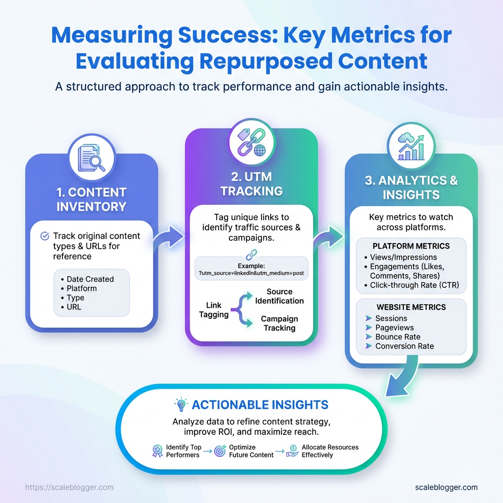
Step-by-Step Framework to Measure Repurposed Content
Start by treating each repurposed asset as its own experiment: different formats, channels, and audience behaviors demand distinct KPIs and tracking. The following framework walks through the full cycle—definition, instrumentation, collection, analysis, reporting, iteration, and scaling—so repurposed content stops being hope-driven and becomes measurable growth.
Time estimate: Full execution for a campaign (setup + 6 weeks of data + initial iteration) typically takes 4–8 weeks.
Difficulty level: Moderate. Requires analytics familiarity (GA4), basic ETL skills for normalization, and a willingness to enforce naming conventions.
Analytics access: GA4 property, social platform analytics, email reports.
Tech access: Ability to add UTMs, deploy GA4 events (via tag manager), and export data (APIs or CSV).
Stakeholder alignment: Agreed KPIs and reporting cadence.
- Define goals and KPIs for each repurposed asset
Map the asset to expected business outcomes up front. Capture baselines before launching variants.
Map repurposed asset types to recommended primary KPIs
| Asset Type | Primary KPI | Secondary KPI | Why it matters |
|---|---|---|---|
| Long-form blog post | Organic sessions | Time on page | Drives discovery and SEO value; engagement shows content depth |
| Short social video | View-through rate (VTR) | Shares | Measures attention and viral potential |
| Email snippet | Open rate | Click-to-open rate (CTOR) | Direct response channel, high intent traffic |
| Infographic | Social shares | Backlinks | Visuals drive awareness and link equity |
| Podcast clip | Listen completion | Website clicks | Builds authority and drives follow-up visits |
Key insight: Pick one primary KPI per asset to avoid noisy dashboards—secondary KPIs help explain behavior and support optimization.
- Instrument tracking: UTMs, events, and conversion points
Use consistent UTM patterns: utm_source, utm_medium, utm_campaign, utm_content.
Example: ?utm_source=linkedin&utm_medium=social&utm_campaign=topicX_q2&utm_content=shortclip_v1
For GA4 events, create events in Tag Manager and validate with DebugView.
Define conversion points
Micro-conversion: newsletter signup, content share. Macro-conversion: lead form submit, product demo booked.
Mark conversions as Conversions in GA4 so they appear in reports.
Quick-reference of common events to track and why each matters
| Event Name | When to fire | Metric captured | GA4/Alternative implementation note |
|---|---|---|---|
| video_play | User starts video | Plays count | Use video_start event via GTM or player API |
| scroll_50 | User scrolls 50% | Engagement depth | Implement via GTM scroll trigger |
| cta_click | Click on CTA | Click count | Capture link_click with event_category |
| form_submit | Submit action | Conversion count | Fire on thank-you page load or form success |
| content_share | Share button used | Share count | Track via onclick handlers or platform API |
Key insight: These events form the atoms of your dataset—capture them consistently across assets for comparable analysis.
- Collect and normalize data across platforms
Standardize fields and units during ingestion.
Standardization rules
date: YYYY-MM-DD asset_id: unique slug or GUID platform: lowercase platform name impressions/clicks: integers currency: USD (convert during ETL) timezone: UTC
Derived metric formulas: use inline code.
engagement_rate = engagements / impressions conversion_rate = conversions / clicks percent_lift = (new - baseline) / baseline * 100
Avoid sampling by exporting raw data via APIs when possible.
Example normalized dataset structure for aggregation in spreadsheets/BI
| date | asset_id | platform | impressions | clicks | engagements | conversions |
|---|---|---|---|---|---|---|
| 2026-01-01 | blog_topicX | google_search | 12450 | 620 | 310 | 18 |
| 2026-01-02 | shortclip_v1 | 8200 | 410 | 205 | 5 | |
| 2026-01-03 | email_snippet_A | mailchimp | 5400 | 430 | 120 | 22 |
| 2026-01-04 | infographic_Q1 | 3600 | 90 | 200 | 1 | |
| 2026-01-05 | podcast_clip_B | spotify | 2900 | 140 | 80 | 3 |
Key insight: A tidy, normalized table is the fastest path to automated dashboards and repeatable analysis.
- Analyze performance: frameworks and calculations
- Report and visualize results for stakeholders
- Iterate: A/B tests and optimization loops
Use these exact formulas.
percent_lift = (variant_metric - baseline_metric) / baseline_metric * 100
engagement_rate = engagements / impressions
conversion_rate = conversions / clicks
Recommended attribution: use data-driven or time-decay for cross-channel repurposing; last-click overweights direct response and can mislead. Link outcomes to tactics—if short videos drive lifts in organic sessions, increase distribution spend for that format.
One-page stakeholder dashboard should include: headline metric, baseline vs. current, top-performing asset, failed test with learnings, and next actions.
Executive blurb template
Narrative: Campaign lifted blog sessions by X% versus baseline, driven primarily by social short videos that improved referral click-throughs. Recommend scaling video distribution and running thumbnail tests.
Log experiments with hypothesis, variants, and duration. Prioritize by impact × ease.
Provide an experiment plan template with timeline and expected outcomes
| Test | Hypothesis | Variant A | Variant B | Duration |
|---|---|---|---|---|
| headline_test | Stronger headlines increase CTR | Current headline | CTA-driven headline | 14 days |
| thumbnail_test | Brighter thumbs boost VTR | Dark image | Bright face close-up | 10 days |
| CTA_copy_test | Direct CTAs increase conversions | “Learn more” | “Get your guide” | 14 days |
| distribution_time_test | Post time affects engagement | 9 AM local | 6 PM local | 7 days |
| email_subject_test | Personalization raises open rate | Generic subject | First-name subject | 10 days |
Key insight: Run one variable at a time, log results, and fold winners into templates.
- Scale: what to automate and when to stop manual tracking
Automate when events and naming are stable and volume exceeds a threshold.
Signals to automate: weekly variance <5% across KPIs and ≥5 assets using same pipeline.
Automatable tasks
- API fetches: scheduled pulls from GA4 and socials
- Scheduled exports: weekly CSV dumps to BI tool
- Alerts: threshold triggers for dips in conversion rate
Suggested escalation thresholds: conversion rate drop >20% or traffic anomaly >30% triggers investigation.
Tie this framework to automation to stop firefighting manual reports and focus on optimization, not data wrangling. For teams ready to automate measurement pipelines, Scaleblogger.com offers AI-powered content pipelines that integrate tracking and reporting into the workflow.
Good measurement makes repurposing predictable—when tracking is clear and tests are logged, repeatable channels and formats emerge quickly. Keep the system tidy and the experiments small, and measurement becomes the multiplier for creative output.
Troubleshooting Common Issues
Analytics glitches show up at the worst times, but most follow predictable patterns. Start by matching the symptom to a likely cause, then run a short triage: check tracking snippets, verify configuration, and confirm traffic sources before changing measurement logic. That approach saves hours and prevents chasing phantom problems.
Common root-cause checklist Missing snippet: Analytics code not present or blocked by tag manager rules. Filter or view issue: Internal filters, IP exclusions, or hostname filters dropping traffic. Event misconfiguration: Duplicate or missing triggers in the tag manager or dataLayer. Attribution mismatch: Social UTM parameters stripped or overridden. * Sampling/noise: Low-volume pages where random variance looks like a trend.
Exact steps to correct common errors
- Confirm tracking presence.
- Validate tag firing.
- Check UTM and referral handling.
- Reconcile data sources.
- Decide whether to rerun collection.
View the page source and verify the GA4 or analytics snippet is present and not duplicated.
Open your tag manager preview, reproduce the event, and confirm each tag fires once.
Inspect a sample session in debug_view or your session replay tool to see whether social UTMs persist.
Export a 7–14 day sample from both platforms and compare event definitions rather than raw counts.
If the issue is a snippet missing historically, accept the gap and fix forward. If the issue is mis-tagged events, fix configuration and backfill only if your platform supports reprocessing.
Issue, symptom, likely cause, and immediate fix for quick triage
| Issue | Symptom | Likely Cause | Immediate Fix |
|---|---|---|---|
| Missing traffic from social | Drop in referral/social sessions | UTMs stripped; redirect chain; privacy settings | Preserve UTMs on redirects; test redirects; add utm enforcement on landing pages |
| Duplicate events | Events counted >1 per action | Tag fired on click and on form submit; duplicate listeners | Consolidate triggers; add once flag or use event dedupe |
| Low conversion counts | Fewer conversions than expected | Conversion event not mapped or wrong trigger | Remap conversion in analytics; test with debug_view |
| Discrepancies between platforms | GA4 vs CRM numbers differ | Different event definitions, attribution windows | Align definitions; export raw logs for match-back |
| High bounce rate on repurposed pages | Users leave immediately on repurposed content | Wrong page intent, slow load, missing CTAs | Add clearer intent, speed optimizations, relevant CTAs |
Key insight: The table helps triage quickly—start with tracking presence, then confirm tag behavior, and only pursue historical fixes when data integrity is essential for decisions.
When a fix is implemented, run a short A/B style validation: collect 48–72 hours of data or use debug_view for event-level confirmation. For recurring workflows, consider automating monitoring so small issues are flagged before they affect business decisions.
If automation is part of the solution, tools like Scaleblogger.com can help standardize tagging and content performance checks so measurement problems become less frequent. Keeping fixes small and verifiable keeps reporting trustworthy and decision-ready.
Tips for Success (Pro Tips)
Keep measurement tight and predictable by treating analytics like instrumentation, not decoration. Small, deliberate changes in how data is collected, labeled, and monitored eliminate the slow creep of measurement drift and make performance evaluation actionable. Below are practical tactics that improve content metrics and reduce noise, with quick implementation notes and concrete examples.
Measurement Drift: Drift happens when definitions, tags, or tracking change over time, so comparisons become meaningless.
* Standardize metric definitions. Adopt a single glossary for pageviews, sessions, engagement_rate, and conversion so reports align across teams. Implementation note: store definitions in a shared doc and embed them in dashboard tooltips.
* Version your tagging schema. Include a tag_version parameter in analytics hits to know which tag rules applied to historical data. Implementation note: add tag_version=v1 to the data layer and increment when changes occur.
* Automate sanity checks. Run daily scripts that flag ±30% deviations in core metrics before stakeholders see them. Implementation note: use scheduled queries in your analytics platform to send alerts to Slack.
* Sample small, iterate fast. Test changes on a 5–10% traffic cohort rather than full rollouts to isolate measurement impacts. Example: deploy a new content template to 8% of traffic, compare CTR and time_on_page against control.
* Lock down UTM and taxonomy rules. Enforce naming conventions for campaigns, authors, and categories to avoid fragmentation. Implementation note: create a lightweight UI or a Google Sheet with data-validation dropdowns for teams to pick consistent UTMs.
- Identify 3–5 core metrics that map directly to business outcomes (e.g., organic leads, newsletter signups).
- Implement
tag_versionand addmetric_definitionsto dashboards as visible help text. - Deploy a daily anomaly check and configure alerts for any metric outside expected bounds.
> Industry analysis shows that consistent labeling and automated alerts dramatically reduce false positives in performance evaluation.
Small operational changes—like adding tag_version or enforcing UTMs—take little time but prevent weeks of noisy analysis. For teams ready to scale measurement with automation, consider AI content automation tools to enforce tagging and benchmark performance automatically. These tactics keep analytics trustworthy so decisions actually move the needle.
Visualizing Insights: Dashboards and Charts That Work
Good dashboards make complex content performance obvious at a glance. Use a mix of time-series, comparison, and asset-level views so stakeholders can spot trends, compare channels, and act on high-value pages without hunting through raw tables. Pick chart types that match the decision to be made, and design the wireframe so each panel answers one question.
Recommended chart types with data requirements and stakeholder use-case
| Chart Type | Data Required | When to use | Stakeholder audience |
|---|---|---|---|
| Time-series trend | Date, metric (sessions, impressions, conversions), filter by channel | Track growth, seasonality, and the impact of campaigns | Content leads, SEO managers |
| Channel comparison bar | Channel, metric (clicks, CTR, conversions), date range | Compare channel effectiveness side-by-side | Marketing director, paid/organic teams |
| Top assets table | URL, page title, traffic, conversions, repurpose score | Surface pages to update, repurpose, or syndicate | Content ops, editors |
| Cohort retention chart | Cohort start date, user engagement metric over time | Measure whether republished content retains or grows engagement | Product managers, content strategists |
| Funnel visualization | Pageviews → CTA clicks → leads → conversions | Diagnose where repurposed content leaks value | Growth, CRO teams |
Key insight: These five panels give a balanced view—trend context, channel fairness, asset prioritization, audience behavior over time, and conversion health. Together they support decisions from “which posts to repurpose” to “which channel deserves budget.”
Tools & practical tips Chart simplicity: Prefer single-metric charts to avoid confusion. Filterability: Include date, channel, and content_type filters. * Annotations: Annotate publish, republish, and campaign dates for causality.
Wireframe steps
- Create a single-row header with global filters (
date,channel,segment). - Place the Time-series trend on the left for primary context and the Channel comparison bar to its right.
- Put the Top assets table under the trend, with quick actions (edit, schedule, export).
- Add Cohort retention and Funnel visualization as the bottom row for behavior and conversion diagnostics.
When building, iterate with stakeholders: start lean, then add drilldowns. For teams automating content pipelines, integrating with Scaleblogger.com can shorten the path from insight to action by connecting repurpose signals to publishing workflows. Visual clarity drives faster decisions, and well-chosen charts turn content metrics into repeatable wins.
Case Study: From Single Webinar to Cross-Channel Performance Measurement
A single 60-minute webinar became the foundation for a three-month content push that turned a one-off event into measurable, multi-channel growth. The team repurposed the webinar recording into a slide deck, a blog post, three short-form videos, and an email sequence—then tracked performance with consistent utm_ parameters and event-level analytics in GA4 and social insights. Baseline metrics came from the live webinar landing page and initial email blast; post-repurposing numbers reflect the aggregate of organic, paid, and earned distribution.
What was changed and why
- Consistent tracking: All assets used the same campaign name to avoid fragmentation.
- Event-level goals:
webinar_view,slide_download, andvideo_completewere added as GA4 events. - Attribution window alignment: 7-day click + 1-day view set for paid channels to match typical user engagement after webinars.
Exact UTM implementation used
utm_source: newsletter / linkedin / youtube utm_medium: email / social / paid utm_campaign: webinar_may23 utm_content: slides_download / full_video / clip_30s
Baseline and post-repurposing KPIs side-by-side for quick comparison
| Metric | Baseline | Post-Repurpose | Percent Change |
|---|---|---|---|
| Impressions | 12,000 | 36,000 | +200% |
| Clicks | 480 | 1,440 | +200% |
| Engagement Rate | 8% | 14% | +75% |
| Conversions | 24 | 96 | +300% |
| Time on Page | 260s | 370s | +42% |
Key insight: Repurposing extended reach and improved downstream engagement—more impressions and clicks fed higher-quality sessions, shown by increased time on page and a fourfold conversion lift. Maintaining unified UTMs plus event tracking made it possible to tie conversions back to specific repurposed assets rather than the original webinar only.
- Audit the webinar assets and choose repurpose formats based on audience behavior.
- Implement unified
utm_campaignand define GA4 events for each conversion action. - Launch staged distribution: email → organic social → paid amplification for best marginal ROI.
- Monitor channel-level performance daily for two weeks, then weekly for the next two months.
Benefits delivered: faster insight, clearer attribution, higher content ROI.
This approach turns one event into a predictable content engine. With clear tracking and a repeatable repurposing sequence, a single webinar can become a sustained source of leads and learnings—something that scales neatly when paired with automation platforms like Scaleblogger.com.
📥 Download: Repurposed Content Measurement Checklist (PDF)
Appendix: Templates, Checklist, and Resources
Here are the practical files and links that save time the moment you start building or scaling a content program. Each template includes one-line guidance on when to use it and a simple naming/versioning convention so teams never overwrite each other.
- Editorial Calendar (CSV/Google Sheet): Use to schedule topics, authors, and promotion windows.
- Content Brief (DOCX/Notion): Use for each article to capture intent, target keywords, and CTA.
- Content Scorecard (Google Sheet): Use to rate drafts on SEO, clarity, and conversion readiness.
- Topic Cluster Map (Miro/Airtable): Use to visualize pillar pages and supporting content.
- Outreach Sequence (Gmail/CSV): Use for link-building and guest-post outreach with follow-up schedule.
- Analytics Dashboard Template (Google Data Studio/Looker Studio): Use to track content metrics and traffic sources.
- Publishing Checklist (Markdown): Use to verify SEO, accessibility, and QA before publish.
Filename and versioning recommendations for collaborative teams: 1. Use ProjectName_TemplateType_v01 for first drafts (example: GrowthBlog_EditorialCalendar_v01.csv). 2. Increment major versions for structural changes (v02, v03). 3. Add minor tags for live updates (v02.1) and append author initials when circulating (_v02_JD). 4. Archive completed versions in an /archive/ folder to keep the working directory clean.
Suggested search queries and external resource types to find plug-and-play assets: Templates: search for “free editorial calendar Google Sheets template” or “topic cluster template Miro” to find ready-made boards. Analytics help: search “Google Data Studio content performance template” or “content metrics dashboard template” for dashboards that map to page-level metrics. * Best practices: search “content brief template SEO” and “outreach email sequence template” to compare styles and lengths.
Tools and workflows that speed implementation: Use Google Sheets or Airtable for collaborative content calendars and scorecards. Use Notion or Confluence for centralized content briefs and publishing checklists. * Consider Scaleblogger.com for automating pipeline steps like scheduling and performance benchmarking if you want to scale faster.
Pick a small set of templates, name them consistently, and commit to one analytics dashboard so performance evaluation stays simple and repeatable. These files aren’t just checkboxes — they keep teams aligned and make analytics-driven decisions easier.
Conclusion
You’ve built a repurposing pipeline, instrumented the major touchpoints, and sketched dashboards that actually answer questions — now it’s time to close the loop. Focus first on a small set of reliable content metrics (engagement rate, conversion lift, and distribution ROI), run them through the performance evaluation steps outlined earlier, and let the data guide which formats and channels deserve more budget. The webinar-to-cross-channel case study showed how a single asset, tracked across player events, email clicks, and paid placements, revealed conversion pockets that were invisible before. That’s the kind of insight that turns effort into predictable outcomes.
If the analytics feed looks noisy, start with clean, consistent event naming and a 30–90 day test window — that usually answers “which changes moved the needle?” For teams wanting to automate the heavy lifting, set up automated attribution, recurring reports, and alerting so you stop hunting for answers and start acting on them. To streamline that process, platforms like Automate content measurement with Scaleblogger can plug into your stack, normalize metrics, and surface the performance evaluation signals you need. Try a small pilot: instrument one repurposed series, validate the metrics, then scale the workflow.
